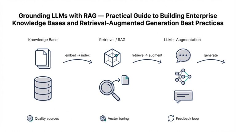
Define Story and Audience
Data visualization and banking data collide when your goal is persuasion, not decoration. Right up front, decide whether your visualization exists to inform a daily operator, to convince an executive, or to trigger a compliance workflow—because that choice drives how you aggregate, filter, and present numbers. What story do you want the chart to tell: a trend, an outlier, a comparison, or a causal chain? How do you make complex ledger-level detail meaningful to different stakeholders without losing auditability or accuracy?
Building on this foundation, the first practical step is defining clear audience personas. A persona is a short, actionable profile that describes the user’s goals, tools, and tolerance for detail; for example, a fraud investigator needs transaction-level drill-down and fast filtering, whereas a CFO needs high-level KPIs and scenario projections. Capture these personas by shadowing users, extracting intent from ticket systems, and instrumenting your dashboards to log which filters and views are used most. When you formalize personas, you avoid one-size-fits-all designs that force analysts to rework executive dashboards into operational tools.
Next, translate the audience and goals into a coherent narrative arc: premise, evidence, and call to action. Pick one primary metric—net inflows, failed payments rate, average balance—and shape the narrative around its signal. For instance, to show an emergent liquidity risk you might compare rolling 7-day outflows to a moving average and expose the top counterparties contributing to the delta; a compact SQL pattern looks like SELECT date_trunc(‘day’, ts) AS day, sum(amount) FROM transactions WHERE channel=’wire’ GROUP BY day. That structure keeps the story tight and helps you choose the right temporal granularity and smoothing strategy.
Match visual affordances to both the narrative and the persona’s mental model. Executives benefit from concise summary visuals—sparkline trends with annotated inflection points and scenario bands—while analysts need multi-dimensional views, interactive filters, and table-level exports. For anomaly detection use small multiples or heatmaps to reveal patterns across segments; for flow analysis prefer Sankey-like diagrams or directed edge graphs to make path dependency explicit. Trade-offs matter: interactivity aids exploration but can obscure audit trails unless you expose the query that produced the view.
Design decisions should prioritize clarity, reproducibility, and compliance. Place precise labels and units on axes, include the aggregation window, and annotate thresholds or model confidence intervals so viewers can judge significance. Adopt a visualization design system that codifies color palettes (with color-blind-safe alternatives), typography, and standard chart components; store chart parameters alongside dataset versioning so every image can be reproduced for audits. These practices reduce disputes over interpretation and make it easier to validate dashboards during incident reviews.
Finally, treat the story and audience definition as hypotheses to test and iterate. Instrument comprehension tests, run quick A/B experiments with alternate layouts, and collect time-to-insight metrics—how long does it take a user to answer a specific question from the visualization? Use those measurements to refine persona assumptions, change aggregation windows, or add contextual annotations. With a validated story mapped to clear audiences, we can move on to picking the precise visualization hacks that amplify the signal without introducing bias.
Prepare and Mask Sensitive Data
Building on this foundation of audience-first storytelling, you must treat sensitive data as a design constraint rather than an afterthought. When you visualize banking data for different personas, the way you prepare and mask that data will determine whether a dashboard is useful, auditable, and compliant. Call out which fields are sensitive early—account numbers, PAN fragments, full names, national IDs, and raw timestamps tied to transactions—and use those classifications to drive downstream masking and aggregation decisions.
Start with a clear classification policy that maps sensitive fields to allowable uses per persona and per view. For operational analysts you might allow pseudonymized identifiers and reversible tokenization; for executives you should present aggregated KPIs and irreversible masking. This mapping makes decisions repeatable: if a chart needs transaction-level drill-down for fraud triage, the data path and approval process are different than for a monthly executive summary built from anonymized aggregates.
Choose masking techniques with the analytics need in mind. Irreversible hashing or redaction is appropriate when you only need grouping or counts; deterministic hashing preserves the ability to join datasets without revealing raw PII. Format-preserving encryption (FPE) or tokenization gives you reversible protection for controlled re-identification, while differential privacy helps when you must publish statistics that resist reconstruction attacks. Each technique trades analytical fidelity for confidentiality, so document why you chose one method over another in the dataset metadata.
How do you let analysts drill down without exposing PII? Use deterministic pseudonyms and strict audit controls. For example, create a reproducible hashed identifier for grouping in SQL while keeping the mapping in a secured vault: sql -- deterministic, salted hash for grouping SELECT sha2(concat(account_id, 'YOUR_ENV_SALT'), 256) AS acct_pseudo, date_trunc('day', ts) AS day, sum(amount) FROM transactions GROUP BY acct_pseudo, day; This lets you detect the same account across tables without leaking the underlying identifier. For reversible tokenization, implement token service calls at query time rather than storing plaintext mappings in analytics databases.
Operationalize key management and provenance so masking remains auditable and reproducible. Store masking parameters (salt values, algorithm identifiers, dataset version) alongside the visual artifact and the SQL or query that produced it; log all tokenization and de-tokenization events with user and purpose. Integrate your secrets manager or KMS for encryption keys and rotate keys according to policy—losing control of a static salt or key is the single biggest operational risk in data masking. Maintain an approval workflow for any request to re-identify data and capture those approvals in the audit trail.
In practice, match protection to intent: show anonymized trend lines and cohort breakdowns to the CFO, use truncated account numbers (last four digits only) for customer support screens, and provide reversible tokens under strict logging for fraud investigators who need full traceability. By building masking into your ETL and visualization pipelines, you preserve both signal and safety—enabling analysts to ask focused questions while protecting customer privacy and meeting compliance obligations. Next, we’ll apply these prepared datasets to visualization patterns that surface the right signals without exposing the underlying identifiers.
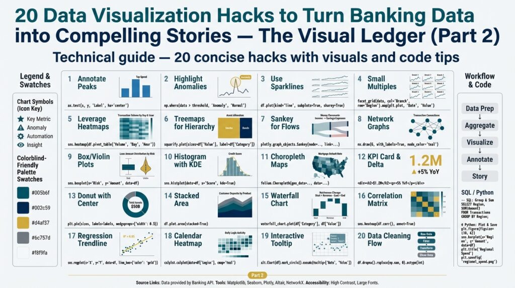
Select Charts for Banking Metrics
Choosing the right visualization for banking metrics is the difference between a dashboard that prompts action and a dashboard that creates confusion. In the first 24–72 hours of an incident you need signal, not decoration, so prioritize chart types that communicate the metric’s intent clearly. Are you tracking trend, distribution, composition, or flow? Asking that question up-front steers both your aggregation strategy and how you mask or expose identifiers, and it primes the visualization to support decision-making rather than curiosity.
Start by mapping metric intent to chart families: use time series charts for temporal signal, distribution charts for skew and outliers, composition charts for portfolio mix, and graph/flow diagrams for counterparty movement. For example, net inflows and outflows demand a line or area chart with rolling windows and context bands; transaction amount distributions call for histograms or boxplots; channel mix benefits from normalized stacked bars or treemaps. This mapping keeps the story tight for each persona—executives see summary composition, investigators get distributional detail—and reduces the temptation to shoehorn multiple stories into one misleading visual.
For temporal banking metrics, choose granularity and smoothing to match the decision horizon. Use daily or hourly series when operators need to triage; aggregate to weekly or monthly for strategic reviews. Apply a moving average or a 7-day rolling sum to mute noise, and always show the aggregation window on the axis label so readers can judge volatility. When you need to compare seasonality and trend, pair a decomposed line plus a seasonality heatmap rather than relying solely on a single smoothed line.
When your goal is to surface outliers and tail risk, favor distribution visuals that reveal skew. Transaction amounts and balances are typically heavy-tailed; a log-scaled histogram or violin plot exposes the long tail without letting the median disappear. For fraud detection, combine a boxplot per customer segment with small multiples across geographies to let analysts visually scan for abnormal variance. These charts make it easier to ask targeted follow-ups: which accounts are driving the upper quartile, and can we link them to recent onboarding events?
Comparisons and composition need careful design to avoid misinterpretation. Use grouped bars or slopegraphs to show changes across two points in time; reserve stacked bars for absolute totals and normalized stacked bars (100%) for share comparisons. Sankey or directed edge diagrams work well for payment routing and channel flows where path dependency matters, but use them sparingly—complex flows can confuse non-technical viewers. Always annotate totals, add percentage labels, and provide a table export so auditors can validate the underlying numbers.
Correlation and relationship charts are indispensable when you want to test causality or highlight leading indicators. Scatter plots with hexbin overlays handle dense clouds like latency versus failed payments; correlation matrices and heatmaps summarize relationships across many KPIs. When do you choose a network graph instead of a scatter? Use a network when entity-to-entity relationships matter—counterparty exposures, fund transfers, or layered credit lines—because network topology reveals clusters and bridging nodes you won’t see in point-wise correlation.
Design pragmatics matter as much as chart choice: annotate inflection points, show confidence or threshold bands, and surface the exact SQL or query that produced the view for auditability. Keep masked identifiers deterministic when analysts need joins, but display only aggregated labels for executive views; store masking parameters alongside the chart artifact so reproducibility survives key rotation. By aligning chart selection to metric intent and audience, you preserve both signal and compliance—next, we’ll apply these chart choices to prepared, masked datasets and demonstrate patterns that surface the right signals without exposing sensitive identifiers.
Highlight Anomalies and Trends
Signal and noise compete for your reader’s attention when you plot banking data, so your job is to make anomaly detection and trend discovery obvious without overfitting the viewer to harmless fluctuations. Start by asking a practical question: How do you separate signal from noise in high-frequency payments data so operations can act and executives can trust the metric? If you front-load anomaly detection, trend decomposition, and clear visual cues in the first chart the reader sees, you reduce misinterpretation and accelerate decision-making.
Differentiate transient blips from structural shifts before you pick a visual encoding. An anomaly is a short-lived deviation that should trigger triage; a trend is a persistent directional change that should drive strategy. Building on the persona work earlier, present anomalies as action items for investigators and trends as contextual evidence for executives—this determines whether you surface raw transactions or masked aggregates. Temporal scope matters: hourly spikes deserve different smoothing and alert thresholds than monthly drift.
Apply statistical lenses that expose true deviations rather than measurement noise. Use rolling z-scores or median absolute deviation (MAD) for robustness against heavy tails, and complement them with EWMA (exponentially weighted moving average) to highlight recent shifts. Here’s a compact SQL pattern to compute a rolling z-score on daily totals so you can flag outliers programmatically:
WITH daily AS (
  SELECT date_trunc('day', ts) AS day, sum(amount) AS total
  FROM transactions
  WHERE channel = 'wire'
  GROUP BY 1
), stats AS (
  SELECT day, total,
    avg(total) OVER (ORDER BY day ROWS BETWEEN 29 PRECEDING AND CURRENT ROW) AS ma30,
    stddev_samp(total) OVER (ORDER BY day ROWS BETWEEN 29 PRECEDING AND CURRENT ROW) AS sd30
  FROM daily
)
SELECT day, total, (total - ma30)/NULLIF(sd30,0) AS zscore
FROM stats;
Translate those signals into visual affordances that guide attention. Use a line chart with a shaded confidence band for trends and overlay discrete anomaly markers sized by severity so the eye focuses where you need action. For cross-sectional scans, small multiples and heatmaps let you compare segments (region, channel, customer tier) in parallel and spot systematic deviations; sparklines provide compact trend context in tables without obscuring exact values. Maintain accessibility: use color-blind-safe palettes, explicit shapes, and textual annotations for every anomaly so the viewer isn’t forced to interpret color alone.
Make interactivity purposeful: enable quick drilldowns, but keep auditability visible. When an analyst clicks an anomaly marker, show the underlying query, the masking parameters, and a reversible tokenization path (if they’re authorized) so triage is reproducible and compliant. Pair visual alerts with an exportable CSV of the contributing transactions and an explanation panel that lists candidate causes (onboarding surge, settlement delay, channel outage). These controls let you surface raw detail for investigators while preserving aggregated, anonymized context for executive dashboards.
To see this pattern in a real workflow, imagine we’re tracking net outflows to detect emergent liquidity risk. Compute a 7-day rolling sum, derive a rolling median and MAD, then tag days where the rolling z-score exceeds a threshold and annotate the chart with top counterparties driving the delta. Operationally, trigger a ticket when a high-severity anomaly appears and attach the exact SQL used to produce the chart for audit. By combining robust statistical detection, clear visual encoding, persona-aware drilldowns, and reproducible provenance you turn banking data into actionable stories that reveal both anomalies and meaningful trends.
Use Overlays, Annotations, Callouts
Building on this foundation of audience-first storytelling, the smartest way to steer a reader’s eye is to layer context directly onto the visual itself—using overlays, annotations, and callouts to make the signal unmissable in noisy banking data. These elements are not decoration; they make intent explicit, surface provenance, and reduce cognitive load for different personas. How do you decide which visual aids to add and which to avoid so you don’t create clutter that undermines trust?
Start by defining the purpose of every overlay or annotation before you render it. If the goal is auditability, attach the exact query, dataset version, and masking parameters to the annotation; if the goal is triage, highlight the contributing entities and an action (open ticket, escalate). This purpose-first rule prevents ad-hoc labels that confuse operators and ensures each callout maps to a clear downstream workflow.
Use overlays to show structural context: add rolling-window bands, benchmark baselines, and maintenance windows as semi-transparent layers that sit behind the primary mark. For example, layer a 7-day volatility band beneath a net outflow time series so readers see both trend and dispersion at once. In Vega-Lite or a similar grammar-of-graphics system you can implement this as a layered spec; a minimal pseudo-pattern looks like:
{"layer": [
  {"mark": "area", "encoding": {"y": {"field": "ma_low"}, "y2": {"field": "ma_high"}}},
  {"mark": "line", "encoding": {"y": {"field": "total"}}}
]}
That pattern separates context (the band overlay) from the primary signal (the line) and preserves visual hierarchy. For performance on high-frequency payments you can precompute band bounds in SQL and store them with the time series so the client only renders a few geometric primitives rather than thousands of points.
Annotations and callouts should answer the reader’s first question: why does this point matter? Use concise, action-oriented text—date, severity, top two counterparties, and the SQL reference—then link the callout to the drilldown path for authorized users. Differentiate persistent annotations (policy thresholds, SLA targets) from ephemeral callouts (one-off incidents, operator notes). For executive views show aggregated, anonymized callouts; for investigators expose reversible token IDs under strict logging so the same annotation can support both situational awareness and traceability.
Scale annotations by severity and provenance rather than by raw count. Size or color markers by a risk score computed server-side (for example, z-score or ML model probability) and store the scoring algorithm version with the annotation metadata. Join an events table to your daily totals rather than rendering every transaction: a compact SQL pattern is to compute aggregate drivers and persist them to an events table, then join that table at render time so overlays remain lightweight and reproducible.
Accessibility and auditability are non-negotiable. Use color-blind-safe palettes, explicit shapes, and alt-text or ARIA labels for every callout so screen readers can narrate anomalies. Always include the provenance string in the annotation payload—the exact query, masking method, dataset version, and key rotation timestamp—so auditors can reconstruct the visual without guesswork. These practices keep your dashboard useful across personas and defensible in reviews.
When you apply these principles you turn static charts into actionable artifacts that simultaneously inform executives and enable investigators. By designing overlays as context providers, making annotations accountable, and treating callouts as executable signals, you preserve both signal and compliance. Taking this concept further, the next practical step is deciding which interactive affordances—drilldowns, exports, or ticket automation—to attach to each type of annotation so the story you surface becomes the action you want.
Add Interactivity and Drilldowns
Building on this foundation, interactivity and drilldowns turn a static KPI into an investigative workflow that guides action. Start by treating interactivity as a narrative affordance: every control you expose should answer a likely question, shorten time-to-insight, or open a safe, auditable path to detail. How do you let analysts explore details without exposing PII? Design drilldowns so that the first click reveals aggregated drivers, the second click reveals pseudonymized cohorts, and the final click (reserved for authorized users) returns reversible tokens with a logged justification.
We recommend mapping interactive elements to personas so interactivity delivers signal, not noise. For operators, expose quick filters, time-window selectors, and pre-baked anomaly zooms; for investigators, provide faceted searches and transaction lists; for executives, limit interactions to scenario toggles and annotated summaries. Keep the UX consistent: a filter you add for one view should behave the same across charts, and drilldowns should preserve the original context (date range, aggregation window, mask level) so you never lose provenance while exploring.
Make drilldowns performant by precomputing lightweight event tables and using parameterized lazy-loading on the client. Persist aggregate drivers and event metadata in a compact table so the client needs to fetch only a few rows to render a contextual panel, then request transaction-level buckets only on demand. A minimal server-side pattern looks like this:
-- precompute daily driver aggregates (safe to show to executives)
CREATE TABLE daily_drivers AS
SELECT day, driver, sum(amount) AS total, percentile_cont(0.5) WITHIN GROUP (ORDER BY amount) AS median
FROM transactions_masked
GROUP BY day, driver;

-- drilldown: fetch top contributors for a selected day (pseudonymized)
SELECT acct_pseudo, sum(amount) AS contributor_total
FROM transactions_masked
WHERE date_trunc('day', ts) = :selected_day
GROUP BY acct_pseudo
ORDER BY contributor_total DESC
LIMIT 25;
On the client, implement progressive disclosure: a compact sparkline in the table, a context panel that shows top contributors and their risk score, and a secondary pane that streams the underlying transactions when the user is authorized and explicitly requests them. Preserve breadcrumbs and a visible “current query” string so users can track how they navigated to a view; this makes sessions reproducible and reduces accidental context loss when analysts pivot between views.
Compliance must be baked into every interactive path rather than bolted on afterward. Store masking parameters and dataset versions as part of the view metadata so each drilldown carries a provenance header (query, mask algorithm, key-rotation timestamp). Use a token service for reversible access and require purpose-bound justification that is logged with user identity and a ticket reference. For example, a detokenization API should return a single-row audit log entry when used:
{ "user": "[email protected]", "purpose": "fraud_triage", "token_id": "tok_123", "timestamp": "2026-01-04T12:32:00Z" }
Instrument and measure the interactivity you provide so you can iterate. Track average time-to-first-action after a drilldown, cache hit rates for precomputed aggregates, and the most common filter sequences per persona; use these metrics to prune seldom-used controls and surface high-value shortcuts. Load-test the lazy-loading endpoints with real-ish payloads (including masked identifiers and provenance) and tune limits—returning 25 deterministic pseudonyms is typically fast and sufficient for triage while keeping client renders snappy.
Taking this concept further, tie interactive callouts to automated workflows: let a high-severity anomaly spawn a ticket with the exact SQL and event bundle attached, or allow an executive to pin a scenario that triggers a scheduled report. By combining persona-aware interactivity, staged drilldowns, precomputed driver tables, and auditable detokenization, you create dashboards that are exploratory and defensible—giving analysts the detail they need and executives the succinct signal they trust.