Overview of CanvasXpress Grids
CanvasXpress grids are the fastest way to turn dense tabular datasets into interactive data visualization experiences you can explore in the browser. Building on the foundations we covered earlier, we’ll treat the grid as both a presentation layer and an analytic entry point: it’s where you preview raw data, apply filters, and trigger linked visualizations without leaving the page. How do you inspect thousands of rows, highlight outliers, and send selections to a scatter plot in one workflow? CanvasXpress grids make that interaction fluid by exposing sorting, filtering, selection events, and export capabilities that integrate directly with the charting components.
At their core, these grids render structured JSON or tabular payloads into a responsive, client-side table with rich interactivity. You can expect column definitions with types and formatting, multi-level headers, cell-level styling, inline editing, and row selection hooks that emit events for other components to consume. This combination makes the grid an ideal control plane for exploratory analysis: filter by a clinical attribute, pivot to a violin plot for distribution, then drill into individual samples represented in the same row. Because the grid acts as a first-class data source, we use it both for ad-hoc inspection and as a trigger for programmatic workflows in dashboards and notebooks.
When integrating a CanvasXpress grid into an application, follow a predictable pattern: prepare a compact JSON payload representing rows and columns, define the column metadata (type, label, format, sortable), and attach event handlers that mirror your UX flows. For example, construct a data object with column descriptors and rows, then initialize the grid and subscribe to selection events so we can call other chart APIs. In practice you’ll wire an event like selectionChanged to update a linked plot; that pattern keeps the grid declarative while preserving imperative control where you need it. Keep your schema stable across components: shared column IDs and consistent typing reduce the friction when you map grid selections to visual encodings in linked charts.
Beyond basic inspection, CanvasXpress grids support advanced interaction patterns you’ll use in production analytics. You can implement crossfiltering where filtering the grid updates multiple charts simultaneously, apply server-side aggregations for grouped summaries, or add custom renderers for sparklines and miniature heatmaps inside cells. We often embed action buttons in rows for quick lookups or asynchronous calls, and use conditional cell styling to surface critical values (for example, coloring p-values or fold-changes). These capabilities let you treat the grid not just as static output but as a control surface that drives downstream analyses and reporting.
Performance and scalability are practical concerns when your dataset hits tens or hundreds of thousands of rows. To keep UI latency low, adopt virtualization or incremental loading and push heavy operations to the server: server-side pagination, range queries, and pre-aggregated endpoints dramatically reduce client memory pressure. Also consider indexing frequently filtered columns, debouncing user-driven queries, and offloading expensive transforms to Web Workers or backend services. In our experience, combining client-side interactivity for small slices with server-backed queries for broad scans gives you the responsiveness users expect while retaining the ability to explore large datasets.
Taking this concept further, the grid becomes the connective tissue in exploratory workflows: it links raw rows to summaries, annotations, and visual narratives. As we move forward, we’ll show concrete configuration examples and wiring patterns that let you bind grid selections to charts, implement collaborative annotations, and persist user-driven filters. For now, understand the grid as a dual-purpose component — it’s both your investigator’s table and a programmatic event source for richer, interactive data visualization.
Installing and Setup
Building on this foundation, the first step is getting a stable CanvasXpress runtime into your project so you can turn tabular payloads into interactive data visualization experiences in the browser. You have two practical paths: drop-in CDN assets for quick prototypes and demos, or install the package into your build pipeline for production apps. Each approach affects caching, bundling, and how you import styles and modules in frameworks like React or Vue. (canvasxpress.org)
For local development and CI-driven builds, install from npm or yarn so you can pin versions and integrate with your bundler. Run npm install canvasxpress or yarn add canvasxpress to add the core library to your node_modules and package.json; this is the recommended route for applications that require reproducible builds. If you need a minimal setup or want to try examples quickly, include the provided CSS and JS from the distribution endpoint instead (for example, the project’s /dist files). Choosing between CDN and package manager depends on whether you prioritize immediate convenience or controlled deployment. (npmjs.com)
Once the library is available, initialize a grid by creating a canvas element or a target container and passing a compact data/config object to the CanvasXpress constructor. The pattern mirrors the chart initialization you saw earlier: point the renderer at a DOM target, pass the data payload with column descriptors, and set grid-specific options such as sortable, filterable, and selection hooks. For example:
<canvas id="gridCanvas" width="800" height="400"></canvas>
<script>
  const data = {
    "y": { "vars": ["col1","col2"], "smps": ["r1","r2"], "data": [[1,2],[3,4]] },
    "z": { /* optional metadata for grid rendering */ }
  };
  const config = { graphType: "Grid", selection: { show: true } };
  new CanvasXpress("gridCanvas", data, config);
</script>
This initialization pattern is documented in the official integration guide and works the same whether you load via CDN or import from node_modules. Use the constructor in your component lifecycle (for example, after mount in React) and keep the data schema stable across linked charts so selection events map cleanly to other visualizations. (canvasxpress.org)
If you’re embedding grids in modern frameworks, prefer the officially supported wrappers or module imports to preserve reactivity and lifecycle semantics. There’s a React component wrapper (canvasxpress-react) that exposes target, data, and config props and makes it straightforward to use within JSX; similarly, the library provides APIs for Python notebooks and an R package for CRAN or GitHub installs if you’re building reproducible analyses. When using a wrapper, bind grid events (selectionChanged, filterChanged) to your application state so you can trigger downstream charts or server requests predictably. (libraries.io)
For production readiness, integrate the CSS into your global stylesheet pipeline and import only the JS modules you need to enable code-splitting and lazy loading. Serve dist assets from your CDN with long cache lifetimes and use hashed filenames for safe cache invalidation. Push heavy operations—server-side pagination, range queries, and pre-aggregated endpoints—into your backend so the browser only receives the slice it needs; this keeps the grid responsive and preserves the interactive data visualization experience for users on the front line.
How do you decide when to prototype with the CDN versus commit to an npm-based build? Prototype on CDN to validate UX quickly, then switch to npm for predictable deployments, automated tests, and tighter integration with bundlers, TypeScript types, and CI. With the library installed and the runtime pattern in place, you’re ready to wire selection events to linked plots, implement server-backed pagination, and move from exploratory tables to full interactive dashboards in the next section.
Preparing Data for Grids
When you drop a dense table into CanvasXpress grids for interactive data visualization, the real work happens before the first render. Start by treating the payload as a contract: stable column IDs, explicit types, and predictable null semantics keep selection events and linked charts reliable. How do you avoid surprises when users filter, sort, or pivot a dataset with thousands of rows? By defining a compact, well-typed schema and validating it early in your pipeline so the grid becomes a dependable control plane rather than an error-prone display.
Design column metadata as the central source of truth for downstream interactions. Define each column with an id, type (numeric, categorical, datetime, boolean, or blob), display label, formatting rules, and whether it is sortable or filterable; keep these descriptors immutable across releases to preserve event mapping. For example, provide a JSON descriptor that annotates columns instead of relying on ad-hoc detection:
{
  "columns": [
    {"id": "sample_id", "type": "string", "label": "Sample ID", "sortable": true},
    {"id": "expr_median", "type": "number", "label": "Median Expression", "format": "0.00", "sortable": true},
    {"id": "group", "type": "categorical", "label": "Group", "values": ["control","treated"]},
    {"id": "timepoint", "type": "datetime", "label": "Timepoint", "format": "iso"}
  ]
}
Clean, consistent values are essential for both performance and correct interaction. Normalize datatypes well upstream: coerce numeric strings to numbers, parse ISO dates into timestamps, and canonicalize categorical labels so filters match predictably. Decide how to represent missing values—null, empty string, or explicit sentinel—and use that same convention in exports and linked visualizations so selections don’t break when a chart expects a numeric array. We also recommend preserving a raw-data column for auditing so you can always reproduce the original row without reversing transformations.
For large datasets, plan your loading and aggregation strategy before the grid touches the DOM. Implement server-side pagination and range queries for broad scans, and return pre-aggregated summaries for group-by operations to avoid shipping huge arrays to the browser. Use an API shape that accepts page, size, sort, and filter expressions; this lets you delegate heavy queries to indexed database paths and keep client memory low. When you must do client-side transforms—for example, complex derived metrics—offload them to Web Workers and debounce UI-driven requests to prevent jank as users type filters or drag range sliders.
Enrich cell content deliberately so you add insight without sacrificing readability. Include miniature time-series arrays inside a cell only when you render them as sparklines or inline heatmaps via custom renderers; keep the underlying data compact (summary + encoded mini-series) to limit payload size. Use conditional styling rules (thresholds, q-value coloring, or z-score highlights) expressed in your metadata so the grid renderer can apply them deterministically. If you need per-row actions—details button, fetch-by-id—embed a stable primary key and an action handler mapping so asynchronous calls don’t need to guess which column stores the identifier.
Validate schema evolution and test the grid with representative slices before release. Add a lightweight schema-check step in CI that asserts required columns, types, and label stability; when the schema changes, bump a payload version so your frontend can migrate or reject incompatible data gracefully. Finally, document the payload contract as part of your frontend-backend API so other teams can wire selectionChanged events and linked charts without guesswork. Building on this foundation, we’ll next wire those selection events to live charts and show patterns for collaborative annotations and persisted filters.
Key Grid Features Explained
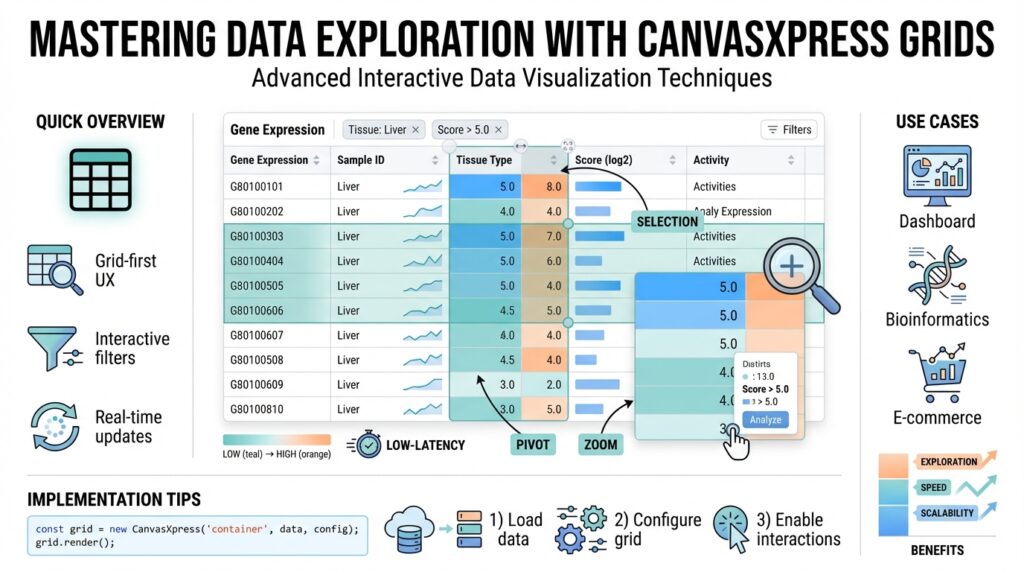
CanvasXpress grids act as the control plane for interactive data visualization: they let you inspect dense tables, apply programmatic filters, and trigger linked charts without context switching. If you’ve ever asked, “How do you rapidly surface outliers and then jump to a related scatter plot?” the answer lies in the grid’s built-in interactivity—typed columns, sortable headers, and selection events that carry semantic IDs. Building on the initialization and schema guidance earlier, this section focuses on the concrete features you’ll rely on when the grid is the primary exploration surface for analysts and engineers.
The first set of capabilities you’ll use every day are the grid’s core behaviors: typed column definitions, multi-level headers, per-column sorting and filtering, inline editing, and row selection hooks. Typed columns (number, categorical, datetime, boolean) drive correct filtering and formatting, so filters behave predictably and downstream charts receive consistent arrays. Multi-level headers and column grouping simplify wide tables—collapse an assay group to focus on metadata columns, then expand to inspect values without losing context. Inline editing and cell-level validation let you correct or annotate rows in-place and emit change events that downstream visualizations can consume.
Beyond core controls, custom renderers make each cell a miniature visualization and a data-dense signal layer. You can embed sparklines, micro heatmaps, or tiny bar charts inside cells to show per-sample time series or expression distributions, and use conditional styling rules to highlight p-values, fold-changes, or z-scores. For example, register a renderer that accepts an array and returns an SVG sparkline so the grid remains lightweight while conveying trend information. These cell-level visuals reduce cognitive load: instead of opening a separate chart, you see trends and anomalies inline and then use the grid selection to drill deeper.
Event wiring is where the grid becomes an orchestrator rather than a display. Subscribe to selectionChanged, filterChanged, and cellEdit events to maintain a single source of truth across components. Keep column IDs stable and use the selection payload (row IDs or index arrays) to request detail endpoints or update linked CanvasXpress charts. A minimal pattern looks like this:
grid.on('selectionChanged', (evt) => {
  const ids = evt.selectedRowIds; // stable primary keys
  updateScatterPlot({ filterIds: ids });
});
This pattern keeps the grid declarative while giving you imperative hooks to query backends or redraw visualizations, enabling crossfiltering where a grid filter updates multiple plots and those plots can push selections back to the grid.
Performance features are essential when your dataset grows to tens of thousands of rows. Use virtualization to render only visible rows, implement server-side pagination and range queries to avoid shipping full tables, and return pre-aggregated group summaries for heavy group-bys. Offload client-side transforms to Web Workers and debounce user-driven queries (search boxes, range sliders) so the UI remains responsive during rapid interactions. In practice we combine client-side interactivity for focused slices with server-backed queries for broad scans to strike a balance between responsiveness and analytical depth.
Taken together, these capabilities make the grid an active exploration surface: it’s where you discover patterns, perform quick edits, and orchestrate downstream visualizations. As we move to wiring patterns and collaborative annotations, you’ll apply these features to build reproducible workflows—linking grid selection to charts, persisting filter states, and enabling shared interpretations across teams. Building on the earlier schema and integration guidance, the next step is implementing those wiring patterns end-to-end so the grid truly controls your interactive data visualization pipeline.
Interactive Exploration Techniques
Building on this foundation, CanvasXpress grids become the first place you reach when exploring a dataset interactively because they surface both raw rows and rich event hooks for downstream charts. Put the keywords up front: CanvasXpress grids and interactive data visualization are your control plane for discovery—so design the grid around clear selection semantics, stable primary keys, and predictable filter events. That upfront discipline prevents subtle mapping bugs when you send a selection to a linked plot or request details from the server. Treat the grid as an event emitter that your visualizations subscribe to, not a passive table.
Start by exposing explicit selection modes and metadata so filters and grid selection behave as you expect. Define single, multi, range, and lasso selection behaviors in the config and document which column represents the stable ID for each row; this guarantees that selectedRowIds remain meaningful even after sorting or pagination. We prefer emitting both index arrays and stable ID arrays with every selectionChanged event so backend fetches and chart updates can pick the representation they need without guessing which mapping is authoritative.
Wire handlers conservatively: debounce rapid UI interactions, batch selection updates, and use optimistic updates for linked charts to keep the interface snappy. For example, debounce selection events and then forward the stable IDs to a scatter plot update; if the backend needs enrichment, fetch asynchronously and replace the optimistic state when the response arrives. A minimal pattern looks like this:
let pending = null;
grid.on('selectionChanged', (evt) => {
  clearTimeout(pending);
  pending = setTimeout(() => {
    const ids = evt.selectedRowIds; // stable keys
    updateScatterPlot({ filterIds: ids });
  }, 120);
});
Linked brushing and crossfiltering turn the grid into an orchestrator rather than a single control. How do you keep linked charts responsive when users lasso-select thousands of rows? We push two strategies: (1) send only ID slices to other components and have those components request detail pages, and (2) maintain pre-aggregated endpoints for common group-bys so charts update with summaries instead of raw scans. Use a transaction pattern when applying multiple updates—suspend chart re-renders while you apply selection, filter, and annotation changes, then commit a single redraw to avoid repeated layout passes.
Progressive disclosure helps you manage cognitive load: render miniature sparklines or tiny heatmaps in cells for immediate context, and surface heavier views only on explicit user actions. Use cell-level renderers to show trends inline, but trigger a full detail panel when someone clicks a row action or context menu item; that panel can fetch richer time series or call compute-heavy endpoints. Push CPU-heavy transforms into Web Workers or server-side jobs; keep the main thread for interaction so your interactive data visualization remains fluid on lower-end devices.
For collaborative workflows, treat annotations and filter states as first-class artifacts: allow users to attach comments or tags to selections, persist those annotations to a versioned backend, and offer shareable links that restore grid filters and selections. We recommend optimistic local saves—show the annotation immediately and reconcile with the server response—combined with a lightweight conflict model (last-writer-wins or merge suggestions) and permission checks for edits. That pattern supports fast teamwork without risking inconsistent shared state.
Performance and UX are inseparable in exploration: use virtualization for rendering, server-side pagination for broad scans, and compact payloads for selection events (IDs instead of full rows). Debounce search and range inputs, index frequently filtered columns on the backend, and stream selection sets when a user is sweeping a large range so charts can progressively refine rather than stall. These optimizations preserve interactivity and let you run crossfiltering and linked brushing across multiple CanvasXpress grids and charts without blocking the UI.
Taking these techniques together gives you a practical toolkit: design clear selection semantics, debounce and batch events, choose progressive disclosure for heavy views, and persist annotations for team workflows. In the next section we’ll apply these patterns to concrete wiring examples that connect grid selection to scatter plots, violin charts, and persisted filter states so you can implement reproducible, collaborative exploration flows.
Performance Tips and Best Practices
Performance is the difference between an exploratory tool that invites curiosity and one that frustrates users; when CanvasXpress grids become sluggish, your interactive data visualization loses its power. Start with the assumption that you will not render the entire dataset in the browser—design the API, UI, and event contracts around compact payloads and streamed responses. What causes most latency: large payloads, repeated re-renders, and unbounded client-side transforms. Front-load the solution by sending IDs and summaries instead of full rows for cross-component messages, and reserve full row payloads for on-demand detail fetches.
The most impactful server-side moves are server-side pagination, range queries, indexed filter endpoints, and pre-aggregated summaries for common group-bys; these keep the grid responsive while supporting broad scans. Define an API that accepts page, size, sort, and filter expressions and returns rows plus a small metadata envelope (totalCount, schemaVersion). We recommend returning compact summaries for inline visuals (sparklines as compressed arrays or base64-encoded small-series) to avoid heavy JSON. Keep column IDs and types stable across versions and use a schemaVersion field so the client can gracefully migrate or reject incompatible payloads.
On the client, avoid blocking the main thread: debounce UI inputs, batch rapid events, and offload expensive transforms to Web Workers. For example, debounce selection events with a short window: const debounced = debounce(handleSelection, 120); grid.on('selectionChanged', ev => debounced(ev.selectedRowIds)); This pattern reduces chattiness when users drag range sliders or sweep long lists. Use optimistic updates for linked charts—render an immediate lightweight summary using IDs, then replace with enriched data when the backend responds. Always wrap multi-step updates in a transaction: suspend redraws, apply state changes, then commit a single render to avoid repeated layout passes.
Rendering strategy matters: use row virtualization to render only visible rows and consider column virtualization or freezing for very wide tables so cell renderers don’t overload the DOM. Defer heavy cell renderers (sparklines, micro heatmaps) until their row is visible and reuse a small pool of DOM/SVG nodes rather than creating new elements per render. Keep cell renderer payloads compact—send a summary plus a tiny series array and let the renderer reconstruct a 32–64px sparkline. Where applicable, prefer canvas-backed mini-visuals in a single layer for thousands of cells rather than thousands of SVG nodes to reduce paint cost.
Coordinate events between the grid and other charts using minimal, predictable payloads: stable primary keys, index arrays, and a compressed diff when selections change. For large selections, stream IDs in chunks so linked plots can progressively refine rather than stall, and add backpressure: if a linked chart is busy, queue or cancel older requests. Use a simple versioned transaction ID for each cross-component update so you can discard stale responses and avoid flicker. These patterns let you implement linked brushing and crossfiltering at scale without saturating the UI thread or network.
Operational practices complete the picture: serve CanvasXpress assets from a CDN with hashed filenames and long cache lifetimes, enable HTTP/2 or QUIC for many small API requests, and monitor both client-side render times and API latency. Add a lightweight CI schema-check that validates required columns, types, and schemaVersion before release so runtime type errors never drive expensive client-side fixes. Instrument slow paths (large selection handling, worker falls back) with metrics and synthetic tests so you can spot regressions early.
Building on the wiring and schema guidance earlier, adopt these patterns as defaults: compact payloads, virtualization, worker-based transforms, debounced and batched events, and server-side summaries. Doing so preserves the interactivity of CanvasXpress grids and keeps your interactive data visualization workflows fluid as dataset size grows—next we’ll apply these practices to concrete wiring examples that connect selections to downstream charts and persisted filter states.