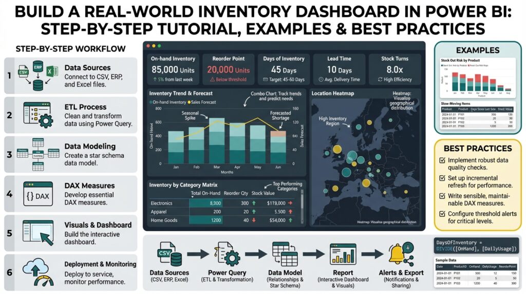
Define Goals and KPIs
Building an inventory dashboard in Power BI starts with a clear north star: what decisions will this dashboard enable? Front-load your project with business goals and measurable KPIs so the report solves concrete problems—reduce stockouts, lower carrying costs, or improve order fill rate. What metrics actually move the needle for inventory management? If you can’t answer that in a stakeholder meeting, pause development and map goals to ranked business outcomes before building visuals.
Building on this foundation, separate strategic goals from analytical objectives. Strategic goals are business outcomes—fewer backorders, faster fulfillment, lower working capital—while analytical objectives describe how you’ll measure progress, such as tracking Days of Inventory Outstanding (DIO) or reorder point breaches. Make each objective SMART: specific, measurable, achievable, relevant, and time-bound. Assign an owner for each goal so KPIs have accountability and a clear escalation path when thresholds are breached.
Choose KPIs that balance leading and lagging indicators and that tie directly to decisions you want users to take. Lagging KPIs like Inventory Turnover and Carrying Cost show the financial outcome of past actions; leading KPIs like Supplier Lead Time, Forecast Accuracy, and Reorder Point Variance give you early warning. Include availability metrics such as Fill Rate and Stockout Frequency for operational teams, and include cycle-level metrics—days to pick, dock-to-stock time—if warehouse workflows will act on the dashboard.
Translate KPIs into data and calculations early, because your Power BI model must support the math. For example, Inventory Turnover can be modeled as DIVIDE(SUM(Sales[COGS]), AVERAGE(Inventory[EndingInventory])) and Days of Inventory as DIVIDE(AVERAGE(Inventory[EndingInventory]) * 365, SUM(Sales[COGS])). Ensure you have a proper calendar table, consistent grain (transaction-level vs snapshot), and links between purchases, receipts, and sales. If you use snapshots for ending inventory, document reconciliation logic so analysts can trace numbers back to source systems.
Design visuals and interaction patterns around decisions, not aesthetics. Use a single KPI card with trend sparkline for executive view, a top-right alert area for threshold breaches, and a time-series chart with decomposition or small multiples for root-cause analysis. Implement dynamic targets so thresholds update by product category or region, and apply conditional formatting to highlight items exceeding reorder lead-time or safety stock variance. Make drill-throughs obvious so operational users can jump from a problem KPI into the supporting transactions that explain it.
Operationalize measurement cadence and data quality checks alongside KPI definitions. Decide whether KPIs refresh in near-real-time, hourly, or daily based on the workflow they inform; replenishment triggers often tolerate hourly updates, while financial carrying-cost metrics can be daily or weekly. Build simple data-quality KPIs—missing supplier lead times, negative balances, or unmatched receipts—and surface them on the same dashboard so trust issues are visible. Add documentation or hover tooltips that explain calculation windows, exclusions, and known data caveats.
Take these definitions and embed them into your rollout plan so the dashboard becomes a decision tool rather than a report. Define alert rules, handoffs (who approves an emergency purchase), and SLA targets for remediation when KPIs cross thresholds. By mapping each KPI to a specific decision, data source, DAX measure, and owner now, we reduce ambiguity and make the Power BI inventory dashboard actionable from day one, which sets the stage for modeling and visualization work that follows.
Connect Data Sources
Building on this foundation, the first technical priority is establishing reliable connections so your Power BI inventory dashboard reflects the truth of operations. You should treat each data source as a contract: schema, update cadence, authentication, and business grain. How do you ensure source grain matches your KPI calculations? Start by inventorying sources (ERP, WMS, POS, EDI feeds, CSVs, and third-party APIs), document their primary keys and timestamps, and annotate whether records are transactional events or periodic snapshots.
Next decide connection patterns and why they matter for performance and correctness. Choose Import when you need fast analytical queries on historical snapshots and choose DirectQuery when near-real-time visibility is essential and the source can handle analytical load. When should you choose DirectQuery over Import? Use DirectQuery for critical operational KPIs (e.g., live stock availability by location) only if query latency from the source is low and you have gateway capacity; otherwise prefer Import with frequent refreshes and incremental loading.
Design a small staging layer to reconcile differences in grain and units before joining anything into your model. Create canonical tables—Receipts, Issues, SalesTransactions, and DailyInventorySnapshots—so joins are predictable and keys remain stable across refreshes. For example, map ERP receipt lines to your SKU master using a normalized SKU code, then aggregate to the same snapshot grain your DAX measures expect; this prevents ambiguous averages when you compute Inventory Turnover or Days of Inventory.
Use Power Query transformations to normalize and validate data as early as possible. Standardize date/time zones, convert units of measure to a canonical base, and apply deterministic trimming and case rules to SKU and supplier codes so joins do not silently drop rows. Implement lightweight data-quality checks in Power Query—row counts by source, null key counts, and unexpected negative quantities—and surface those counts back into the model so the dashboard can flag upstream issues.
Plan architecture for scale: centralize shared transformations with Dataflows or a staging database, and push heavy aggregations into the data source when feasible. Use incremental refresh for high-volume tables (transactional lines), and consider composite models to mix Import and DirectQuery where needed. Configure an on-premises data gateway for ERPs or WMS that live inside your network, secure service accounts with least privilege, and document credential rotation so refreshes don’t silently fail.
Consider a real-world pattern we use often: import nightly aggregated snapshots for all SKUs (fast historical analysis), and keep a small DirectQuery layer for recent transactions (last 24–48 hours) to power operational alerts. Reconcile these two streams by using a date-bound union and a deterministic precedence (DirectQuery recent > Import historical) so users see one coherent inventory position. This hybrid pattern balances performance, freshness, and the reconciliation guarantees your stakeholders asked for when we defined KPIs earlier.
Finally, instrument and monitor your source connections from day one so you can detect schema drift, refresh failures, or performance regressions. Capture refresh duration, row deltas, and data-quality metrics in a small support report; when thresholds breach, have an escalation path to source system owners. With sources connected, validated, and staged, we’re ready to move into modeling and measures that turn raw events into actionable inventory insights.
Transform and Model Data
Building on this foundation, the crucial next step is converting raw receipts, sales transactions, and snapshot files into a single trusted Power BI inventory dashboard data model that analysts and ops can rely on. How do you turn disparate ERP lines and periodic inventory snapshots into a single, authoritative view that supports both operational alerts and financial KPIs? Start here: force determinism on grain, timestamps, and units before you join anything, because modeling ambiguity is the most common source of downstream DAX bugs and reconciliation fights.
Define a clear grain for each fact table up front so your joins are deterministic and your measures are auditable. For transactional lines use a Receipt/Issue grain (line-level with timestamps); for position reporting use EndOfDay snapshots (SKU-location-date). Then design a star schema: a compact Date table with fiscal attributes, a SKU dimension with normalized codes and attributes, and small supplier, location, and warehouse dimensions. Role-playing dimensions (for example, receipt date vs receipt posted date) and surrogate keys simplify time intelligence and avoid brittle composite natural-key joins.
Normalize and validate consistently in Power Query before data hits the model to keep your data model performant and explainable. Convert units of measure to a canonical base, trim and uppercase SKU and supplier codes, and collapse noisy transactional attributes you don’t need for analysis. Use incremental refresh for high-volume transaction tables and push nightly aggregated snapshots into an Import table for history while keeping a small DirectQuery or recent-transaction layer for last-48-hour operational alerts. Centralizing these transformations in Dataflows or a staging schema reduces duplication and keeps your Power BI dataset lean.
Design relationships and filter directions with intent rather than convenience. Prefer single-direction filter flows from dimensions into facts and avoid excessive bi-directional relationships unless you deliberately need them for specific cross-filtering scenarios. Use calculated columns only when they’re static or required for relationships; prefer measures for calculations so you benefit from VertiPaq compression and query folding. Consider calculation groups for repeated time-intelligence logic and expose a small set of atomic measures that you can compose—this makes testing and change control far easier.
Translate business definitions from the KPI design phase into explicit DAX measures and test them against source queries. For example, Inventory Turnover and Days of Inventory can be implemented as atomic measures that reference the same EndingInventory base, which keeps reconciliation straightforward:
InventoryTurnover := DIVIDE(SUM(Sales[COGS]), AVERAGE(Inventory[EndingInventory]))

DaysOfInventory := DIVIDE(AVERAGE(Inventory[EndingInventory]) * 365, SUM(Sales[COGS]))

ReorderSignal := IF([OnHand] < [ReorderPoint] && [LeadTime] > [SupplierLeadTimeThreshold], 1, 0)
Those patterns let you trace every KPI back to a small set of base measures and tables. When you build safety-stock or reorder-point calculations, compute them at the SKU-location-date grain and store results in a pre-aggregated table if the logic is computationally heavy.
Finally, validate, optimize, and document the model so the dashboard is trustworthy and maintainable. Run reconciliation queries that compare Power BI aggregations to nightly source extracts, remove unused columns and reduce string cardinality to shrink model size, and use aggregated tables or composite models to keep interactive queries fast. Instrument refresh duration and row-count deltas so you catch schema drift early; when discrepancies appear, the model should point you to the offending table and date range. Taking these steps turns data transformation work into a robust, auditable data model that powers the inventory dashboard and makes downstream analysis reliable and scalable.
Build Core DAX Measures
Power BI DAX measures are the engine that turns your prepared model into actionable inventory insights; if those measures are ambiguous or slow, your dashboard won’t be trusted. How do you design DAX measures that are auditable, performant, and aligned with the KPIs we defined earlier? Start by mapping each KPI to a small set of atomic measures—OnHand, Receipts, Issues, COGS, and EndingInventory—so every higher-level calculation can be traced back to those primitives. Front-loading these definitions makes debugging and stakeholder reconciliation straightforward and keeps your inventory dashboard reliable for operations and finance.
Start with atomic base measures that calculate one thing only and do it well. Define OnHand as a transactional net (received minus issued) calculated at the SKU-location-date grain, and keep naming consistent across the model to avoid confusion later. For example, implement OnHand as a simple base measure and use it everywhere higher-level measures need it, rather than re-implementing the same logic in multiple places; this reduces risk and improves maintainability.
OnHand := SUM(Receipts[QtyReceived]) - SUM(Issues[QtyIssued])
Time windows and aggregation choices change the meaning of inventory KPIs, so compute moving averages and period denominators intentionally. When you calculate Days of Inventory or Inventory Turnover, decide whether to use average ending inventory over a period, last-day snapshots, or a business-specific rolling window; each choice answers a different operational question. For Days of Inventory use base measures and measured denominators to ensure consistency across visuals:
AvgEndingInventory := AVERAGEX(VALUES(Date[Date]), [EndingInventory])
DaysOfInventory := DIVIDE([AvgEndingInventory] * 365, [COGS])
Optimize measures for performance by pushing heavy work to the source or to pre-aggregated Import tables and keeping DAX expressions declarative and variable-driven. Use variables to calculate intermediate values once per query instead of repeating expensive subexpressions, and prefer SUMMARIZECOLUMNS or precomputed snapshot tables for large-grain aggregations. Composite models are useful: keep historical snapshots in Import for fast trend analysis and expose recent transactions via DirectQuery for operational alerts, then write DAX measures that deterministically choose the recent layer when available.
Make every measure auditable with explicit test cases and reconciliation queries that mirror source extracts. Create a validation page that compares Power BI aggregates to nightly CSV extracts for key dimensions and date ranges, and add a metadata table that records measure definitions, last-author, and version—this helps analysts and auditors understand how numbers were derived. When a discrepancy appears, use isolated CALCULATE filters and small sample SKUs to step through intermediate values and confirm whether the gap comes from transformation, grain mismatch, or DAX semantics.
With the core DAX measures robust and validated, you can build dynamic targets, conditional formatting, and drill-throughs that drive operational decisions rather than just display numbers. Reference the same atomic measures in your alerting logic so thresholds update automatically by category or location, and expose a small set of explainability visuals (transactions behind a KPI) for rapid root-cause analysis. Taking this approach ensures your Power BI inventory dashboard is not only performant but also trustworthy and actionable—so the next step is designing visuals and alerts that turn these measures into daily operating routines.
Design Visuals and Layout
Power BI is where your inventory dashboard becomes a decision surface, not a static report. Start by treating visuals as decision prompts: front-load KPI cards that answer the key questions users brought to the requirements session, place trend sparklines directly under values, and reserve a top-right alert zone for breaches and exceptions. This immediately communicates what needs attention and why, so users scan, decide, and act instead of hunting for context. Keeping the most important inventory metrics visible in the first viewport reduces cognitive load and speeds operational responses.
Building on the modeling and DAX work we already completed, prioritize visual hierarchy over visual variety. Use a single-row master KPI band for OnHand, ReorderSignal, FillRate, and DaysOfInventory, each paired with a 12-week sparkline and a delta to target; beneath that, place a time-series area chart for rolling inventory and a decomposition or small-multiples set for SKU-category variance. Visual hierarchy guides attention: large, high-contrast cards for executive decisions, medium charts for trend analysis, and dense tables for transactional drill-downs. This ordering ensures that the analytical flow—identify an issue, explore trends, drill to transactions—maps directly to the layout.
Separate executive and operational concerns into purpose-built pages or toggled views so you don’t overload a single canvas. For executives, build a concise one-screen summary optimized for presentation and export; for operations, create a two- or three-column grid that supports scanning by location, SKU, and supplier with pinned filters for today and last 48 hours. Use responsive layout techniques: constrain visuals to fixed aspect ratios so charts don’t compress awkwardly, and use the mobile layout designer to reorder KPI cards for field technicians. When you design with intent, the dashboard becomes a workflow tool—executives monitor trends while planners and pickers get actionable lists.
Choose charts for the question they answer rather than for aesthetics. Use line or area charts for time-series inventory position, stacked bars for receipt vs issue composition, and small multiples for comparing the same metric across 20–50 SKUs. How do you make drill-throughs obvious? Place a clear “Drill to Transactions” button on row-level tables and enable row-level tooltips that show the five most recent receipts and issues; combine that with a Decomposition Tree or ribbon chart when root-cause analysis is common. For dense reconciliation tasks, favor a matrix with conditional formatting instead of a raw table—color communicates priority faster than numbers alone.
Design interactivity to answer “what next” questions without breaking performance. Synchronize slicers for time and location across pages, use bookmarks to switch between target-adjusted and raw-value modes, and implement tooltip pages driven by the same atomic measures we validated earlier. Use conditional formatting tied to measures like ReorderSignal := IF([OnHand] < [ReorderPoint], 1, 0) or a dynamic target measure so colors update automatically by category. Prioritize accessibility: use a high-contrast, colorblind-friendly palette, explicit legends, and keyboard-navigable controls so your Power BI inventory dashboard works for all users.
Finally, balance interactivity with performance and maintainability as you arrange visuals. Limit the number of high-cardinality visuals per page, prefer pre-aggregated tables for historical trends, and use bookmarks or paginated output for printable replenishment sheets. Document visual intents with small help text or hover tooltips so analysts know which measure version (rolling average vs end-of-day snapshot) a chart reflects. Taking these layout and visual decisions together gives us a reproducible pattern: visible KPIs, clear investigative paths, and lightweight operational pages—patterns we’ll apply when we wire alerts, drill-throughs, and export workflows in the next steps.
Add Interactivity and Publish
Building on the modeling and visual work we’ve already completed, interactivity is what turns your Power BI inventory dashboard into a productive operational surface rather than a static report. Start by thinking of interactivity as a set of decision flows: what filter or click should lead a planner from a concerning KPI to the exact transactions that explain it. In this opening viewport you want interactive KPI cards, synchronized time and location slicers, and obvious drill paths so users can act quickly without hunting for context. Front-load interactivity decisions now so publishing and governance later reflect the same UX expectations.
Design interactivity around specific user workflows instead of treating every visual as independently explorable. Ask yourself: when should a planner drill through to transaction-level receipts versus when should they open a lightweight tooltip summary? If users need immediate root cause for a stockout, implement a drill-through page that accepts SKU and Location as context filters and shows the last 30 receipts, linked POs, and inbound ETA; use row-level tooltips to surface the five most recent receipts inline so they don’t need to leave the chart. These choices reduce clicks and speed mean-time-to-resolution for operational teams.
Be deliberate about the interactive features you enable because each one has performance costs; syncing slicers, cross-filtering high-cardinality visuals, and enabling many tooltip pages can slow queries. Use pre-aggregated Import tables for historical trend visuals and restrict DirectQuery to a narrow recent-transaction layer if you need near-real-time interactivity. When should you use DirectQuery to support live interactivity? Use it only for operational KPIs that require sub-hour freshness and where the source can sustain analytical queries; otherwise prefer incremental refresh and composite models to balance responsiveness and scalability.
Make drill paths explicit and auditable so analysts can trace numbers from KPI to transaction. Create a dedicated drill-through page called “Transactions” that expects SKU, Location, and Date context, include a matrix with conditional formatting driven by your ReorderSignal measure, and add a “View Source” column that links to the raw ERP document key. For tooltips, build a compact page that uses the same atomic measures you validated earlier so the tooltip values match full reports. This consistency preserves trust and simplifies reconciliation when auditors or planners probe a discrepancy.
Secure interactivity and control distribution with role-based access and workspace governance. Implement row-level security (RLS) for warehouse or region scopes so users only interact with the data they are authorized to see, and put sensitive or admin-only drill-throughs behind a separate app or workspace. When publishing, deploy the dataset to a managed workspace, enable the enterprise gateway for on-prem sources, set dataset credentials to a service account with least privilege, and schedule refreshes appropriate to the chosen interactivity patterns—hourly for near-real-time layers, nightly for historical snapshots.
Automate alerting and operational workflows as part of the publish step so interactivity triggers action. Configure data-driven alerts on key measures like ReorderSignal or FillRate in the Power BI Service, use subscriptions for routine reporting, and wire alerts to Power Automate for downstream notifications or approval workflows (for example, auto-create a PO request when a critical SKU breaches safety stock). Also consider exposing paginated exports for replenishment sheets and enable the Export to CSV action on matrix visuals so pickers get consumable lists without manual copy-paste.
When you publish, document expected interaction patterns and owner SLAs so the dashboard becomes part of daily operations rather than an isolated visualization. Publish the report as an app, include a one-page help panel describing drill-throughs, tooltip behavior, refresh cadence, and who to contact for data-quality issues, and version the app via deployment pipelines so you can iterate safely. Doing this ensures the interactivity we designed maps to real operational workflows and that publishing is a controlled handoff to users and support teams.