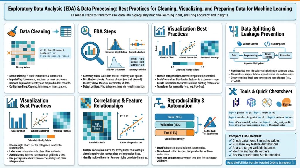
Set goals and load data
Jumping into Exploratory Data Analysis (EDA) without clear objectives and a reliable data-loading strategy wastes time and creates noisy results. Start by translating business questions into measurable EDA objectives and success criteria—what model metric or business KPI will determine whether an exploration is useful? How do you translate a product question like “Why did conversions drop?” into concrete data tasks (time-series drift checks, cohort slicing, feature importance)? Framing goals and data loading up front sets the direction for cleaning, visualization, and feature engineering.
Define measurable goals that constrain scope and guide technique. Begin with one or two primary outcomes—e.g., improve ROC AUC by 0.03, reduce prediction RMSE by 10%, or identify features with >5% predictive gain—and then list secondary investigative tasks such as missingness analysis, outlier detection, and label stability over time. These targets determine which diagnostics you run, the sampling strategy you choose, and when an exploration is “done.” When we measure progress against explicit criteria, we avoid chasing every anomaly and focus on changes that matter for the model or business.
Specify exactly which tables, columns, and time ranges you need before loading any data. Catalog the sources (transaction DB, event stream, third-party APIs, offline logs), note expected schemas, and write the minimal extraction queries—e.g., use pd.read_sql(query, con) for small relational pulls or pd.read_parquet(‘s3://bucket/path’) for columnar reads. If the dataset is large or imbalanced, plan stratified or time-windowed sampling so you analyze representative slices without loading everything. This phase reduces surprises and helps you catch upstream issues early.
Validate and profile as you load to surface data quality issues immediately. Run lightweight checks on types, null rates, unique counts, basic distributions, and foreign-key integrity; for example flag columns with >30% missingness or categorical cardinality that explodes unexpectedly. Use incremental loading patterns for big files—pd.read_csv(‘large.csv’, chunksize=100000) or a Dask dataframe—to compute sample-level statistics before committing to heavy transformations. Instrument these checks so they log schema drift, checksum mismatches, and source timestamps; that logging makes it possible to reproduce or roll back explorations when upstream data changes.
Make the loading step reproducible and auditable so we can iterate safely. Drive your extraction with configuration (query templates, date ranges, sampling seeds) stored in version control, and persist dataset metadata (row counts, column hashes, retrieval time) alongside the artifacts. Tag snapshots or register dataset versions in a lightweight catalog so you can re-run an analysis with the exact input that produced a given insight—this avoids “it worked yesterday” dead-ends when data upstream mutates.
With goals defined and data reliably loaded, your next practical steps are obvious: run distributional checks, visualize feature interactions for prioritized slices, and triage columns by predictive potential and repair cost. As we move into cleaning and visualization, keep returning to those original success criteria—every transformation should have a clear purpose relative to the goals. That discipline keeps EDA efficient, interpretable, and aligned with the model or business outcomes you care about.
Inspect and profile the dataset
Dataset profiling and focused data inspection are the fastest ways to turn a noisy table into a usable signal for modeling. In the first pass you want to establish the dataset’s shape, typical value ranges, and obvious integrity problems so subsequent decisions (sampling, cleaning, feature selection) are grounded in measurable facts. We’ll treat profiling as both a lightweight discovery loop and a reproducible artifact: a JSON summary, a small sample snapshot, and a set of automated checks that travel with the dataset. This approach keeps EDA efficient and reduces time wasted chasing irrelevant anomalies.
Building on the goals and loading strategy we established earlier, start with targeted diagnostics that answer high-impact questions about data quality and label reliability. How do you quickly surface schema drift and label leakage? Run column-wise summaries (type, null rate, unique count), compute label distributions across temporal slices, and compare recent windows against historical baselines using simple statistics and delta thresholds. For categorical fields measure cardinality growth; for numerics compute percentile ranges and trimmed means. These quick checks prioritize where to spend effort and reveal whether you need deeper profiling or immediate repairs.
Automated profiling tools speed up repeatable inspections, but you should understand what they produce and when to trust them. Use a light-weight profiler to generate correlation matrices, missingness maps, and frequency tables, then validate those outputs with focused manual queries when something looks suspicious. For example, if the profiler flags high correlation between two features, verify with a scatterplot and compute mutual information to decide whether to combine, drop, or transform the variables. Treat profiler reports as hypotheses to be tested, not final answers.
When datasets are large or temporally partitioned, adapt your profiling strategy to scale while preserving representativeness. Apply reservoir sampling or hash-based partitioning to produce stable samples; compute cohort-level metrics (e.g., df.groupby(‘cohort’)[“label”].mean()) to detect shifts; and run windowed drift tests that compare feature distributions using Kolmogorov–Smirnov or Earth Mover’s Distance on numeric features. For time-series and streaming inputs, maintain rolling statistics and alert on significant divergence—this catches upstream pipeline regressions before they reach training.
Turn profiling outputs into actionable metadata and automated gates so data inspection produces lasting value. Persist a small schema spec, column histograms, and a checksum or row-count snapshot alongside the dataset; register these artifacts in your catalog or CI checks so deployments reject inputs that violate expectations. In a real-world example, we found a shifted timestamp timezone during profiling that changed label windows and degraded model performance in production; because we had artifacted the snapshot and validation rules, we rolled back the data ingestion and patched the ETL within hours instead of days.
Finally, triage features using the profiling results to weigh predictive potential against repair cost and stability. Use distributional health, cardinality dynamics, and correlation to rank columns for feature engineering or removal, and annotate columns with remediation strategies (impute, transform, drop, or monitor). By turning dataset profiling and methodical data inspection into reproducible artifacts and decision rules, you keep EDA focused on the metrics that matter and create a clear handoff to cleaning, feature engineering, and modeling.
Handle missing values and duplicates
Building on the profiling work we did earlier, the first step is intentional triage: quantify how many rows and which columns contain nulls, how many exact or near-duplicate records exist, and how those problems intersect with your target and business logic. You should front-load this diagnostic in the first 10–15 minutes of exploration because missing values, duplicates, and poor data cleaning choices change model signal and evaluation metrics. Run quick aggregations that show null-rate by cohort and duplicate counts by key, and flag any columns with explosive cardinality or time-dependent null patterns for deeper inspection.
Not all nulls are created equal; understanding the mechanism of missingness guides remediation. Classify missingness as MCAR (missing completely at random), MAR (missing at random, conditional on observed variables), or MNAR (missing not at random, dependent on the unobserved value) and use that classification to choose imputation strategies that won’t introduce bias. For example, a sensor failing during cold weather (MNAR) requires different treatment than optional survey fields left blank (MAR). Because model performance and fairness hinge on these choices, we recommend documenting your missingness hypothesis for each column before you transform it.
When you triage columns, weigh three factors: null-rate, predictive value, and repair cost. Use the profiling artifacts you generated—null-rate, mutual information with the label, and cardinality trends—to rank columns for imputation, transformation, or removal; building on the earlier rule-of-thumb checks, treat columns with extreme missingness or exploding cardinality as candidates for dropping or monitoring rather than immediate repair. Apply cost-aware thresholds: a moderately predictive feature with 20–40% missingness may justify a sophisticated imputation, whereas a low-signal field with 80% missingness is often not worth the engineering debt. This prioritization keeps data cleaning aligned with the success criteria we set at the start of the project.
Choose imputation methods that match the data type, missingness mechanism, and downstream model assumptions. For numeric features, start with distribution-aware imputations—median for heavy tails, mean for symmetric distributions—and then evaluate model-based approaches like KNN or IterativeImputer (multivariate regression) when relationships between features carry predictive information. For categorical features, create an explicit ‘missing’ category when missingness itself may be informative, or use target-encoding with careful cross-folding to avoid leakage. In code, simple patterns look like df[‘a’].fillna(df[‘a’].median(), inplace=True) for numerics or df[‘cat’].fillna(‘MISSING’, inplace=True) for categoricals; move to model-based imputation only after validating assumptions.
Duplicates require the same disciplined trade-off between signal and cost: identify exact duplicates, then search for near-duplicates using key combinations, hashes, or fuzzy string similarity for messy text. Decide whether to drop, merge, or keep duplicates based on business rules—e.g., deduplicate on user_id+timestamp and retain the most recent event for ingestion into a time-windowed label, or aggregate duplicates into a single record with summed metrics if duplicates represent batched events. Be cautious: dropping duplicates blindly can remove legitimate repeat behaviors that are predictive, so when in doubt, preserve an indicator column like is_duplicate or duplicate_count to let the model learn whether repetition matters.
How do you validate that your imputation and deduplication choices improved downstream results? Treat remediation as an experiment: keep original indicators (was_null_x, duplicate_count), run cross-validated comparisons of models trained on raw versus cleaned data, and compare distributional shifts pre- and post-imputation with visual checks and KS tests. Monitor training/validation metric variance and run sensitivity analysis by varying imputation parameters; if performance or fairness metrics degrade, revert or try alternate strategies. By logging transformations, preserving raw snapshots, and surfacing null/duplicate features as part of feature engineering, we make data cleaning auditable and reversible and prepare the dataset for the next phase of feature engineering and modeling.
Detect and treat outliers
Outliers and outlier detection matter because a handful of extreme values can dominate summary statistics, distort feature distributions, and bias model training if you treat them the same as typical observations. How do you decide which extreme values to keep, transform, or remove? Building on the profiling work we did earlier, we start by asking whether an extreme value is a measurement error, a legitimate but rare behavior, or a signal of a different operating regime. That classification directly informs outlier treatment and the downstream experimental plan.
When you triage outliers, focus first on impact: which features and slices change model metrics or business KPIs when extremes are present. Outliers break assumptions—many statistical tests and linear models assume normality or bounded variance—so quantify their influence with leverage and Cook’s distance for regression, or by computing validation metric sensitivity with and without extremes. Moreover, consider fairness and sampling: rare but valid events (e.g., high-value fraud attempts) may be crucial for safety or business rules, so don’t remove them reflexively.
Detecting outliers requires a mix of simple, robust, and multivariate techniques rather than a single rule. Use univariate rules like z-score, IQR (interquartile range), or median absolute deviation (MAD) for initial flags; visualize with boxplots, violin plots, and scatter matrices for quick sanity checks. For multivariate or correlated features, apply Mahalanobis distance, Local Outlier Factor (LOF), or isolation forests to catch contextual anomalies that univariate tests miss. For time-series data, add rolling z-scores or seasonal decomposition so you detect temporary spikes versus regime shifts.
Here’s a compact pandas pattern to flag univariate extremes using IQR and MAD:
q1, q3 = df['amount'].quantile([0.25, 0.75])
IQR = q3 - q1
iqr_mask = (df['amount'] < q1 - 1.5 * IQR) | (df['amount'] > q3 + 1.5 * IQR)
mad = (df['amount'] - df['amount'].median()).abs().median()
mad_mask = (df['amount'] - df['amount'].median()).abs() > 3 * mad
Once detected, choose an outlier treatment strategy that preserves signal and minimizes unintended bias. Winsorization or capping is useful when extremes are plausible but destabilize models—cap at a domain-informed percentile rather than an arbitrary number. Transformation (log, Box–Cox, Yeo–Johnson) stabilizes variance for heavy tails and often helps linear models. For clear measurement errors, correct or drop after verifying with domain owners. Always add a binary indicator (was_outlier) so the model can learn whether extremeness itself is predictive.
Sometimes the right approach is to change the model, not the data. Tree-based models, quantile regressors, or robust loss functions (Huber, Tukey) reduce sensitivity to outliers without removing them. In high-stakes settings, consider two-model strategies: one model specialized for the bulk of data and a separate model or rule-based system for extreme cases. These patterns keep rare but important behavior visible and auditable in production.
Treat outlier handling as an experiment: version your raw data snapshot, log the detection rules and transformations, and run cross-validated comparisons (AUC, RMSE, calibration) plus distributional checks (KS, Earth Mover’s Distance) between original and cleaned sets. Monitor downstream changes in fairness or error decomposition across cohorts. Building on our earlier emphasis on reproducible profiling, register the outlier gate in your CI checks so deployments fail fast if upstream changes produce new extremes.
Taking this concept further, integrate outlier detection into your feature engineering loop: use flagged extremes as features, use robust scaling when appropriate, and decide whether to treat rare regimes as separate cohorts for modeling. By instrumenting detection, choosing principled treatments, and validating impact experimentally, we keep data quality aligned with the project’s success criteria and prepare the dataset for reliable feature engineering and modeling.
Visualize patterns and relationships
Building on this foundation, the fastest way to turn curiosity into insight is to prioritize visualizations that expose structure rather than prettify noise. In exploratory data analysis we want plots that answer specific hypotheses about predictiveness, stability, and bias—so front-load visualization with the questions that matter for modeling and the business. Focus your first pass on signal discovery: which features move together, which features separate classes, and which slices show systematic drift. When you anchor visuals to those goals you avoid aesthetic-driven exploration and surface actionable patterns quickly.
Choose visualization types to match the question and data modality rather than defaulting to a single chart. Use scatterplots to inspect pairwise relationships and heteroskedasticity, histograms and kernel density estimates to reveal tails and multimodality, and box/violin plots to compare distributions over categorical slices. For many features, a correlation heatmap or pairplot gives a rapid map of feature relationships, but remember that correlation only captures linear dependence—so treat heatmaps as guides, not proofs. Good visualization is about surfacing plausible hypotheses for follow-up statistical tests or feature transforms.
Here’s a compact pattern you can reuse for exploratory pairwise checks: sample a representative shard, plot a scatter with a density contour, and annotate with Spearman rho to detect monotonic but non-linear association. For example:
sample = df.sample(n=20000, random_state=42)
sns.jointplot(data=sample, x='feature_a', y='feature_b', kind='hex', marginal_kws={'bins':50})
plt.annotate(f"Spearman={sample[['feature_a','feature_b']].corr(method='spearman').iloc[0,1]:.2f}", (0.05,0.95), xycoords='axes fraction')
That pattern combines visual cues (density, outliers) with a robust statistic (Spearman) so you can quickly decide whether to apply monotonic transforms, binning, or a non-linear model. Keep these small reproducible snippets in your EDA notebook so teammates can reproduce the exact view and sampling seed.
How do you spot non-linear dependencies that correlation misses? Use information-theoretic and model-based diagnostics: compute mutual information between features and label to detect any dependency regardless of shape, fit a simple generalized additive model (GAM) or a shallow tree and inspect partial dependence plots for directionality, and overlay LOESS or spline fits on scatterplots to visualize curvature. These approaches reveal when a non-linear transform (log, power, spline) or a new engineered interaction will likely increase predictive power.
Multi-feature interactions require different visual strategies because two-way plots miss conditional structure. Use faceting to stratify by a third variable, color-encode a continuous moderator, or visualize conditional density estimates across cohort buckets. When dimensionality grows, apply projection methods—PCA for linear structure, UMAP or t-SNE for neighborhood preservation—to map cluster structure, but annotate these embeddings carefully: distances are informative for local structure, not for global metric interpretation. Always validate embedding-driven hypotheses by mapping back to original features and running small predictive checks.
For time-dependent signals, visualize relationships over rolling windows and cohort slices rather than single aggregate charts. Plot rolling correlation matrices, cross-correlation functions for lagged relationships, and heatmaps that stack cohort-level metrics by week or month to expose regime shifts and label leakage risks. In production-like examples, conversion drop investigations often expose a windowed change in a small subset of user cohorts; a time-cohort heatmap will reveal that pattern far faster than static aggregates.
Treat visualization as an experimental step in your EDA pipeline: sample deterministically, log plot parameters and seeds, save figure artifacts, and version the notebook that generated the view. Use flagged patterns from plots to create new features (was_outlier, interaction terms, rolling aggregates) and then validate those engineered features with small cross-validated experiments. By making visualization hypothesis-driven, reproducible, and tightly coupled to feature engineering we convert intuitive patterns into validated, deployable signals for modeling and monitoring.
Scale, encode, and split data
Building on this foundation of profiling, missingness, and outlier triage, the next practical step is to put features into forms your models actually expect: apply consistent feature scaling, choose appropriate categorical encoding, and partition data so evaluation mirrors production. Feature scaling and categorical encoding belong in the same reproducible pipeline stage because both can leak information if fitted on the full dataset. We’ll treat these transformations as experiments: pick a baseline, validate with cross-validation, and persist transformers as artifacts so preprocessing is auditable and repeatable.
Feature scaling matters because models respond differently to magnitude and distribution. Distance-based models and gradient-based optimizers (k-NN, SVM, logistic regression, neural nets) are sensitive to scale, whereas tree ensembles are usually invariant; that difference guides our choice of scaler. How do you decide which scaler to use? Use StandardScaler (z-score) for roughly Gaussian features, MinMaxScaler when you need bounded inputs (e.g., neural network activations or feature maps normalized to [0,1]), and RobustScaler or quantile transforms for heavy tails and outliers—select based on the distribution diagnostics you generated during profiling. Feature scaling should be fitted only on the training set to avoid leaking validation information into parameter estimates.
Make scaling and encoding part of a single, testable pipeline so your transformations are applied identically in training and production. In scikit-learn this looks like a ColumnTransformer inside a Pipeline that you fit on training data and then serialize. For example:
from sklearn.compose import ColumnTransformer
from sklearn.preprocessing import StandardScaler, OneHotEncoder
from sklearn.pipeline import Pipeline

preproc = ColumnTransformer([
    ("num", StandardScaler(), numeric_cols),
    ("cat", OneHotEncoder(handle_unknown='ignore'), low_card_cat_cols)
])
model_pipe = Pipeline([('preproc', preproc), ('clf', LogisticRegression())])
model_pipe.fit(X_train, y_train)
Categorical encoding choices depend on cardinality, model type, and leakage risk. For low-cardinality features, one-hot encoding is robust and interpretable; for high-cardinality keys, ordinal hashing, frequency encoding, or cross-validated target encoding reduce dimensionality but introduce leakage risk if not implemented with proper out-of-fold procedures. Embeddings trained inside neural networks or using entity embeddings from simple categorical factors can capture complex interactions but require larger data and careful regularization. Always instrument categorical encoding with validation checks: monitor cardinality growth over time and produce a fallback for unseen categories (e.g., ‘UNK’ or hash buckets) so production data never breaks the pipeline.
Partitioning strategy directly affects how realistic your validation metrics are—random splits, stratified splits, group folds, and time-based splits each answer different questions. Use stratified k-fold when class imbalance matters and examples are IID; prefer group k-fold when observations are correlated by an entity (user_id, device_id) to avoid leakage across folds; use time-based train/validation/test splits for forecasting or when label leakage across time would otherwise inflate metrics. Create a stable train/validation/test split that reflects the deployment scenario: a holdout test set reserved until final evaluation, and a rolling/time-window validation when you expect temporal drift. Persist split seeds and the split indices as metadata so experiments are reproducible and comparable.
Operationalize these decisions with guardrails: fit all transformers only on the training partition, save fitted preprocessors as versioned artifacts, and include end-to-end integration tests that run a small sample through the serialized pipeline to detect schema drift. Add binary indicators for important transformations (was_imputed, was_outlier, category_unknown) so models can learn correction signals rather than relying on silent repairs. When you change encoding or scaling strategy, run controlled A/B experiments or cross-validated model comparisons and log distributional differences (KS, EMD) between original and transformed features.
Taking this concept further, treat preprocessing as part of feature engineering rather than a one-off step: build modular, versioned preprocessors, experiment with different scaling and encoding strategies as part of your model search, and choose your final train/validation/test split to reflect the monitoring scheme you’ll use in production. This keeps the path from EDA to deployed model short, auditable, and robust to upstream changes as you move into feature selection and model evaluation.