Why air-quality visuals often mislead
Building on this foundation, think of most public dashboards as persuasive summaries rather than raw measurement systems: they compress noisy, multi-source air quality data into a single number and a color, and that compression is where distortion begins. When you see an AQI badge or a heatmap tile, you’re looking at an aggregated signal that hides sampling gaps, sensor biases, averaging windows, and model assumptions. Because searchers often query for “air quality” and expect clear answers, visualization designers trade nuance for clarity—but that trade frequently produces misleading impressions that change behavior and policy inappropriately.
A core problem is spatial undersampling and naive interpolation. Monitoring networks are sparse by design—regulatory monitors sit at fixed sites to meet federal siting rules, not to capture every street canyon or playground—and dashboards often fill gaps by interpolating or kriging. Those mathematical techniques estimate concentrations between monitors, but they assume spatial covariance that may not hold near highways, industrial stacks, or wildfire plumes. In practice, a single sensor placed next to a busy arterial road can show very different PM2.5 dynamics from a park a few hundred meters away, yet maps will smooth both into one color region, which makes local exposure invisible and degrades the utility of any pollution data visualization for personal or hyper-local decisions. (vox.com)
Temporal aggregation compounds the problem: AQI and many public indicators are intentionally averaged over multiple hours to reflect health-relevant exposures, which stabilizes the signal but erases short-lived peaks. The EPA’s AQI converts pollutant concentrations into a 0–500 scale and uses multi-hour averages and NowCast methods to report a single value that’s meaningful for public health messaging. That approach is useful for day-to-day guidance, but it understates acute spikes—like a passing diesel plume or a wildfire embers event—that matter for commuters, outdoor workers, and shift-based decisions. When you design a dashboard, you must decide whether your audience needs an hourly NowCast, minute-level streaming, or both, and label the aggregation clearly so users don’t mistake a smoothed “moderate” for transiently hazardous air. (aqs.epa.gov)
Sensor accuracy and calibration are another frequent source of visual misdirection. Low-cost optical PM sensors are great at capturing temporal trends, but they respond differently to particle composition, size distribution, humidity, and aging; identical units can diverge over months and across seasons. Studies show wide variability in accuracy and seasonal bias, and they demonstrate that uncalibrated sensors can overestimate or underestimate concentrations by large factors depending on conditions. How do you know a sensor reading is trustworthy? Collocation with a reference monitor, dynamic calibration (including humidity and temperature correction), and regular quality checks are non-negotiable if you want to surface reliable data rather than noise. (pubs.acs.org)
Visual encoding choices then amplify small errors into big perceptions. Color scales, bins, and axis ranges are rhetorical: a heatmap that uses harsh reds for values just above the “moderate” threshold primes alarm, while a softer gradient conceals the same numerical jump. Non-linear scaling, truncated y-axes, or hiding uncertainty bars makes the chart read as more certain than the underlying measurements deserve. For pollution data visualization, explicitly encode uncertainty—show raw and corrected streams, provide sensor quality flags, and keep legends and aggregation windows prominent—so viewers can judge the evidence rather than be guided by aesthetic emphasis.
These distortions aren’t just academic; they affect behavior and enforcement. Misleading visuals can trigger unnecessary school closures, misallocate mitigation resources, or create false reassurances that delay protective action during wildfire or industrial incidents. As dashboard builders and data engineers, we should instrument our visualizations with provenance metadata, expose calibration methods, and offer drilldowns from the summary AQI to raw measurements and model assumptions. Next, we’ll apply these principles with concrete patterns and code snippets that show how to surface uncertainty, perform on-the-fly calibration, and design interpolation that respects urban heterogeneity.
Common visualization pitfalls in pollution charts
Air quality visualization often looks authoritative even when it isn’t, and that apparent certainty is the single biggest danger for readers of pollution charts. When a map tile, a single AQI badge, or a time-series line feels definitive, viewers make behavior and policy decisions. We need to treat visual emphasis as rhetoric: color choices, aggregation windows, and axis framing change perceived severity as much as the raw numbers do. How do you avoid amplifying small errors into large actions?
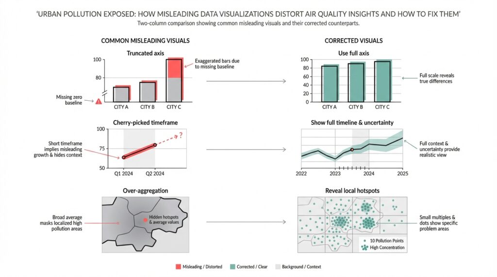
Color scales and binning choices are rhetorical tools that frequently mislead. If you use hard thresholds or a palette that jumps from green to red across a narrow value range, you create a cliff where the underlying measurements may be noisy; conversely, a flattened palette can hide real public-health thresholds. Truncated y-axes or dual-axis time series disguise magnitude and correlation respectively: a compressed y-axis exaggerates trends, while a secondary axis can imply a causal link between unrelated series. We should prefer perceptually uniform palettes, continuous gradients with clear legends, and avoid truncating axes without explicit callouts.
Temporal and spatial aggregation decisions create subtle but important distortions that affect everyday decisions. Averaging across long windows will hide short high-exposure events that matter for commuters and outdoor workers, while averaging across heterogeneous neighborhoods erases exposure disparities—area-weighted city averages differ greatly from population-weighted exposure metrics. When you design charts, expose the aggregation window and offer both raw and aggregated views: show minute-level points with a semi-transparent rolling mean overlay so users can interpret peaks and baselines together.
Treat provenance and sensor quality as first-class visualization layers rather than metadata buried in a help panel. Plotting model outputs and sensor streams with the same visual weight confuses measurement and prediction; failing to flag low-confidence sensor reads or out-of-range values produces false certainty. Show quality flags, calibration status, and collocation-based corrections inline—either as marker styling or subtle glyphs—so users can filter or drill down by data quality. Animations that lag or smooth for performance can make “real-time” look more stable than it is; surface latency and sampling cadence prominently.
Overplotting and map interpolation introduce perceptual artifacts that are easy to miss but hard to justify. Smooth contour fills and continuous heatmaps implicitly claim spatial precision that monitoring networks rarely support, and common interpolation methods can bleed hotspots across barriers like highways or rivers. Instead of a single interpolated layer, consider small multiples of sensor clusters, hexbin density maps, or interactive contours tied to sensor uncertainty; provide a toggle between raw sensor points and modeled surfaces so readers understand where estimation begins.
A practical pattern we use combines raw streams, a rolling summary, and an uncertainty ribbon to make trade-offs visible. For example, a compact Python/Plotly pattern plots semi-transparent raw samples, overlays a 1-hour rolling mean, and shades the 10–90th percentile band to show variability:
# raw: df.timestamp, df.pm25; rolling = df.pm25.rolling('60min')
fig.add_trace(go.Scatter(x=df.timestamp, y=df.pm25, opacity=0.2, mode='markers'))
fig.add_trace(go.Scatter(x=rolling.index, y=rolling.mean(), line=dict(width=2)))
fig.add_trace(go.Scatter(x=rolling.index.tolist()+rolling.index[::-1].tolist(),
                         y=rolling.quantile(0.9).tolist()+rolling.quantile(0.1)[::-1].tolist(),
                         fill='toself', fillcolor='rgba(100,100,200,0.2)', line=dict(width=0)))
Designing pollution charts requires explicit decisions about what to hide and what to show; every simplification should be annotated and reversible. We should default to transparency: surface uncertainty, label aggregation schemes, and distinguish modeled data from observations so that readers judge the evidence themselves. Building on the prior discussion about sampling and calibration, the next step is to demonstrate implementation patterns that make uncertainty actionable in dashboards and APIs.
Data quality and sensor bias issues
Building on this foundation, the invisible problem that most dashboards hide is poor data quality and systematic sensor bias—these quietly change the story your air quality maps tell. If you treat every incoming PM2.5 stream as equally trustworthy, you’ll bake bias into aggregated AQI tiles and mislead users about exposure gradients. How do you detect sensor drift before it skews a city map? Asking that question early shapes both your ingestion pipeline and your visualization layer.
Start by cataloguing bias sources explicitly rather than hoping downstream smoothing will hide them. Spatial sampling bias comes from monitor siting: roadside units, rooftop reference sites, and community sensors each sample different microenvironments and therefore different particle mixes. Temporal sampling bias arises when sensors report at different cadences or when clocks are misaligned; a commute peak can vanish if timestamps are off by minutes. Sensor-level biases—cross-sensitivity to humidity, temperature effects, and composition-dependent response—change with season and aerosol type, so a summer wildfire and a winter woodsmoke event will distort low-cost sensors in different ways.
Calibration strategies must be pragmatic and conditional, not one-size-fits-all. Collocate a representative subset of low-cost units with reference monitors to derive transfer functions, then apply conditional corrections that include humidity, temperature, and aerosol loading as features. You can start with a simple linear correction or use a model that captures nonlinearity; for example, train a regression that maps raw counts plus environmental covariates to reference µg/m3:
from sklearn.ensemble import RandomForestRegressor
X = df[['raw_signal','humidity','temp']]
y = df['pm25_ref']
model = RandomForestRegressor().fit(X, y)
calibrated = model.predict(new_sensor[['raw_signal','humidity','temp']])
Calibration is not a single operation; it’s an operational loop. Implement automated drift detection using rolling bias statistics and control charts—compute a 24‑hour rolling median bias against nearby references, then trigger maintenance or retraining when bias exceeds a practical threshold (for example, a persistent >30% deviation or a fixed µg/m3 threshold relevant to local standards). Track sensor age and last-cleaned date as metadata so you can correlate sudden shifts with physical degradation rather than model failure.
Instrument your data pipeline with strong validation and provenance so you can explain any corrected value back to a raw measurement. Persist raw, timestamped samples alongside calibrated streams and quality flags that encode collocation status, recent drift score, and sample cadence. Align timestamps to a shared timeline and normalize sampling windows before aggregation; otherwise, naive averaging will mix one-minute spikes with ten-minute smoothed readings and produce artifacts that look like trends.
Quantify and propagate uncertainty instead of hiding it. When you apply a calibration model, carry the prediction interval or bootstrap the model to produce an uncertainty band for each calibrated point; propagate that uncertainty into any aggregation step so the AQI badge and map tiles reflect both central estimate and confidence. Visual layers should allow users to toggle between raw points, calibrated means, and uncertainty ribbons so viewers can reason about risk rather than react to a single color.
Finally, operationalize graceful fallbacks for real-time dashboards and APIs. If collocated corrections are unavailable for a sensor, fall back to cluster-level transfer functions trained on similar microsites and mark those readings with lower confidence. Expose calibration provenance in the API and the UI—show when a sensor was last calibrated, what model was applied, and whether a reading is interpolated or observed. Taking these steps ensures your air quality products inform safer decisions and reduce the risk that sensor bias and data quality issues will misdirect policy or personal behavior.
AQI versus concentration: choose metrics correctly
Air-quality dashboards trade a numeric truth for communicative simplicity, and that trade starts with the basic choice between AQI and raw concentration. If you work with PM2.5 or ozone data, you already know these two metrics communicate different things: AQI is a health-oriented index scaled to 0–500, while concentration (µg/m3 or ppb) is the actual measured mass or volume that sensors report. When should you display AQI versus raw concentrations, and how does that choice change what your users do? Framing this decision up front prevents a visualization from becoming persuasive rhetoric instead of an operational tool.
AQI converts pollutant concentration into banded health categories; concentration is the physical measurement. Define AQI on first use for your audience: it’s a standardized transform that maps pollutant concentrations to a common scale and color system so non-technical users can act on an intuitive severity signal. Concentration, by contrast, is the scientific quantity you get from instruments—micrograms per cubic meter for PM2.5, parts per billion for gases—and it’s what modelers and exposure scientists need to compute doses or regulatory compliance. Use both terms early and explicitly so readers understand you are switching between an interpretive layer (AQI) and raw measurement data (concentration).
AQI is the right default when your goal is clear public-health guidance. For a city-wide alert, school administrators, or press-facing dashboards we build AQI because it normalizes across pollutants and ties to recommended actions (stay indoors, reduce exertion). This is why AQI often uses multi-hour averages or a NowCast algorithm: it prioritizes stable, health-relevant messaging over minute-level volatility. Present AQI with its averaging window and the pollutant driving the index—“AQI 150 (PM2.5, 24‑hour equivalent)”—so users aren’t misled about what the color actually represents.
Concentration is essential when you need technical fidelity for modeling, source attribution, or short-duration exposure decisions. Analysts estimating inhaled dose, planners comparing emission-control scenarios, or operators diagnosing a diesel plume should work in µg/m3 or ppb because those units feed directly into dispersion models and dose calculations. For example, a commuter exposed to a 15‑minute spike of 80 µg/m3 PM2.5 will see very different risk implications than a smoothed AQI that averages that spike into a lower band; showing concentration preserves that nuance. Use concentration for data export, debugging, and any decision that depends on exact physical units rather than a simplified health bin.
Choose a presentation strategy that surfaces both perspectives without doubling user confusion. Always show which metric is primary, then provide a toggle or small-multiple view: raw concentration time series alongside the computed AQI band, with the aggregation window labeled. Include a compact code-pattern in your API layer that returns both values and provenance, for example: {"timestamp": t, "pm25_ugm3": x, "aqi": compute_aqi(x), "agg_window": "1h"}—this makes it straightforward for clients to render either view consistently. Carrying provenance (calibration model, collocation status, and aggregation window) allows downstream tools to choose the right signal for their audience.
Visual encoding and UX matter: map colors to AQI bands only when you’re communicating health guidance, and reserve continuous palettes or numeric scales for concentration layers. Explicitly encode uncertainty—show a 10–90% ribbon around calibrated concentrations and a confidence flag on AQI badges—so users can see when a band change is statistically meaningful versus sensor noise. Label the pollutant that dominates the AQI, provide a link or tooltip explaining the conversion, and make the raw data downloadable so analysts can reproduce your transforms.
Taking this concept further, we should treat the AQI conversion as an interpretive layer, not an irreversible reduction. Provide both the index and the raw concentration in APIs and UI, propagate calibration and uncertainty into aggregates, and let users choose the fidelity they need. In the next section we’ll implement these patterns in code and visualization examples that make uncertainty and provenance actionable for both public-facing alerts and technical analysis.
Map and color scale mistakes
Building on this foundation, the way you color and tile spatial data often dictates whether an air quality map is informative or persuasive. If your air quality maps use abrupt bins, nonuniform palettes, or aggressive smoothing, viewers infer precision that your monitoring network doesn’t support. How do you choose a color scale and tiling strategy that communicates risk without overstating certainty? We’ll walk through concrete mistakes we see in production dashboards and practical fixes you can apply today.
The most common visual error is treating category boundaries as hard facts rather than noisy estimates. When a map switches from green to red across a narrow value range, you create a cliff where measurement noise and calibration drift are likely; users then behave as if that boundary were a deterministic health threshold. In practice you should show the conversion to AQI or health bands as an interpretive layer, not the sole truth: label the aggregation window that produced the band, surface the pollutant driving the index, and render the band change alongside a confidence cue so a small, uncertain spike doesn’t trigger disproportionate action.
Map interpolation choices compound the problem because spatial methods impose assumptions that rarely hold in heterogenous urban areas. Techniques like simple inverse-distance weighting or unconstrained kriging implicitly smooth across barriers—highways, buildings, greenbelts—and bleed hotspots into adjacent low-exposure zones. Instead, tie interpolation to sensor uncertainty and contextual features: use barrier-aware kriging or conditional simulation when you have geographic constraints, offer a hexbin or Voronoi toggle to reveal raw sensor support, and weight estimates by sensor provenance so roadside samplers don’t overwrite background monitors in park areas.
Color scale selection is a technical decision with perceptual consequences; choose palettes that preserve relative differences and remain legible for viewers with color-vision deficiencies. A perceptually uniform palette maps equal data steps to equal perceived steps, which prevents visual exaggeration of small concentration changes; palettes like Viridis or carefully chosen ColorBrewer sequences are good defaults. Avoid rainbow maps and abrupt multi-hue transitions that create spurious gradients, and always accompany continuous palettes with an explicit legend, numeric ticks, and a clear statement of whether colors represent AQI bands or raw concentration.
Encoding uncertainty directly on the map reduces the rhetorical power of color and gives users a path to reason about risk. Use alpha modulation, stippling, or hatched overlays to communicate low confidence; add small glyphs or colored outlines for sensors with recent collocation or calibration events; and make tooltips show the calibrated concentration, the calibration model used, and a quantitative confidence interval. A practical UI pattern is to overlay a semi-transparent modeled surface above raw points and provide a single-click toggle to expose underlying sensor values and provenance—this makes it trivial for a technical user to inspect where the model is extrapolating versus where it is interpolating between real data.
Taking these fixes together, you can design air quality maps that prioritize truthful communication over aesthetic persuasion. By combining perceptually uniform color scales, barrier-aware interpolation, explicit uncertainty encodings, and provenance-rich tooltips, we reduce the likelihood that viewers will misinterpret a tile as a ground truth. In the next section we’ll implement these patterns in code and visualization examples so you can operationalize map and color-scale corrections in dashboards and APIs.
Practical fixes and reproducible visualization workflows
When your dashboard looks authoritative but can’t reproduce its numbers, users make risk decisions on a fragile foundation. Air quality visualization must be reproducible by design: every plotted pixel, AQI badge, and map tile should be traceable to a named dataset, a calibration model, and an aggregation window. If you want to stop arguing about whose dashboard is “right,” we need pipelines and artifacts that you can re-run, inspect, and version-control end to end.
Building on this foundation, start by treating data provenance and quality flags as first-class inputs to every visualization. Ingest raw sensor streams into immutable partitions with a schema that includes sensor_id, raw_signal, sample_cadence, collocation_tag, and ingestion_timestamp; record environmental covariates (temperature, humidity) alongside raw counts so calibration models are deterministic. Store both raw and calibrated streams; expose a quality_score and calibration_version for every point so users and downstream transforms can filter or weight readings explicitly rather than guessing. This approach prevents silent corrections from changing historical maps and makes audits straightforward.
Operationalize a reproducible visualization workflow as a sequence you can run in CI: ingest → validate → calibrate → aggregate → render → publish. Implement the calibration step as a standalone, versioned artifact that produces both point estimates and uncertainty bands, then persist model metadata with a digest and training-data snapshot. Example minimal pattern in Python-like pseudocode shows the idea:
raw = read_partition('s3://air/raw/2026-02-01')
model = load_model('models/cal-v2.pkl')
calibrated, unc = model.predict_with_uncertainty(raw[['signal','temp','rh']])
save('s3://air/calibrated/2026-02-01', calibrated.assign(uncertainty=unc))
render_time_series(calibrated)
Calibration must be reproducible and auditable, not opaque. Use collocation experiments to derive transfer functions, and version both the training dataset and the parameterized preprocessing pipeline (humidity correction, clock alignment, outlier rules). Containerize the training job and publish model artifacts to an artifact registry with semantic versions so rollback is trivial. Automate drift detection and retraining triggers in CI/CD—retrain when 24‑hour rolling bias against reference monitors exceeds a threshold—and record the trigger event so you can correlate visualization changes with model lifecycle events.
How do you make the visualization itself repeatable and testable? Parameterize chart code and store chart specs (for example Altair/Vega or Plotly JSON) in the repo; generate visuals from those specs inside reproducible notebooks or pipeline tasks. Include small automated tests that compare numeric aggregates (mean, median, 90th percentile) for a given time window and run visual diffs on rendered PNGs for smoke checks. Keep the spec-driven renderer separate from styling so you can run accessibility checks (color-vision safe palettes), consistency checks (legend units and aggregation window), and ensure mapping layers consistently encode uncertainty.
For maps and public-facing tiles, propagate uncertainty and provenance into the spatial layer instead of hiding it. Render a base hexbin or Voronoi layer that shows sensor support, then overlay a modeled surface that samples its uncertainty per tile; use alpha modulation, stippling, or hatched overlays where confidence falls below a threshold. Expose the pollutant driving the AQI and the aggregation window in tooltips and API responses so a badge like “AQI 120 (PM2.5, NowCast)” is always accompanied by a confidence flag and calibration_version. These patterns reduce the rhetorical impact of color and let users make informed choices about local exposure.
Taking these practices together, you get dashboards that are auditable, debuggable, and defensible. When every visualization is built from versioned data partitions, named calibration artifacts, and parameterized chart specs, you can reproduce a map from raw samples to PNG in minutes—and explain every correction along the way. In the next section we’ll implement one of these pipelines end-to-end so you can run it against your own city network and verify that visualization choices reflect measurement reality rather than designer preference.