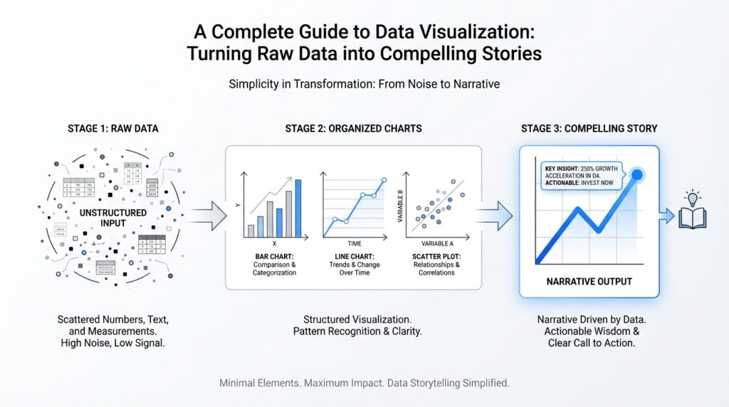
Define Your Visualization Goal
Imagine you have a spreadsheet full of numbers and a blank chart waiting in front of you. Before you move a single data point, the most important question is not which colors to use or which chart type looks nicest; it is what you want the reader to understand when they finish looking. That is the heart of a strong data visualization goal. When we define the goal early, we give the whole project a compass, so every line, label, and choice points in the same direction.
Building on that foundation, we need to name the one outcome that matters most. Do you want to explain a trend, which is a pattern that changes over time, or do you want to compare categories, like sales across different regions? Maybe you want to show distribution, meaning how values are spread out, or highlight an outlier, a data point that sits unusually far from the rest. Each goal asks the data visualization to do a different job, and a chart works best when it has one clear job instead of three competing ones.
This is where the story becomes practical. If your goal is to help a team decide where to invest next quarter, a chart should make the decision obvious by showing growth, decline, and gaps at a glance. If your goal is to help a beginner understand why a website lost traffic, the visualization might need to show a timeline with a sharp drop and a few annotations that explain what changed. How do you know whether your visualization is working? Try finishing this sentence: “After viewing this chart, the reader should be able to ___.” If you cannot fill in that blank cleanly, the goal is probably still too broad.
Once that purpose is clear, the rest of the design choices start to feel less mysterious. The best data visualization goal acts like a recipe: it tells you what ingredients matter and what can stay in the cupboard. If your goal is comparison, you might choose a bar chart because people read differences quickly from length. If your goal is change over time, a line chart may make the story easier to follow because the eye naturally traces the path from one point to the next. In contrast, if you are trying to show the shape of a dataset, a histogram or scatter plot may serve you better because it reveals spread or relationship rather than a simple before-and-after picture.
Taking this concept further, we also need to think about the audience’s next step. A visualization goal is not only about explaining what the data says; it is also about what happens after the reader sees it. Do you want them to ask a follow-up question, make a decision, spot a problem, or feel confident in a recommendation? That final intention matters because a chart meant for exploration looks different from a chart meant for persuasion. When you define your visualization goal with that kind of clarity, you make the story sharper, the design cleaner, and the message far easier to remember.
Prepare and Clean Your Data
Building on this foundation, the next step in data visualization is to prepare and clean your data before you ever draw a chart. Think of raw data like ingredients after a long trip from the market: some are fresh, some are bruised, and some are mixed together in the wrong bag. If we skip this stage, even the most beautiful visualization can tell a confusing story, because a chart can only be as trustworthy as the data underneath it.
How do you know your chart is telling the right story if the raw data is still full of holes? That is the question preparation answers. In practice, this means looking for missing values, which are blank spaces where information should be, duplicate rows, which are repeated records that can make a result look bigger than it really is, and inconsistent labels, such as “NY,” “New York,” and “New York State” all meaning the same place. Small inconsistencies like these may look harmless in a spreadsheet, but they can quietly distort the message of your data visualization.
Once we start cleaning, we are really teaching the data to speak one language. Suppose one column lists dates as text, another stores numbers as words, and a third mixes currencies without warning. The charting tool may still produce something on the screen, but it may sort incorrectly, calculate totals the wrong way, or skip values entirely. That is why prepare your data work matters so much: it turns a messy collection of entries into structured data, meaning information arranged in a consistent format that software can read reliably.
This is also the moment to decide what belongs in the story and what does not. If your goal is to show sales by region, then a column full of internal notes may distract from the point, while a field that identifies product category may be exactly what you need later for comparison. In contrast to the previous step, where we defined what we wanted the reader to understand, here we are trimming away noise so the visualization can focus on the most relevant details. A clean dataset is not about removing everything unusual; it is about removing anything that hides the pattern you want to reveal.
Another important habit is to look for outliers, which are values that sit far away from the rest of the data. Sometimes an outlier is a mistake, like an extra zero entered by accident, and sometimes it is the most interesting event in the entire dataset, like a sudden spike in website traffic after a campaign launch. That is why cleaning data is not the same as flattening it. We are not trying to make every value look average; we are trying to separate genuine signals from accidental errors so the chart reflects reality as accurately as possible.
As we discussed earlier, the goal of data visualization is to help someone understand, decide, or notice something quickly. Preparation supports that goal by making sure the numbers, categories, and labels are dependable before they reach the screen. When you take time to prepare and clean your data, you give yourself a smoother path into the design stage, because now the question shifts from “What is wrong with this dataset?” to “What is the clearest way to show what it means?”
Choose the Right Chart Type
Building on this foundation, the next question is not about decoration or color, but about chart type. Once your data is clean and your goal is clear, the chart becomes the bridge between raw numbers and human understanding. How do you choose the right chart type when there are so many options on the screen? The answer starts with a simple idea: the best chart is the one that matches the shape of your story, not the one that looks the most impressive.
A good way to think about data visualization is like choosing the right lens for a camera. If you want to show comparison, a bar chart usually gives the cleanest view because people can compare lengths quickly and accurately. If you want to show change over time, a line chart often works better because the eye naturally follows the path from left to right, which makes trends feel continuous. When we say chart type matters, we mean that each format guides the reader toward a different kind of understanding, and that guidance is the real job of data visualization.
As we discussed earlier, your goal should lead the design. That same idea applies here, because chart selection is really goal selection in disguise. If you are answering “Which region sold the most?” you want a chart that makes comparison effortless. If you are answering “What happened across the year?” you want a chart that reveals movement, not just totals. And if you are asking “How are values distributed?” a histogram, which groups numbers into ranges so you can see the shape of the data, may tell the story more clearly than a table ever could.
It also helps to match the chart to the kind of data you have. Categories are groups, like products or cities, while continuous data is measured along a range, like temperature or revenue over time. A bar chart is a strong choice for categories because it separates each group into a distinct visual block. A scatter plot, which places individual points on a two-axis grid, is better when you want to see whether two variables move together. In other words, the chart type should fit the relationship in the data, the way a key fits a lock.
Here is where things get interesting: not every chart that can display your data should display it. A pie chart, for example, can work when you have a small number of parts that make up a whole, but it becomes hard to read when slices are too similar or too numerous. A stacked chart can show totals and composition at the same time, but it can also make comparisons harder if the segments do not share a common baseline. So when you choose a chart type, you are not only asking what it can show; you are asking what it might hide.
That is why the reader’s experience matters just as much as the dataset itself. In a data visualization, clarity beats cleverness every time. If someone needs to compare values precisely, give them a chart with a shared scale and a straightforward layout. If someone needs to spot a trend quickly, reduce clutter and let the path stand out. When you keep the audience in mind, your chart type becomes more than a container for data; it becomes a guide that helps the reader move through the story without getting lost.
Taking this concept further, you can test your choice by asking one final question: what should the reader notice first? If the answer is a ranking, comparison, trend, relationship, or distribution, the chart type should make that idea visible within seconds. When you align the chart with the message, the visualization feels natural, and the data visualization becomes easier to trust, easier to read, and much more likely to leave a clear impression.
Design Clear Labels and Colors
Building on this foundation, we now arrive at the part of data visualization that often makes the difference between “interesting” and “instantly understandable”: labels and colors. How do you make a chart readable at a glance when the data is already doing most of the heavy lifting? The answer is to treat labels as signposts and colors as cues, not decoration. When those two pieces work together, your chart becomes easier to scan, easier to trust, and far more likely to communicate the story you intended.
Labels are the words that help readers orient themselves, and they deserve more care than many beginners expect. A label is any piece of text that explains what a mark, axis, or section means, such as a category name, a value, or a unit like dollars or percent. If you leave labels vague, people have to guess what they are looking at, which slows them down and weakens the message. Clear labels answer the small questions first so the reader can focus on the larger insight: what changed, what differs, and what matters most.
This is where we want to be precise without being noisy. Axis labels, which identify the scales along the sides of a chart, should tell the reader exactly what the numbers represent and in what units. Data labels, which place numbers directly on bars, points, or slices, can be helpful when the exact value matters, but too many of them can crowd the chart and turn a clean visual into a cluttered wall of text. In practice, you want the chart to carry the story while the labels quietly remove any uncertainty.
Colors play a similar role, but they speak in a faster language. A color palette is the set of colors you choose for a chart, and in data visualization it should help readers notice patterns, comparisons, and categories without forcing them to work hard. If everything is bright, nothing stands out. If you use one strong accent color and keep the rest subdued, the reader’s eye naturally lands where you want it to land. That same idea helps when you want to show a series, highlight one key trend, or guide attention to an outlier that deserves a closer look.
As we discussed earlier, the reader’s experience matters just as much as the dataset itself, and color is one of the fastest ways to shape that experience. Think of it like a room with good lighting: the goal is not to make every corner glow equally, but to help people see what is important without strain. When you assign colors consistently, the brain learns the pattern quickly. For example, if blue always represents one product line and green always represents another, readers can compare them across charts without relearning the code each time.
At the same time, good data visualization design respects accessibility, which means making the chart usable for people with different abilities and viewing conditions. Color alone should never carry the entire meaning, because some readers have color vision differences, and others may be viewing the chart on a dim screen or a printed page. That is why strong labels, clear contrast, and distinct shapes or line styles matter so much. If two categories only differ by shade, the message can disappear; if you pair color with text or pattern, the story stays intact.
Here is a practical test we can use: if you removed the color, would the chart still make sense? If you removed the labels, would the reader still know what each part means? When the answer is yes, you have built a chart with a strong backbone. When the answer is no, the design is probably relying too much on one visual trick and not enough on clarity. That is why the best data visualization designs feel calm, not flashy; they use labels to ground the reader and colors to guide the eye.
Taking this concept further, the real goal is to reduce friction. Every label should remove a question, and every color should point to a relationship. When you design that way, the chart no longer feels like a puzzle waiting to be solved. It feels like a well-lit path, with each visual choice helping the reader move through the data and notice the story hidden inside it.
Add Context and Annotations
Building on this foundation, the next challenge is helping the reader understand why the chart matters, not only what it shows. A clean chart can still leave people guessing if they do not know the time frame, the baseline, or the event that shaped the numbers. That is where context in data visualization comes in: it gives the data a setting, like a scene in a story, so the reader can place each number in the right frame of reference.
How do you know when a chart needs more context? A good test is whether someone could look at it and misunderstand the meaning of the trend. If sales rose in March, that is useful on its own, but it becomes much more meaningful if March was the month a new product launched or a promotion began. Context turns a bare change into an explainable change, and that small shift can completely change how the audience reads the chart.
This is also where annotations become valuable. An annotation is a short note placed directly on a chart to explain a specific point, event, or pattern, and it works like a margin note in a book. Instead of forcing the reader to search through a caption or separate paragraph, annotations bring the explanation to the exact place where it matters. In data visualization, that directness is powerful because it keeps the story and the evidence in the same line of sight.
The best annotations are focused and selective. You do not need to label every point on the chart, because that would compete with the data instead of supporting it. Instead, choose the moments that change interpretation: a sharp spike, a sudden drop, a turning point, or an unusually strong comparison. Think of annotations as a spotlight, not a floodlight; they should illuminate the one or two details that help the reader understand the larger pattern.
While we covered labels earlier, annotations play a different role. Labels tell the reader what something is, while annotations tell the reader why it matters. A line chart might already have axis labels, dates, and values, but still feel incomplete until you add a note such as “Price increase after supply shortage” or “Traffic drop during site outage.” That extra phrase gives the chart a human explanation, which is often what transforms a collection of measurements into a compelling story.
Context can also come from comparison, not only from notes. Sometimes the clearest way to explain a number is to place it beside a benchmark, a goal, or a previous period. If a revenue bar looks strong, the reader may still wonder whether it is strong enough to matter. By adding a target line, a previous-year reference, or a category average, you give the viewer a frame that helps them judge the result instead of merely observing it.
Taking this concept further, context is especially important when the data contains anything unusual. A sudden jump, a missing period, or a seasonal pattern can look alarming until you explain the reason behind it. Without that explanation, readers may draw the wrong conclusion and blame the wrong cause. With a brief annotation, you can prevent that confusion and make the data visualization feel thoughtful rather than cryptic.
Good annotations also respect the rhythm of the chart. If every point gets a note, the reader has to stop and start repeatedly, and the story loses momentum. If only the most important moments are annotated, the eye moves naturally from setup to turning point to takeaway. That pacing matters because a chart should feel like a guided walk through the data, not a wall covered in sticky notes.
As we discussed earlier, the reader’s experience matters just as much as the dataset itself, and context is one of the strongest ways to shape that experience. It helps people answer the question they actually have in mind: what happened here, and why? When you add context and annotations with care, your data visualization becomes easier to trust, easier to interpret, and much more likely to leave the reader with the right story in mind.
Publish and Share Your Story
Once the chart feels clear in your own hands, the next question is how to let it meet other people. This is where data visualization becomes more than a personal exercise and turns into a shared story. How do you know when a visualization is ready to leave your notebook and face an audience? The answer is usually when the message is strong enough that someone else can understand it without sitting beside you and asking for a tour. At that point, publishing is not an afterthought; it is part of the craft.
Before we share anything, we need to choose the right format for the journey. A static image is a fixed picture, like a printed photograph, while an interactive visualization lets people hover, click, or filter to explore the data themselves. Both have a place. A static chart works well in slides, reports, and social posts because it delivers one clear idea quickly. An interactive version works better when the reader may want to dig deeper, compare categories, or look at details one step at a time. In data visualization, the format should match the kind of attention you expect from the audience.
Now that we understand the format, we can think about export. Export means saving your chart in a file type that other tools can open and display, such as PNG, PDF, SVG, or HTML. PNG, which stands for Portable Network Graphics, is useful when you want a clean image for documents or web pages. SVG, or Scalable Vector Graphics, keeps lines sharp at any size, which is helpful when a chart may be enlarged. HTML can preserve interactivity, so the reader can explore the chart instead of only viewing a snapshot. Choosing the right export is a small decision with a big effect on how your data visualization survives outside your workspace.
In contrast to the design stage, publishing asks us to think like a reader, not a creator. A chart that looks perfect on your monitor may become cramped on a phone screen or blurry in an email. That is why we test the visualization in the place where it will actually live. If you plan to share it in a presentation, make sure labels remain readable from a distance. If it will appear in a newsletter, keep the message visible in a small space. If it will sit on a website, check that the layout still feels calm when surrounded by text, buttons, and other distractions.
Taking this concept further, accessibility matters just as much as appearance. Accessibility means designing so people with different abilities and viewing conditions can still understand the chart. Good contrast, readable text, and clear alt text, which is a short written description of an image for screen readers, all help more people benefit from your work. This is especially important when you share a data visualization widely, because not everyone will experience it the same way. A story that depends on color alone can fade for some readers, but a story supported by labels, patterns, and strong structure stays intact.
Sharing also works better when you know who is receiving the message. A teammate who needs to make a decision may want a simple chart with one takeaway and one recommendation. A curious general audience may want a little more context, perhaps with a short caption or a note that explains what changed and why. An executive audience may prefer a polished summary, while a technical audience may appreciate the ability to inspect the details. When you tailor the same data visualization to the audience, you are not changing the truth; you are changing the doorway into that truth.
As we discussed earlier, context helps readers understand what the numbers mean, and that idea becomes even more important when you publish and share your story. A title, subtitle, or short caption can frame the chart so people know what they are looking at before they interpret the pattern. A thoughtful description can tell them whether the chart shows trends over time, comparisons across groups, or a relationship between variables. When you give readers that frame, they do not have to guess at your intention, and the data visualization feels more confident and more trustworthy.
Finally, sharing is not only about sending the chart out into the world; it is also about listening for what comes back. When someone asks a follow-up question, pauses at a confusing label, or reacts to an unexpected spike, you learn where the story is strong and where it still needs polish. That feedback helps you refine the next version and makes your data visualization work better each time you publish it. With that in mind, the real goal is not just to display data, but to make it travel clearly from your screen into someone else’s understanding.