Define Dashboard Goals
When you start building a customer support KPI dashboard, the first question is not which chart to use, but what the dashboard is supposed to help you do. A KPI, or key performance indicator, is a measurement that tells us whether the team is moving in the right direction, and a dashboard is the screen where those measurements come together. If we skip the goal-setting step, we end up with a busy wall of numbers that looks impressive but does not help anyone make a decision. So the real work begins with a clear purpose: what problem should this customer support KPI dashboard solve for the people who will use it?
That question matters because different people need different views of the same support operation. A team lead may want to spot slow response times before they become a backlog, while a manager may care more about trends in customer satisfaction score, often shortened to CSAT, which measures how happy customers feel after an interaction. An analyst may want detail, while an executive may want a quick read on whether service quality is improving. When we define the goal first, we give the dashboard a job, and that job keeps the rest of the design honest.
A good goal also helps us separate useful metrics from noisy ones. In customer support, it is tempting to track everything, from ticket volume to agent activity to every possible rating. But a dashboard works best when each metric connects to a decision we might actually make, such as staffing more agents during peak hours, coaching on first contact resolution, or investigating why resolution time is creeping upward. First contact resolution, for example, means solving a customer’s issue in the first conversation instead of asking them to come back later. If a number does not point toward an action, it probably does not deserve prime real estate on the dashboard.
This is where we start thinking like the people who will use the dashboard day to day. What should a customer support KPI dashboard actually answer in one glance? It might need to show whether the team is meeting service-level targets, which are the response or resolution promises the team makes to customers, or whether backlog is growing faster than the team can handle it. It might also need to reveal patterns, like whether one support channel is creating more friction than another. By writing down the answers we need before building anything, we make sure the dashboard supports real work instead of becoming decoration.
The clearest dashboard goals usually fall into three categories: visibility, accountability, and improvement. Visibility means helping the team see what is happening right now, accountability means showing whether the team is meeting the standards it set, and improvement means revealing where process changes could make service better. These categories sound simple, but they are powerful because they keep us from mixing too many intentions into one screen. A customer support KPI dashboard that tries to do all three without deciding which one matters most often ends up doing none of them well.
As we define the goal, it also helps to name the audience in plain language. A frontline supervisor may need live operational signals, while a monthly business review may call for broader trends and fewer moving parts. The same dashboard can support both, but only if we are careful about what the primary purpose is and what role each metric plays. Once that purpose is clear, the next steps in the build become much easier, because every chart, label, and threshold can be chosen to support the story we want the dashboard to tell.
Select Essential Support Metrics
Now that we know the dashboard needs a clear job, the next question is which support metrics deserve a place on it. This is where a customer support KPI dashboard starts to feel real, because the numbers we choose will shape what the team notices first and what it ignores. If you have ever wondered, “Which customer support metrics should I track on my dashboard?” the answer begins with restraint: pick the measures that reflect the most important decisions, not the longest possible list.
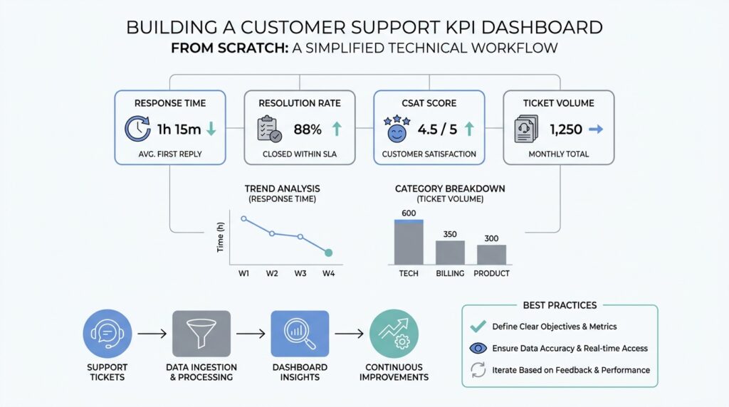
The best starting point is to choose metrics that tell the story of the customer experience from first contact to final resolution. First response time, which is how long a customer waits before getting an initial reply, shows whether support feels attentive. Resolution time, which is the total time needed to solve the issue, shows whether the team can actually finish the job. These two numbers work well together because speed matters in different ways at different moments, and a support dashboard that tracks both gives us a fuller picture than either one alone.
From there, we need one metric that tells us whether the issue was solved well, not just quickly. First contact resolution, or FCR, means a customer’s problem gets solved in the first conversation without a follow-up loop. That matters because a fast reply that leads nowhere still leaves the customer frustrated. When we place first contact resolution beside resolution time, we can see whether the team is moving quickly and effectively at the same time, which is often the difference between a busy support desk and a strong one.
Customer satisfaction score, often shortened to CSAT, belongs on the dashboard too because it captures how people feel after the interaction. CSAT is usually gathered through a short survey, and it acts like a temperature check for the experience we are creating. A team can meet speed targets and still disappoint customers if the answers are unclear, the tone feels cold, or the problem returns later. That is why the most useful customer support KPI dashboard balances operational speed with a customer-centered signal.
We also need a workload metric, because even the best team can struggle if the queue grows faster than people can handle it. Ticket volume shows how many requests are coming in, while backlog shows how many still need attention. Together, they tell us whether support is keeping pace or falling behind. These numbers are especially helpful because they explain the context behind other metrics; a slower response time may not mean poor performance if the team suddenly received twice as many tickets as usual.
At this stage, we should resist the urge to add every possible measure. Reopen rate, for example, which tracks how often a supposedly solved ticket comes back, can be useful when quality is a concern, but it is not always a core dashboard metric. The same is true for escalation rate or channel-specific breakdowns. Each one can be valuable, yet each one should earn its place by answering a real question the team will act on, not by filling empty space on the screen.
A helpful way to decide is to ask what action each metric could trigger. If a number goes red, does someone know what to do next? If the answer is no, it probably belongs in a deeper report instead of the main customer support KPI dashboard. When we keep only the essential support metrics, the dashboard becomes easier to read, faster to trust, and much more likely to guide better decisions day after day.
Connect Your Data Sources
By the time we reach the data connection step, the customer support KPI dashboard starts to feel less like a sketch and more like a living system. We already know which numbers matter, but those numbers usually live in different places: a help desk, a customer relationship management system, a survey tool, maybe even a spreadsheet that someone updates by hand. Connecting those sources is the part where we gather the puzzle pieces and make sure they fit, because a dashboard can only be trusted when its sources speak the same language.
The first place we usually look is the ticketing system, which is the software where customer requests become trackable tickets. This source gives us the backbone of the customer support KPI dashboard: when a request arrived, when someone replied, when it was closed, and whether it was reopened later. Those timestamps and status changes are what make metrics like first response time, resolution time, and backlog possible. If the ticket records are incomplete or inconsistent, the dashboard may look polished while quietly telling the wrong story.
Next comes the customer relationship management system, often called a CRM, which is a tool for storing customer details and account history. This source adds context that a support queue alone cannot provide, such as plan type, region, account size, or renewal status. That context helps us read the numbers with more care, because a spike in tickets from enterprise customers may matter differently from a spike in general inquiries. To connect the CRM cleanly to the support data, we need a shared identifier, such as a customer ID or account number, so the dashboard can match records without guessing.
Then we bring in customer feedback, usually from a survey tool that collects CSAT, or customer satisfaction score. CSAT is the short survey result that tells us how customers felt after the interaction, and it becomes much more useful when it links back to the ticket that produced it. If the survey response does not carry the same ticket ID, we lose the ability to compare happy or unhappy ratings with the work that caused them. This is one of the quiet but important steps in building a customer support KPI dashboard: we are not only collecting opinions, we are connecting those opinions to the exact support moment that shaped them.
As soon as more than one source enters the picture, we also need to think about consistency. A data pipeline, which is the path data follows from its source to the dashboard, should clean up time zones, date formats, status labels, and duplicate records before anything reaches the final view. A ticket marked “resolved” in one system and “closed” in another can create confusion unless we translate both into one shared rule. This is also the right moment to define terms like reopened ticket, escalated case, or inactive backlog in one clear way, because dashboards become far easier to trust when the definitions stay steady across systems.
It helps to test the connections with real examples instead of waiting for the full dashboard to reveal problems. We can pick a few tickets, follow them from the help desk into the CRM and survey data, and check whether the numbers still match what we expect. If a support dashboard says the team handled 200 tickets but the source systems add up to 187, that mismatch is a signal to inspect the joins, not a reason to redesign the charts. In practice, the cleanest customer support KPI dashboard is the one that has already survived a few uncomfortable checks.
When the sources finally line up, the rest of the build gets much easier because the dashboard no longer depends on guesswork. We are free to focus on how the numbers should appear, knowing that the foundation underneath them is solid. That is the quiet payoff of this stage: once the data sources are connected well, the dashboard can start telling a story the team can actually believe.
Design Clear KPI Visuals
Picture the moment a support lead opens the dashboard before a busy shift. In the first few seconds, their eyes should find the story, not hunt for it. That is the heart of a strong customer support KPI dashboard: the visuals should feel calm, readable, and immediate, with the most important number standing out before anything else tries to compete for attention. Dashboard guidance from Microsoft and Nielsen Norman Group both points in the same direction here: use clear visual hierarchy, keep the view uncluttered, and let size, color, and spacing tell the viewer what matters most.
The easiest way to build that calm is to give one visual the opening line of the story. Put the most important metric where people naturally look first, and make it larger or more visually prominent than the supporting details, because scale signals importance. On a customer support KPI dashboard, that might be today’s response time, backlog, or CSAT, depending on the goal we defined earlier. Tableau and Microsoft both recommend placing the highest-level information near the top left and using prominent card-style displays for key numbers, since dashboards are meant to be scanned rather than studied like a report.
Once the lead metric has its place, the next step is choosing the right shape for each story. A line chart works well when you want to show change over time, while a bar chart is better when you want people to compare categories side by side; Microsoft specifically notes that bar and column charts are easier for comparison than many circular or decorative alternatives. That matters in a customer support KPI dashboard because response time, resolution time, and ticket volume often need to be read as trends, while channel performance or team comparisons need a cleaner side-by-side view. When the chart matches the question, the dashboard feels like it is answering the reader instead of asking them to decode it.
Clarity also depends on consistency, and this is where many dashboards quietly lose their audience. If one panel uses one scale, another uses a different scale, and a third mixes time frames or precision levels, the viewer has to re-learn the language every time they move their eyes. Microsoft recommends keeping chart scales consistent, avoiding mixed levels of precision and time, and removing unnecessary labels when the chart already communicates the value clearly. In practice, that means using the same color for the same status everywhere, keeping date ranges aligned, and resisting the urge to label every bar or point if the number is already obvious.
Spacing matters just as much as data. When a screen is packed edge to edge, the eye loses its resting places and the whole customer support KPI dashboard starts to feel noisy, even if the numbers are accurate. Tableau and Nielsen Norman Group both emphasize limiting clutter, using white space to separate groups, and keeping the number of views small enough that the big picture does not disappear into detail; Tableau even suggests two or three main views as a practical limit for many dashboards. Think of white space as the pause between sentences: it does not add facts, but it makes the facts easier to absorb.
It also helps to design for the place where the dashboard will actually live. Microsoft notes that dashboards should work at a glance, and Tableau recommends building at the final display size so the layout does not become cramped on smaller screens. If your support team uses a large monitor in a command center, you can show a bit more context; if they check the customer support KPI dashboard on laptops or tablets, fewer tiles and larger type will usually read better. This is one of those moments where the right design choice is less about style and more about respecting how people really work.
A good test is to step back and ask whether someone could understand the state of the team in a few seconds. If the answer is no, the screen is probably doing too much at once, or the hierarchy is too flat to guide the eye. A clear customer support KPI dashboard does not try to impress people with density; it helps them notice, compare, and act. Once the visuals can do that cleanly, we are ready to layer in thresholds, alerts, and the small signals that make the dashboard feel alive.
Add Filters and Alerts
Once the customer support KPI dashboard is readable at a glance, the next step is to make it responsive to real-life questions. A static view can tell us what is happening, but filters and alerts help us ask, “What is happening for this team, this channel, or this time period?” That shift matters because support work changes by shift, region, product line, and urgency, and a dashboard feels far more useful when it can narrow the picture without rebuilding the whole screen.
Filters are the controls that let us slice the data into smaller, meaningful views. Think of them like the dimmer switch on a lamp: the room stays the same, but we can brighten one corner and soften the rest so we can focus. In a customer support KPI dashboard, the most helpful filters are usually time range, channel, team, region, and priority, because those are the lenses people reach for when they want to understand why a number moved. If someone asks, “Why did resolution time spike last week?” a filter helps us compare last week with the week before instead of guessing from the full data set.
The best filters are the ones that match real decisions, not the ones that make the dashboard look sophisticated. A manager may want to filter by team to see whether one group is carrying a heavier load, while a supervisor may filter by channel to check whether chat is behaving differently from email. We can also filter by customer segment, product line, or ticket type when those categories affect the work in a meaningful way. The rule of thumb is simple: if a filter does not help someone answer a question they actually ask, it will probably just add friction.
It also helps to keep the support dashboard filters gentle and predictable. Too many options can turn a helpful dashboard into a maze, especially for new users who are still learning the meaning of each metric. We want the default view to tell the main story first, then let the filters reveal the details underneath, like opening a map from country view to city street. When we choose a few well-labeled filters and keep their behavior consistent, we preserve clarity while still giving the team room to explore.
Alerts, on the other hand, are the dashboard’s way of tapping us on the shoulder when something needs attention. An alert is a notification triggered when a metric crosses a threshold, which is a set point we decide in advance. In a customer support KPI dashboard, that might mean response time exceeds a target, backlog rises above a safe level, or customer satisfaction score drops below an agreed floor. Instead of asking someone to stare at the screen all day, alerts bring the important change to the surface at the right moment.
The most useful alerts are tied to action, not anxiety. If every small fluctuation sends a warning, people start ignoring the messages, and the dashboard loses trust; if alerts only appear for meaningful deviations, the team learns to rely on them. A good threshold should reflect service-level expectations, workload capacity, and historical patterns, so the alert feels like a signal rather than a surprise. We can think of it as a guardrail: it does not steer the car for us, but it keeps us from drifting too far off course.
It is also worth distinguishing between informational alerts and urgent alerts. A gentle notice might tell us that ticket volume is trending upward and deserves review later, while a stronger alert might flag a sharp drop in first contact resolution or a backlog that could affect customers today. That distinction matters because not every change needs the same level of response, and a mature customer support KPI dashboard should reflect that difference. When alerts are ranked by severity, the team can respond with the right level of urgency instead of treating every issue as a fire.
The real power comes when filters and alerts work together. Filters help us investigate the why behind a signal, and alerts help us notice the signal in the first place. If an alert shows that CSAT fell below target, a filter can reveal whether the drop came from one channel, one region, or one ticket type, which turns a vague problem into a solvable one. That combination is what makes a customer support KPI dashboard feel alive: it not only reports on the past, but also guides the team toward the next best action.
Test, Share, and Refine
Now that the customer support KPI dashboard is built and the numbers are flowing in, the work shifts from construction to confidence. This is the moment where we ask, how do you know if your customer support KPI dashboard is actually useful? The answer comes from testing it with real people, sharing it with the team that will rely on it, and refining it until the dashboard feels less like a prototype and more like a trusted part of the workday.
Testing starts with the simplest but most revealing question: do the numbers make sense to someone who lives this work every day? We want a support lead, a supervisor, or an analyst to look at the dashboard and recognize the story it is telling without needing a guided tour. That means checking whether the calculations match the source systems, whether the date ranges behave as expected, and whether the dashboard still makes sense when a day gets unusually busy. A customer support KPI dashboard can look polished and still be wrong, so this step is less about presentation and more about truth.
The best tests happen with real scenarios, not ideal ones. We can use a recent spike in tickets, a reopened case, or a shift that ran across time zones to see whether the dashboard handles edge cases cleanly. This is where hidden problems often appear, like a metric that rolls up differently on Monday than it does on Sunday, or a filter that hides part of the backlog when a region is selected. When we test the customer support KPI dashboard against messy real-world data, we learn whether it can survive the same complexity the support team faces every day.
Sharing the dashboard is the next step, and it works best when we treat it like a conversation rather than a launch announcement. We want the people who will use it to open it, ask questions, and point out where their reading of the numbers does not match ours. A frontline manager may notice that a chart overemphasizes volume while underplaying urgency, while an executive may ask for a cleaner summary that fits a weekly review. These reactions are valuable because they show us how the customer support KPI dashboard is interpreted in practice, not just how it looks in design mode.
It also helps to share the dashboard in stages. First, we can give it to a small group of trusted users who understand the metrics and can spot awkward gaps early. Then we can widen the circle and watch whether new viewers understand the main story without extra explanation. As the audience grows, the dashboard should become easier to read, not harder, because the goal is to create a shared view of support performance that different roles can use with confidence.
Refinement is where the dashboard starts to feel personal to the team. After feedback comes in, we can tighten labels, remove a metric that no one acts on, adjust a threshold that triggers too often, or rewrite a title so it matches the way the team actually talks. This stage matters because a customer support KPI dashboard improves through use, not through guesswork. The best revisions usually come from small changes that make the screen calmer, clearer, and more aligned with the decisions people need to make.
We should also expect refinement to be ongoing, not a one-time cleanup. Support operations change as staffing shifts, customer behavior changes, and new products create new kinds of tickets, so the dashboard has to evolve with them. That is why we keep watching for signs that a metric has lost relevance or that a chart is no longer answering the original question. When we test, share, and refine in a steady loop, the customer support KPI dashboard becomes something the team can trust, use, and improve together, which is exactly what makes it valuable.