Define dashboard goals and metrics
Imagine you’re staring at a blank canvas for your March Madness dashboard, the clock ticking and a bracket full of possibilities waiting to come alive. In the first 100 seconds you have to decide what story this dashboard will tell, because real-time NCAA basketball data will flood in and you don’t want noise, you want meaning. We’ll treat this like planning a road trip: pick a destination (what decision should follow from the chart), choose the stops that matter (metrics), and map how often you’ll check the map (update frequency). This early clarity saves you from building something pretty that nobody uses.
Building on this foundation, the most important step is defining the goals your dashboard must achieve. A goal is the specific outcome you want from a viewer—examples include helping a commentator call a comeback, enabling a coach to spot fatigue patterns, or keeping a casual fan glued to live plays. Ask yourself: who will act on this dashboard and what action should they take? This question directs which numbers matter and which can be left off the screen.
Next, let’s meet the main characters: metrics and KPIs. A metric is any measurable number—points, rebounds, or time of possession—while a KPI (Key Performance Indicator) is a metric tied to a goal, like “win probability” for predicting game outcome. Think of metrics as ingredients in a recipe and KPIs as the dish you’re trying to serve. We’ll pick a handful of KPIs to highlight and let the rest live in drill-downs, so your dashboard reads like a clear menu instead of a chaotic grocery list.
Now we choose which metrics to show up front. Different audiences need different lens: coaches care about possession efficiency and player load, broadcasters want momentum and highlight plays, and fantasy managers watch minutes and usage rate. Usage rate is the percentage of a team’s plays a player is involved in—define it the first time it appears so everyone follows. Resist the temptation to display everything; prioritize metrics that prompt an immediate decision or insight, and keep secondary stats one click away.
Because we’re working with live sports data, we must respect the constraints of freshness and latency. Latency is the delay between an event happening and it appearing on your dashboard; lower latency feels more “live” but demands more technical resources. Choosing a 5-second, 30-second, or 1-minute refresh cadence changes infrastructure needs and the types of metrics you can reliably show. For example, a 5-second cadence supports instant play-by-play and shifting win probability, while a 60-second cadence is fine for box-score aggregates.
Let’s be concrete about the metrics that make March Madness feel alive. Core real-time NCAA basketball data elements to surface include the score and clock (basic state), possession (who has the ball right now), shot location visualized on a court map (shot chart), and win probability (a running estimate of each team’s chance to win). Define win probability as a percentage derived from score, time remaining, and historical situational outcomes so readers know it’s a predictive estimate, not a prophecy. Add context metrics like scoring margin, offensive efficiency (points per 100 possessions), and player minutes to help viewers interpret sudden swings.
Finally, frame your decisions so every chart serves a role in the narrative you promised at the start. Decide which KPI will live in the top-left, what will animate during momentum shifts, and how drill-downs will satisfy curiosity without distracting. With those choices made, we’ll be ready to move into sourcing and shaping the live feed—choosing APIs, handling missing plays, and designing refresh strategies that match the goals you just set.
Choose a live-data provider
Building on this foundation, imagine you’ve chosen the metrics and cadence for your dashboard and now face a practical question: where will the live feed come from? Right away we need to treat the live feed—the stream of play-by-play events, box-score updates, and roster changes—as the heart of the system. Live sports data and real-time NCAA basketball data aren’t interchangeable buzzwords here; they describe the moving parts you’ll rely on: event-level plays, updated scores and the game clock, player substitutions, and any derived KPIs like win probability.
First, let’s meet the contenders like characters in a cast. An API (application programming interface) is a programmatic doorway that lets your dashboard request or receive structured data. Some providers offer REST APIs, which you poll for updates on a schedule. Others offer WebSocket or webhook-based push feeds, which stream updates to you the moment a play happens. There are official/licensed feeds tied to the league’s data rights, commercial aggregators that normalize multiple sources, and community or open datasets that might work for practice but rarely meet production needs. Each type behaves differently and solves different problems; we’ll walk through how to choose between them.
Latency and coverage are the two lead actors in this story. Latency is the delay between a play happening and it appearing in your dashboard; lower latency makes your board feel live but usually costs more. Coverage means the breadth and depth of data: does the provider give shot locations, possession identifiers, advanced player tracking, or only basic box-score updates? Think of latency like how quickly a friend texts you during a game and coverage like how many details they share in that text. For a broadcaster-style dashboard that animates momentum, prioritize low-latency play-by-play and support for shot coordinates; for a post-game analytics board, comprehensive box scores and advanced metrics might be enough.
Cost, licensing, and reliability quietly shape every technical choice. Commercial feeds carry subscription fees and contractual restrictions—license means the legal permission to use and display data, and it often defines whether you can redistribute or store historical datasets. Reliability covers SLAs (service-level agreements) and error rates; you’ll want a provider that publishes uptime guarantees and has a sandbox or developer environment for testing. Before committing, request sample data, review rate limits (how many requests per minute your account can make), and confirm whether player and team identifiers match other systems you use—mismatched IDs create maddening joins later.
How do you evaluate a provider in practice? Treat it like a short road test. First, run a simulated game through their sandbox to measure median latency and error frequency, and push a few edge cases such as overtime and quick consecutive substitutions. Next, test integration patterns: can you consume via WebSocket to minimize polling, or do you need to implement a resilient polling loop with exponential backoff? Finally, measure how often the provider updates derived metrics you care about—some feeds supply raw events only, leaving you to calculate KPIs like possession-based efficiency or win probability in real time.
Integration architecture matters almost as much as the data itself. If you expect 5-second refreshes, prefer push-based streams (WebSocket or webhook) to avoid wasted polling. If you need historical reconciliation, ensure the provider offers event replay or sequence numbers so you can recover missed messages. Design a simple fallback: if the live feed hiccups, show the most recent reliable state and indicate staleness to users. This keeps your dashboard trustworthy even when upstream systems wobble.
Choosing a provider is a practical experiment, not a one-off decision. Match the feed’s latency, coverage, legal terms, and reliability to the goals you set earlier; prototype quickly, measure latency and data completeness, and keep a contingency plan for outages. With that approach, the live-data layer becomes an enabler for the compelling visuals and insights we planned—so that when the bracket tightens and the clock winds down, your dashboard is ready to tell the story the moment it unfolds.
Obtain API keys and access
Building on this foundation, picture the moment you’ve picked a live-data provider and now need the keys to open the door: the API keys that let your dashboard ask for play-by-play and box-score updates. An API (application programming interface) is the programmatic doorway that your code uses to request structured game events; an API key is a secret token the provider gives you so their system knows who you are. How do you get those keys and what kinds of access should you expect when working with real-time NCAA basketball data and live sports data feeds?
First, create a developer account with the provider and use their sandbox environment to experiment. A sandbox is a safe test area that mimics the production service so you can try requests without affecting billing or live contracts. During signup you’ll usually receive test credentials (often labeled “test” or “sandbox” keys) and sample payloads; use these to confirm your parsing logic and to measure sample latency. Ask for example play-by-play messages and sequence numbers so you know how events are ordered and how to reconcile missed messages later.
Next, understand the common authentication models you’ll encounter. API key auth is a simple token you include in request headers; OAuth is an authorization protocol that issues time-limited tokens and can grant scopes (specific permissions); JWT (JSON Web Token) is a signed token that carries identity and expiration. Each model trades simplicity for security: API keys are easy to use but must be protected, while OAuth and JWT give you finer-grained control and safer short-lived credentials. The provider’s docs will label which method they require—follow that pattern.
When you’re ready to move beyond sandbox to production, expect a small workflow: request production access, accept the provider’s license or terms of service (this often defines display and redistribution rights), and receive production keys or certificates. Many providers also enforce rate limits—how many requests or messages you can make per minute—so check those limits early. If your dashboard needs low-latency play-by-play or high throughput for many concurrent games, ask for higher rate limits or a dedicated feed and get the allowance in writing.
Protecting and handling keys is a practical responsibility you can’t skip. Never embed secret keys in client-side code that runs in browsers; instead, store them server-side using environment variables or a secrets manager. For example in Node.js you might read a key with process.env.SPORTS_API_KEY and keep that environment configuration out of version control. Rotate keys periodically, enable revocation if available, and restrict usage by IP or CIDR ranges where possible (this is called allowlisting). Treat keys like passwords: logging them or exposing them in error messages creates immediate risk.
Choose the right integration pattern for live sports data: REST polling, WebSocket streaming, or webhook push. REST is request/response—useful for snapshots and history—but adds latency if you poll frequently. WebSocket creates a persistent bidirectional connection for near-instant updates, while webhooks push events to an endpoint you host. Ask your provider whether they support event replay or sequence numbers so you can recover missed messages, and test edge cases like overtime and rapid substitutions. Implement exponential backoff for retries and a clear UI indicator when data becomes stale.
Finally, don’t forget the legal and operational steps that unlock full access: confirm display rights for NCAA content, request an SLA or uptime commitment if this is production-critical, and put monitoring in place to track usage and cost. Once your keys are issued, stored securely, and tested in both sandbox and production modes, you’ll be ready to wire authentication into your integration and start streaming the real-time NCAA basketball data that brings your March Madness dashboard to life.
Decide streaming versus polling
Imagine you’re watching a tense late-round March Madness game and your dashboard either nudges the win probability in near real time or lags by several possessions. Right away you need to match your story to the technical rhythm: real-time NCAA basketball data and live sports data can arrive like a steady river or a series of hourly snapshots, and that shape decides how your system behaves and how your viewers experience the game. We’ll walk through the tradeoffs together so you can pick the pattern that fits your goals, users, and infrastructure.
First, let’s meet the two ways data gets to your dashboard as if they were characters on stage. Streaming means the provider pushes updates to you instantly over a persistent connection; WebSocket is a common streaming technology that keeps a live channel open so messages flow the moment a play happens. Polling means your application asks the provider on a schedule—often via REST API requests—to pull the latest snapshot. Each approach carries its own style: streaming rewards low latency and immediacy, while polling offers simplicity and easier horizontal scaling in constrained environments.
Now consider the story you want to tell and the acceptable delay for each metric. If you plan to animate possession changes, shot charts, or a five-second win-probability ticker, streaming usually gives the responsiveness you need. If you’re showing refreshed box-score aggregates, leaderboards, or post-possession summaries that tolerate 15–60 second delays, polling can be perfectly adequate and cheaper to operate. Which should you pick for a 5-second win-probability update versus a 30-second aggregate leaderboard? The answer flows from your latency target, cost tolerance, and the viewer’s expectations.
Don’t forget the audience device and network realities. Browser clients and mobile apps behave differently: opening thousands of persistent WebSocket connections from browsers invites connection management, while polling from clients can exhaust rate limits quickly and expose your API keys if done client-side. Define where the connection lives—server-side proxies often absorb streaming complexity and hide secrets. Also account for flaky mobile networks and battery-sensitive clients: fewer, smarter pushes or adaptive polling can preserve user experience without draining devices.
Scale and cost are the next two antagonists in our story. Pushing every play to every connected client multiplies bandwidth and server resources; conversely, frequent polling multiplies API requests against provider rate limits and increases cost. If you expect hundreds of concurrent games or tens of thousands of viewers, plan for connection orchestration, sticky sessions, and autoscaling for streaming, or a distributed cache and aggregated polling layer for REST-based designs. Cost models vary by provider—measure requests and connection minutes during your prototype.
A practical middle path often wins: a hybrid architecture that uses streaming for the high-value, low-latency signals (score, clock, possession, shot events) and polling for lower-priority aggregates or historical reconciliation. Add sequence numbers or event IDs to every message so you can detect gaps and replay missed events; when the stream drops, fall back to a short-polling reconciliation loop that grabs the authoritative snapshot. Surface a clear staleness indicator in the UI so viewers understand when data is delayed.
Before you commit, instrument and measure. Run a sandbox game to record median end-to-end latency, error rates, and reconnection frequency for streaming, and the mean request cost and cache hit-rate for polling. Set pragmatic thresholds—if median streaming latency is consistently under 2–3 seconds, prefer push for live KPIs; if network churn or cost makes streaming brittle, design a 10–30 second polling cadence with event reconciliation. Test edge cases like overtime and fast substitutions so your recovery logic proves itself under pressure.
With the decision framework in hand—latency targets, audience devices, scale, and cost—you’ll be ready to wire auth, secure keys, and build resilient connectors that match the narrative you want your March Madness dashboard to tell. Next we’ll translate this choice into concrete integration steps and security practices so your chosen pattern runs reliably when the bracket tightens and every second counts.
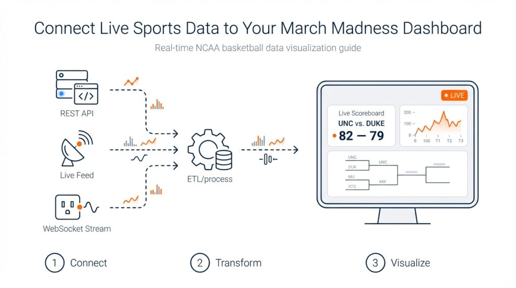
Ingest, normalize, and store feeds
Building on this foundation, imagine you’ve connected to three different vendors and suddenly your dashboard is flooded with slightly different versions of the same play: one feed calls a two-point jumper a “fg2,” another uses “2P,” and the clock timestamps arrive in different timezones. The immediate task is to bring live feeds into a single system — ingesting means accepting those incoming messages reliably, shaping and standardizing them means transforming them into a consistent format, and persisting means writing them somewhere you can query later. How do you make those steps predictable when low latency and accuracy both matter for real-time NCAA basketball data? We’ll walk through a practical pattern you can implement today that keeps play-by-play fidelity intact and your downstream visualizations trustworthy.
First, create a resilient intake layer that treats each provider as a character with its own accent. Ingesting here means opening a connection (WebSocket, webhook receiver, or periodic REST request), authenticating with the provider’s key, and streaming messages into a buffer or message queue. Define sequence numbers and idempotency early: a sequence number is an increasing integer that orders events and idempotency means processing the same event more than once has no bad side effects. Buffering in a durable queue gives you time to validate, reorder, or replay events if the stream hiccups — this is the safety net that keeps your win probability and score consistent even when upstream feeds wobble.
Next, shape those messages into a canonical event model that every part of your stack understands. Normalizing means mapping vendor-specific field names into a single schema — for example, map both “fg2” and “2P” into shot.type = “two_point” and convert all timestamps to UTC so clocks line up. A schema is simply a shared definition of the fields you care about (game_id, event_id, timestamp_utc, team_id, player_id, event_type, coordinates, clock_ms). Validate each incoming record against the schema and flag or quarantine messages that fail checks; record the original payload so you can debug mismatches later. This single source of truth makes joins, aggregations, and replay straightforward and prevents the messy ID mismatches that ruin analytics.
After a canonical model, enrich and derive the metrics you’ll surface on the dashboard. Enrichment is adding useful context — attach normalized player and team master records, convert raw coordinates into court zones, and compute possession identifiers when a sequence of events implies a change of possession. Derived metrics like running win probability or possession-based efficiency can be calculated either at ingest time (for immediate UI needs) or downstream in a stream-processing job. Decide which calculations must be near-instant and keep heavy, historical computations in a batch or analytics layer to avoid overloading your live path.
Now decide where to keep each type of state so reads are fast and historical queries are cheap. Use a short-term, low-latency store for the current game state and ticking KPIs (this could be an in-memory cache or a fast key-value store) and a time-series or columnar store for event history and analytics. Persist raw, normalized events to a durable archive for replay and audit; include sequence numbers and original payloads so you can reconstruct any moment exactly. Set retention policies that match your licensing and business needs: short-term hot state for live viewers, medium-term for replay and analysis, and long-term archival for compliance and research.
Finally, bake in operational controls: monitor stream lag, message drop rates, and schema-violation counts; surface a clear staleness indicator in the UI when the last confirmed event is older than your SLA; and provide a manual replay button that replays archived events through the same normalization pipeline. Taking these steps ties the technical work back to the goals we set earlier — low latency, accurate play-by-play, and dependable win probability — and prepares you to move into concrete integration and security practices that make your dashboard reliably live when the tournament tightens.
Build visualizations and live widgets
Building on this foundation, imagine your screen as a live stage where real-time NCAA basketball data performs and you are directing which moments get center stage. In the first beat you want clarity: a single glance should answer who’s ahead, who has the ball, and whether the game just took a dramatic turn. We’ll treat visuals and widgets as characters in that play—each one has a role, a rhythm, and an update cadence that must match the pace of the game. Front-load the most important signals so viewers don’t have to hunt for meaning when a possession flips.
Start by choosing the core widgets that serve the goals you already set: a compact scoreboard (score + clock), a possession timeline (who has the ball and for how long), a shot chart (a map of shot attempts by location), and a running win probability (an estimated chance to win, expressed as a percentage). Define terms where they first appear so everyone follows: a shot chart is simply a court diagram showing where players took shots, and win probability is a predictive estimate based on score, time, and historical situational outcomes. Think of the layout like a newspaper front page—one headline KPI, a supporting visual that explains momentum, and smaller panels for context.
How do you make a live widget feel fast without overwhelming the user? The technical heartbeat matters: push low-latency events for score, clock, possession, and shot events; poll or batch for aggregates like per-possession efficiency. Use your canonical event model and sequence numbers to order updates and detect gaps, and route everything through a server-side aggregator that normalizes vendor differences before it reaches the client. Send delta-only updates (what changed) rather than full state dumps, and debounce rapid-fire events into sensible animation frames so the UI stays smooth while preserving fidelity.
Rendering choices shape both performance and aesthetics. Use SVG (scalable vector graphics) for crisp, interactive controls and small charts where accessibility and DOM integration matter; choose Canvas or WebGL for dense, high-frequency visuals like a full-game shot replay with thousands of points. Explain the trade-offs briefly: SVG is easier to hook into ARIA for accessibility, Canvas is faster for many moving elements, and WebGL shines when you need GPU-accelerated animations. Smooth transitions—fade-ins, eased position shifts—help viewers follow changes; abrupt jumps feel like missing information.
Design the interaction so changes are meaningful rather than noisy. Show freshness with a tiny timestamp or a staleness indicator and highlight what changed with micro-animations (a subtle glow when possession changes, a brief spike on the win-probability line). Use color and motion to call attention—warm colors for momentum swings, cool for steadiness—but provide alternatives and patterns for color-blind users and attach ARIA labels and keyboard focus orders for screen readers. Progressive disclosure keeps detail one click away: let curious users drill into player splits and shot details without cluttering the main stage.
Handle reliability and edge cases out loud in the UI. If your ingest layer detects a missing sequence or the stream drops, surface a clear message and gracefully fall back to short-polling reconciliation that replays archived events until the stream recovers. Keep a compact cache of the last known authoritative snapshot and expose a manual replay or “catch up” button for commentators or analysts who need exact sequencing. Don’t forget license-driven display rules—if the data provider requires attribution or restricts redistribution, bake that into the widget’s chrome early so it never becomes an afterthought.
Picture a single possession to see these pieces act together: the clock ticks, the shot dot animates from the player’s location on the shot chart, the play-by-play feed autoscrolls, and the win-probability ticker nudges—each update arrives as a small message from the canonical feed, is normalized and sequenced on the server, then pushed as a delta to the client where a smooth animation helps you interpret the shift. That sequence—event -> normalize -> delta -> render—keeps the viewer anchored to what matters and preserves historical fidelity for later analysis.
With these building blocks in place, we can now translate the designs into concrete front-end patterns and deployment practices that keep widgets fast, accessible, and reliable under tournament loads. That’s where we’ll head next to ensure your March Madness dashboard performs when the bracket tightens and every second counts.