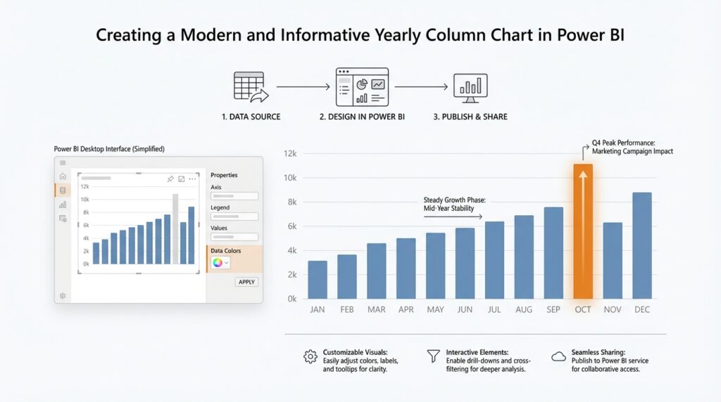
Prepare Yearly Sales Data
Building on this foundation, we start with the part that makes a yearly sales chart trustworthy: the data itself. If your sales table only contains raw transactions, the chart has nothing clean to stand on yet. What you want is a version of the data where each record can roll up into a year without confusion, so the visual can tell a clear story instead of a noisy one. How do you prepare yearly sales data in a way that Power BI can read confidently? The answer is to make sure your date field is truly a date, your sales values are numeric, and your model has a dependable way to group records by year. Power BI can create hidden date tables and year hierarchies automatically for some date columns, but those defaults are only a starting point, not always the best long-term structure for a report you want to control carefully.
Let us take a step back for a moment and look at the date column, because that is the spine of the whole idea. A yearly sales visual depends on dates that Power BI can understand as actual date values, not text that merely looks like dates. Microsoft’s guidance for date tables recommends using a proper date table, often built with DAX expressions such as CALENDAR or CALENDARAUTO, so the model has a complete and consistent range of dates to work with. That matters because yearly sales data becomes much easier to summarize when every transaction can point to one shared calendar, rather than each chart trying to invent its own idea of time.
Now that the calendar is in place, we need to give the year itself a clear home. In Power BI, categories like years and month names can sort alphabetically if you leave them as plain text, which is how a chart can accidentally show 2023 before 2021 in the wrong context or place months in a strange order. Power BI lets you sort one column by another column, so a Year label can follow a numeric year field, just as a Month Name can follow Month Number. In practice, this is the small detail that keeps your yearly sales data from feeling scrambled when you finally place it on the axis of a column chart.
From there, we turn to the sales numbers themselves, and this is where a lot of beginner reports quietly go off track. The sales field should behave like a measure, which means it needs to add up correctly when you group it by year, instead of staying fixed like a single row value. If your source data includes line items, orders, or invoices, the model should let Power BI aggregate those values into yearly totals without extra manual work. Think of it like pouring many small streams into one bucket labeled by year; once the water is in the right container, the chart can show the shape of growth, dips, and seasonal shifts much more clearly.
With those pieces aligned, yearly sales data starts to feel less like a spreadsheet and more like a story you can actually read. You are not only collecting numbers; you are teaching Power BI what each number means, when it belongs, and how it should be grouped. That is why the preparation stage matters so much before you build the visual itself. When the dates are clean, the year field is ordered correctly, and the sales values summarize the way you expect, the column chart can do its real job: showing you how each year compares at a glance, without making you solve a puzzle first.
Insert a Clustered Column Chart
Building on this foundation, we now turn clean yearly data into a visible story with a clustered column chart in Power BI. In Power BI Desktop, you begin by selecting a column chart icon from the Visualizations pane, which drops a blank visual placeholder onto the canvas, and then you feed it fields from the Data pane or drag them into the field wells. Power BI offers three main column chart styles—stacked, clustered, and 100% stacked—and the clustered version is the one that helps yearly totals stand next to one another so comparisons feel immediate.
Now that the canvas is waiting, we place the year on the axis and the sales figure in the values area. That part sounds ordinary, but it is where the chart starts behaving like a story instead of a spreadsheet, because the axis gives each year a home and the value field tells Power BI what to measure for each one. If your model is using a date hierarchy, Power BI can surface year, quarter, month, and day levels automatically, which is helpful later when you want to drill deeper, but for a yearly view we keep the year level front and center. Think of it like lining up labeled buckets before you pour the numbers in.
Before we go further, it helps to check the order of those year labels. Power BI lets you sort one column by another column, which is why a text label can follow a numeric sort field instead of falling back on alphabetical order. That matters because a clustered column chart should read like a timeline, not like a shuffled deck of cards, and the small sort-by-column step is what keeps the years in the right sequence. If the year field is already numeric, you may not notice the issue right away, but this is still the habit that protects your report as it grows.
Once the clustered column chart appears, the next move is to shape it so people can read it quickly. Microsoft’s column chart guidance points you to the Format visual icon in the Visualizations pane, where the Visual tab and General tab hold the controls that let you tailor the chart’s appearance and behavior. This is the point where a plain visual becomes a polished one, and it is worth slowing down long enough to make sure the chart feels calm instead of crowded. If a reader can understand the yearly pattern in a glance, the chart is doing its job.
If you are wondering how to insert a clustered column chart without getting lost in the interface, the safest mental model is to treat it as a three-step path: choose the visual, feed it the year and sales fields, then refine the layout. That workflow keeps the report simple at first and leaves room for richer analysis later, whether you want to drill into the date hierarchy or let other visuals respond through interaction. With the clustered column chart in place, you have a clear frame for yearly comparison, and that frame can support the rest of the report as we build outward from here.
Map Year and Value Fields
Building on this foundation, we now give the chart its two most important instructions: what time period to line up and what number to count. In Power BI, that means mapping the Year field to the Axis area and the sales or revenue field to the Values area, which is the part of the visual that tells Power BI what to measure. If you have ever wondered, “How do you connect the year and the number so a yearly column chart actually works?” this is the moment where the pieces click together.
Think of the Axis as the row of labeled containers and the Values area as the liquid we pour into them. The year belongs on the Axis because it gives each column a place in time, while the value field belongs in Values because it tells the chart how tall each column should be. Once those two fields meet in the right spots, Power BI can turn a table of records into a clear yearly story, where each column represents one year and its height reflects the total sales for that year.
Now that the idea is clear, let us place the fields with care. Drag the Year field into the Axis well, then drag the sales amount, revenue, or other numeric metric into Values. A value field is a numeric column or measure, which means it can be added, averaged, counted, or otherwise summarized across many rows. That summary behavior is what makes a clustered column chart useful, because you usually do not want one column per transaction; you want one column per year that represents the full yearly total.
This is where Power BI quietly does a lot of work for you. When a numeric field lands in Values, Power BI often treats it like a measure and applies an aggregation, which is a fancy way of saying it combines many records into one result. For a yearly column chart in Power BI, that usually means summing sales so each column shows the total for that year. If your chart looks wrong, the first thing to check is whether the value field is being summarized in the way you expect, because the wrong aggregation can make a strong-looking chart tell the wrong story.
The Year field deserves a small moment of attention too, because not every year label behaves the same way. If the field comes from a date table, Power BI may let you choose the exact year level from a date hierarchy, which is a built-in date structure that breaks time into layers such as year, quarter, month, and day. For a yearly view, you want the year level only, so the chart stays focused on the broad pattern instead of drifting into extra detail. That choice keeps the visual clean and makes the yearly comparison feel immediate.
With the fields mapped, the chart begins to answer the question you were really asking all along: what does growth look like from one year to the next? A strong yearly column chart should make the pattern obvious without making you inspect the data table behind it. If one year towers above the others, you notice it at once. If two years are close together, you see that too. That is the quiet power of mapping the Year field and the Value field correctly: the chart stops being a blank frame and starts becoming a readable timeline.
Before we move on, it helps to pause and check the result with fresh eyes. Ask yourself whether the Year labels sit in the right place, whether the columns represent totals rather than individual rows, and whether the value field is using the right summary. When those three pieces line up, the yearly column chart feels steady and trustworthy, and we are ready to refine the way it looks and communicates.
Sort Years Chronologically
Building on this foundation, we now face one of the easiest places for a yearly column chart in Power BI to lose its rhythm: the order of the years on the axis. Your fields may be mapped correctly, your sales totals may be working, and the chart may still feel off if the years do not read from left to right in a true chronological line. How do you sort years chronologically in Power BI when the labels look fine but the story feels scrambled? We fix that by telling Power BI which column should control the display order, instead of letting it guess.
The first thing to understand is that a year label and a year sort order are not always the same thing. A label like 2024 may look numeric, but in some models it behaves like text, and text often follows alphabetical rules rather than time rules. That is why a yearly column chart can become confusing when a field is stored as text, when a fiscal year label is used, or when a custom display name does not match the order you want. In a report, the chart should feel like a timeline, not a stack of name tags arranged by spelling.
This is where Power BI’s sort by column feature becomes the quiet hero. Think of it like giving each year two identities: one name that people see, and one index card that tells the chart where that year belongs in sequence. If your Year field is a display label, create or use a numeric sort field such as YearNumber, YearStart, or a date value from your calendar table, then set the label column to sort by that field. Once that link is in place, Power BI knows that 2021 must come before 2022, even if the visible label is formatted in a way that would otherwise confuse the visual.
Taking this concept further, we need to pay special attention to custom year formats. If your report uses fiscal years, school years, or labels like FY 2024, the visible text may not sort naturally on its own. In that case, the label should sort by a separate column that holds the real chronological position, such as the starting date of the fiscal period or a simple sequence number. That extra column is the difference between a chart that merely looks polished and one that stays trustworthy when someone changes the filter or compares several years side by side.
There is also a practical check worth making inside the visual itself. After you assign the sort order, open the chart and confirm that the axis runs in the direction you expect, because Power BI can still show the axis in ascending or descending order depending on the visual settings. If the years still appear out of place, the problem is often hiding in the model rather than the chart, such as duplicate year labels, mixed data types, or a display column that is not uniquely tied to its sort column. This is one of those moments where patience pays off, because a small modeling fix can save a lot of visual confusion later.
When the years are sorted correctly, the whole yearly column chart becomes easier to read and easier to trust. You can follow growth from one period to the next without pausing to decode the axis, and your audience can focus on the pattern instead of the setup. That is the real reason chronological sorting matters in Power BI: it turns the chart from a collection of bars into a timeline that tells the truth in the right order, which gives us a much stronger base as we move toward making the visual more polished and easier to interpret.
Format Axis, Labels, and Colors
Building on the structure we already put in place, this is the moment where a yearly column chart in Power BI starts to feel readable instead of merely correct. Think of the Format pane as the chart’s dressing room: the data is already on stage, and now we decide how clearly the audience can see it. When you select the visual and open the paint-brush icon, Power BI gives you separate controls for the X-axis, Y-axis, data labels, and colors, so you can tune each part without changing the underlying numbers.
The axis is the first place to slow down, because it carries the timeline your reader follows. On a column chart, the X-axis labels sit below the columns, and Power BI lets you change their text color, size, and font, or even turn them off if the page is crowded. The Y-axis deserves the same care: you can adjust label color and size, add a title, and keep the scale grounded so the columns are compared honestly from a zero baseline. If the chart feels tight, reducing label density or simplifying the axis can make the whole view breathe again.
Now that the axis is steady, the labels on the columns can add a second layer of clarity. Data labels are the small numbers that appear on the bars themselves, and they are useful when you want readers to see exact yearly totals without guessing from the axis. Power BI lets you format those labels too, including their font, color, transparency, and layout, so they can stay subtle instead of shouting for attention. A yearly column chart often works best when labels are used with care: enough to answer “what was the exact value?” but not so many that the chart starts to feel crowded.
Color is where the chart starts to carry a mood, and in Power BI column charts, color is more than decoration. You can open the Columns card in the Format pane and set a fixed color for the series, or use conditional formatting through the fx button to color columns by gradient, rules, or field value. That means you can keep the chart calm with one consistent brand color, or highlight a standout year with a different shade when there is a meaningful change to call out. If you later add a legend with multiple series, remember that legend-based color assignment can limit conditional color formatting.
So what does that mean in practice for a yearly sales chart? It means you are not decorating the visual; you are guiding attention. A readable axis helps the reader follow the years in order, clear labels help them trust the values, and thoughtful color helps them notice what matters first. When those three pieces work together, your Power BI column chart stops feeling like a generic default and starts behaving like a polished report element that tells the story cleanly at a glance.
Add Tooltips and Summary Insights
Building on this foundation, we can give the yearly column chart a second layer of meaning without making it cluttered. A tooltip is the small pop-up that appears when you hover over a data point, and in Power BI it can show extra context from the same visual or even a full report page designed for that purpose. That means your chart can stay clean on the surface while still answering the next question a reader naturally asks: “What is behind this one year?”
First, it helps to think of a tooltip as a pocket-sized side story. When someone points to a column in the Power BI yearly column chart, the tooltip can filter to that year and reveal supporting details such as sales, margin, or another measure you want to highlight. Microsoft also notes that report page tooltips can include visuals, images, and other elements, so the hover experience does not have to be plain text; it can feel like a miniature companion report that expands the year without crowding the main chart.
Taking this concept further, report page tooltips are the best fit when you want richer context than the default hover card can provide. Power BI lets you build a separate page, set its page size to the built-in Tooltip format, and then hide that page so readers only see it when they hover. Microsoft recommends keeping the tooltip page small, using Actual Size while you design it, and matching the report’s theme so the tooltip feels like part of the same story rather than a separate detour.
Once that tooltip page exists, you can attach it to the column chart in a way that feels intentional. Power BI supports both default tooltips and custom report page tooltips on visuals like bar and column charts, and you can choose which behavior you want from the visual’s formatting options. That is useful when one year needs more explanation than the others, because the tooltip can reveal a deeper comparison, a trend line, or a brief breakdown that helps the reader understand why that year stands out.
Now that the hover detail is in place, we can add a summary insight so the chart speaks in sentences, not only bars. Power BI’s smart narrative visual creates a quick text summary of visuals and reports, highlights relevant insights, and can be customized for the audience you are trying to reach. You can add it to a page or a single visual, and Power BI can update the narrative when the report refreshes or when filters change, which makes it a helpful companion for a yearly chart that may be sliced by region, product, or department.
This is where the experience becomes especially friendly for beginners, because the chart starts answering itself. A smart narrative can point out the biggest year, the sharpest change, or the broader trend, while the tooltip remains ready for anyone who wants to inspect the details behind one column. You can even add dynamic values to the narrative, which means the text can pull live numbers from your model instead of staying fixed like a caption. In practice, that gives you a simple pattern: the chart shows the pattern, the tooltip explains the point, and the summary insight states the takeaway.
With those two layers working together, your yearly column chart becomes much easier to scan and much easier to trust. Readers do not need to leave the visual to understand a spike, a dip, or a year that deserves attention, because the tooltip and summary each carry a different part of the conversation. That balance is what makes a modern Power BI report feel considerate: the surface stays calm, but the detail is always close at hand when the story needs it.