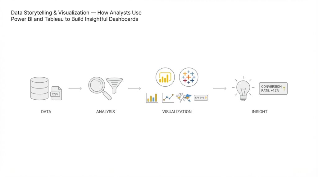
Define objectives and audience
Defining clear objectives and a precise audience is the single highest-leverage activity before you build any Power BI or Tableau dashboard for data storytelling and visualization. In the first pass you should state the business outcome, the primary metric(s), and the expected cadence of consumption—these three items determine whether you design an executive KPI canvas, an investigative exploration, or an operational real-time dashboard. When we frame objectives in this way, we avoid feature creep and ensure the visual narrative maps directly to a decision. How do you choose the right level of aggregation and interaction? Start by naming the decision the dashboard must enable.
Building on this foundation, write a one-line objective that ties to a measurable outcome and a timeframe. For example: “Reduce weekly customer churn by 10% within six months by identifying at-risk cohorts and measuring retention lift after interventions.” That statement tells you which metrics to create (churn rate, cohort retention, intervention attribution), which calculations to implement (DAX measures or Tableau LOD expressions), and the update frequency you need. We recommend expressing success as a specific metric and a time-bound target so stakeholders can validate the dashboard’s impact rather than evaluate it by aesthetics alone.
Identify distinct audience personas and enumerate their needs in operational terms. Executives typically need top-line KPIs and trend context with one-click access to anomalies; product managers need cohort comparisons and attribution detail; analysts need the ability to slice-and-dice with granular filters and raw data export. For each persona, define the primary question they will ask—“Are we improving?” for executives, “Why did this cohort fall off?” for product teams, and “Which rows produce the anomaly?” for analysts—and then design interactions and permissions accordingly. This persona-driven approach keeps Power BI row-level security or Tableau user filters aligned to real use patterns rather than hypothetical ones.
Translate objectives and audience into specific visual and technical constraints. If you target an operations team that acts hourly, choose incremental refresh and near-real-time sources, optimize DAX measures for query folding, and present tables with actionable drill-throughs. If the audience is strategic, emphasize aggregates, confidence intervals, and annotations that tell the story—use Tableau’s Level of Detail calculations or Power BI’s time-intelligence measures (e.g., a DAX YoY measure) to surface meaningful comparisons. We decide visualization types by intent: use line charts for trends, waterfall charts for contribution analysis, and small multiples for cohort comparisons to keep cognitive load low for decision-makers.
Include concrete examples of implementation decisions we typically make in analyst workflows. When building a retention dashboard in Power BI, implement a DAX measure like RetentionRate = DIVIDE([RetainedUsers], [TotalCohortUsers]) and materialize cohort buckets as calculated tables or use incremental refresh to avoid recomputing large joins at runtime. In Tableau, you might use FIXED LODs to pre-aggregate cohorts (e.g., {FIXED [CohortDate]: SUM([Purchases])}) so visual performance remains smooth when analysts pivot dimensions. These patterns illustrate how the objective (retention lift) directly shapes the technical work (measures, LODs, refresh policy) and the front-end interactions.
Finally, codify validation and success criteria before you build the first visual. Define three acceptance checks: the dashboard answers the primary question within two clicks, performance meets the expected SLA (for example, <3 seconds for executive views), and a small pilot group can reproduce a decision from the dashboard outputs. This makes the next phase—data modeling and visualization—work-driven and measurable rather than aesthetic. Taking these steps ensures your data storytelling and visualization efforts in Power BI and Tableau consistently produce dashboards that support real decisions and measurable outcomes.
Collect and prepare data
Building on this foundation, the first engineering task is to make sure the dashboard’s inputs match the decisions you defined earlier. Start by inventorying sources and capturing the minimal fields that map to your primary metrics and dimensions; this prevents scope creep and keeps refreshes fast in Power BI and Tableau. Capture provenance metadata (source, extraction timestamp, schema version) at ingestion so we can trace any downstream anomaly back to a specific extract. Early alignment between stakeholder questions and raw fields saves hours later when a visual needs a missing dimension or a reworked calculation.
When you choose how to ingest data, match the pattern to the use case: batch extracts for daily executive reports, CDC (change data capture) or streaming for operational, hourly views, and API pulls with pagination for third‑party products. CDC is a technique that captures and applies only row-level changes, which reduces load and preserves history for time-series analysis. For ETL pipelines we prefer staging tables that mirror source schemas and a single transformation layer that enforces business rules; this makes it easier to re-run a failing job without touching production tables. In production, design connectors with idempotency and backfill logic so a late file or an API outage doesn’t corrupt aggregated results.
Data cleaning must be explicit and testable: validate types, normalize timestamps to UTC including daylight savings adjustments, enforce unique keys, and standardize categorical values with a look-up table. Detect duplicates programmatically; for example, use a SQL pattern to keep the authoritative row per business key:
WITH ranked AS (
  SELECT *, ROW_NUMBER() OVER (PARTITION BY customer_id, event_date ORDER BY updated_at DESC) rn
  FROM staging.events
)
DELETE FROM ranked WHERE rn > 1;
That pattern gives you deterministic dedupes and a reproducible audit trail. In Power BI use Power Query with attention to query folding so heavy work runs in the source database; in Tableau consider Tableau Prep or database-side transforms to avoid extracting dirty data into an extract.
Decide your modeling strategy based on query patterns: adopt a star schema for interactive, slice-heavy dashboards and a denormalized wide table for single-purpose operational canvases where join cost dominates. Pre-aggregate measures at the grain your dashboard needs—cohort-week, day-part, or customer-lifetime—so visuals don’t recompute massive joins at render time. For Power BI choose Import mode with incremental refresh for large historical datasets where low latency matters; for Tableau weigh extracts (for fast, repeatable queries) against live connections (for near-real-time accuracy). These modeling choices directly affect performance and the kinds of analyses you can expose to each persona.
How do you ensure lineage and auditability across this pipeline? Implement a lightweight metadata layer that records job runs, source file hashes, row counts, and schema diffs; expose those metrics as a small operational dashboard so analysts can confirm data freshness and completeness before trusting a visual. Add unit-style tests for transformations (assert expected joins, non-null critical keys, and acceptable growth rates) and include those tests in CI for your ETL code. Finally, tie governance requirements back to personas: enforce row-level security where needed and document transformation logic so a product manager or an analyst can reproduce the calculation that produced a KPI.
Once the ingestion, cleaning, and modeling are stabilized, we can focus on the visual layer with confidence that the numbers are traceable and performant. The practical payoff of rigorous data preparation is predictable: dashboards that answer the right question within two clicks, meet performance SLAs, and let analysts reproduce decisions from source to visualization. From here, we take the prepared model into visualization work and start shaping the narrative with the validated metrics and aggregates your stakeholders will actually use.
Select appropriate chart types
Building on this foundation, the fastest way to derail a dashboard is to pick a visual that doesn’t match the decision you want to enable. When you design in Power BI or Tableau, front-load the choice of chart types with the business question and the audience in mind—this immediately narrows which encodings and interactions are viable. How do you choose between a line chart and a small multiple, or a heatmap and a table? Asking that before you wire a data source saves design cycles and prevents misleading presentations of your metrics.
Start by mapping intent to visual primitives. If the question is about direction and rate of change, use line charts with clear time granularity; for contribution or stepwise impact, choose waterfall or stacked bars with careful ordering. When you need to compare many categories, grouped bars or ordered lollipop charts keep baseline comparisons readable; when you need to show distribution, prefer boxplots, violin plots, or histograms instead of compressing distributions into averages. Avoid pie charts for more than three slices and treat 100% stacked bars as a last resort—they obscure absolute differences and are hard to scan for precise comparisons.
Account for audience and consumption cadence when you pick a visual. Executives need a compact KPI plus a trendline or sparkline and an immediate call to action; operations teams need dense, row-level tables, status heatmaps, and sparklines that update frequently; analysts need small multiples, scatterplots with trendlines, and the ability to pivot to raw rows. Design your dashboards with progressive disclosure: show summary visuals first and put exploratory, high-cardinality views behind clicks or bookmarks so each persona gets the right cognitive load and interactivity.
Consider technical factors that change what’s practical at render time. Chart choice depends on cardinality (how many series), continuous versus categorical axes, and whether the visualization requires on-the-fly binning or smoothing. For example, a 30-day rolling average in Power BI is a valid smoothing choice for noisy metrics; implement it as a DAX measure like:
RollingAvg30 =
AVERAGEX(
  DATESINPERIOD('Date'[Date], LASTDATE('Date'[Date]), -29, DAY),
  [Metric]
)
In Tableau, the equivalent is WINDOW_AVG(SUM([Metric]), -29, 0). Pre-aggregate where possible; small multiples are powerful but costly at high cardinality, so materialize cohorts or use extracts to keep interactions snappy.
Don’t treat color and encoding as afterthoughts—visual perception drives comprehension. Use color to highlight an anomaly or to encode a single ordinal scale, but avoid multi-hue categorical palettes that compete for attention; reserve saturation and size for magnitude and prominence. Add error bars or confidence intervals for strategic dashboards so stakeholders can gauge statistical uncertainty, and annotate charts with a short insight or a tooltip that explains outlier logic so viewers can act without guessing the calculation behind the number.
Make chart selection a repeatable part of your dashboard workflow rather than an aesthetic choice. Prototype two or three chart types with real slices of your model, test them with a stakeholder or two, measure which answers the primary question within two clicks, and iterate based on readability and performance. When you follow these patterns in Power BI and Tableau, your chart types become defensible design decisions that align with data storytelling and keep your dashboards focused on the decisions they must enable.
Build interactive visuals and filters
Building on this foundation, the first thing to decide is which interactions actually answer the decision your dashboard must enable—interactive visuals and filters should reduce friction, not add options for their own sake. Start with a clear default state that surfaces the primary metric and a single, prominent filter for the main decision axis (time period, cohort, or region). When you expose interactions, make the affordance obvious: labeled slicers, persistent date ranges, and contextual tooltips tell users how to explore without guessing. Design for two levels of interaction: immediate answers for executives and progressive disclosure for analysts who need deep, slice-and-dice control.
Design interactions around intent and cognitive load. Cross-filtering (where selecting a point in one chart updates others) gives fast, intuitive exploration, but too many linked visuals creates noisy feedback loops; prefer targeted cross-filter groups or highlight actions that preserve context. Use parameters (Tableau) or disconnected tables with SELECTEDVALUE in Power BI to switch metrics and sort orders, so you avoid volatile context transitions in your core measures. Keep the primary visual uncluttered and push high-cardinality exploration—large categorical filters and raw row exports—behind drill-throughs or a dedicated exploratory tab.
Implement common interaction patterns as reusable components rather than one-off widgets. In Power BI, use slicers with single-select for critical decision pivots and sync slicers across report pages for consistency. In Tableau, use parameter controls and set actions to let users swap dimensions without rebuilding the view. For a Top‑N control in Power BI you can materialize a small disconnected table and capture the selection with a measure like:
SelectedTopN = SELECTEDVALUE('TopN'[Value], 10)
TopNFlag = IF(RANKX(ALL('Customers'), [Metric]) <= [SelectedTopN], 1, 0)
That pattern makes the filter performant and avoids complex visual-level filters over high-cardinality joins.
How do you keep interactions fast when your dataset has millions of rows? Focus on reducing on-the-fly work: pre-aggregate at the grain your interactions need, implement incremental refresh for import-mode models, and favor extracts or materialized views when Tableau or Power BI queries repeatedly scan raw tables. Limit visual-level filters that force full-table scans; instead, push heavy calculations into the model as measures or precomputed columns so visuals render in milliseconds. Monitor and set performance SLAs for different personas—<3 seconds for executive canvases, <5–8 seconds for analyst exploration—and instrument report telemetry to catch regressions.
Make interactions discoverable and trustworthy by surfacing provenance and filter state. Show the active filters in a compact header, add a “Reset to default” action, and use bookmarks (Power BI) or dashboard actions (Tableau) to capture narrative states for meetings. For investigatory workflows, enable export of filtered rows and include a drill-through that carries filter context to raw data tables; this helps analysts reproduce decisions end-to-end. Don’t forget security: enforce row-level security at the model layer rather than relying on front-end filters so filters cannot be bypassed.
Finally, account for form factor and accessibility. Touch-friendly controls, a compact filter panel for mobile, and clear keyboard focus order make interactive visuals usable across devices. Add short, contextual microcopy to explain any non-obvious filter logic (for example, whether “Last 30 days” is rolling or anchored) so users won’t misinterpret the metric. When interactions are thoughtfully limited, performant, and documented, the filters and visuals become tools for decision acceleration rather than sources of confusion—setting the stage for advanced features like anomaly detection and automated insights in the next section.
Apply visual design and color
When you build dashboards in Power BI or Tableau, visual design and color decide whether your data storytelling lands or gets ignored. Good visual design creates a clear visual hierarchy, guides attention, and reduces cognitive load so stakeholders can act on the metric you defined earlier. Color is not decoration; it’s a data encoding and a signpost—used poorly it misleads, used deliberately it highlights anomalies, encodes magnitude, and maintains context across views. How do you choose palettes and enforce consistency across pages so your dashboards read like a single instrument panel rather than a collection of mismatched graphics?
Start with hierarchy and affordance as design rules before you pick hex codes. Establish three tiers of visual importance—primary metric, supporting context, and neutral background—and assign contrast and saturation accordingly so viewers see the decision variable first. Define color semantics (qualitative for categories, sequential for magnitude, diverging for values centered on a meaningful midpoint) and document them in a single source-of-truth theme file or Power BI theme JSON that team members reuse. Consistent use of typography, spacing, and iconography complements color choices and reduces the visual work required to interpret trends.
Translate those principles into practical palette strategies that work at scale. For magnitude-based KPIs use sequential palettes with a single-hue progression where luminance maps to value; for comparisons across independent groups use a qualitative palette with distinct hues and limited siblings. For change or deviation use diverging palettes anchored at a logical baseline (zero, target, or median). In Power BI apply conditional formatting rules or theme JSON to keep the same encoding across visuals; in Tableau create a workbook color palette and use calculated fields to drive color thresholds so the logic is part of the model rather than embedded in each chart.
Account for perception and accessibility when you choose color and visual encodings. Use colorblind-safe palettes and verify contrast ratios for text and thin lines (aim for WCAG AA contrast for body text and higher for interactive controls), and never rely on color alone to convey critical state—pair it with shape, pattern, or direct text for alerts and categories. Use saturation and size to emphasize magnitude while preserving hue for categorical identity; for example, use darker saturations to call out a breached SLA and lighter tints to show historical context. Testing with real users and simulated color-vision conditions prevents last-minute redesigns when a stakeholder can’t see the difference between two series.
Make design choices reproducible with concrete implementation patterns so analysts and engineers can iterate without breaking the visual language. For example, implement a DAX color measure that maps status to hex strings and bind it to conditional formatting so exports and tiles remain consistent:
StatusColor =
SWITCH(TRUE(), [Status] = "Critical", "#D9534F",
[Status] = "Warning", "#F0AD4E", "#5BC0DE")
In Tableau, materialize the same mapping as a dimension and use it across worksheets to keep legend semantics identical. These patterns let us change a single mapping when the business adjusts thresholds rather than hunting through dozens of visuals.
Validate your design through lightweight experiments and measurable criteria before you finalize the report. Run a rapid A/B with a small stakeholder group to confirm that the primary question is answered within two clicks and that color choices reduce misinterpretation rates; instrument telemetry to measure rendering time and interaction lag after adding saturated palettes or gradients. Taking this approach ensures color and visual design become decision-enabling assets for your dashboards rather than stylistic afterthoughts, and sets up the next workstream where we add annotations, automated insights, and anomaly detection to the same visual language.
Publish, share, and monitor
Building on this foundation, the last mile of a successful data storytelling effort is about making the work available, trusted, and observable so decisions actually change behavior. How do you ensure the right people see the right view at the right time? We focus on three intertwined activities: packaging and publishing the report artefact, sharing it through the right channels with appropriate access controls, and monitoring both content health and consumer behavior so we can iterate. Early decisions about cadence, ownership, and SLAs determine whether a Power BI or Tableau report becomes a daily operating instrument or a dusty PDF that never moves the needle.
Start by treating a dashboard as a release artifact rather than a file. Create a versioned workspace or content project where each publish includes release notes, the data refresh stamp, and a test plan that validates primary metrics. In Power BI that means using workspaces, apps, and deployment pipelines to move content from development to production; in Tableau we use separate projects on Server or Online and promote extracts via an automated pipeline. Packaging this way enforces reproducibility and makes rollback feasible when a data model change causes a regression.
Next, match distribution modes to user needs and risk profiles. For executives we typically configure scheduled subscriptions and mobile-optimized views so they receive a concise snapshot each morning; for analysts we enable workbook access with export and drill-through to raw rows. Embed interactive visualizations into internal portals or product pages where operational teams need context inside their workflow, and reserve public links only for sanctioned external reports. Configure row-level security and group-based permissions at the model layer so filters cannot be bypassed by sharing the front-end alone.
Monitoring is both technical and behavioral, and you must instrument both. Capture telemetry about load times, query duration, and cache hit rates to detect performance regressions; capture usage metrics such as unique viewers, time on page, and the filters or bookmarks users activate to understand adoption. Set concrete SLAs—under 3 seconds for executive canvases, under 6–8 seconds for exploratory tabs—and build alerts that fire when average render time or error rates exceed thresholds. We treat these signals as data: they tell us when to optimize the model, add pre-aggregations, or simplify visuals to restore interactivity.
Operationalizing data freshness and alerting keeps dashboards trustworthy. Define a single source-of-truth freshness timestamp visible on every report and automate data refreshes using incremental refresh or extracts to limit load. Configure metric-level alerts that notify owners when a KPI deviates from expected ranges and wire those notifications into your team channels—email, Teams, or Slack—so the action chain begins without manual polling. For critical operational monitors we push lightweight API-based health checks that verify not only successful refresh but also expected row counts and schema signatures.
Governance and lifecycle management determine long-term sustainability. Enforce publishing policies, require annotation of transformations that affect KPIs, and keep an audit trail of who changed which calculation and when. Implement a content promotion pipeline that includes automated tests for primary measures and visual rendering checks in pre-production. We pair these controls with periodic content sweeps to retire stale dashboards and consolidate duplicative visualizations so the catalog remains navigable for users.
Finally, measure impact rather than vanity metrics. Track consumer-focused KPIs such as decision completion rate (did a manager act after the insight?), time-to-decision, and the rate of downstream tickets that cite dashboard outputs. Use heatmaps and session replays to see where users hesitate, and run lightweight surveys inside the report to capture qualitative feedback. These signals close the loop: they tell us whether our visualization choices and interaction patterns actually answered the business questions we defined earlier.
Taking these operational practices together turns a single report into a reliable information product that supports ongoing data storytelling, continuous improvement, and trust. In the next section we’ll connect these delivery and monitoring patterns to automated insight features—anomaly detection, alerts, and narrative generation—that let dashboards surface surprises rather than waiting for users to find them.