Descriptive analytics overview
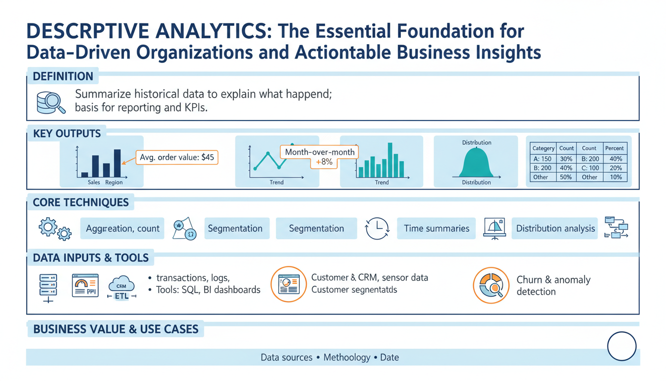
Building on this foundation, descriptive analytics anchors every data-driven program by turning raw event logs and transactions into a reliable ledger of what happened. Descriptive analytics tells you the who, what, when, and where — it compiles summary statistics, time-series trends, and cohort snapshots so stakeholders can see the state of the business. For SEO and clarity, we’ll use the keyword “descriptive analytics” up front because searchers often look for actionable overviews and practical patterns. When you need clear business insights available to decision-makers, this is the analysis you build first.
At its core, descriptive analytics is about aggregation and representation: rollups, averages, counts, percentiles, histograms, and simple visualizations that expose patterns in past data. Aggregation here means grouping raw records by dimensions (time, customer segment, product) and computing metrics that matter to the business, like monthly active users, median order value, or churn rate. We define a KPI as a repeatable, instrumented metric with a single canonical definition; that definition is critical because inconsistent KPIs wreck downstream trust. By standardizing how you compute metrics, descriptive analytics becomes a shared language across engineering and product teams.
You implement descriptive analytics with a small set of well-known techniques and tools: SQL-based aggregations in your data warehouse, in-memory DataFrame operations for ad-hoc exploration, OLAP cubes for fast multidimensional slicing, and dashboarding layers for distribution. A practical example in pandas shows the pattern you’ll use in many places: compute weekly revenue and customer counts by channel, then pivot for a dashboard.
df['week'] = df['timestamp'].dt.to_period('W')
summary = (df.groupby(['week','channel'])
             .agg(revenue=('amount','sum'), customers=('user_id','nunique'))
             .reset_index())
pivot = summary.pivot(index='week', columns='channel', values='revenue')
This code illustrates three recurring choices: which time grain to use, which dimensions to include, and whether to deduplicate users for customer counts. Those decisions directly affect downstream business insights.
How do you know when descriptive analysis is enough? Use descriptive analytics whenever the goal is monitoring, reporting, or establishing baselines. If a stakeholder asks, “What were revenue trends last quarter?” descriptive analytics supplies the authoritative answer. However, it has limits: descriptive results describe correlation and snapshots, not causes or future behavior. When you need root-cause explanations you move to diagnostic analytics; when you need forecasts you move to predictive models. Keep those boundaries clear in your data product contracts to avoid overloading dashboard consumers with actionable claims that the data doesn’t support.
A concrete real-world scenario clarifies the value: imagine an e-commerce team noticing a 12% drop in conversion. Descriptive analytics first isolates the signal—by device, geography, and traffic source—and establishes whether the drop is localized or systemic. We might discover that traffic from a specific ad campaign declined, or that mobile conversion fell during a particular release window. Those descriptive outputs feed the next step: targeted experiments, rollback decisions, or immediate prioritization of engineering fixes. In short, descriptive analytics converts noise into prioritized hypotheses.
Operationalizing descriptive analytics requires more than dashboards: you need instrumentation, data contracts, freshness SLAs, and drift monitoring so metrics remain correct and timely. Instrument events close to source, version metric definitions in code, and set up alerts for metric regressions; these practices keep business insights trustworthy and actionable. Taking this concept further, we’ll use these stable, validated metrics as the input layer for diagnostic and predictive analytics, which is where causal analysis and forecasting build on the foundation we’ve just described.
Business value and uses
Descriptive analytics is where the business starts to see itself clearly — summary metrics, cohort rollups, and trend lines that make the past material and measurable. When stakeholders ask for a single source of truth about what happened last week or last quarter, descriptive analytics gives you that authoritative ledger and reduces noisy debate. Because these outputs are repeatable and instrumented, they become the language product managers, engineers, and finance teams use to prioritize work and quantify impact.
The immediate business value shows up in decision velocity and risk reduction. For product teams, descriptive metrics like weekly active users, funnel conversion by acquisition channel, and feature adoption rates expose where to invest engineering cycles; for finance, reconciled revenue rollups and MRR cohort charts reduce accounting disputes and accelerate close cycles. Operations and SRE use simple aggregations — error rates, median latency, and request volume by region — to set paging thresholds and capacity plans. Marketing uses campaign-level granularity from these rollups to optimize spend and attribution windows without waiting for models.
You realize practical benefits faster when you treat metrics as products rather than ad-hoc outputs. Start by codifying canonical queries and publishing them in a metric registry so teams pull the same definition. For example, a compact SQL pattern for a weekly active users rollup looks like SELECT date_trunc('week', ts) AS week, COUNT(DISTINCT user_id) AS wau FROM events WHERE event_type = 'session' GROUP BY week; — that single, versioned query prevents divergent derivations and lets you build dashboards and alerts atop the same logic.
Operationalizing these outputs turns descriptive analytics into reliable tooling for automation. We version metric definitions alongside ETL code, enforce freshness SLAs on materialized views, and attach provenance metadata so consumers can trace a number back to source events. Configure automated anomaly alerts on top-level KPIs and couple them to runbooks and annotated dashboards; when an alert fires, the first responder should be able to see the canonical SQL, the data freshness timestamp, and recent schema diffs. This reduces mean time to diagnosis and prevents firefights caused by inconsistent definitions.
Which business workflows depend most on these summaries, and how do you convert them into prioritized work? Use descriptive outputs as triage trees: detect an anomaly, segment it by dimension (device, plan, geography), attach contextual metadata (deployments, campaign changes), then create a ticket with suggested hypotheses and data slices for investigation. That flow — detection, segmentation, annotation, and ticketing — turns noisy signals into reproducible experiments, A/B rollbacks, or prioritized bug fixes. Beyond triage, descriptive analytics supports contract billing (reconciling usage to invoices), compliance reporting (audit-ready aggregations), and capacity planning (forecast inputs and safety buffers).
Finally, treat descriptive analytics as the foundation for diagnostic and predictive work rather than the endpoint. These validated, versioned metrics become features for forecasting models, inputs for causal analysis, and checkpoints for model drift monitoring. As we move from describing what happened to explaining why and predicting what happens next, our investments in clean, reproducible descriptive analytics pay exponential dividends: they improve model quality, reduce investigation time, and keep decision-makers aligned on the same numbers.
Data sources and preparation
Descriptive analytics depends on the quality of the inputs, so start by treating source selection and preparation as design problems, not plumbing chores. Building on this foundation, choose authoritative sources that map to the business events you care about—transactional ledgers for revenue, session events for product engagement, and integration feeds for third-party attribution—and declare which table is canonical for each KPI. When you design upstream contracts, include the expected primary keys, time fields, and update semantics so downstream consumers know whether a record is immutable, append-only, or updateable; this clarity prevents divergent derivations of the same metric and reduces firefights over definitions.
Source type drives ingestion patterns and downstream transformations. If your primary source is an append-only event stream, you can tolerate eventual consistency and favor streaming pipelines for near-real-time rollups; if it’s a transactional OLTP table with updates and deletes, use change-data-capture (CDC) to preserve intent and avoid double-counting. Choose batch windows and watermarking rules based on business tolerance for freshness: nightly materializations for financial close versus sub-minute updates for operational dashboards. How do you decide between batch and streaming for a given metric? Match the SLA for decision-making—if the dashboard is used to trigger actions, prioritize lower latency and idempotent ingestion.
Canonicalization and schema design matter for analytic performance and interpretability. Define a canonical event schema with fixed field names (ts, user_id, event_type, event_id, source) and normalize where it aids joinability, but publish denormalized analytic tables for speed—pre-joined user profiles, product catalogs, and attribution windows reduce costly dashboard-time joins. Implement deterministic deduplication during transformation: for example, use ROW_NUMBER() OVER (PARTITION BY event_id ORDER BY processed_at DESC) = 1 to drop duplicates in SQL-based ETL. Version your transforms so the same pipeline run against the same source snapshot produces identical outputs; this lets us reproduce anomalies and audit metric changes.
Enrichment and identity resolution are where raw records become business-ready metrics. Enrich events with durable identifiers (canonical_user_id) by applying deterministic matching rules (email hash, SSO id) and fallbacks (device fingerprinting) while minimizing joins that explode row counts. Sessionize clickstreams with well-defined heuristics—30-minute inactivity windows or explicit session_start events—and compute session-level aggregates before rolling up to user metrics to avoid attribution errors. For privacy and compliance, hash or tokenize PII at ingestion and store mapping tables with strict access controls so analytics teams can work with derived identifiers without exposing raw data.
Handling late-arriving data and backfills is essential to keep descriptive outputs reliable. Implement watermarking and a reconciliation job that reprocesses affected partitions when late records arrive, and label metrics with a freshness timestamp and a “finalized” flag until windows are closed. Define clear backfill policies: allow safe backfills for correction windows (e.g., seven days) and require change requests plus review for longer reprocessing to prevent silent retroactive changes to dashboards. Track lineage metadata—source files, offsets, job versions—so you can trace an unexpected delta in a KPI back to a specific pipeline run.
Automated validation and monitoring prevent bad data from propagating into decision processes. Apply schema enforcement and expectations tests (null-rate thresholds, foreign-key existence, value ranges) as part of CI for ETL code, and fail builds when essential assertions break. Push data quality metrics—ingest latency, rejection rates, and schema drift—into a monitoring dashboard and wire alerts to the team owning the contract. We should version metric definitions alongside transformation code and include unit tests for edge cases (time zone changes, daylight savings, duplicate keys) to keep descriptive analytics trustworthy.
Operationalizing prepared datasets completes the loop from raw events to dependable insights. Materialize the curated tables or views used by dashboards, attach provenance metadata and SLA timestamps, and publish a dataset registry that documents owners, canonical SQL, freshness, and acceptable error budgets. When teams can quickly inspect the canonical query, freshness, and lineage for a metric, they move from arguing about numbers to acting on them. Taking these preparation steps ensures descriptive analytics serves as a stable, auditable input for diagnostic and predictive work we’ll build next.
Key metrics and KPIs
When your organization asks for a single truth about past performance, the hardest work isn’t the dashboard design—it’s selecting and codifying the handful of metrics that will guide every decision. In descriptive analytics we start by asking which measurements will change behavior and who will act on them, because metrics without clear actors become noise. Which KPIs should you prioritize for product, finance, and ops so that reports actually trigger action? Frame each metric by its decision context up front and you avoid creating dashboards that look informative but don’t lead to work.
A KPI must be a repeatable, instrumented metric with one canonical definition; treat all other numbers as exploratory metrics. That canonical definition includes source tables, joins, time zone handling, deduplication rules, and the acceptable freshness SLA—if any of these vary, the KPI has multiple meanings. Examples that become KPIs in most organizations are weekly active users (WAU), conversion rate for a funnel step, median request latency, monthly recurring revenue (MRR), and cohort retention at 30/90 days. We version those definitions in a metric registry and store the canonical SQL or view so every team reads the same number.
Metric design choices change interpretation more than analysts expect, so design deliberately around time grain, attribution window, and identity resolution. For example, choosing session-level versus user-level counting alters conversion rate denominators; a 30-minute sessionization rule can raise or lower funnel conversion by consolidating events. Similarly, using mean revenue versus median revenue masks versus highlights outliers—use percentiles when tail behavior drives risk. State these design choices in the metric contract so downstream users understand how the KPI responds to anomalies and releases.
Implement KPIs using patterns that make them auditable and efficient: materialized views or incremental tables for heavy rollups, change-data-capture (CDC) for updateable sources, and deterministic deduplication keyed on event_id. Attach a freshness timestamp and a finalized flag to each metric partition so dashboards can show provisional versus final values. Persist provenance metadata—source offsets, pipeline version, and the canonical query—so a surprised stakeholder can trace a delta to a specific job run instead of chasing speculation.
Operationalize monitoring and alerts around the metric, not just the pipeline. Define an SLO for metric freshness and acceptable drift, then wire anomaly detection that checks relative and absolute thresholds and dimensional spikes. When an alert fires, include the metric version, the recent trend slice, and the top contributing dimensions in the notification so responders can act immediately. Complement automated alerts with a short runbook: who owns the metric, which downstream reports to pause, and which rollback or mitigation steps to take while we investigate.
We treat metrics as products: assign an owner, enforce change review, and publish impact windows for backfills and redefinitions so teams can plan. Good governance reduces “metric surprise” where a remodeled ETL silently shifts KPIs and invalidates experiments. Taking this concept further, validated, versioned KPIs from descriptive analytics become the features and checkpoints for diagnostic and predictive work—so invest early in precise definitions and automated tests to scale trustworthy decision-making across the organization.
Visualization and dashboards
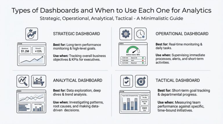
Dashboards often fail not because visualization libraries are weak, but because the underlying descriptive analytics are untrusted or misaligned with decisions. We build on the metric contracts and freshness SLAs discussed earlier: if the numbers feeding your visual layers aren’t canonical, the charts become noise. How do you ensure a dashboard leads to action? Start by treating each visual as a decision surface—show what a stakeholder needs to decide and nothing more, and surface provenance and freshness prominently so viewers can judge trust at a glance.
Design for audience, not for beauty. For executives you want top-line trends and directional confidence; for analysts you want drillable slices, distributions, and the canonical SQL behind the metric. Tie every visualization to a single, versioned KPI definition so users never wonder whether today’s WAU matches the finance report. We should place the metric’s finalized flag, last-processed timestamp, and the owning team next to the headline numbers so responders can immediately determine whether a spike is provisional or requires escalation.
Pick chart types that match the analytic question and expose failure modes. Use time-series with confidence bands for trend detection, stacked or grouped bars for ordered breakdowns, and violin or box plots when you need to show distribution and outliers rather than averages. For heavy-cardinality dimensions, use small multiples or top-N + “other” aggregations instead of a single overloaded chart. When runtime cost matters, precompute the aggregate you’ll visualize; an example materialized view for daily conversion might look like:
CREATE MATERIALIZED VIEW daily_conversion AS
SELECT date_trunc('day', ts) AS day,
       COUNT(DISTINCT CASE WHEN event = 'purchase' THEN user_id END) * 1.0
         / NULLIF(COUNT(DISTINCT CASE WHEN event = 'visit' THEN user_id END),0) AS conversion_rate
FROM events
GROUP BY day;
Engineering visuals for performance and reliability pays dividends in adoption. Pre-aggregate heavy rollups and store them as incremental tables or materialized views, push the most-accessed slices into a cache, and avoid runtime joins across large dimension tables. Limit dashboard query timeouts and provide sampled preview queries for ad-hoc exploration so analysts can iterate without blowing up the backend. When you expose interactive filters, enforce sensible default time windows and server-side pagination to prevent accidental full-table scans.
Interactivity must be purposeful: enable drilldowns that answer follow-up questions and wire each interactive path to rapid context. For instance, clicking a declining cohort should open a panel showing the last deploys, attribution channel shifts, and top-5 segments contributing to the delta. Annotate visualizations with deployment tags, campaign start/end dates, and unusual ingest events so causal investigation starts from evidence instead of speculation. We should also embed runbook links and the canonical SQL in the dashboard so the first responder has both the why and the how immediately available.
A concrete example ties these patterns back to the earlier e-commerce scenario. When conversion drops 12%, the dashboard should display the daily trend with a provisional flag, the top dimensions (device, geography, campaign), and a ranked list of contributing segments computed from a pre-aggregated rollup. It should also show recent deploy annotations and a quick link to the metric’s provenance so you can confirm whether the delta is a true business change or an ETL regression. That flow—detect, slice, annotate, act—keeps descriptive analytics from being noise and turns visuals into a triage engine.
Building visuals as part of the descriptive analytics product means we design for trust, explainability, and actionability from day one. When charts present canonical metrics, include provenance, and enable evidence-driven drilldowns, they accelerate decisions instead of creating debate. Next, we’ll use these validated visual outputs as the input features and checkpoints for deeper diagnostic and predictive work, connecting what happened to why it happened and what may come next.
Operationalizing and best practices
Building on this foundation, descriptive analytics must be operationalized deliberately if it’s going to drive reliable decisions rather than occasional insights. Start by treating descriptive analytics outputs as production-grade artifacts: canonical queries versioned in code, SLAs for freshness, and explicit data contracts that specify keys, time fields, and update semantics. How do you ensure metrics remain trustworthy in production? Define the contract, automate validation, and make ownership visible so teams can act without second-guessing numbers.
Instrument close to the source and enforce contracts upstream so downstream pipelines can be simpler and more deterministic. We recommend keeping instrumentation commits small and reviewable, and including schema assertions with each event change; a single-line SQL assertion like SELECT COUNT(*) FROM events WHERE ts IS NULL should fail CI if it regresses. For identity and deduplication, implement deterministic keys (event_id, processed_at) and use ROW_NUMBER() patterns in your transformations so re-runs are idempotent and reproducible.
Validate metrics through automated tests that run in your CI pipeline and on nightly builds. Write unit tests that re-run the canonical SQL against a fixed snapshot and assert key properties—no negative revenues, WAU changes within expected bands, and reconciliation back to raw ledgers—using thresholds for acceptable drift. For example, a regression test can assert that ABS(new_metric – baseline_metric) / NULLIF(baseline_metric,0) < 0.05; failing that check should open a ticket and block deployments until owners triage.
Operational pipelines should be designed for incremental, observable execution rather than opaque batch jobs. Use materialized views or incremental tables for heavy rollups, and prefer CDC (change-data-capture) where sources are updateable so you preserve intent and avoid double-counting. Canary ETL releases work well: deploy transform changes against a shadow dataset, compare outputs across dimensions, and only promote when differences are within agreed tolerances. For planned backfills, publish impact windows and expose a staging dashboard so consumers can see the delta before it lands in production.
Monitor both pipeline health and metric quality, because freshness alone doesn’t guarantee correctness. Define SLOs for latency (e.g., 15 minutes to materialization) and for accuracy (e.g., <1% drift vs. a reconciliation ledger) and surface both in alerting. When an anomaly fires, include contextual payloads—metric version, last-processed timestamp, top contributing dimensions, and the canonical SQL—so the first responder can decide to pause downstream reports, trigger a backfill, or roll back an ETL change. Pair alerts with short runbooks that list the owner, escalation path, and immediate mitigation steps.
Governance keeps change predictable and prevents “metric surprise.” Assign a metric owner, require change requests for redefinitions, and publish a metric registry that lists owners, provenance, and acceptable error budgets. Use review gates for metric changes: require consumer signoff, automated test coverage, and an impact statement that enumerates dashboards and alerts affected. For rapid experiments, use feature-flagged metric versions so you can measure the effect of new definitions in parallel without invalidating historical comparisons.
Scale and performance matter once dashboards move from exploration to operational workflows. Pre-aggregate high-cardinality slices, cache top-N queries, and serve heavyweight joins from denormalized analytic tables to keep interactive latency low. Embed provenance metadata and a finalized/provisional flag in every visual so viewers always know trust and recency. Taking these operational patterns together turns descriptive analytics into a dependable, auditable layer—one we can confidently use as the input to diagnostic and predictive systems we’ll build next.
