Load and Inspect Data
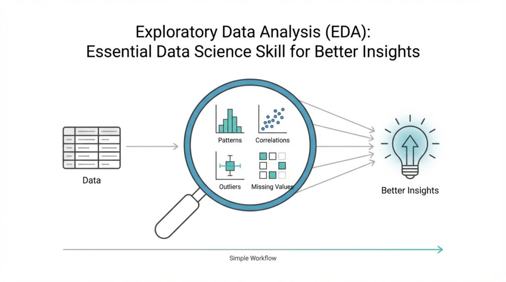
Building on this foundation, we now arrive at the moment where your raw file becomes a working dataset. In exploratory data analysis, or EDA, loading and inspecting data is the first real conversation you have with the material in front of you. You open the file, and instead of trusting that everything is tidy, you look closely at what actually came in. That first look matters because many later questions—why a chart looks strange, why a model behaves oddly, or why a summary seems incomplete—often begin right here.
Before we can draw insights, we need to know what we are holding. How do you know whether your data is ready for exploration if you have not checked its shape, columns, and types? Think of it like unpacking groceries before cooking a meal: you want to see what arrived, what is missing, and whether anything looks out of place. This is where exploratory data analysis starts to feel practical rather than abstract, because you are no longer imagining the dataset—you are meeting it.
The first task is loading the data into a format you can work with, such as a table, a dataframe, or a worksheet. A dataframe is a table-like structure that stores rows and columns, and it is one of the most common ways data scientists explore information. Once the file is loaded, we inspect the basic structure: how many rows there are, how many columns exist, and what each column appears to represent. This quick scan gives you a map of the terrain before you start walking through it.
Next, we look for the kinds of details that can quietly shape every later decision. Are the dates being read as dates, or as plain text? Are numbers stored as numbers, or accidentally treated like strings because of a stray symbol? These data types matter because they tell your tools how to interpret each value, and they tell you whether the dataset is behaving as expected. In exploratory data analysis, a column that looks correct at first glance can still hide a problem that changes the entire story.
This is also the moment to check for missing values, duplicates, and unusual entries. Missing values are simply empty spaces where information should be, and duplicates are repeated records that can make totals or averages misleading. If you imagine a guest list, missing names leave gaps, and duplicate names can make the headcount too high. When you inspect data carefully, you begin to spot these small inconsistencies before they grow into bigger analytical mistakes.
Once the structure looks sensible, summary statistics help you understand the dataset at a glance. These are simple measurements such as minimum, maximum, average, and spread, and they act like a quick weather report for your data. If one column has values that are much larger than expected, or if a supposedly numeric field contains impossible numbers, the summary will often reveal it. That is why loading and inspecting data is not busywork; it is the part of EDA that protects the rest of your analysis from false confidence.
At this stage, you are not trying to explain everything yet. You are gathering clues, building trust in the dataset, and noticing where the story might get complicated later. That careful first pass makes the rest of exploratory data analysis far more meaningful, because every chart, comparison, and pattern you explore afterward starts from a clearer view of the raw material. And once you know what is really inside the file, you are ready to move from reading the data to understanding it.
Clean Missing Values
Building on this foundation, we now face one of the most common turns in exploratory data analysis: missing values. These are the blank spots in a dataset, the places where information should have been recorded but was not. If the earlier inspection stage was about noticing what is there, this stage is about understanding what is not there, because those gaps can quietly shape every chart, average, and comparison we make.
How do you clean missing values in exploratory data analysis without distorting the story? That is the question we need to answer carefully, because not every empty cell means the same thing. Sometimes a value is missing because no one collected it, sometimes because the answer did not apply, and sometimes because a system failed to record it. Think of it like a recipe with a few absent ingredients: before we replace anything, we need to know whether the missing item is essential, optional, or intentionally left out.
The first move is to look for patterns, not just count blanks. If an entire column is missing too much information, that column may be too incomplete to help us, especially if the gaps are spread everywhere rather than concentrated in one place. On the other hand, if only a handful of rows are missing a value, we may be able to preserve most of the dataset with a small correction. In exploratory data analysis, this step matters because missing values can be random, clustered, or tied to a meaningful pattern, and each case calls for a different response.
Once we understand the pattern, we decide whether to remove or fill the missing values. Removing a row means deleting it from the dataset, which can work when only a few records are affected and the loss will not weaken the analysis. Filling a value, often called imputation, means replacing the blank with a reasonable estimate such as the average, median, or most common category. The median is the middle value after sorting numbers, and it often works better than the average when outliers, or unusually large and small numbers, would pull the mean in the wrong direction.
This is where data cleaning starts to feel like careful editing instead of mechanical repair. If you are working with a numeric field like income or age, the right replacement depends on the shape of the data and the meaning of the column. If you are working with a category like city or product type, you may use the most frequent value or a special label such as “Unknown” when that choice better reflects reality. The goal is not to make the dataset look perfect; the goal is to make it honest and usable for exploratory data analysis.
As we discussed earlier, every decision in EDA should protect the next step of analysis, and that is especially true here. After cleaning missing values, we need to check that the dataset still makes sense by reviewing row counts, summary statistics, and any columns we changed. A replacement that looks harmless at first can still shift averages or hide an important signal, so validation is part of the process, not an extra chore. When you ask what causes a result to change after cleaning, missing values are often one of the first places to look.
In practice, this is the quiet work that makes the rest of the journey possible. Clean missing values and you give your exploration a steadier foundation, because charts become easier to trust and patterns become easier to read. Leave them untouched, and they can blur the picture in ways that are hard to notice at first. That is why careful missing value treatment is such an important part of EDA: it turns uncertainty into something you can manage, and it prepares the dataset for the next layer of discovery.
Summarize Key Statistics
Building on this foundation, summary statistics give us our first real pulse check on the cleaned dataset. In exploratory data analysis, or EDA, these numbers tell us whether the data feels balanced, noisy, or suspicious before we ever draw a chart. How do you know if a column is behaving normally or quietly hiding a problem? You start by asking the data for a quick report: what is typical, what is unusual, and how wide is the spread around the center.
The most familiar place to begin is with measures of center. The mean, which is the average, gives us a general midpoint for a numeric column, while the median, which is the middle value after sorting the numbers, helps us see a more resistant center when extreme values are present. The mode, or most frequent value, is especially useful when a column contains categories or repeated numbers. Taken together, these summary statistics help you answer a simple but important question: what does the “usual” value look like in this dataset?
Once we know the center, we want to understand how far the values wander from it. That is where measures like the minimum, maximum, range, and standard deviation come in. The minimum and maximum show the edges of the dataset, the range tells us the distance between those edges, and standard deviation measures how spread out the values are around the average. If one column has a very large spread, we immediately know that the data is more varied and may need closer attention than a tighter, more consistent column.
This is also where summary statistics start acting like a safety net. A number that looks reasonable in the raw table can still stand out once we compare it against the rest of the column. For example, if most values cluster in a narrow band but one value sits far outside that band, the summary will make that jump visible. That is one reason EDA depends so much on summary statistics: they help us spot outliers, which are values that sit unusually far from the rest, and they often point us toward data entry errors, special cases, or genuinely important exceptions.
For a fuller picture, we often look beyond the single center and spread values and examine quartiles as well. Quartiles are the points that split sorted data into four equal parts, and they help us see how the lower, middle, and upper parts of the distribution behave. This is useful because two columns can share the same average but tell very different stories underneath it. One may be tightly grouped around the center, while another may be stretched out with long tails at one end, and those differences matter a great deal in exploratory data analysis.
Not every summary has to be numeric, either. When a column contains categories like product type, region, or customer segment, we can summarize it with counts and percentages instead of averages. A frequency table, which lists how often each category appears, quickly shows whether the data is balanced or dominated by a small number of groups. That matters because uneven categories can shape later conclusions, especially when one label appears far more often than the others and quietly drives the pattern we think we see.
So what do we gain from all of this? We gain a first-pass understanding of the dataset that is fast, practical, and surprisingly revealing. Summary statistics do not replace deeper analysis, but they give us a trustworthy starting point and help us ask sharper questions before moving on. Once these numbers make sense, we are ready to compare them with visual patterns and see how the story changes when the data is laid out in charts and distributions.
Explore Single Variables
Building on this foundation, we now narrow our attention from the whole dataset to one column at a time. This is where exploratory data analysis starts to feel like listening closely instead of skimming the room, because a single variable can reveal its own rhythm, quirks, and surprises. When you look at one variable on its own, you are doing univariate analysis, which means studying one feature, field, or measurement without comparing it to anything else yet. How do you read one variable clearly before the bigger relationships begin to appear? We start by asking what kind of variable it is and what shape its values take.
The first step is to separate numeric variables from categorical ones, because each speaks a different language. A numeric variable holds quantities, such as age, salary, or temperature, while a categorical variable stores labels, such as city, color, or product type. For numeric data, we often want to know whether the values cluster tightly, spread widely, or lean toward one end. For categorical data, we want to know which categories appear most often and whether a few labels dominate the field. That simple distinction keeps exploratory data analysis grounded, because one chart or summary style rarely fits every type of data.
For a numeric variable, the most helpful picture is often a histogram, which groups values into bins, or buckets, so we can see how often each range appears. A histogram is a little like arranging coins by size and noticing where most of them pile up. If the bars form a tall center with thin edges, the data may be fairly balanced; if the bars stretch out more on one side, the distribution is skewed, meaning it leans left or right rather than sitting evenly around the middle. This is a powerful moment in EDA, because a variable’s shape can hint at hidden behavior before we ask any deeper questions.
A box plot gives us a different kind of story. A box plot is a compact chart that shows the middle half of the data, the median, and possible outliers, which are unusually distant values that sit far from the rest. Think of it like a suitcase packed with the main items in the center and a few odd objects left outside. This view is useful when you want to compare the shape of a single variable quickly and see whether a few extreme values are pulling the story off balance. In exploratory data analysis, that matters because one unusual value can make a normal-looking column behave in a very different way.
Categorical variables need a different lens, and that is where frequency counts and bar charts come in. A frequency count tells us how many times each category appears, while a bar chart turns those counts into a visual pattern we can scan at a glance. If one category appears far more often than the others, we immediately see that the data is uneven, and that imbalance can affect later analysis. This is exactly why single-variable analysis is so useful: it helps us notice which labels are common, which are rare, and whether the column represents a broad mix or a narrow slice of reality.
At this stage, we are not trying to explain cause and effect yet. We are learning the personality of each variable, one by one, so the next steps in exploratory data analysis rest on firmer ground. When a column looks strangely lopsided, overly flat, or packed with rare values, we can pause and ask what might be driving that pattern. That question often leads to better decisions later, whether we are transforming a variable, grouping values, or deciding which columns deserve more attention. Taken together, these small observations turn a raw column into something we can actually reason about, and that is the quiet strength of exploring one variable at a time.
Compare Variable Relationships
Building on this foundation, we now move from looking at one variable at a time to seeing how two variables move together. This is where exploratory data analysis starts revealing relationships, not just descriptions, because a number rarely tells its full story in isolation. If one column is the character in a scene, two columns are the conversation between characters, and that conversation often explains much more than either voice alone. How do you compare variable relationships in a way that feels clear instead of overwhelming? We begin by choosing the right pair to compare and the right lens to view them through.
The first thing to notice is that not every relationship looks the same. Sometimes you want to compare two numeric variables, such as height and weight, or advertising spend and sales. Other times you want to compare a categorical variable with a numeric one, such as product category and revenue, or region and delivery time. In exploratory data analysis, that distinction matters because the comparison method should match the type of data, much like you would not use the same measuring cup for flour and water without checking the recipe first.
When both variables are numeric, a scatter plot is often the clearest starting point. A scatter plot places one variable on the horizontal axis and the other on the vertical axis, then lets each pair of values appear as a dot. You can think of it like laying breadcrumbs on a map and watching the trail form before your eyes. If the dots rise together, we may be seeing a positive relationship, where one variable tends to increase as the other increases. If the dots fall as one rises, that suggests a negative relationship, where one variable moves in the opposite direction. And if the dots seem scattered without a clear pattern, the variables may not be strongly connected at all.
This is also where correlation enters the picture. Correlation is a number that summarizes how strongly two numeric variables move together, usually on a scale from -1 to 1. A value near 1 suggests they rise together, a value near -1 suggests one rises as the other falls, and a value near 0 suggests little visible linear connection. But correlation should be treated like a helpful signpost, not the entire map. It tells us about association, not cause and effect, which means exploratory data analysis can hint at relationships without proving that one variable actually causes the other.
That caution matters because relationships can be trickier than they first appear. A curve may be present even when correlation looks weak, and a few extreme points may pull the pattern in a misleading direction. These unusual points are called outliers, and they can make a relationship look stronger, weaker, or more distorted than it really is. So while we covered outliers earlier in single-variable analysis, now we see their influence in context: one unusual customer, one odd transaction, or one rare observation can reshape the story between two columns.
When one variable is categorical and the other is numeric, we need a different comparison. A box plot is especially useful here because it shows how the numeric values are distributed within each category. Imagine comparing delivery times across different shipping methods: instead of staring at a long list of numbers, you can see which group tends to be faster, which has more spread, and which contains unusually high values. This kind of comparison helps exploratory data analysis move from “What does this column look like?” to “How does this group behave compared with that one?”
If both variables are categorical, the story shifts again. Now we often use a contingency table, which is a table that counts how often category pairs appear together, or a stacked bar chart to compare proportions. This is useful when you want to know whether two labels appear together more often than chance might suggest, such as whether certain customer segments prefer specific products. Here, the relationship is not about rising or falling numbers; it is about patterns of association, and those patterns can be just as revealing.
As we discussed earlier, exploratory data analysis is about asking the next smart question before jumping to conclusions. Comparing variable relationships helps you see whether a pattern is consistent, surprising, or fragile, and that insight often shapes every later step in the analysis. Once you can read how two variables interact, you are ready to explore the more complex picture that appears when several variables work together at once.
Visualize Key Patterns
Building on this foundation, we now turn the numbers into something your eyes can read at a glance. In exploratory data analysis, or EDA, visualizing key patterns is where scattered measurements begin to reveal shape, rhythm, and structure. You already inspected the data, cleaned missing values, summarized the statistics, and compared variables one pair at a time. Now we use charts to answer a deeper question: what story is the dataset trying to tell before we ever build a model?
How do you visualize key patterns in exploratory data analysis without getting lost in too many charts? The trick is to look for the few visuals that expose the most important behavior. A chart is like a flashlight in a dark room: it does not show everything equally, but it can quickly reveal where the important objects are sitting. We are not decorating the data here. We are trying to make patterns visible so we can notice trends, breaks, clusters, and surprises that might stay hidden in a table.
One of the most useful patterns to look for is change over time. If your dataset includes dates, a line chart can show whether values rise steadily, fall sharply, or move in waves. Those repeating waves are called seasonality, which means a pattern that comes back at regular intervals, like higher sales every weekend or more website visits every morning. When you see a line bend, spike, or flatten, you are learning how the data behaves over time, and that can reveal events or cycles that summary statistics alone would miss.
Another pattern worth watching is concentration. Sometimes data does not spread evenly at all; it gathers into small pockets that suggest groups with similar behavior. A heatmap, which is a color-coded grid, is especially helpful here because it lets you scan for areas of intensity without reading every value one by one. In exploratory data analysis, a heatmap can help you spot which variables move together strongly, or which parts of a table contain unusually high or low counts. Think of it like a weather map: the colors quickly show where the pressure is building.
When we want to compare many numeric variables at once, a pair plot can be useful. A pair plot is a set of small scatter plots arranged in a grid, so you can compare each numeric feature against the others in one view. This is helpful when you want to see whether several variables are forming a consistent pattern or whether one of them behaves differently from the rest. Instead of studying each relationship separately, you get a broad sense of the landscape, which is exactly the kind of overview EDA is meant to provide.
Sometimes the clearest pattern is not about individual values but about groups. A grouped bar chart or a faceted chart, which repeats the same chart for different categories, can help you compare segments side by side. This matters when you want to know whether one customer group behaves differently from another or whether one region is consistently ahead of the others. In contrast to the previous approach, where we focused on one or two variables, this kind of visualization helps you see how a pattern changes once the data is split into meaningful sections.
This is also where anomalies start to stand out in a more human way. An anomaly is a value or event that does not fit the pattern around it, and in a chart it often looks like a sudden spike, a deep drop, or a point sitting far away from the rest. You may already know from earlier steps that outliers can distort summaries, but visualizing them helps you see whether they are mistakes, rare events, or important signals. That distinction matters because not every unusual point should be removed; sometimes the exception is the most interesting part of the story.
As we discussed earlier, exploratory data analysis is about building confidence before making conclusions, and visual patterns are one of the fastest ways to do that. When a chart confirms the summary statistics, your trust in the data grows. When a chart contradicts them, you know to pause and investigate further. That is why visualizing key patterns is such a valuable step in EDA: it turns raw columns into meaningful shapes, and those shapes guide you toward the next question with much more confidence.