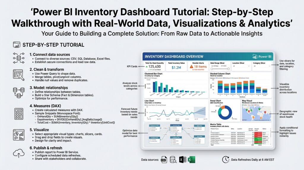
Define project goals and KPIs
Building on this foundation, start by translating business problems into measurable outcomes for the Power BI inventory dashboard: tie every visualization back to a clear project goal and two to four critical KPIs. This front-loading of objectives forces clarity about scope, data sources, and refresh cadence before you design a single report page. By stating project goals early, we reduce scope creep, speed iteration, and ensure the inventory dashboard delivers actionable insights instead of attractive but irrelevant charts.
Define outcomes using concrete, timebound language so stakeholders can judge success. Ask yourself and your sponsors: which KPIs will move the needle for your supply chain costs, customer service levels, and cash flow? A good project goal could be “reduce safety stock by 15% within six months while maintaining a 98% fill rate”; this maps directly to measurable KPIs (safety stock, fill rate, carrying cost) and a timetable for evaluation. Framing goals this way helps you prioritize dataset ingestion, transformation logic, and refresh frequency in Power BI.
Choose KPI definitions that are precise and computable from your source systems. Core inventory KPIs we routinely implement are on-hand quantity (real-time snapshot of stock), days of inventory outstanding (DIO, inventory depth expressed in days), fill rate (orders fulfilled vs. orders requested), stockout rate (percentage of SKUs with zero availability), inventory turnover (COGS divided by average inventory), and carrying cost (dollars tied up per SKU). Define each KPI in one sentence, identify the canonical table and key columns (SKU, location, date, transaction type), and record any business rules such as reserved inventory or in-transit stock treatment.
Plan the data model and calculation patterns with concrete examples so the metrics are unambiguous. For DIO we often compute a rolling average daily usage and divide average on‑hand by that usage, for example: DIO = DIVIDE([Average OnHandQuantity], [Average DailyUsage]). For fill rate we implement numerator and denominator as SUMs across a consistent date grain and then use DIVIDE to avoid divide-by-zero: Fill Rate = DIVIDE(SUM(‘Orders’[FulfilledQuantity]), SUM(‘Orders’[RequestedQuantity])). Establish whether calculations are computed in Power Query (ETL) or as DAX measures; prefer ETL for expensive aggregations and DAX for dynamic slicing.
Set targets, tolerances, and visualization rules before building the report so the dashboard communicates status at a glance. Attach target lines to trend charts, use color-coded KPI cards with conditional formatting (green/amber/red), and configure alert thresholds for high-priority KPIs (for example, flag DIO > 90 days or Stockout Rate > 3%). Decide which metrics are leading indicators (daily usage, incoming PO lead times) and which are lagging (turnover, carrying cost), and design interactions that let users explore root causes when a KPI trips a threshold.
Embed accountability and operational workflows into the KPI design so the dashboard drives action. Assign owners for each KPI, define update cadence (daily for operational KPIs, weekly/monthly for financial KPIs), and codify data quality SLAs for upstream systems. Use Power BI features like subscriptions, data-driven alerts, and drill-throughs to link a KPI breach to a playbook—who to notify, which report to inspect, and what corrective steps to start—so the inventory dashboard becomes an operational control, not just a reporting artifact.
With goals, KPI definitions, data model patterns, and action paths documented, you create a clear roadmap for development and validation. Next we’ll convert these definitions into a concrete data model and sample DAX measures, so you can validate accuracy against source-of-truth systems and iterate quickly on the Power BI inventory dashboard.
Collect and clean real-world data
Building on this foundation, the single biggest determinant of a trustworthy Power BI inventory dashboard is the way you ingest and sanitize real-world data before it ever hits your model. How do you ensure your inventory metrics reflect ground truth when source systems disagree on SKUs, units, or timestamps? Start by cataloging every upstream system (ERP, WMS, OMS, EDI feeds, handheld scanners, and IoT telemetry) and record canonical keys, expected update cadence, and tolerances for each feed. Front-loading this inventory of sources prevents late-stage surprises and makes your data quality SLAs actionable rather than aspirational.
Define canonical schemas for the three core domains you’ll consume: transactions (movements, receipts, adjustments), master data (SKU, location, unit-of-measure), and orders (demand, allocations, shipments). Use those canonical shapes as the target for your Power Query transformations so all pipelines converge on the same column names, types, and grain. Converting mixed date formats to a single UTC timestamp and normalizing units-of-measure into a base unit (for example, convert cases and pallets to individual units) are examples of cheap, high-impact fixes that save endless DAX work downstream.
When we implement ingestion pipelines, we choose incremental refresh and change-data-capture where possible rather than full reloads. Incremental approaches reduce load on source systems and make reconciliation easier because you can validate deltas instead of entire tables. In Power Query, prefer keyed merges and Table.Buffer for stable joins, and push heavy aggregations upstream in SQL or a dataflow to avoid moving millions of rows into the report layer. This is particularly important for inventory dashboards where daily transaction volumes can spike and degrade refresh times.
Cleaning rules should encode business logic, not guesswork. Normalize SKU aliases against a single master list, collapse location hierarchies into logical nodes (DC vs. store vs. crossdock), and flag reserved or in-transit quantities explicitly so your DIO and on-hand calculations exclude or include them per the KPI definition. For deduplication, use deterministic keys (transaction_id + source_system) and a last-modified timestamp; for conflicting records, prefer the source-of-truth system you documented earlier and create an audit column that records the resolution decision for later review.
Quantities are where dashboards diverge from reality fastest: returns, negative adjustments, and manual corrections break assumptions. Build validation rules that catch negative on-hand totals, sudden spikes beyond configurable thresholds, and mismatches between closing balances and the sum of movements. Reconcile daily aggregates against the ERP snapshot using a small SQL-backed validation job that compares expected closing balance = opening + receipts + adjustments − shipments; when the delta exceeds a tolerance, flag the SKU/location pair and attach the offending transaction IDs for rapid investigation.
Automate data quality checks so they run as part of the ETL pipeline and surface directly in the inventory dashboard or an operations view. Implement simple tests—row counts, null rate per column, foreign-key integrity to the master SKU table, and checksum comparisons for daily totals—and log failures to an errors table with timestamps and severity. You can also implement light anomaly detection (rolling z-score of daily receipt quantities) to catch upstream feed degradation before stakeholders notice KPI drift.
Optimize transformations for performance and downstream modeling. Push expensive windowed calculations into pre-aggregated tables or dataflows, use integer surrogate keys for joins, and prefer a star schema with fact_transactions and dimension tables for SKU, location, and calendar. Reserve DAX for interactive measures and time-intelligence; compute stable aggregates like average daily usage or historical lead times in ETL so your Power BI model stays responsive at slice-and-dice time.
Once your sources, rules, and tests are in place you’ll move into measure validation with confidence: we can compare DAX results to reconciled ETL aggregates and iterate on edge cases rather than chasing basic cleanliness issues. This preparation makes the subsequent steps—building the data model, authoring DAX, and designing visual alerts—far more predictable and defensible for both analysts and business stakeholders.
Model tables and relationships
Building on this foundation, the most common reason inventory KPIs drift from source-of-truth numbers is a mismatched model: wrong grain, ambiguous keys, or circular relationships that silently change filter context. If you open the model view in Power BI and see multiple bidirectional filters or facts joined directly to each other, you already have technical debt that will make DAX measures fragile. We must design a data model that enforces a single source of truth for dimensions (SKU, location, calendar) and keeps heavy aggregations in ETL so your inventory dashboard remains fast and auditable.
Choose a star schema as the default pattern because it clarifies grain and simplifies relationships. Center the model on a fact_transactions table that records every movement (receipts, picks, adjustments) at its natural grain: transaction_id, txn_date, sku_key, location_key, quantity, movement_type, source_system. Surround that with narrow dimension tables—dim_sku, dim_location, dim_calendar, dim_supplier—and a small dim_uom if you normalize units of measure. This layout makes common queries predictable: filter a dimension, push selection to the fact, and aggregate; Power BI performance and usability both improve when you avoid snowflaking complex hierarchies into the fact.
Create integer surrogate keys in ETL rather than relying on concatenated text keys inside the model. Convert natural keys (ERP_sku + site_code) into a single SKU surrogate in Power Query or your data warehouse, and use that integer for joins. Surrogates reduce memory, speed joins, and make composite uniqueness explicit; when you need to expose natural identifiers for auditing, keep them as attributes in the dimension, not as relationship keys. We also recommend materializing a canonical facts table for daily snapshots (fact_onhand_daily) so you can answer point-in-time questions without replaying the entire transaction history on every visual.
Be deliberate about relationship cardinality and cross-filter direction: prefer single-direction filters from dimension to fact for predictable filter propagation. Set the active relationship to the calendar on the date column you want most measures to use (for example, transaction_date or snapshot_date) and create secondary inactive relationships when you need alternate time semantics (ship_date, receive_date). Use USERELATIONSHIP in DAX to temporarily activate those alternate links for calculations; this keeps your model expressive without introducing ambiguous both-way filters that cause performance and correctness issues.
Modeling movements that reference two locations (from_location_id and to_location_id) requires a pattern instead of forcing two direct relationships to dim_location. Keep the movement fact with both foreign keys and create named measures that use USERELATIONSHIP to evaluate context-specific questions: which items are in-transit, which left a DC, or which arrived at a store. For many-to-many scenarios—SKU aliasing across systems or multi-assigned locations—use a small bridge table and enforce the business rule in ETL so that the bridge is deterministic; this prevents ambiguous aggregations and keeps the inventory dashboard trustworthy.
Shift stable, expensive aggregations into ETL or pre-aggregated dataflows: average daily usage, rolling lead-time percentiles, and historical on-hand snapshots are prime candidates. When you materialize fact_onhand_daily you avoid computing cumulative sums at report time and dramatically reduce refresh and visual load. Also add minimal surrogate indexes and partitioning in the source or Power BI dataflow when possible; model-level optimizations combined with incremental refresh make the difference between a responsive report and one that times out under operational load.
Put auditing columns and reconciliation keys into the model so every measure can be traced back to source rows. Include source_system, transaction_id, load_batch_id, and a reconciled_flag on any pre-aggregated fact; this gives you deterministic reconciliation queries (for example, closing_balance = opening + receipts − shipments) and speeds investigations when a KPI deviates from the ERP snapshot. How do you validate a suspect DIO number? Use the same model to pull transaction IDs for the SKU/location/date and compare against the ERP batch stored in your reconciliation table.
Taking this concept further, once the tables and relationships are stable we can author robust DAX measures and design interactions that surface root causes. A disciplined data model is the foundation for reliable time-intelligence, role-level security, and drill-throughs that actually point analysts to the corrective playbook you defined earlier. When your model enforces grain, uses integer keys, and isolates complex semantics in ETL or named measures, the Power BI inventory dashboard becomes an operational tool rather than a brittle report.
Create DAX measures for KPIs
Building on this foundation, the first step is to translate your KPI definitions into explicit, testable DAX measures so Power BI delivers the same business answers your stakeholders expect. You should start by declaring the calculation intent in plain language (numerator, denominator, time grain, inclusions/exclusions) and then implement that intent with DAX patterns that preserve filter context. How do you create DAX measures that remain correct across slices and time? Define each KPI as a single measure that encapsulates business rules and uses safe arithmetic functions like DIVIDE to avoid runtime errors.
Begin with stable building blocks: atomic measures that represent canonical aggregates (on-hand, receipts, picks, COGS). These measures become the primitives for higher-level KPIs and make debugging straightforward. For example, create TotalReceipts = SUM(Fact_Transactions[ReceiptQuantity]) and TotalShipments = SUM(Fact_Transactions[ShipmentQuantity]), then build FillRate = DIVIDE([TotalShipments],[TotalDemand]) so you keep numerator and denominator explicit and auditable. Using small, well-named measures also simplifies performance tuning because you can swap a measure implementation from a real-time transaction scan to a pre-aggregated table without changing dependent KPIs.
Time-intelligence is central for inventory KPIs like DIO and rolling usage, so implement period-aware patterns and snapshot-aware measures. When you need rolling averages use DATESINPERIOD or a materialized fact_onhand_daily and then compute AverageDailyUsage = AVERAGEX(VALUES(dim_calendar[Date]), [DailyUsage]) to ensure consistent granularity. For DIO you can then express the business rule directly: DIO = DIVIDE([AverageOnHandQuantity],[AverageDailyUsage]). When alternate dates matter (ship date vs. transaction date), use USERELATIONSHIP inside CALCULATE to activate the correct relationship rather than changing the model’s default filter propagation.
Performance matters as much as correctness for an operational inventory dashboard, so prefer measures that leverage pre-aggregated or snapshot tables and minimize row-by-row iterators on large facts. Use variables to compute intermediate values once: VAR Receipts = CALCULATE(SUM(Fact_Transactions[Quantity]), Fact_Transactions[MovementType] = "Receipt") RETURN Receipts. Avoid broad SUMX over the transaction table at report time when you can push that work to ETL or a daily summary. If you must iterate, constrain the iterator with FILTER on a summarized table (for example, SUMX(VALUES(dim_sku[SKUKey]), [PerSKUValue])) to limit cardinality and memory churn.
Validation and traceability turn measures into trusted controls rather than black boxes. Create reconciliation measures that mirror your ETL checks—for example, ReconciledClosing = [OpeningBalance] + [TotalReceipts] - [TotalShipments] + [Adjustments]—and expose a small diagnostics table in a hidden report page that surfaces deltas, source_system, and offending transaction IDs. For targets and thresholds, implement a TargetTable (disconnected) and a simple comparison measure like Status = IF([FillRate] >= SELECTEDVALUE(TargetTable[FillRateTarget]), "OK", "Action") so you can drive conditional formatting on cards and KPI visuals.
Finally, codify conventions and deploy measures with discipline so your inventory dashboard scales and remains auditable. Name measures with a clear prefix (M_ or KPI_), keep complex logic in intermediate measures, and version changes in your repository with comments describing business rule changes and test cases. Taking these steps makes drill-throughs, alerting, and root-cause exploration far more reliable; next we’ll apply these measures to visuals and design interactive diagnostics that surface why a KPI tripped, who owns the response, and which transactions to investigate.
Design visuals and interactive tiles
Building on this foundation, the visual layer should make the inventory dashboard’s decisions immediate: when a metric trips a threshold you want the user to see cause, owner, and next action within two clicks. Start pages with a clear visual hierarchy—big, high-contrast KPI cards for on‑hand, DIO, and fill rate, a trend line or sparkline beneath each card, and a prominent status color that matches the thresholds you defined earlier. Use the phrase Power BI and inventory dashboard early in the page so stakeholders immediately recognize context; readers judge the page by the top-left quadrant, so place the highest-priority KPI there.
Choose visuals that reveal the right level of detail at the right time rather than everything at once. A combination of single-number KPI cards, time-series charts, a heatmap for location density, and a focused table (matrix) for root-cause rows usually covers operational workflows. For example, pair a KPI card for Stockout Rate with a small-multiples bar chart broken down by warehouse and a matrix that exposes offending SKUs; this lets you go from a top-level exception to a per‑SKU investigation without leaving the page. Keep visuals consistent: use the same color mapping for statuses across charts so green/amber/red convey identical tolerances.
Interactions should be deliberate and predictable so users can pivot from alert to action quickly. How do you let an operations manager pivot from a top-line stockout alert to the exact SKU transactions? Implement cross-filtering, persistent drill-through pages, and a pre-built bookmark that sets slicers to “critical SKUs” and opens the transactions drill-through. Use synced slicers for global filters like site and date, and create report-page tooltips that surface last 7‑day receipts/picks for a hovered SKU. Avoid enabling unnecessary cross-highlighting on every visual; prefer explicit actions (buttons, bookmarks, or drill-through) for costly context changes.
Design your metric tiles—cards and compact charts—with traceability and action baked in. Show target lines on trends, attach the responsible owner and SLA in the card subtitle, and add a small action button that launches a filtered playbook page or external ticket creation URL. Implement a simple DAX status measure for conditional formatting, for example: Status = IF([FillRate] >= SELECTEDVALUE(Targets[FillRateTarget]), "OK", "Action") and then map that measure to the card background or border color. Use compact layout grids so each tile aligns to a 12-column system; consistent sizing reduces cognitive load when users scan dozens of SKUs or locations.
Performance and maintainability must guide visual choices for an operational report. Limit the number of visuals per page, prefer visuals that work against the pre-aggregated snapshot tables we discussed earlier, and avoid live iterators over the full transaction fact. Use report-level measures that reference fact_onhand_daily or summary tables instead of scanning fact_transactions in each visual. Also plan for progressive disclosure: expose a diagnostics page with detailed tables and transaction IDs rather than cluttering the main operations page. This preserves responsiveness in Power BI while keeping the inventory dashboard auditable and actionable.
Taking this concept further, design each visual and interactive card as an entry point to a prescribed workflow: the visual flags the problem, the tile explains who owns it, and the interaction surfaces the transactions to investigate. Integrate bookmarks, drill-throughs, and targeted tooltips so a user can move from insight to follow-up steps in under a minute. With consistent visuals, explicit interactions, and precomputed aggregates, we ensure the dashboard directs operational decisions rather than simply reporting them—next we’ll apply these patterns to a sample page layout and wire the playbook buttons to live actions.
Publish, refresh, and share dashboard
Building on this foundation, nothing makes a Power BI inventory dashboard useful faster than a disciplined approach to publishing, refresh automation, and sharing with the right audience. If stakeholders can’t access the report or the numbers are stale, your carefully built KPIs and reconciliations become academic exercises. We’ll walk through pragmatic choices you’ll face when you publish, how to design refresh patterns that match operational SLAs, and how to share dashboard access so teams can act without compromising security or performance.
Start your publish workflow by treating the workspace and app model as the deployment surface rather than the canvas. Publish the report from Power BI Desktop into a dedicated app workspace that mirrors your environment—Development, Test, Production—and use deployment pipelines or service-principal-driven automation to promote changes. This keeps versioning predictable, prevents ad-hoc overwrites in production, and makes it trivial to roll back when a DAX change causes metric drift. When you publish, set dataset credentials (gateway or service principal) and annotate the release with the KPI changes and reconciliation notes so auditors and operators can trace what changed between versions.
Design refresh patterns to match the operational cadence of the inventory KPIs rather than a one-size-fits-all schedule. How do you decide refresh cadence? Base it on KPI criticality: operational metrics (on-hand, stockout rate, allocations) often need hourly or sub-hourly refreshes via DirectQuery, composite models, or frequent incremental refresh; financial aggregates (carrying cost, turnover) can use nightly snapshots. Implement incremental refresh for transaction tables to limit load and speed recoveries; materialize fact_onhand_daily for point-in-time queries and configure partitions so refresh jobs update only recent windows. Also plan for source constraints—coordinate with ERP/WMS owners to avoid peak-hour heavy loads and document reasonable thresholds for delta sizes that trigger a manual reconciliation.
When you share dashboard access, embed governance into the delivery method so users get the right view for their role. Publish the report as an app to provide a curated, versioned experience and assign access via Office 365 groups or Azure AD security groups instead of individual sharing; this scales and simplifies audits. Use row-level security (RLS) for per-site or per-region visibility, and prefer app-level permissions over ad-hoc shares to prevent accidental data exposure. For operational alerting, wire data-driven alerts and email subscriptions to the KPI measures you defined earlier; subscriptions provide passive delivery while alerts push immediate notifications when thresholds breach, and both can include a link back to a filtered drill-through page with offending transaction IDs.
Operationalize refresh monitoring and error-handling so failures are visible and actionable rather than ignored. Pipe dataset refresh failures into a monitoring table or an incident channel (Teams/Slack) with the dataset name, failure reason, and last successful time; configure automated retries for transient gateway issues and escalate persistent failures to an owner. Use the refresh history and audit logs to correlate a failed refresh with upstream ETL changes—sometimes a schema drift in a dataflow causes a dataset break—and include the load_batch_id in your model to speed root-cause debugging. For deployments, use a service principal for CI/CD so automated flows can upload datasets and update dataflow parameters without tying to a user account that may expire.
Finally, align publishing and sharing policies with operational SLAs and the KPI ownership you already documented. Require a published release note for any change that affects KPI calculations, enforce incremental refresh for large transaction facts, and store a “why” field in the dataset metadata describing intended refresh cadence and owner. These controls keep the Power BI inventory dashboard reliable and auditable so analysts can focus on investigating exceptions instead of questioning data freshness. Taking these steps makes the dashboard a trusted operational tool and sets the stage for tuning visuals and drill-through playbooks in the next section.