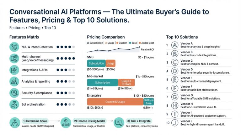
Why enhance bar charts
If your Power BI reports rely on basic bar charts, you’re leaving insight—and user attention—on the table. Readers scan dashboards quickly, and simple visual tweaks change whether they notice a trend or miss it entirely; enhancing bar charts improves readability and directs focus to the right signal. How do you turn a basic bar chart into something that drives decisions? We’ll show why investing a few design and technical minutes pays off in clarity, speed, and stakeholder confidence.
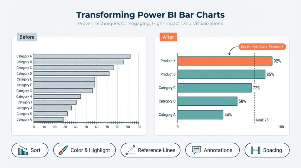
Well-designed bar charts improve perceptual accuracy and reduce cognitive load. Humans compare lengths far more reliably than areas or angles, so ordering bars by value, aligning labels to the baseline, and removing unnecessary gridlines let viewers interpret differences without extra mental work. For example, sorting a product-sales chart descending reveals top sellers at a glance, while a left-to-right time series ordered by time preserves temporal context; these are simple layout decisions that change who finds the insight first. This is fundamental data visualization hygiene that prevents misreading and supports faster action.
Enhancing charts isn’t cosmetic; it changes outcomes—faster decisions, clearer priorities, and fewer follow-up requests. In an operational dashboard, a sales manager scanning for regions with drops needs rank order, anomaly cues, and quick drill paths to detail—features that a plain chart rarely provides. Adding interactive visuals like tooltips showing month-over-month change, or conditional color that highlights declines beyond a threshold, converts passive plots into investigative tools. These additions reduce meeting time because teams arrive with answers rather than questions.
Power BI gives you technical levers—DAX measures, conditional formatting, and visual interactions—that let you make bar charts informative at a glance. Implement a dynamic percent-of-total label with a measure such as PctShare = DIVIDE(SUM(Sales[Amount]), CALCULATE(SUM(Sales[Amount]), ALL(Sales))) and expose it in a tooltip to avoid cluttering the axis. Use drill-through pages or bookmarks so a click on a bar surfaces transaction-level context without leaving the report flow. When you combine a small-multiples layout with synchronized axes, you preserve comparability across categories while keeping each view focused.
UX patterns matter: ordering, color scales, and labeling determine whether viewers see the signal or the noise. Choose categorical palettes with enough contrast for scannability and reserve saturated colors for exceptions or targets; use neutral tones for baseline bars so outliers pop. Show top-N plus an aggregated “Other” to avoid 30 tiny bars that obscure meaning, and add reference lines for targets or averages to anchor interpretation. Also watch performance—complex visuals with many interactions can slow page load; we balance richness with responsiveness by pre-aggregating with DAX or Power Query where appropriate.
Taking these principles forward, we’ll apply targeted techniques to transform charts into actionable visuals in the next section. We’ll implement DAX-driven labels, conditional color scales, and interactive tooltips step-by-step, and demonstrate patterns you can reuse across report pages. Building on this foundation, you’ll learn concrete patterns that make your Power BI reports both more persuasive and more dependable without sacrificing performance.
Choose the right bar
Power BI bar charts are the workhorse of categorical comparison, but choosing the right bar format decides whether viewers see the signal or the noise. Start by matching the visual to the analytic question: do you want to compare totals, show composition, or reveal change over time? Front-load that decision before you touch formatting, because orientation and aggregation shape perception more than color or labels. Building on our earlier points about ordering and perceptual accuracy, this initial choice prevents downstream rework and keeps your report performant.
Pick the bar type that aligns with the question you intend to answer. Which bar type best surfaces your signal? Use a vertical bar chart for discrete period comparisons where time is categorical (e.g., monthly campaign spend by channel), a horizontal bar chart when category names are long or rank matters (e.g., product list), a clustered (grouped) bar chart for side-by-side subcategory comparisons, and a stacked or 100% stacked bar when composition is the story (e.g., revenue by channel and device). Choose stacked only when absolute totals are less important than proportion; otherwise clustered bars preserve magnitude clarity and avoid misreading.
Orientation and sorting are not aesthetic choices; they control cognitive load and discovery. Sort by value to surface leaders, sort by time to preserve temporal literacy, and prefer left-to-right or top-to-bottom flows that match reading direction. For high-cardinality categories, implement Top-N plus an aggregated “Other” to avoid 30 tiny bars: create a rank measure like
RankBySales = RANKX(ALL(Sales[Product]), SUM(Sales[Amount]), , DESC)
and then filter or replace labels with a conditional IF(RankBySales <= 10, Product, "Other") before plotting. This pattern preserves context while keeping the chart scannable.
Axis scaling and grouping decisions determine whether comparisons are fair. When you show small multiples, synchronize axes so viewers make apples-to-apples comparisons; otherwise differences reflect scale, not behavior. Use a fixed axis range when comparing groups with similar maxima, and use dynamic ranges sparingly—dynamic axes can hide regressions. When composition matters, annotate stacked bars with percent labels driven by a DAX measure such as Pct = DIVIDE(SUM(Sales[Amount]), CALCULATE(SUM(Sales[Amount]), ALLEXCEPT(Product))) and expose the number in a tooltip to avoid cluttering the visual.
Color and conditional formatting should guide attention, not decorate it. Reserve saturated or brand colors for exceptions—targets, outliers, or selected segments—and render baseline categories in muted neutrals. Implement conditional color by returning a short category from a measure, e.g. ColorKey = IF([Value] < [Target], "Below", "OnTrack"), then bind that field to the color formatting in the visual or use the conditional formatting dialog to map hex values. Also consider performance: if you apply complex measures for each bar, pre-aggregate in Power Query or create summarized materialized tables so rendering remains fast for end users.
Choosing the right bar is a practical blend of analytic intent, perceptual rules, and technical constraints—so prototype early and validate with stakeholders. Building on this foundation, we’ll now implement DAX-driven labels, conditional color scales, and interactive tooltips step-by-step to make those chosen bars actionable in real dashboards. In the next section, we’ll translate these selection patterns into explicit Power BI recipes you can drop into your reports.
Prepare data and measures
Start by treating your data pipeline as part of the visualization design: the cleaner and better-aggregated the model, the fewer workarounds you’ll need in the visual. In Power BI, preparing tables, keys, and summary layers upstream reduces reliance on expensive row-by-row DAX measures and keeps bar chart rendering responsive. Front-load data typing, null handling, and basic aggregations in Power Query so reports can rely on concise DAX measures rather than complex transformations at render time. This saves both authoring time and runtime latency when you deploy dashboards to dozens or hundreds of users.
Normalize and shape your data to a star schema before you build visuals; relationships and lookup tables make DAX measures simpler and more performant. Create a dedicated Date table with continuous dates and mark it as the model’s Date table so time intelligence functions behave predictably. Reduce cardinality on the fact table by replacing text keys with integer surrogate keys and by pre-aggregating at the level your bar chart needs—monthly, weekly, or product-category—so a bar chart comparing thousands of SKUs won’t suffer from excessive distinct values. When you anticipate Top-N or “Other” buckets, compute that grouping in Power Query or as a materialized summary table rather than computing complex ranks at render time.
Decide carefully which calculations belong as measures versus calculated columns: measures are dynamic and context-aware, while calculated columns become persisted attributes used for slicing and coloring. Use measures for aggregations that change with filters (for example, TotalSales or MonthOverMonthChange) and reserve calculated columns for stable classifications like ProductSegment or RegionGroup. For example, compute a stable Top10Flag in Power Query if it rarely changes; compute a ranked label as a measure only when the ranking must react to slicer selections. This distinction keeps your bar chart DAX measures lean and predictable.
Write DAX measures with variables, defensive functions, and minimal context transitions to improve readability and performance. Use VAR to store intermediate results and CALCULATE only when you need to change filter context; prefer DIVIDE over simple division to avoid divide-by-zero errors. A practical pattern for a percent-of-total tooltip measure looks like this:
PctOfTotal =
VAR TotalAll = CALCULATE(SUM(Sales[Amount]), ALL(Product))
VAR ThisValue = SUM(Sales[Amount])
RETURN DIVIDE(ThisValue, TotalAll)
This keeps the measure simple, debuggable, and safe for use in tooltips and conditional formatting on a bar chart.
Handle missing and outlier values explicitly so the visual story isn’t distorted. Replace blanks with zeros where an absence implies zero activity, or expose NULLs in tooltip measures when absence is meaningful; use COALESCE or IF(ISBLANK()) to control presentation. For conditional formatting and color measures, return compact categorical keys (for instance “Below”, “OnTrack”, “Top5”) rather than long text, and map those keys to hex colors in the visual’s conditional formatting dialog to avoid recalculating colors repeatedly. These small choices prevent label clutter, preserve scan-ability on a bar chart, and keep the color logic centralized.
How do you keep visuals responsive when your dataset has millions of rows? Pre-aggregate using summary tables, enable Power BI aggregations and composite models when appropriate, and avoid iterator-heavy functions like SUMX over large tables in visuals. If you must use detailed measures, test them against representative datasets and use Query Diagnostics to find bottlenecks; often a single unnecessary FILTER or nested CALCULATE is the culprit. Building on this foundation, we’ll next implement the DAX-driven labels, conditional color scales, and interactive tooltips that make those prepared measures visible and actionable in your bar charts.
Style with colors and rules
Color is the fastest visual cue you have in Power BI bar charts, so use it to guide attention rather than decorate. Front-load your visual with a clear color strategy: muted neutrals for baseline bars, a single saturated brand color for positive targets, and a contrasting alert color for exceptions. This approach improves scan-ability and reduces cognitive load, letting viewers distinguish signal from noise in a single glance. We’ll show concrete rules and examples you can implement with DAX and conditional formatting to make those choices reproducible across reports.
Why do color rules matter beyond aesthetics? Color encodes meaning, and inconsistent application creates ambiguity: if red sometimes means loss and sometimes just a category, users learn the wrong mapping. Ask yourself: What single analytic decision do we want the color to answer—trend direction, performance versus target, or category membership? Defining that question upfront lets you pick between categorical palettes (distinct categories), sequential scales (magnitude), and diverging scales (positive vs negative), and keeps your Power BI bar charts interpretable across filters and pages.
Pick the right palette for the analytic intent. Use a categorical palette when you’re comparing non-ordered segments like product family; use a sequential scale when encoding magnitude such as sales volume; and use a diverging palette centered on zero or target when showing variance or change. For accessibility, prefer colorblind-safe palettes (for example, blue/orange contrasts) and reserve saturated reds or greens only for exceptions. Map palette choices to consistent semantic keys—Baseline, AboveTarget, BelowTarget, TopN—so the same semantics apply in tooltips, legends, and bookmarks.
Implement rules with compact DAX measures that return short keys, then map those keys to hex values in the visual’s conditional formatting dialog. For dynamic decisions that depend on filters, return keys from a measure like this example:
ColorKey =
IF([TotalSales] < [Target], "Below",
IF([RankBySales] <= 5, "Top5", "Baseline"))
Then create a second measure that translates those keys to hex when Power BI needs a color value (Format by -> Field value):
ColorHex =
SWITCH([ColorKey],
"Below", "#D9534F",
"Top5", "#0275D8",
"Baseline", "#AAB0B6",
"#CCCCCC")
This two-step pattern keeps logic readable and performant and separates semantics (keys) from presentation (hex codes).
Decide where to compute those keys: if the classification is static, prefer Power Query or a calculated column to avoid recalculation on every visual render; if it must react to slicers or date contexts, use a measure. Precomputing reduces CPU in complex reports and keeps interaction snappy. Also avoid returning long text values from measures—short keys or hex strings are faster and simpler to map in the conditional formatting UI.
Use gradients and diverging scales deliberately. A sequential gradient helps when you want readers to perceive magnitude across many bars, but gradients dilute categorical distinctions—don’t use them when you need precise category membership. Use a diverging scale when the center (zero, target, or baseline) is the interpretation pivot; this makes positive and negative deviations immediately visible. When combining percent-of-total labels or change measures in a tooltip, pair diverging color with data labels that show absolute values so users get both direction and magnitude.
Accessibility, annotation, and performance complete the rule set. Never rely on color alone—add icons, labels, or reference lines for critical states so colorblind or print-view users still get the message. Add a compact legend or single-line caption that explains color semantics (e.g., “Top 5 = blue; Below target = red”) and expose the color logic in a tooltip or help panel. Finally, test performance: run Query Diagnostics with representative datasets and move color-key logic upstream if rendering lags. Building these rules makes your Power BI bar charts predictable, auditable, and far more effective at directing decisions.
Labeling, axes, and annotations
Power BI bar chart design often breaks or succeeds at the level of labels, axes, and annotations—get these wrong and your insight hides, get them right and the dashboard guides action. Front-load labels and axis choices so viewers can read rank, magnitude, and variance in one glance: show concise data labels, clearly named axes, and targeted annotations for exceptions. We’ll focus on practical rules you can apply immediately to improve readability, discoverability, and interpretability without sacrificing performance.
Start by deciding what each label is meant to answer, because that determines placement and density. If you want magnitude comparison, surface absolute values on the baseline and use succinct axis tick formatting (K, M) so numbers don’t compete with category names; if you want composition or proportion, surface percent labels in tooltips and use smaller axis granularity. How do you keep labels readable when bars are crowded? Prioritize: shorten category names, use horizontal orientation for long labels, hide secondary labels behind interactions, or show values on hover rather than on every bar.
Axes control perception and must be deliberate—synchronize axes across small multiples, fix ranges when comparability matters, and reserve zero-start axes when magnitude is meaningful. Use a shared axis for side-by-side comparisons to prevent scale illusion; conversely, allow dynamic axes for a single exploratory view where relative change is the focus. Improve tick readability by grouping with units and using a single axis title that describes the metric and unit; concise axis titles reduce cognitive load and lower questions during stakeholder reviews.
Annotations and reference lines are the narrative tools that turn a bar chart from descriptive to prescriptive. Add a constant or measure-driven reference line for target, average, or threshold and label it with a short annotation explaining why it matters. For dynamic labels we prefer lightweight measures so the visual renders quickly; for example, a combined label measure you can place in a tooltip looks like this:
LabelTooltip =
VAR v = SUM(Sales[Amount])
VAR p = DIVIDE(v, CALCULATE(SUM(Sales[Amount]), ALL(Product)))
RETURN FORMAT(v, "#,0") & " (" & FORMAT(p, "0.0%") & ")"
This pattern keeps on-chart labels minimal while surfacing precise context on demand. Use annotations sparingly: a well-placed callout highlighting an outlier and its cause (promotion, stockout, policy change) guides next actions more than ten unlabeled flags.
Interactive annotations—tooltips, drill-through callouts, and conditional color keys—extend static labels without cluttering the visual. Map compact semantic keys (Baseline, BelowTarget, TopN) to hex colors via a measure and surface the semantic explanation in the tooltip so color isn’t the only cue. For accessibility and exportability, pair color with text and optional icons; for performance, compute classification upstream in Power Query or a summarization table when the logic is stable across slicers, and use measures only when the label must react to filter context.
Building on this foundation, treat labels, axes, and annotations as a single storytelling layer that supports your analytic question rather than an afterthought. When we implement DAX-driven labels, conditional colors, and interactive tooltips next, we’ll reuse these patterns so each bar chart communicates one clear decision: what changed, why it matters, and what to do next. Applying these principles consistently across Power BI reports reduces ambiguity, shortens review cycles, and makes dashboards reliably action-oriented.
Interactivity, tooltips, drilldown
Static bar charts answer a single question; interactive visuals let users follow the next one. Interactivity should let viewers pivot from signal to explanation without breaking flow, so we design controls that reveal context only when needed and keep the canvas clean. Tooltips and drilldown are the primary levers we use to convert a glance into investigation: tooltips surface precise context on hover, while hierarchical drill paths and drill-through pages let users move from aggregates to transaction-level detail. When you plan interactivity, front-load the analytic questions users will ask so every interaction answers a next-step question rather than creating noise.
Tooltips are micro-investigations embedded in the visual and should be treated as lightweight report pages you control. Build a dedicated tooltip page in Power BI with visual-level filters and use measures to present the metrics you want—summary value, percent-of-total, and a tiny trend. For example, a compact tooltip measure for value plus share looks like this:
TooltipSummary =
VAR v = SUM(Sales[Amount])
VAR p = DIVIDE(v, CALCULATE(SUM(Sales[Amount]), ALL(Product)))
RETURN FORMAT(v, "#,0") & " (" & FORMAT(p, "0.0%") & ")"
Place that measure on the tooltip page and set the bar chart to use the page as its tooltip; this pattern keeps the main chart uncluttered while surfacing exact context on demand.
Drill paths and drillthrough behave differently and we choose one depending on exploration depth. Use drilldown (hierarchy drill) when the question is “how did this aggregate distribute across levels?”—for example Year → Quarter → Month—because it preserves the visual frame and lets you compare levels quickly. Use drillthrough when the user needs a dedicated detail page—transactions, comment threads, or exception logs—because drillthrough can carry filters and give a full layout for analysis. When you implement drillthrough, add the target field to the Drillthrough pane and include a clear “Back” affordance; when you need the drillthrough to be context-aware across many slicers, consider a bookmarking pattern to restore global filter state.
How do you balance rich interactivity with performance? Prioritize measures and pre-aggregations that minimize row-level iterators during rendering. Tooltip pages are cheaper than adding many static small visuals to the main canvas because they render only on hover; similarly, prefer summarized tables or aggregation tables for common groupings so visuals don’t evaluate SUMX or heavy FILTER expressions over millions of rows. We also limit cross-highlighting breadth by disabling unnecessary interactions and using focused sync-slicers to avoid cascading recalculations across every visual on the page.
Design the content of interactive layers for progressive disclosure: the main chart gives the headline; tooltip gives the numbers and mini-trend; drillthrough provides root-cause context. For example, show a sparkline or compact column in the tooltip that uses a separate measure for recent momentum, and include a labeled reason field on the drillthrough page that surfaces known causes (promotion, stockout, price change). This layered approach helps you answer “What changed and why?” without crowding labels on the main bar chart and preserves accessibility by pairing color with text and concise annotations.
Building on these patterns, we’ll next convert these interaction designs into reproducible Power BI recipes using DAX measures, tooltip pages, and drillthrough templates so you can apply the same interactive strategy across reports. The next steps will show concrete implementation details—measure-by-measure and click-by-click—so you can deploy responsive, explainable bar charts that guide action rather than confuse it.