Dashboard Types Overview (thoughtspot.com)
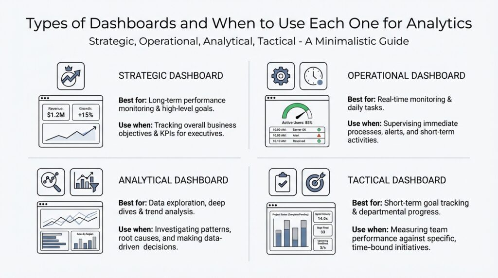
Building on this foundation, the easiest way to understand dashboard types is to picture them as different lenses on the same business. One lens helps you spot trouble as it happens, another helps you steer toward long-term goals, and another lets you pull the data apart to find the reason behind a trend. So when should you use a dashboard that updates every minute versus one that helps you think through a question? The answer depends on the decision you need to make, because different dashboard types are built for different jobs. Operational dashboards emphasize day-to-day monitoring, strategic dashboards focus on long-range goals, tactical dashboards sit in the middle, and analytical dashboards support deeper exploration.
Operational dashboards are the closest thing to a control room. They track current activity and real-time operational insights so teams can react quickly, which is why support, operations, IT, and logistics teams use them for things like ticket resolution time, uptime, or order fulfillment. Think of the arrivals board at an airport: you do not want a yearly summary there, you want the live status right now. That same idea applies when a warehouse manager needs to see orders stuck in the queue or a support lead needs to catch a spike in tickets before it grows. Because these dashboards are for fast action, clarity matters more than crowding them with every metric available.
Tactical dashboards are the bridge. They help team leads, project managers, and department heads track short- to mid-term goals such as monthly sales targets or campaign performance, so they can make course corrections before the quarter slips away. Strategic dashboards, on the other hand, zoom out to the big picture. They show executives and directors whether long-term objectives like revenue growth, customer retention, or market share are moving in the right direction. If the operational dashboard is your car dashboard and the tactical dashboard is your road trip map, the strategic dashboard is the compass that tells you whether you are headed toward the right destination.
Analytical dashboards are where curiosity gets room to breathe. Instead of focusing on a quick status check, they are built for filters, drill-downs, and custom queries so analysts and power users can explore trends, test ideas, and look for root causes. This is the dashboard type you reach for when the number changed and you need to know why it changed, not just whether it changed. It can show conversion rates by segment, customer lifetime value, or data quality patterns, which makes it valuable for investigations that need more detail than a status board can comfortably hold. The tradeoff is that analytical dashboards can overwhelm casual users if they are packed with too many options.
How do you choose the right one? Start with the decision rhythm. If people need to act now, choose an operational dashboard; if they need to guide a team toward a near-term target, choose a tactical dashboard; if they need to judge progress against long-term goals, choose a strategic dashboard; and if they need to investigate causes, choose an analytical dashboard. That way, the dashboard matches the conversation you want to have with the data instead of forcing everyone into the same view. When the type fits the job, the data feels less like a pile of numbers and more like a story you can move through with confidence.
Strategic Dashboards for Planning (thoughtspot.com)
Building on this foundation, a strategic dashboard is the view you reach for when you are planning where the business should go next, not when you are trying to fix what is happening this minute. Imagine you are sitting in a quarterly review, and the room is less interested in yesterday’s activity than in whether the company is moving toward its long-term goals. That is where a strategic dashboard earns its place. It turns broad business health into a planning dashboard that helps leaders see progress, spot drift, and decide whether the current strategy still makes sense.
What makes this kind of dashboard different is its pace and its purpose. An operational dashboard reacts to the present, but a strategic dashboard for planning looks ahead by measuring outcomes that matter over months or years, such as revenue growth, customer retention, profitability, or market expansion. Think of it like a compass rather than a speedometer: the point is not to tell you how fast you are moving, but whether you are still headed toward the right destination. When should you use a strategic dashboard? Use it when the question is, “Are we on track for the future we said we wanted?”
That future-focused view works best when the data is organized around a few high-level indicators, often called key performance indicators, or KPIs, which are the most important numbers used to measure progress against a goal. A good strategic dashboard does not drown you in detail. Instead, it brings together the signals that matter most to executives, directors, and planning teams, so they can compare actual results with targets without getting lost in the noise. This is why strategic dashboards often feel calm and uncluttered: they are designed to support decision-making, not to entertain every possible question at once.
The real value shows up when planning gets complicated, because business plans rarely fail in a dramatic moment. More often, they drift. Maybe customer retention is stable but not improving, or maybe sales are growing while profit margins quietly shrink. A strategic dashboard helps you catch those patterns early enough to adjust the plan before a quarter or a year passes by. In that sense, it acts like a trail map during a long hike: you do not stare at every rock on the path, but you do check whether you are still close to the route you meant to follow.
How do you build a strategic dashboard that people will actually use? Start with the decision it needs to support, then work backward to the metrics that prove whether the strategy is working. If the goal is growth, you might track new customers, average deal size, and retention together. If the goal is efficiency, you might focus on cost trends, margin, and productivity. The important thing is that every chart answers a planning question, because a strategic dashboard should make it easier to choose the next move, not just admire the numbers.
This is also why context matters so much. A single number can look encouraging or alarming depending on the goal beside it, so strategic dashboards usually compare current performance with a target, a previous period, or a forecast. That comparison gives leaders a clearer story: not just what happened, but what it means for the plan ahead. And unlike a deeper analytical dashboard, this view stays intentionally high level, because the job here is alignment. We want everyone looking at the same business priorities, not each person pulling in a different direction.
Taken together, strategic dashboards for planning act like a shared language for long-term decisions. They help leadership teams stay focused on the outcomes that matter most, keep strategy visible, and make course corrections before small misses become bigger ones. Once that lens is clear, the next step is to see how tactical dashboards turn those broad goals into nearer-term action.
Operational Dashboards for Monitoring (thoughtspot.com)
Building on this foundation, an operational dashboard is the view you reach for when the day is already moving and you need to see what is happening right now. Think of it like a control room screen: you are not there to admire the scenery, you are there to notice a signal, react, and keep things running smoothly. In practice, operational dashboards focus on day-to-day activity and immediate performance, giving teams real-time operational insights so they can respond quickly.
What makes this dashboard type so useful is its sharp focus. Instead of trying to answer every possible question, it shows the few numbers that tell you whether work is on track, such as ticket resolution time, system uptime, daily sales volume, or order fulfillment rate. A key performance indicator, or KPI, is just the important measurement you use to judge performance against a goal, and operational dashboards work best when those KPIs are easy to scan at a glance. That is why clarity matters so much here: if the screen gets crowded, people lose the ability to spot trouble fast.
So when should you use an operational dashboard? Use one when the question is, “What needs attention right now?” If a support team sees ticket volumes rise, a warehouse manager notices orders slowing down, or an IT team spots uptime dropping, the dashboard should make the problem obvious before it spreads. These dashboards are built for customer support, operations, IT, and logistics teams because those groups need to act on what is happening in the moment, not wait for a weekly summary.
The best operational dashboards feel calm, not noisy, even though they are watching a busy environment. They usually rely on live or near-real-time data, and they often include alerts, filters, and simple visualizations so people can move from “something changed” to “here is what changed” without extra delay. That might mean an alert when uptime slips, a filter for a specific region, or a chart that shows whether today’s order flow matches the normal pattern. The goal is not depth for its own sake; the goal is to surface exceptions early enough for someone to step in.
If you are building one, start with the decisions the team needs to make during the day and work backward from there. Ask which numbers truly warn you that a process is drifting, then keep the layout simple enough that a person can understand it in seconds. It also helps to connect the dashboard to current data sources and add alerts or shared notes, because fresh information and shared context are what turn a dashboard from a passive screen into a working tool for action. That same discipline is why operational dashboards stay different from the broader strategic view we covered earlier: they are about immediate response, not long-range planning.
Once that feels natural, the next step is easier to see: operational dashboards tell you what is happening now, while tactical dashboards help you use that short-term visibility to guide a team over the weeks and months ahead.
Tactical Dashboards for Team Decisions (thoughtspot.com)
Building on this foundation, a tactical dashboard is the view you reach for when the question is not “What is happening right now?” and not “Where are we headed in five years?” but rather, “Are we on pace to hit this month’s or this quarter’s target?” This is the dashboard for team decisions, because it gives managers and team leads enough detail to steer without drowning them in every data point. Think of it like a coach’s clipboard during a game: you are not rewriting the whole playbook, but you are making smart adjustments while the action is still unfolding.
That middle ground is what makes tactical dashboards so valuable. They take short- to mid-term goals and turn them into a clear, shared picture that people can act on together. A sales manager might watch pipeline progress, average deal size, and rep activity. A marketing lead might track campaign performance, lead quality, and conversion rates. A project manager might follow milestone completion, sprint progress, and workload balance. Each of those views supports a different team decision, but they all serve the same purpose: helping people course-correct before a small miss becomes a bigger problem.
How do you know when to use a tactical dashboard instead of an operational one? The answer comes down to the rhythm of the decision. Operational dashboards help you react in the moment, while tactical dashboards help you guide work over days, weeks, or a quarter. That means the tactical dashboard should be detailed enough to show progress and patterns, but focused enough that people can discuss it in a meeting without losing the thread. It is the bridge between day-to-day activity and long-range strategy, which is why it often becomes the shared language for department heads, project leads, and team managers.
The best tactical dashboards are built around measures that connect directly to action. A key performance indicator, or KPI, is the important number you use to judge progress toward a goal, and tactical dashboards usually center on a small set of KPIs that tell a story. Maybe the story is that demand is strong but fulfillment is slowing, or that a campaign is bringing in traffic but not enough qualified leads. Once those patterns are visible, the team can decide what to change next, whether that means reallocating effort, adjusting timing, or revising the target itself. Without that connection to action, the dashboard becomes decoration instead of a decision tool.
Context matters just as much as the numbers themselves. A metric on its own can be misleading, but a tactical dashboard usually pairs current performance with a target, a previous period, or a forecast so people can see whether they are ahead, behind, or holding steady. That comparison is what turns a chart into a conversation. When a team sees that weekly progress has flattened, for example, the dashboard does not need to explain every cause on its own; it needs to reveal where the team should look next. In that sense, tactical dashboards support team decisions by narrowing attention to the few signals that deserve a meeting, a message, or a course correction.
If you are building one, start with the decision the team needs to make this week or this month, then choose the metrics that make that decision clearer. Keep the layout readable, use plain labels, and group related numbers together so people can understand the story quickly. It also helps to include trend lines, comparisons, and brief notes about what changed, because that extra context makes the tactical dashboard feel less like a report and more like a working guide. The goal is not to impress people with complexity; the goal is to help them leave the room knowing exactly what to do next.
That is why tactical dashboards sit in such an important middle position. They translate broader goals into practical team decisions, giving managers a way to stay aligned without waiting for a quarterly review or reacting too late to a problem. Once you can see that rhythm clearly, it becomes easier to choose the right dashboard for the job and move naturally from daily monitoring into longer-term planning.
Analytical Dashboards for Exploration (thoughtspot.com)
Building on this foundation, analytical dashboards are what you reach for when the story behind the numbers matters more than the numbers themselves. Imagine you are staring at a sudden drop in conversions or a strange jump in costs, and the first question is not whether it happened, but why it happened. That is the space analytical dashboards for exploration are designed to serve, because they let you move from a surface-level signal into the layers underneath it. If operational dashboards are about watching the road and tactical dashboards are about steering the team, analytical dashboards are the map, compass, and magnifying glass all at once.
What makes an analytical dashboard different is its invitation to investigate. Instead of presenting a fixed set of answers, it gives you filters, drill-downs, and custom queries, which means you can narrow the data by region, time period, product line, customer segment, or any other lens that might reveal a pattern. A filter is a way to focus on one slice of the data, while drill-down means clicking from a broad view into a more detailed one. That combination matters because exploration rarely happens in a straight line; you start with one question, find an odd result, and then follow the trail until the reason becomes clearer.
So how do you use analytical dashboards in practice? You begin with a hypothesis, which is a working idea you want to test, such as “this decline is coming from one customer segment” or “the change started after a pricing update.” Then you compare slices of the data to see whether that idea holds up. Maybe the overall conversion rate looks flat, but one device type is slipping. Maybe revenue is stable, but one geographic market is carrying the decline. Analytical dashboards for exploration help you spot those hidden differences, which is why they are so useful when a single headline number is not telling the whole story.
This is where things get especially valuable for analysts and power users. A power user is someone who knows the data well enough to ask sharper questions and move through the dashboard with confidence, often without needing help from a separate reporting team. These users need room to compare cohorts, inspect outliers, and trace changes over time, because the real insight often lives in the exceptions rather than the average. Think of it like listening to an orchestra: the overall sound matters, but sometimes you have to isolate the violins or the drums to hear what is actually changing.
At the same time, analytical dashboards can become overwhelming if they try to do too much. Exploration works best when the layout encourages curiosity without turning into clutter, because too many charts, filters, or metrics can make the user lose the thread. That is why a strong analytical dashboard usually balances breadth and focus: enough detail to uncover root causes, but not so much noise that every question feels buried. When should you use one? Use it when the team is asking, “What caused this?” or “What patterns are we missing?” rather than “What is our status right now?”
The best analytical dashboards also make space for comparison, because insight often appears when you place one slice of data beside another. A change may look minor in the overall total, but it can become obvious when you compare new customers with returning ones, or this month with the same month last year. That is the heart of exploratory analysis: you are not looking for a single fixed answer, but for clues that help you understand the system more deeply. Once that understanding starts to form, the dashboard becomes more than a report; it becomes a working desk for curiosity, where each click can lead to a better question and, eventually, a better decision.
Choosing the Right Dashboard (databox.com)
Building on this foundation, choosing the right dashboard starts with one quiet but important question: what are you trying to help someone do with the data? If the goal is to choose the right dashboard, we do not begin with charts or colors; we begin with the decision itself. A dashboard is only useful when it matches the pace of the work, the people who will read it, and the kind of action they need to take. That is why dashboard types matter so much. The wrong view can make careful data feel confusing, while the right one can make a fast-moving team feel steady and informed.
The easiest way to narrow your choice is to think about timing. If people need to react to what is happening right now, an operational dashboard fits best because it keeps eyes on live activity and immediate exceptions. If the conversation is about this month’s progress or a quarter’s target, a tactical dashboard gives managers enough detail to steer the team without dragging them into every raw metric. And if the question is bigger, like whether the business is moving toward its long-term goals, a strategic dashboard keeps the focus on high-level outcomes. In other words, the dashboard should match the rhythm of the decision, not the other way around.
Audience matters just as much as timing. A dashboard for executives should feel different from one for analysts, because they are not walking into the same room with the same job. Executives usually need a calm, high-level strategic dashboard that shows direction, trend, and goal progress in a few clear signals. Team leads often need a tactical dashboard that helps them compare current performance with targets and decide what to adjust next. Analysts, on the other hand, usually need an analytical dashboard because they are trying to answer why something changed, not just whether it changed. Who will use this dashboard, and what question will they ask first? That question alone can save a lot of redesign later.
Data freshness is another clue that helps you choose the right dashboard. When a number changes minute by minute, like ticket volume, uptime, or order flow, the dashboard has to stay close to the source so people can respond quickly. When the data tells a slower story, like retention, profit trends, or campaign impact, the dashboard can focus more on patterns than on instant movement. This is where many teams get stuck: they build a dashboard that is technically impressive but practically awkward because it updates too often, or not often enough, for the job at hand. The best choice always respects the speed of the underlying process.
It also helps to ask how much detail the reader can use without losing the thread. A dashboard with too many metrics can feel like a crowded desk, where every paper seems important and nothing is easy to find. That is why the right dashboard keeps only the signals that support the decision in front of you. A strategic dashboard might show a handful of key performance indicators, or KPIs, which are the most important measures tied to a goal. An analytical dashboard might offer more filters and drill-downs because the user is prepared to explore. The more exploratory the task, the more room you can give the data.
So how do you choose the right dashboard in practice? Start by naming the decision, then name the user, then name the pace. If the decision is immediate, lean operational. If it guides a team over weeks or months, lean tactical. If it tracks whether the organization is on course for the future, lean strategic. If the team is searching for root causes, lean analytical. That simple sequence keeps the dashboard types aligned with the work, which is what makes the data feel useful instead of noisy.
A good dashboard does not try to do every job at once. It does one job well, and that clarity is what makes people trust it. When the dashboard matches the question, the audience, and the timing, the numbers stop feeling like a wall and start feeling like a path forward.