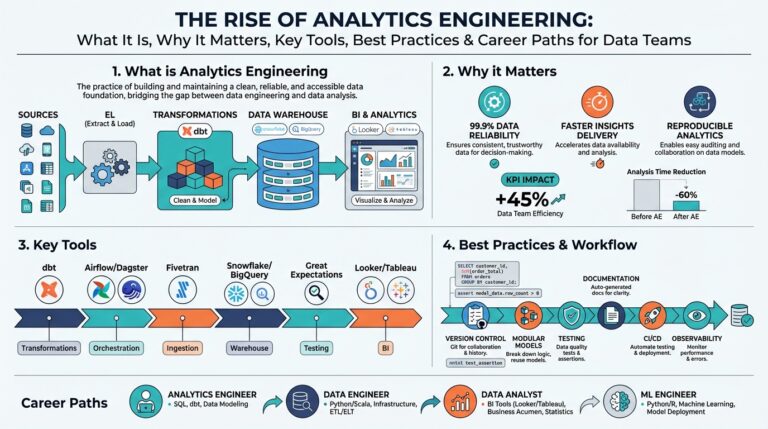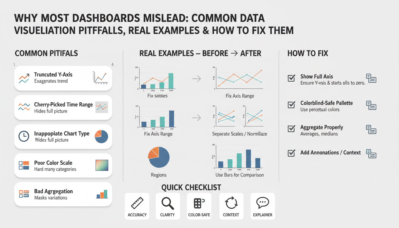
How dashboards mislead
Building on this foundation, dashboards and data visualization can feel like a single source of truth—but they often create false certainty instead. When you scan a compact interface and see green KPIs or an upward trend, you assume metrics are accurate and decisions safe. How do dashboards produce that false confidence, and what specific visualization pitfalls should you watch for? We’ll unpack the common failure modes, show real examples from product and analytics work, and point toward concrete fixes you can apply immediately.
A primary way dashboards mislead is through aggregation and sampling choices that hide important variability. Aggregating hourly data into a daily average might flatten repeated outages; sampling for performance can miss rare but critical events; smoothing (moving averages) can delay detection of sudden regressions. Moreover, mismatched joins and implicit NULL handling in queries change denominators and create phantom trends. These are not academic problems: when teams act on aggregated or sampled signals, incidents get ignored and bad releases stay live longer.
Consider a conversion-rate KPI that your growth team watches every morning. If the dashboard reports a 7-day cumulative conversion rate (conversions / clicks since Monday), a weekend spike can inflate Monday’s baseline and hide Monday-to-Tuesday drops. A simple SQL example illustrates the root cause: SELECT date, SUM(conversions)::float / NULLIF(SUM(clicks),0) AS conv_rate FROM events GROUP BY date; changing SUM() to a moving window or changing the GROUP BY timeframe materially alters the displayed number. In practice, we’ve seen stakeholders roll back releases because aRollingAverage masked a regression for three days; showing both raw counts and rates would have prevented that expensive move.
Visual encoding choices amplify cognitive bias. Truncated y-axes make small changes look dramatic; area and stacked charts obscure relative contribution when series scale differently; dual-axis charts create implicit correlations that aren’t validated. Color and saturation convey urgency—red makes you react, green makes you relax—so inconsistent color rules across dashboards create contradictory signals. These are classic data visualization pitfalls: the way you draw data is as influential as the data itself, so we treat visual encoding as a design decision that requires the same rigor as your schema.
Interaction and filtering behavior adds another layer of risk. Default filters that only show “active users” or preselected cohorts bake assumptions into every view and bias exploratory analysis. Hidden filters or poorly documented derived metrics (for example, excluding a non-trivial percentage of NULLs) mean two teams can truthfully report different numbers for the same KPI. If you can’t reproduce a number by running the query yourself, you shouldn’t be making product decisions from it.
Operational problems complete the failure chain: stale caches, delayed ETL jobs, and metric-definition drift create temporally inconsistent dashboards. A dashboard that refreshes hourly with stale materialized views will silently lag incidents; a business metric defined in a notebook but translated differently in an operational query causes ownership confusion. When you tie alerts or SLA gates to those dashboards, misalignment moves from annoyance to business risk.
To reduce harm, adopt a few practical rules. Display raw counts alongside rates, always show the time window and timezone, annotate dashboards with metric definitions and last-refresh timestamps, and add confidence intervals or error bars where sampling is involved. Make filters explicit and default to the least-assumptive view; version your metric definitions and treat them like API contracts. When you pair disciplined instrumentation with careful visual encoding and reproducible queries, dashboards become decision-support tools rather than persuasive artifacts.
These changes don’t require a visual redesign sprint; they require shifting how we instrument, document, and review dashboards as engineering artifacts. Taking this concept further, the next section will show implementation patterns and templates you can use to operationalize these practices across teams.
Choosing misleading metrics
Building on this foundation, dashboards, metrics, and KPI choices drive the decisions teams make every day — so picking the wrong measurements creates false certainty fast. When you select a metric without scrutinizing its denominator, time window, or filters, the dashboard will confidently display a number that doesn’t reflect the underlying behavior. Metric definitions must be explicit and versioned; otherwise stakeholders interpret the same KPI differently and you end up with competing truths. How do you know which measures are telling lies of omission versus useful signals?
Start by separating descriptive metrics from outcome metrics. Descriptive metrics summarize system state (for example, average session length or page views) while outcome metrics map directly to business impact (revenue, validated conversions, retained customers). If you optimize for descriptive metrics alone you risk optimizing an intermediate artifact rather than the outcome you care about. For instance, average session duration is susceptible to outliers and bot traffic; in many cases the median or trimmed-mean is a more robust choice, and you can compute it in SQL with percentile functions like percentile_cont(0.5) WITHIN GROUP (ORDER BY session_duration) to avoid misleading means.
Cohort and denominator drift are common sources of misinterpretation in retention and engagement KPIs. If your DAU/MAU uses ambiguous cohort membership or silently excludes inactive accounts, the ratio will look healthier than reality. Instead, define cohorts by an acquisition event and measure retention with fixed windows (e.g., 7-day, 30-day) so that you compare apples to apples across releases. A concrete pattern is to materialize a cohort table keyed by acquisition_date then compute cohort retention with a deterministic window: COUNT(DISTINCT user_id) FILTER (WHERE event_date BETWEEN acquisition_date AND acquisition_date + INTERVAL '7 days') / total_acquirers — this preserves reproducibility across dashboards and analysis notebooks.
Beware composite KPIs that stitch together multiple signals without exposing components. Goodhart’s Law applies: once a metric becomes a target, people optimize for the metric, not the underlying value. That creates gaming risk — support teams might reduce open-tickets to hit an SLA while customer satisfaction falls, or growth teams might inflate click counts through low-quality acquisition to lift conversion rates. We mitigate this by publishing components alongside the composite (for example, composite = 0.6*validated_success + 0.4*customer_satisfaction) and by adding guardrail metrics that raise alerts when components diverge from expected ranges.
Operational discipline converts better metrics into reliable dashboards. Treat metric definitions like API contracts: store them in a metric registry, run unit tests on your SQL/aggregation logic in CI, and include last-refresh timestamps on every tile. Instrument drift detection that alerts when denominators change more than a threshold, and log the lineage of derived metrics so you can trace a number back to raw events. When you pair automated tests with a documented metric contract, you prevent silent breaks from ETL changes and parameterized filters.
These practices shift the conversation from “what the dashboard shows” to “what the dashboard means,” and they set up the next step: implementing measurement patterns across teams. In the following section we’ll translate these principles into reproducible templates and CI checks you can drop into your analytics pipelines to reduce ambiguity and make KPIs trustworthy for real product decisions.
Wrong chart types
Building on this foundation, one of the fastest ways a dashboard turns honest numbers into convincing falsehoods is by choosing the wrong visual encoding for the question at hand. Data visualization and chart types are decision points, not defaults; picking a pie because it “looks nice” or a dual-axis because it fits two series on one tile creates misleading charts that persuade rather than inform. How do you decide which encoding preserves truth rather than distorting it?
Start by matching the encoding to the data’s measurement level and decision task. Use bars or dot plots for comparing discrete categories where rank and magnitude matter, and use line charts for continuous time series where slope and trend detection are the goal; these choices preserve perceptual accuracy because humans compare lengths and positions more reliably than areas or angles. Avoid pie charts when you have more than three slices or when small differences matter — angle and area are poor at communicating subtle proportion differences, so slices that look “small” can hide important segments of your cohort.
Understand the specific pitfalls of compound encodings. Stacked area charts and stacked bars encode cumulative totals well but obscure individual component trends when series scale differently; a low-volume segment can disappear into the stack while its relative trend flips wildly. Dual-axis charts (two y-axes) introduce an implied correlation because viewers read both series against the same x-axis despite different scales; unless you explicitly annotate units and transform one series (for example, normalize to z-scores) you’re inviting spurious interpretation. Define “dual-axis” on first use: a plot with two vertical scales mapped to different measures — it’s convenient, but statistically risky.
Replace deceptive encodings with alternatives that expose, not hide, data behavior. Small multiples (repeated identical charts faceted by category) let you compare shapes without forcing a misleading shared scale; a 3×3 grid of per-region time series surfaces regional regressions immediately. When magnitude and proportion both matter, show raw counts alongside normalized rates in the same panel (for example, left axis = count, right axis = percentage) but don’t combine them into a single stacked visual — instead, pair a bar chart of counts with a line for rate and clearly label units and scales. For geographic data, prefer choropleths of rates or per-capita metrics rather than raw counts, because population-weighted regions otherwise dominate the visual.
Use examples from product analytics to make the choice concrete. Suppose you monitor conversion by traffic source: a stacked area chart might show overall conversions rising while one channel collapses but is visually masked by larger channels. A small-multiples view of conversion-rate time series per channel or a grouped bar chart with confidence intervals surfaces the failing channel and its variance. Similarly, when plotting latency distributions, a violin or box plot (which shows distribution shape and outliers) is more informative than a single mean line that hides tail latency that breaks SLAs.
Practical rules you can apply now: prefer position-based encodings for precise comparison, avoid area/angle for subtle differences, and use faceting or small multiples whenever multiple series compete for attention. Provide interactivity that lets users toggle series, normalize scales, or switch from absolute to relative views — this reduces the cognitive load of interpreting complex visualizations. These chart-type decisions combine with the metric-definition and aggregation practices we covered earlier; when you choose the right encoding, you make dashboards tools for questioning data rather than amplifying misleading charts, and that sets us up to discuss implementation patterns for encoding choices and CI checks next.
Axis and scale issues
Building on this foundation, axis and scale choices are among the fastest ways a dashboard turns accurate data into persuasive but misleading stories. When you look at a chart the axis and scale determine the visual magnitude of every change, so small formatting decisions—y-axis baseline, tick spacing, or whether two series share a scale—can flip a calm trend into an alarm signal. We’ve seen stakeholders react to “dramatic” drops that were artifacts of a truncated y-axis or a misaligned scale on a dual-axis chart, and those mistakes cost time and poor product choices.
Human perception reads position and length far more reliably than area or color, so the primary rule is to make the axis encode the metric’s true magnitude. A concrete example: a conversion rate rising from 2.0% to 2.4% is a 20% relative increase but only a 0.4 percentage-point absolute change; if you start the y-axis at 1.9% that 0.4 point looks massive, whereas starting at zero clarifies the actual size of the effect. For counts and rates where absolute magnitude matters, default to a zero baseline and show raw counts alongside percentages; for change-focused views where relative movement is the signal, annotate the percent-change explicitly so users aren’t misled by visual exaggeration.
Dual-axis charts and mismatched scales introduce a second class of risk: implied correlation. Plotting latency (milliseconds) against throughput (requests/sec) on two y-axes invites viewers to assume behavioral coupling even when the scales make unrelated fluctuations appear synchronized. When should you use a log scale? Use log transforms for metrics spanning several orders of magnitude—error counts during an incident or request sizes across endpoints—because log compression preserves multiplicative relationships and reveals proportional change. However, log scales exclude zeros and negatives and hide small absolute shifts; in those cases show a complementary linear chart or highlight the minimum nonzero value and document the transform explicitly.
Practical display rules reduce guesswork and improve reproducibility. Always label units and time windows on the axis, annotate where you’ve truncated or transformed scale, and lock scales for faceted small multiples so readers can compare shapes rather than being fooled by different ranges. Prefer indexed charts (base = 100 at start-of-period) when the decision task is “how did this metric move relative to baseline” and prefer absolute axes when the task is “how big is this problem right now.” For dashboards that mix counts and ratios, place counts on a left axis and the derived rate on a clearly labeled right axis only when you also surface the raw numerator and denominator nearby.
Treat axis rules as code: instrument checks and guardrails in your visualization pipeline. In CI and review flows assert sensible defaults (bar charts start at zero, line charts document transforms), and add linting that flags dual-axis tiles lacking normalization or annotation. Automate unit tests that render every critical tile with a test dataset and verify axis ticks and labels, and bake a “reproduce this number” link that opens the raw query used to compute the series. These engineering controls stop accidental misconfiguration from reaching stakeholders and make charts auditable artifacts rather than one-off images.
Taking this concept further, apply these axis and scale practices consistently across your dashboards and pair them with the metric-definition and aggregation disciplines we discussed earlier. When you lock scales, document transforms, expose denominators, and automate checks, charts become question-starters instead of conclusions. In the next section we’ll translate these display rules into implementation patterns and CI templates you can drop into your analytics pipelines to enforce trustworthy visual encoding.
Color, labels, and context
Color, labels, and context are where dashboards persuade as much as they inform — and that persuasion can be accidental. When you scan a dashboard tile and see saturated reds or high-contrast greens, your brain shortcuts to urgency or safety; if the label omits the denominator, time window, or refresh timestamp you’re interpreting a number without necessary context. Building on what we discussed about axes and aggregates, this layer of visual semantics directly shapes decisions, so ask yourself: how do you choose a palette, annotation strategy, and label policy that communicate truth rather than elicit knee-jerk reactions?
Start with predictable, semantic color rules and stick to them across your dashboards. Define a limited palette where colors encode meaning — for example, a diverging scheme for positive/negative deltas and a sequential scheme for magnitude — and bind those schemes to metric types in a design token file. Use color-blind safe palettes and test with simulated desaturation; roughly 8% of men have red–green deficiency, so relying on hue alone is a risk. For example, declare CSS variables or visualization tokens like --metric-positive: #2b9a3e; --metric-negative: #d9534f; --neutral: #6c757d; and enforce those tokens in your chart renderer so color semantics remain consistent across tiles.
Labels are not an afterthought: they are the contract between visualization and consumer. Always expose units, denominators, time windows, and sample size in the visible label or hover text — Conversion rate: 2.4% (conversions/clicks, 7-day rolling, n=12,432, UTC) is vastly more useful than Conversion rate: 2.4%. When you show a rate, show numerator and denominator nearby; when you show an aggregate, annotate whether NULLs were excluded or whether smoothing was applied. These explicit labels remove ambiguity and make reproducing a number possible without digging through notebooks or asking the data team.
Context extends beyond static labels to metadata and annotations that explain why a number looks the way it does. Surface last-refresh timestamps, the sampling rate, and confidence intervals when sampling or probabilistic estimates are involved; if a tile is driven by a 1% sample, your visual should say so and show uncertainty. Annotate major events — deployments, A/B-test rollouts, marketing campaigns — directly on time series so viewers can map causes to effects. When teams missed this step we’ve seen them misattribute dips to product regressions when the real cause was a delayed ETL job or a campaign-driven traffic surge.
These three concerns — color, labels, context — must work in concert, not independently. Choose a palette and legend convention, then programmatically enforce label templates and metadata overlays in your dashboard library so every tile carries the same minimum telemetry: metric_name, unit, window, refresh, sample_size, link_to_query. Add linting to your visualization pipeline that fails tiles missing unit labels or a legend mapping color to meaning, and include a “reproduce this number” link that opens the underlying query with parameters. This is the operational approach that turns data visualization pitfalls into engineering requirements and prevents one-off stylistic choices from misleading stakeholders.
Taking this concept further, make these rules part of your dashboard governance and CI checks so color decisions, label templates, and contextual annotations are reviewed like any other change to production instrumentation. When we enforce semantic color tokens, require explicit denominator labels, and mandate context metadata on every critical KPI tile, dashboards stop being persuasive artifacts and become auditable decision tools. Next we’ll translate these practices into implementation patterns and CI templates you can drop into your analytics pipeline to enforce consistency and reduce accidental bias.
Practical fixes and checklist
Building on this foundation, start by treating every critical tile as a mini-service: give it a versioned metric contract, a reproducible query link, and a minimum metadata header that includes window, timezone, sample size, and last-refresh timestamp. Data visualization and dashboards are persuasive; we must make them auditable instead. Front-load these fields into the tile template so every new KPI requires the same information before it goes live. This small habit reduces “what does this number mean?” questions and forces engineers to think about denominators and time windows before stakeholders act.
For implementation, automate the metric registry and bind it to CI so metric definitions are code-reviewed and testable. We store metric definitions as JSON/YAML and generate both documentation and SQL from that single source of truth; when you change a denominator the diff is visible and reviewed. Include a unit test that runs the compiled SQL against a deterministic test dataset and asserts numerator/denominator invariants. Example test pseudocode looks like this:
-- test fixture run
INSERT INTO test_events (...) VALUES (...);
SELECT metric_value FROM compiled_metric('conversion_rate') WHERE date='2025-01-01';
-- assert value == expected
These checks catch silent definition drift and make metric definitions reproducible across dashboards, notebooks, and reports. When something fails, the PR must include a migration plan for downstream tiles.
On the visualization side, codify guardrails in your chart library so visual encoding choices are policy, not opinion. Define default axis behavior (zero baseline for counts, explicit transform for logs), enforce color tokens for semantically positive/negative states, and provide a small-multiples helper that locks scales across facets. We implement a dashboard-linter rule that flags dual-axis charts without explicit normalization and rejects tiles missing numerator/denominator labels. By moving visual encoding into reusable components, you avoid ad-hoc charts that exaggerate trends and make dashboards easier to review in code review workflows.
How do you ensure a metric change doesn’t break a KPI tile in production? Add smoke tests and visual regression tests to your CI pipeline: render every critical tile with a canned dataset and compare PNG/SVG snapshots or key summary statistics. Combine this with monitoring that checks tile freshness and variance thresholds; if a denominator changes by more than X%, trigger an alert to the analytics owner. Also version the dataset schema and run lineage checks so you can trace a displayed number back to raw events within a single click—this reduces time-to-diagnosis when stakeholders question a spike.
Operational hygiene completes the checklist: add runbook links, deployment annotations, and event overlays to time series tiles so users can map spikes to deployments or ETL incidents without asking. Ensure every tile exposes a “reproduce this number” button that opens the exact query with parameters pre-filled and a single-click link to the underlying raw data sample. Maintain a short dashboard-review cadence (biweekly for high-impact KPIs) and require cross-team signoff for any metric-contract change that alters downstream alerts or SLAs.
Taking these practices together, we turn design and instrumentation choices into engineering requirements that scale with teams. Implement the registry, CI tests, visualization tokens, and operational links as repeatable templates so new dashboards inherit trust by default. In the next section we’ll drop in concrete templates and CI snippets you can copy into your repo to enforce this checklist across projects and reduce the chance that a misleading visualization leads to a costly decision.