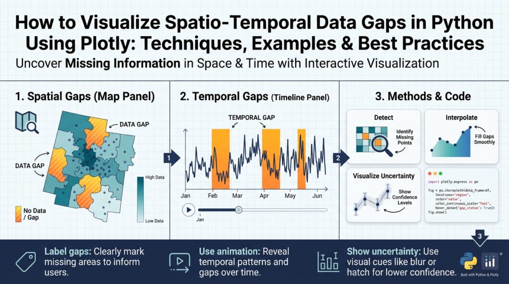
Why visualize data gaps
Missing observations in spatio-temporal datasets aren’t just an annoyance—they actively shape every downstream decision you make. In the first 100 words we need to be explicit: spatio-temporal data gaps in Python workflows can bias models, mask systemic outages, and wreck operational SLAs if left invisible. When you combine spatial sparsity with irregular time sampling, simple aggregate statistics become misleading and automated pipelines silently fail. Visualizing these patterns early with tools like Plotly helps you see where the data story breaks down before you build on top of it.
If you don’t visualize the absence of data, you can’t answer a basic question: how much should I trust this model or dashboard? Visual checks reveal whether missingness is random, seasonal, or correlated with external events—information that directly affects imputation strategy, sampling design, and model validation. For example, missing sensor readings that correlate with peak load times indicate non-random loss and demand different handling than randomly distributed dropouts. Asking how and when observations disappear is the practical starting point for robust analysis.
Spatial and temporal dimensions introduce distinct failure modes, so treat them separately and jointly. Spatial gaps show up as whole regions with no coverage—think dead zones in cellular telemetry or cloud cover in satellite imagery—while temporal gaps look like regular maintenance windows, daylight-only sampling, or network blips. Combined patterns matter: a coastal buoy that drops out every winter creates a spatio-temporal stripe that naive interpolation will misrepresent. Use this concrete framing when you audit your dataset: which locations, which time windows, and which covariates co-vary with missingness?
Visualization gives you an intuitive diagnostic language for those patterns. Heatmaps over time, spatial masks layered on map tiles, and interactive gap timelines make non-random structures immediately visible. In Python, Plotly lets you build linked views so you can click a region on a map and see its temporal missingness profile. A compact example: render a binary mask for each sensor across time and plot it as a heatmap to spot regular outages.
# pseudocode: binary mask heatmap with Plotly
import plotly.express as px
mask = df.pivot(index='sensor_id', columns='timestamp', values='is_present')
fig = px.imshow(mask, labels={'x':'time','y':'sensor'})
fig.show()
When you present these visualizations to product owners or operators, they become decision tools rather than diagnostic curiosities. A clear chart that highlights regions with repeated data loss lets you prioritize remediation—redeploy hardware, adjust sampling frequency, or negotiate retention SLAs. Visualization also helps quantify the cost of gaps: show how much coverage is lost during business hours, how many events fall into imputed ranges, or how many model predictions would be unsupported by ground truth.
Beyond operations, visuals guide rigorous analysis choices. They inform whether to impute, reweight, or exclude records; whether to change cross-validation folds to respect temporal gaps; and whether to propagate uncertainty from missingness into downstream forecasts. We should tag datasets with gap metadata (gap length, frequency, spatial extent) and expose those tags to feature engineering and model explainability layers. Visual inspection, then, becomes part of reproducible data provenance rather than a one-off sanity check.
Building on this foundation, the next section will show practical plotting patterns and Plotly code that let you move from discovery to action—turning visual insights about missingness into concrete remediation and modeling strategies. We will implement interactive maps, aggregated timelines, and linked heatmaps so you can both detect and prioritize the most harmful spatio-temporal blind spots in your data pipeline.
Install libraries and setup
Building on this foundation, the first practical step is a reliable local environment so you can quickly prototype spatio-temporal visualizations and iterate on detecting data gaps. You’ll want to set up a reproducible Python environment that isolates binary geospatial dependencies from your system Python; this reduces “it works on my machine” friction when you share figures or notebooks with colleagues. How do you get Plotly working with map tiles and large spatio-temporal datasets while avoiding dependency headaches? We’ll choose tools and install libraries with those constraints in mind.
Choose between a lightweight venv and a more robust conda environment depending on whether you need compiled geospatial libraries. If your work is mainly tabular time series and small GeoJSON overlays, a pip-based virtualenv or Poetry is fine and keeps things minimal. If you consume shapefiles, raster data, or packages that wrap C libraries (for example geopandas, rasterio, or pyproj), conda (or mamba) with the conda-forge channel dramatically simplifies installation and ensures compatible binary wheels. We prefer conda for production-ready pipelines and reproducible demos because it avoids runtime surprises when loading spatial indexes or projections.
Install a core set of packages that cover data manipulation, spatio-temporal processing, and interactive plotting. At minimum, install pandas and numpy for tabular transforms, xarray for labeled multi-dimensional arrays (handy for regular gridded time series), and dask for out-of-core workflows when datasets grow. For spatial work add geopandas, shapely, pyproj, and rtree or spatialindex to support fast spatial joins and polygon operations. For visualization install plotly (plotly.express and graph_objects are bundled), and optionally dash if you plan to build dashboards. Mentioning data gaps explicitly: you’ll also want parquet and pyarrow for efficient I/O of presence/absence masks and partitioned time-series, which make iterative plotting fast.
A concise install pattern that works well on most machines looks like this (conda + pip mix). Create and activate the environment first, then install core geospatial binaries from conda-forge and Python-only libs from pip.
# using mamba/conda (recommended for geospatial binaries)
conda create -n gaps-env python=3.10 -c conda-forge mamba -y
conda activate gaps-env
mamba install -c conda-forge geopandas rasterio pyproj rtree xarray dask pandas pyarrow jupyterlab -y
pip install plotly==5.* dash
After installation, configure Plotly for interactive work and map basemaps. By default, Plotly renders inline in JupyterLab with the appropriate renderer; set an explicit renderer so plots behave predictably across environments. If you want Mapbox basemaps for richer spatial context, obtain a Mapbox access token and set it as an environment variable (MAPBOX_TOKEN) rather than hard-coding it into notebooks. For quick maps you can use the built-in “open-street-map” style with no token.
import os
import plotly.io as pio
pio.renderers.default = "jupyterlab"
# set your token once in your shell, not in notebooks
# export MAPBOX_TOKEN="pk.xxx..."
os.environ.get("MAPBOX_TOKEN")
Prepare for scale by deciding on data formats and a testing strategy before you visualize large datasets. Store presence/absence masks as partitioned Parquet (by sensor, region, or month) or as compressed Zarr for gridded time series; these formats let you stream only the time ranges or spatial tiles needed for a given plot. Integrate Dask when you need lazy evaluation and distributed computation for aggregations that feed heatmaps or timeline summaries. Finally, we recommend validating the environment by running a small end-to-end notebook that loads a subset of your dataset, builds the binary mask we discussed earlier, and renders a quick Plotly heatmap—this confirms your setup and prepares you to scale the visual diagnostics in the next section.
Prepare spatio-temporal dataset
Building on this foundation, the first practical step is to make your spatio-temporal observations analysis-ready in Python so visualizations reveal true data gaps instead of artifacts. Start by aligning temporal axes, normalizing spatial references, and producing a presence/absence mask that explicitly encodes missingness; these three artifacts will power every Plotly chart and downstream metric you build. How do you know which transformations to apply first? We recommend a deterministic, reproducible pipeline: canonicalize time, canonicalize coordinates, derive masks and gap metadata, then materialize partitions for fast queries.
Normalize timestamps and sampling frequency early because inconsistent time indexing creates phantom gaps and misleading heatmaps. Convert timestamps to a single timezone and a pandas.DatetimeIndex (or xarray time coordinate) and decide whether you need regular resampling (e.g., 1-min, 15-min, hourly) or to preserve irregular sampling for event-based analysis; resampling means aggregating or up-sampling observations onto a uniform grid to make presence/absence explicit. Create a binary presence/absence mask (1 = observation present, 0 = missing) with a simple pivot: set the temporal axis as columns, sensor or tile as rows, and fill missing cells with 0. Example pattern in Python:
# pivot to presence mask
df['ts'] = pd.to_datetime(df['ts']).dt.tz_convert('UTC')
mask = (df.assign(present=1)
          .pivot_table(index='sensor_id', columns='ts', values='present', fill_value=0))
Canonicalize spatial references next so spatial joins and map overlays are trustworthy across datasets. Reproject all geometries to a single CRS (usually EPSG:3857 for web maps or EPSG:4326 for lat/lon) and simplify or buffer sensor footprints when necessary to avoid topology issues. If you operate sensors that report points but you need areal coverage (for example cell towers or weather stations), create a tile grid or hexbin that your analytics will use as the spatial join key; snapping points to a fixed grid reduces noise and ensures consistent aggregation for Plotly choropleths and mapbox layers. Use spatial indexing (rtree) to accelerate joins when working with thousands of geometries.
Build gap metadata alongside the mask so you can filter and prioritize during visualization. For each sensor or grid cell compute gap lengths, gap frequency, first/last outage timestamps, and the fraction of expected samples missing within sliding windows; these derived fields let you sort sensors by severity and color-code gaps in an interactive map. Implement gap detection with groupby and diff operations to find runs of zeros in the mask and then aggregate run lengths; store results as columns like gap_mean_length, gap_max_length, and gap_count. Persist presence/absence masks and gap metadata to partitioned Parquet or Zarr so Plotly dashboards can stream only the time slices or regions needed for a view, keeping interactivity responsive at scale.
Account for covariate-aware missingness instead of treating all blanks the same. When missingness correlates with external variables—seasonality, load spikes, or daylight—your visual diagnostics should expose that relationship by joining covariates to the gap metadata and creating indicator features (e.g., outage_during_peak_hours). This helps you decide whether to impute, reweight, or exclude affected intervals; for example, systematic dropouts during peak load should be handled as non-random missingness in model training rather than naive mean imputation.
Validate the prepared dataset with a small suite of sanity checks before plotting: sample random sensors and plot their mask slices, compute coverage histograms over weekday/hour buckets, and render a coarse spatial coverage map to detect registration errors. Downsample or aggregate long time axes for initial inspection to avoid browser overload, and rely on server-side aggregation (Dask or precomputed rollups) for interactive drill-downs. These validation steps reduce surprises when you build Plotly heatmaps, linked timelines, and spatial masks.
After these steps you’ll have a reproducible, queryable representation of presence and absence that feeds efficient Plotly visualizations and robust diagnostics. With canonical time and space, partitioned masks, and rich gap metadata, we can now focus on concrete plotting patterns—interactive heatmaps, timeline brushing, and linked map timelines—that let you both detect and prioritize the most harmful spatio-temporal data gaps in your pipeline.
Detect and quantify missingness
Spatio-temporal data gaps and missingness can silently sabotage models, SLAs, and operational decisions long before you visualize them. Building on the canonical presence/absence mask we created earlier, the first practical step is not plotting but measuring: we need reproducible, comparable metrics that turn absence into numbers you can sort, filter, and aggregate. By front-loading the problem with explicit metrics you avoid chasing visual artifacts and you give Plotly-driven dashboards concrete knobs for prioritization. How do you turn a messy time-series of blank rows into actionable severity scores for remediation?
Start by detecting temporal runs of absence at the unit level (sensor, tile, or cell). Compute per-entity statistics such as total_coverage_fraction (observed / expected), gap_count (number of zero-runs), gap_mean_length, and gap_max_length; these summarize whether missingness is episodic or chronic. For irregular sampling, normalize expected samples by a defined schedule (for example hourly or per event window) before computing coverage_fraction so that maintenance windows and true outages are distinguishable. These temporal metrics become the primary keys for drill-down filters in interactive heatmaps and timelines.
Compute gap runs programmatically so you can reproduce results across datasets and scale to thousands of sensors. For example, build runs by sorting timestamps, creating a binary present mask, then using a cumsum trick to label consecutive zero sequences and aggregating their lengths. A compact pandas pattern looks like this:
# assume df has columns: sensor_id, ts (datetime), present (0/1)
mask = df.sort_values(['sensor_id','ts'])
mask['gap_group'] = (mask['present'] == 1).groupby(mask['sensor_id']).cumsum()
gaps = (mask[mask['present']==0]
          .groupby(['sensor_id','gap_group'])['ts']
          .agg(gap_start='min', gap_end='max')
          .assign(length=lambda x: x['gap_end'] - x['gap_start']))
stats = gaps.groupby('sensor_id')['length'].agg(['count','mean','max']).rename(columns={'count':'gap_count'})
Measure spatial missingness with area-aware metrics rather than point counts when coverage matters. Compute spatial_coverage_fraction by rasterizing or snapping sensors to a tile grid (hex or square) and measuring the fraction of tiles with at least one sample in a time window; for areal sensors compute union area of active footprints and divide by the target region area. Use geopandas spatial indexes to accelerate these operations and precompute grids so Plotly choropleths can color-code tiles by coverage quickly. For systems with heterogeneous footprints (cell towers vs. weather buoys), a tile-based normalization makes cross-type comparisons meaningful.
Combine temporal and spatial metrics into a single severity score to rank and prioritize. For example, define severity = w1 * normalized_gap_max + w2 * normalized_gap_count + w3 * (1 – coverage_fraction) + w4 * outage_during_peak_hours, where weights w1..w4 reflect business impact; normalize components via z-score or min-max to keep scales comparable. Use this score to drive color scales in Plotly maps, to sort sensor lists, and to power threshold alerts that surface the worst offenders first. What should you remediate first? The highest-severity entities that also feature frequent outages during critical windows.
With numeric gap metrics in place you gain two concrete benefits for visualization and operations: you can filter noisy axes before rendering heavy heatmaps, and you can expose interpretable knobs in Plotly dashboards (color by severity, threshold by gap_length, time-window selectors). Persist gap metadata alongside partitioned Parquet masks so the UI can stream only the aggregates needed for a view and remain responsive. Taking this concept further, the next step is to wire these metrics into interactive Plotly patterns—linked heatmaps, brushable timelines, and map-based drilldowns—so detection immediately becomes prioritization and remediation.
Heatmaps, matrices and timelines
Spatio-temporal data gaps often reveal their structure when you view presence/absence as a dense grid rather than as scattered points; Plotly heatmaps, matrices and timelines give you that high-bandwidth view so you can spot recurring outages, seasonal stripes, and correlated failures immediately. How do you surface recurring outages across hundreds of sensors at a glance? Convert your binary presence mask into a matrix (rows = sensors or tiles, columns = time bins), then front-load sorting and aggregation so visual patterns map directly to operational severity. This approach turns abstract missingness metrics into a visual language you and stakeholders can act on.
Arrange rows and columns so the matrix tells a story rather than adding noise. Order sensors by a severity score or gap_max_length to surface the worst offenders at the top, or run hierarchical clustering on rows to group similar outage profiles; both approaches reveal whether missingness is systemic or localized. In practice, we sort the mask by severity and use a compact Plotly heatmap to render the binary matrix, keeping hover text focused on actionable fields (sensor id, time bin, gap run id). Example pattern:
# order sensors by severity and render a binary mask with Plotly
order = stats.sort_values('severity', ascending=False).index
mask_ord = mask.loc[order].to_numpy()
import plotly.graph_objects as go
fig = go.Figure(go.Heatmap(z=mask_ord, x=mask.columns, y=order,
                           colorscale=[[0,'white'],[1,'#1f77b4']]))
fig.update_traces(hovertemplate='sensor=%{y}<br>time=%{x}<br>present=%{z}')
fig.update_layout(height=800, xaxis_title='time', yaxis_title='sensor')
fig.show()
Use timelines to represent gap runs as intervals when you need temporal precision rather than a dense bitmap. Timelines (Gantt-style views) show gap_start and gap_end for each sensor so you can quantify run length, correlate outages with known maintenance windows, and highlight outages that cut across critical business hours. Transform the zero-runs you computed earlier into a gaps table and render it with px.timeline, color-coding by length or outage severity for quick triage. For example:
# gaps: DataFrame with columns sensor_id, gap_start, gap_end, length
import plotly.express as px
fig = px.timeline(gaps, x_start='gap_start', x_end='gap_end', y='sensor_id', color='length')
fig.update_yaxes(autorange='reversed')
fig.show()
Make interactive linking the default: clicking a map region should filter the matrix, and brushing a timeline should highlight rows on the heatmap. Plotly supports event-driven selection in notebooks and production via Dash callbacks; expose selections as sensor lists and stream their pre-aggregated masks (partitioned Parquet or Zarr) back to the client so the UI stays responsive. Use customdata and hovertemplate to surface gap_count, gap_max_length, and coverage_fraction directly in tooltips so product owners see impact metrics without context switching.
Scale and performance matter because raw matrices can be huge. Aggregate time into coarser bins for overview heatmaps and provide a drill-down mode for exact timestamps; downsample low-priority sensors or render only the top-N by severity. When you need dense rendering, prefer Plotly’s WebGL traces (Heatmapgl) or px.imshow over millions of cells, and compute server-side rollups with Dask or precomputed Parquet partitions to avoid shipping entire arrays to the browser. Persist gap metadata and serve slices on demand—this keeps interactive timelines and matrices snappy while preserving fidelity where it matters.
Taking this concept further, combine a choropleth or point map, a severity-sorted heatmap, and a gap timeline in a linked dashboard so you can pivot from spatial context to temporal detail in one click. As we discussed earlier, those linked views convert visual discovery into prioritization: you see where gaps occur, when they recur, and which entities deserve remediation first. Next we’ll implement concrete Plotly patterns and Dash callbacks that wire maps, matrices, and timelines together so detection immediately becomes action.
Map-based and animated visualizations
When spatio-temporal data gaps hide in plain sight, map-based and animated visualizations expose the who, where, and when that static tables miss. Building on the presence/absence masks and gap metadata we created earlier, you should use Plotly map traces to convert numeric severity scores into geographic context so stakeholders immediately see which regions lose coverage and when. Front-load the most important signals—coverage_fraction and gap_max_length—into map tooltips so product owners can evaluate impact without switching views. This approach turns diagnostic artifacts into operational priorities.
Map-based displays work best when you treat spatial elements as first-class citizens rather than adornments. Render tile-aggregated metrics (hex or square grid) as choropleths or shaded GeoJSON layers and overlay point sensors with scattermapbox so you can compare area-level coverage to individual outliers. For example, color tiles by severity (the composite score from earlier) and add sensor-level hover text with gap_count and outage_during_peak_hours to show whether gaps are systemic or localized. In practice this pattern helps you spot dead zones—cellular blackspots or buoy clusters with winter losses—and immediately tie them to remediation actions like redeployment or schedule changes.
Animated visualizations let you communicate the rhythm of outages across space and time: how often do gaps appear at 02:00 versus during peak hours, and where do those episodes travel? How do you communicate the rhythm of outages across geography and time? Plotly Express supports frame-based animation (animation_frame) for map layers so you can step through time bins and watch coverage expand and contract. Keep frames coarse for overview and provide a scrubber for drill-down; pre-aggregate per-minute or per-hour presence masks to frames to avoid sending raw timestamps to the browser. A compact pattern looks like this:
# aggregate mask to hourly coverage_per_tile then animate
fig = px.choropleth_mapbox(coverage_df, geojson='tiles_geojson', locations='tile_id',
                           color='coverage_frac', animation_frame='hour', mapbox_style='open-street-map')
fig.show()
Make map interactions the control layer for linked analyses rather than isolated visuals. Clicking a geographic region should filter the severity-sorted heatmap and timeline so you can pivot from spatial context to temporal detail; in Jupyter you can wire Plotly selection events to callback handlers, and in production use Dash callbacks to stream precomputed Parquet slices back to the client. Use customdata on map traces to carry sensor_id lists and gap aggregates; when a region is selected fetch only those sensors’ masks from partitioned storage so the heatmap and timeline remain responsive even with millions of rows.
Visual design choices profoundly affect interpretability when you’re showing absence rather than values. Use a perceptually uniform color scale for severity and reserve a distinct visual treatment (crosshatch, dot pattern, or a transparent “no-data” color) to show true absence so it isn’t mistaken for low-value signal. Choose linear or log scaling deliberately for metrics like gap_count, and annotate frames that overlap maintenance windows to avoid misclassifying expected downtime as failure. Always surface uncertainty: show fractional coverage with confidence bands or a toggled “uncertainty” overlay so decision-makers see both magnitude and reliability of the coverage metric.
At scale, performance considerations drive design. Reduce the number of animation frames, snap sensors to a grid for map aggregation, and compute server-side rollups with Dask or SQL before plotting. Prefer WebGL traces (scattergl, heatmapgl) for dense point clouds and use Mapbox vector tiles or pre-rendered raster tiles when you need rapid pan/zoom. Persisting presence/absence masks as partitioned Parquet or Zarr (as discussed earlier) enables on-demand streaming of only the time slices you animate or the tiles you render, keeping the UI snappy while preserving analytical fidelity.
Taking this concept further, treat map-based and animated visualizations as the operational interface of your missingness audit: they reveal where to prioritize fixes, when to change sampling, and which models require special validation. As we move into concrete Plotly patterns and Dash callbacks, we’ll implement these linked map, heatmap, and timeline patterns so you can pivot from detection to remediation with a single click.