Define purpose and audience
Imagine you’ve collected a pile of charts from your analytics tools and you’re staring at them wondering which ones actually move the needle. In moments like that, data storytelling becomes the compass that guides us: it’s the practice of turning numbers into a narrative that leads to action. Right away we need to decide why this story exists and who will read it — purpose and audience are the two guiding stars that keep your charts from becoming noise and help you create decision-driving insights from analytics.
Start by naming the purpose out loud. Purpose is the single, concrete outcome you want from the reader — for example, win budget approval, diagnose a drop in conversions, or set next quarter’s priorities. When we say “outcome,” we mean a decision or a next step, not a vague feeling. A Key Performance Indicator (KPI) is a measurable number that ties directly to that outcome; KPI stands for Key Performance Indicator and it tells us whether we’re succeeding. By defining the purpose first we make every chart, annotation, and sentence serve the same end rather than competing for attention.
Next, imagine the people who will open your one-page template or slide deck. Audience means the real humans with roles and constraints: executives who have little time, product managers who need root causes, analysts who crave details, and frontline teams who need to act. Think of tailoring like cooking for guests — a quick, rich stew for a tired executive; a plated tasting menu of details for an analyst. Ask yourself: how does this reader judge value? That question steers how much context we include, which visualizations we pick, and how bold our recommendation should be.
Now let’s connect purpose to audience in practice. If your purpose is to secure funding, highlight trend charts and forecast visualizations (a visualization is any visual representation of data, like a bar chart or line chart) that show momentum and the return on investment; if your purpose is to fix a process, surface diagnostic charts that compare segments and call out anomalies. Choose one clear headline — the single-sentence takeaway that answers “what should I do?” — and place it where the busy reader will see it first. This decision-driven headline becomes the spine for the rest of the page, and the charts become evidence rather than the story itself.
We don’t have to guess whether our choices land. Before finalizing, test the narrative with one representative person from the actual audience and watch what questions they ask. Ask three quick prompts: “What decision would you make after seeing this?”, “What number would you remember?”, and “What would make you hesitate?” Their answers reveal whether your purpose is clear and whether your charts create decision-driving insights. Iterate by pruning non-essential visuals, simplifying labels, and adding a one-line recommendation that connects the data to the desired action.
Taking these steps turns a scatter of analytics outputs into a focused message that can actually change behavior. By naming a specific purpose, picturing the audience as real people, and testing the short narrative, we make our charts work as instruments of decision, not decoration. With that foundation in place, the next step is to choose the story arc and craft the single visual and headline that will carry your recommendation forward.
Identify the decision to inform
Building on this foundation, imagine you and I standing in front of a map of charts and numbers, trying to pick the single turn that will change the journey. Right now you’ve named the purpose and pictured the reader; the next task is to be surgical about the actual choice you want those charts to prompt. In the world of data storytelling and analytics, a decision is not a vague impression but a concrete, named choice—approve spend, pause a feature, reassign headcount—and that clarity is what turns a page from informative into action-oriented.
Start by treating the decision like a question you’d ask at a meeting. A decision is the one-sentence ask that could be answered with a yes/no, a ranked choice, or a commitment to a next step; saying it out loud forces precision. For example, instead of “improve conversion,” say “increase paid search budget by 20% next quarter to reach 10,000 additional trial signups.” That kind of specificity connects your analytics to a real-world outcome and makes your one-page template easier to design because every chart becomes evidence for that exact ask.
Not all decisions are the same; categorize the type of choice to shape what evidence matters. Strategic decisions are long-term and high-impact—think CEO-level shifts in product direction. Tactical decisions are short- to medium-term trade-offs—reallocating a marketing channel for the next quarter. Operational decisions are day-to-day fixes—patching a broken ETL job or pausing a failing ad set. Recognizing the type tells us the time horizon, the acceptable risk, and which stakeholders need to be convinced. This matters because your analytics will prioritize different metrics depending on whether the decision is strategic, tactical, or operational.
How do you confirm the exact decision your page is meant to influence? Ask these plain-language questions: who signs the approval, what are the available options, when must the choice be made, and what would make someone say no? Turning the decision into a simple template sentence helps: “Approve X if metric Y is above/below Z by date T.” That template forces you to specify the KPI link, the threshold that changes behavior, and the deadline—three anchors that make a recommendation actionable rather than aspirational.
Once the decision is framed, map the evidence: which charts prove or disprove the ask? Think in terms of leading and lagging indicators. A leading indicator is a metric that signals future change (for example, signups per marketing touch that predict revenue), while a lagging indicator measures outcomes after the fact (like monthly recurring revenue). Choose at least one leading indicator to show momentum and one lagging indicator to show impact. Also identify the signal threshold—what pattern in the chart would flip the recommendation—and highlight that so your reader doesn’t have to infer it.
Put the human back into the loop by testing the decision statement and evidence with a single, representative reviewer from your audience. Watch whether they can answer: “What would you do now?” and “Which number would change your mind?” Their answers reveal gaps in causality, timing, or clarity. If they hesitate, prune supporting charts, simplify labels, or replace ambiguous trends with comparisons or cohort splits that expose the root cause.
With the decision clearly named, the rest of the page becomes choreography: pick the one visual that directly answers the question, place the decision-first headline so it meets the reader at the top of their attention span, and use the remaining space to show the smallest set of analytics necessary to justify the choice. This is exactly where the next step comes in—crafting the narrative arc and the single visual that will carry your recommendation forward—because once the decision is nailed down, telling its story becomes much easier and far more persuasive.
Collect and prepare data
Building on this foundation, imagine you standing at the gate of a kitchen where the meal you plan to serve is a decision, and the ingredients are numbers pulled from different places. The first step is to be ruthless about what we actually need: name the single KPI (Key Performance Indicator — a measurable number tied to the outcome you want) and two or three supporting metrics that prove or disprove the decision. Treat this like packing for a trip — only what serves the itinerary comes along — and in doing so we make data storytelling and analytics work together rather than compete for attention.
The next task is deciding which exact metrics to collect and why. Start by listing the evidence your decision needs: a leading indicator that signals change (for example, click-through rate per marketing channel) and a lagging indicator that shows impact (like revenue or churn). When you write these down, give each metric a short definition and the calculation formula so there’s no ambiguity: “conversion rate = trials / visits over 30 days.” This small discipline stops confusion later and keeps everyone aligned on what counts.
Now let’s talk sources and trust, because not all inputs are equal. How do you know which sources to trust? Treat a data source (a system or file that produces data) like a person you’ve just hired — check their credentials: freshness (how recent), coverage (what period), and consistency (how often fields change). If you rely on an ETL (Extract, Transform, Load — the process that moves and reshapes data between systems), confirm the transformation logic and timestamps so you understand how raw events became the numbers you’ll analyze.
Cleaning the numbers is where the work visibly pays off, so plan to spend time here and celebrate it as part of the craft. Data cleaning (fixing or removing incorrect, corrupted, or empty values) includes removing duplicates, handling missing values with explicit rules, and deciding how to treat outliers: investigate whether an extreme value is a true signal or a loader’s hiccup. Define your schema — the structure of the dataset, including column names and types — and keep it immutable for the analysis version so downstream readers never wonder what “users_count” meant.
Once individual datasets are tidy, we merge them thoughtfully, because joining different tables is like fitting puzzle pieces that were cut at different scales. Pay attention to granularity (the level of detail, e.g., per-session vs. per-user) and align time windows so comparisons are apples-to-apples. Derive any new metrics you need (for instance, cost per acquisition = ad spend / attributable signups) and store those derived fields alongside the raw ones — derivations are part of provenance and save a dozen “how did you get this?” questions at review time.
Make the process reproducible: build a small, versioned pipeline that runs the same steps every time and logs its checks. A pipeline (an automated sequence that extracts, transforms, validates, and loads data) reduces human error and lets you re-run analyses for different time ranges or assumptions. Add lightweight validation rules that fail loudly when totals change dramatically, and use quick visual sanity checks — a simple line chart or distribution plot will often reveal mismatches faster than row-counting ever will.
Finally, remember that clean, well-sourced data is a bridge to persuasive visuals and a clear recommendation. Before you craft the headline and single visual that will carry your ask, run the prepared dataset by one representative reader and ask: “What would you decide after seeing this?” Their confusion will highlight gaps in collection or preparation faster than any checklist. With the data properly gathered, cleaned, and documented, we can move confidently to shaping the story and selecting the one chart that answers the decision at hand.
Select clear visualizations
Imagine you’re holding the dataset you cleaned in the last step and a dozen possible graphics staring back at you like menu choices. You want a single image — or a tiny set of images — that makes the decision obvious, not mysterious. A visualization (a visual representation of data, like a bar or line) should act like a compass: it points to the answer the decision requires, highlights the threshold that flips your recommendation, and fits the reader’s time and tolerance for detail.
Building on this foundation, the first rule is pragmatic: choose visuals that directly answer the decision you named earlier. If the decision is about momentum, we want a visualization that shows trend and velocity; if it’s about allocation across options, we want clear comparisons. This is data storytelling in practice — the chart is evidence for a single, actionable claim — so every visualization you include must have a one-line role that ties back to the decision and the audience.
How do you pick the right chart to make a decision? Think of common chart types as tools with personalities: a line chart is a path that shows change over time; a bar chart is a scale for clear comparisons; a scatter plot shows relationships between two measures; a table gives exact numbers when precision matters. Use small multiples (a grid of the same chart sliced by segment) when you want to compare many similar groups without stacking everything into one confusing plot. Match the tool to the question: time-based questions want lines, ranking questions want bars, and causality or correlation questions often start with scatter plots.
Keep the visuals as simple as possible while preserving the signal you need to show. Remove decorative gridlines, redundant labels, and 3D effects that only make the reader work harder. Use color with purpose: one accent color to call out the signal or cohort of interest, neutral tones for background lines, and avoid palettes that imply ranking when none exists. Always label axes clearly, include units (for example, “users” or “conversion rate (%)”), and show the time window in the caption so a busy reader instantly knows what they’re seeing.
For decision-driven analytics, combine an aggregate view with one diagnostic split that could change the recommendation. Show both the raw counts and the percent change next to each other so the reader sees scale and momentum; show a cohort or channel breakdown when the root cause matters. If distributions matter (for example, whether conversions are concentrated among a few power users), surface a simple histogram or box plot — explain what the shape reveals in one sentence so the reader isn’t left guessing.
Treat clarity as an experiment: draft a single visual, then test it with a colleague who matches your real audience. Watch which number they remember, what question they ask first, and whether their decision matches yours. If they hesitate, prune: remove a secondary series, widen the font, or add a one-line annotation that points to the threshold that should trigger action. Iteration here is cheap and powerful — the right tweak can turn a polite glance into a confident yes or no.
Once a single, clear visual stands up to that quick test, place it at the top of your one-page narrative and use the remaining space for only the smallest set of supporting charts. With the decision as your lodestar, these visuals become evidence rather than decoration, and they prepare us for the next step where we craft the headline and narrative arc that carry your recommendation forward.
Craft concise narrative
Imagine you’ve been handed a stack of charts five minutes before a meeting and you need to turn them into a single, actionable message. In that pressure-cooker moment, data storytelling becomes the tool that keeps you steady: it’s how we turn raw analytics into a decision someone can actually act on. We’ll walk together from cluttered graphs to a tight, decision-first page that guides the reader to one clear next step, and along the way you’ll learn simple rules you can use again and again.
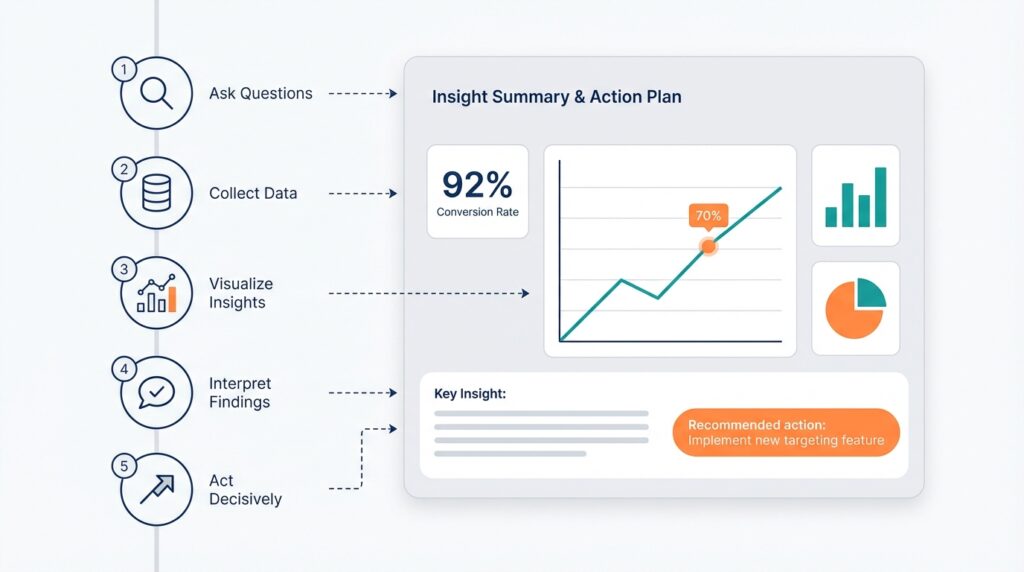
Start by treating the first sentence as your compass: a one-line takeaway that answers the question your reader came to the meeting to resolve. A takeaway is not a summary of observations — it’s the decision you want, stated plainly (for example: “Approve 20% additional paid search spend to add 10k trial signups next quarter”). Define any KPI (Key Performance Indicator — a measurable number tied to the outcome you want) you reference in that sentence so there’s no guessing about what success looks like. When you put the decision first, every chart and statistic that follows becomes evidence rather than noise.
Next, choose one visual that directly answers the decision and put it next to the takeaway; treat supporting visuals like footnotes, not co-stars. A leading indicator (a metric that signals future change, like weekly signups per campaign) shows momentum, while a lagging indicator (a result measured after the fact, like monthly recurring revenue) shows impact — name which is which in a single line. Also state the threshold that would flip the recommendation (for instance: “If weekday signups fall below 1,000, pause the campaign”), because a clear threshold removes guesswork from the decision. This small structure makes your one-page template feel like a short case: claim, evidence, boundary for action.
Writing the short context that connects the visual to the ask is where most people over-explain; we’ll be surgical. Limit yourself to two supporting sentences after the takeaway: one that explains the root cause in plain language and one that links the evidence to the recommended action. For example: “Search CTR dropped 18% after the creative update, reducing attributable signups; increasing bids on top-performing keywords recovered volume in prior tests.” Saying it this way shows causality without dragging the reader through every intermediate chart.
Think of the mini-narrative as a tiny movie with four beats: set the scene, show the surprise, present the proof, give the call to action. The scene is the KPI and time window (“This quarter’s trial signups, last 90 days”); the surprise is the change or anomaly (“down 12% vs. prior quarter”); the proof is the single chart and one sentence that explains why it happened; the call to action is the exact decision you want. Because we sequence ideas like a story, busy readers follow a logical arc instead of hunting for meaning across disconnected charts.
How do you know when a narrative is concise enough? Read it out loud and then cut half of the adjectives and any clause that doesn’t change the decision. Replace jargon with plain verbs, spell out acronyms once, and use one number as the anchor — the single figure you want the reader to remember. Test it quickly on a colleague who matches your audience and ask: “What would you decide now?” If their answer matches yours, you’re done; if it doesn’t, keep trimming until it does.
Building this skill makes your analytics work less like a slide deck and more like a decision engine. With a single decision-first sentence, one clear visual, and two explanatory lines, we turn charts into decision-driving insights that respect your reader’s time and still persuade. In the next section we’ll use this concise structure to pick the single visual and craft the headline that carries the recommendation onto the agenda.
Build one-page story template
Imagine you’ve stitched together the purpose, the decision, and the clean dataset and now need a compact, usable one-page template that turns all that work into action. A one-page template is a single-page layout used to present the claim, evidence, and ask so a decision can be made quickly; we’ll treat it as the control panel for your data storytelling — the place where numbers become decision-driving insights. Start by naming the KPI (Key Performance Indicator — a measurable number tied to the outcome) you want the reader to remember and place it where the eye lands first. Doing this up front keeps the page focused and makes your story reusable for future reports.