Define the Business Question
The most important moment in any data science project often happens before a single chart appears or a model gets trained: we pause and turn a vague need into a clear business question. Maybe a manager says sales are down, customers are leaving, or a process feels slow, but those are symptoms, not answers. A strong business question gives us a destination, like asking not “What happened?” but “What should we do next to improve retention?” That shift matters because data science becomes useful only when it is tied to a decision someone actually has to make.
A business question is a specific, decision-focused question that a team can answer with data and then act on. In plain language, it is the bridge between curiosity and action. If we skip this step, we risk collecting the wrong data, analyzing the wrong trend, or presenting results that sound impressive but change nothing. A business question keeps data science grounded in reality, where time, budget, and attention are always limited.
This is where beginners often feel the fog start to lift. Instead of asking, “How can we use data?” we ask, “What decision are we trying to improve?” That one sentence changes the conversation. Are we trying to reduce customer churn, which means customers leaving? Are we trying to increase conversion rate, which means the share of visitors who buy? Are we trying to cut delivery delays, which means making the service faster and more reliable? Each question points us toward a different answer, and each answer demands different data.
The best way to shape the business question is to make it concrete enough that a stranger could understand it without extra explanation. We want to know who is affected, what outcome matters, and over what time frame. For example, “Why are our customers unhappy?” sounds important, but it is too broad to guide analysis. “Which part of the checkout process causes first-time buyers to abandon their cart in the last 30 days?” gives us a sharper target, a clearer metric, and a more useful starting point. That is the heart of effective business problem definition: narrowing the fog until we can see a path forward.
As we refine the question, it helps to test whether it will lead to action. If the answer does not change a decision, then we may still be too early in the process. We can ask ourselves, “What would we do differently if the answer were yes versus no?” That question sounds simple, but it is powerful because it reveals whether we are solving a real business need or only satisfying curiosity. A good business question also names success in measurable terms, such as revenue, cost, speed, satisfaction, or risk, because those are the signals leaders use to judge whether a change worked.
There is also a human side to this step that is easy to overlook. The people who ask for analysis may describe a problem from their own point of view, while the people doing the data science work may see a different pattern in the numbers. Our job is to listen carefully, translate business language into analytical language, and then translate the findings back again. When we do that well, the business question becomes a shared map, not just a request handed to a data team.
By the time we have a clear business question, we have already done something valuable: we have turned a broad concern into a focused problem that data can actually address. That clarity saves time, sharpens analysis, and makes the final insight easier to trust. From here, the next step is to find the right data and decide whether it can באמת answer the question we have set in front of us.
Gather Relevant Data Sources
Now that we know the business question, the next challenge is picking the right data sources without drowning in everything that happens to be available. This is where data science starts to feel like gathering ingredients for a meal: not every item in the pantry belongs in the recipe, even if it looks interesting. We want relevant data sources, meaning the specific places where information lives that can help answer our question. If we choose well here, the analysis becomes clearer, faster, and much more trustworthy.
The first move is to look close to home. Internal data is information a company already collects, such as sales records, customer support tickets, website analytics, and data from a customer relationship management system, or CRM, which is software for tracking customer interactions. These sources often tell the story of what people did, when they did it, and how the business responded. If the question is about cart abandonment, for example, transaction logs and checkout events may matter more than a broad monthly report because they capture the moment the problem happened.
From there, we ask a practical question: which data sources can actually connect to the decision we want to make? This is a small but powerful filter. If a dataset does not describe the people, events, or outcomes tied to the business question, it may be interesting but not useful. A marketing team trying to understand retention might need subscription history, email engagement, and support interactions, while a logistics team might care more about delivery scans, route data, and delay reports. The shape of the question determines the shape of the data science work.
Sometimes the answer does not live inside the company at all, and that is when external data sources become useful. External data means information collected outside the organization, such as public demographics, weather records, industry benchmarks, or market trends. These sources can add context, much like looking outside the window before deciding what to wear. If late deliveries spike during storms, weather data may help explain a pattern that internal systems alone would miss.
As we gather relevant data sources, we also need to think about quality, timing, and detail. Quality tells us whether the data is accurate and complete, timing tells us whether it is recent enough to matter, and detail, often called granularity, tells us how finely the data is recorded. Hourly website visits can reveal a problem that monthly totals hide, while a survey collected once a year may be too slow for a fast-moving issue. Which data sources are worth using if one is precise but outdated and another is fresh but incomplete? That question pushes us to balance usefulness instead of assuming that more data is always better.
It also helps to remember that one source rarely tells the whole story. A single spreadsheet might show a drop in sales, but it may not explain whether the cause was traffic, pricing, seasonality, or something else. When we combine relevant data sources, we start to see the same event from different angles, like stepping back to view a room from several corners instead of standing in one spot. That broader view is often what turns a vague suspicion into a credible insight.
The goal at this stage is not to collect everything we can find. The goal is to build a focused set of data sources that match the business question, support the analysis, and leave room for confidence in the result. Once those sources are identified, we can start checking whether they fit together cleanly and whether they are ready to be used in the next part of the journey.
Clean and Prepare Data
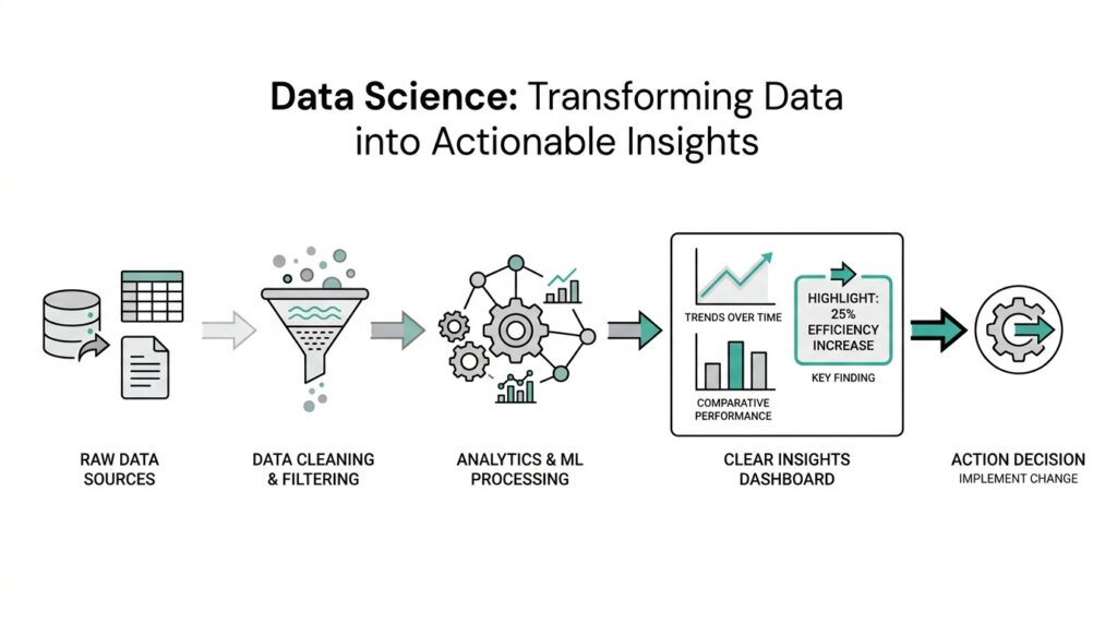
The moment we bring several data sources together, the story usually gets a little messy. One spreadsheet uses dates in one format, another calls the same customer by a different name, and a third has missing values where we expected a full record. This is where data cleaning and data preparation begin, and it is one of the most important parts of the whole journey. If we skip this step, even strong data can lead us into the wrong answer.
Think of it like setting a table before a meal. We do not eat the ingredients as they arrive from the market; we wash, sort, trim, and arrange them so the recipe works the way we expect. Data preparation works the same way, because raw data usually needs shaping before it can support analysis. How do you clean and prepare data for analysis? We start by looking for the places where the dataset does not match the real world we are trying to describe.
The first thing we usually check is whether the data is complete, consistent, and accurate. Complete means the important fields are filled in, consistent means the same thing is written the same way across sources, and accurate means the values make sense. A customer age of 240, for example, is probably an error, while a missing order date may make an entire transaction hard to use. During data cleaning, we look for these issues early so they do not quietly shape the results later.
From there, we deal with duplicates, formatting problems, and mismatched labels. Duplicates happen when the same record appears more than once, which can make a customer base look larger than it really is. Formatting problems show up when one system stores a date as 04/29/2026 and another uses 2026-04-29, or when one file says “NY” and another says “New York.” These may seem like small differences, but data preparation helps us turn them into one reliable language.
Missing data deserves special attention because it can change the meaning of an analysis. Sometimes a blank field means the information was never collected, and sometimes it means something failed during capture or transfer. We might fill in missing values, remove incomplete rows, or keep them and mark them carefully, depending on the situation. The key is to understand why the data is missing before we decide how to handle it, because different causes call for different fixes.
Then we begin shaping the data into a form that matches the question we want to answer. This may mean combining tables, creating new fields, standardizing categories, or converting messy text into numbers that models and reports can use. For example, if we want to study customer retention, we may need to turn raw purchase dates into time since last purchase. That kind of data preparation helps us move from a pile of records to a set of signals we can actually read.
This stage also asks us to slow down and check assumptions. If a number looks strange, we ask whether it reflects a real event or a data issue. If two sources disagree, we trace where the mismatch came from instead of choosing the first answer that looks convenient. Careful data cleaning builds trust, because the team can see that the analysis rests on records that were checked, aligned, and prepared with intention.
By the time the data is clean and ready, we have done more than tidy a file. We have protected the analysis from noise, confusion, and avoidable error. That gives us a stronger base for exploration, because now the patterns we see are more likely to reflect the business reality we set out to understand. From here, we can start turning those prepared records into charts, comparisons, and questions that reveal what the data is trying to tell us.
Explore Patterns and Trends
Now that the data is clean, we can begin the part of data science where the numbers start telling a story. This is where we explore patterns and trends, meaning we look for repeated behaviors and changes that unfold over time. If the earlier steps were about getting the table ready, this step is where we sit down and notice what keeps appearing in front of us. The goal is not to stare at every column at once, but to let the data science workflow reveal which signals deserve our attention.
At first, pattern and trend can feel like cousins that sound similar but do different jobs. A pattern is a repeated relationship or arrangement, like customers in one group buying more often than customers in another group. A trend is the direction something moves over time, like sales slowly rising each quarter or support requests climbing after a product launch. When we explore patterns and trends, we are asking two related questions: what keeps happening, and which way is the story moving?
A good place to start is with simple comparisons, because they give our eyes a place to land. We might compare weekdays to weekends, new customers to returning customers, or one region to another. These comparisons help us spot patterns in data without jumping too quickly into complicated models. How do you spot patterns in data when everything looks noisy at first? We begin by grouping similar records together and looking for differences that repeat, because repetition is often the first clue that something meaningful is going on.
Time matters a great deal here, so we also look at the data as a sequence, not only as a pile of records. A time series is data collected over time, such as daily orders or monthly churn, and it helps us see whether a change is temporary or persistent. If orders dip for one week and then recover, that tells a different story than a steady decline over six months. Trends become easier to trust when we can separate a one-time wobble from a real shift in behavior.
We also pay attention to outliers, which are values that sit far away from the rest of the data. An outlier is not automatically a mistake; sometimes it points to a holiday rush, a system failure, or a sudden spike in demand. Still, it deserves a closer look because it can distort the overall picture if we ignore it. In data science, exploring patterns and trends means learning to notice both the common rhythm and the unusual note that breaks it.
As we keep exploring, segmentation often becomes one of our best tools. Segmentation means dividing data into smaller groups so we can compare them more clearly, like separating first-time buyers from loyal customers or mobile users from desktop users. This can reveal patterns that disappear in the full dataset, because averages often hide important differences. When we explore patterns and trends this way, we move from broad impressions to sharper insight, and we start seeing which groups behave differently and why that might matter.
Charts help us make sense of all this because they turn abstract records into shapes our minds can read quickly. A line chart can highlight a trend, a bar chart can compare categories, and a scatter plot can show whether two variables move together. That last idea is called correlation, which means two things change in a related way, though it does not prove that one causes the other. Visual exploration gives us a working map of the data, and that map helps us ask better follow-up questions instead of guessing in the dark.
The real value of this step is that it narrows our attention to the signals most likely to matter. When we explore patterns and trends carefully, we begin to see where the business question may have an answer hidden inside the data. We are not trying to finish the analysis here; we are trying to notice the strongest clues so the next step can turn those clues into evidence.
Build Features and Models
By this point, we have a clean dataset and a few promising patterns, but the story is not finished yet. Now we need to turn those clues into something a model can work with, which is where feature engineering and model building enter the picture. A feature is a measurable piece of information the model uses, such as days since last purchase, average order value, or number of support tickets. When people ask, “How do we build features and models from clean data?”, they are really asking how we turn raw records into a prediction-making system.
Feature engineering is the craft of shaping data into more useful signals. That may sound technical, but the idea is familiar: if we want to understand how someone is doing in school, we would not look only at one test score; we might also consider attendance, assignment completion, and recent improvement. In the same way, feature engineering helps us describe the business problem in a way a machine learning model, which is a system trained to find patterns in data, can actually learn from. The better our features, the easier it becomes for the model to separate noise from meaning.
This is where we start asking which details matter and which ones only add clutter. We might turn a raw date into a time-based feature like “days since first purchase,” or convert a long text field into a simple signal such as whether a customer mentioned a refund. That kind of feature engineering often reveals relationships that were hiding in plain sight. A useful question here is, what should we build features and models to predict if we want the result to be useful for a real decision? That question keeps us focused on action, not just prediction.
Once the features are ready, we choose a model, which is the rule-based mathematical structure that learns from examples. Some models are easy to explain, like decision trees, which split data into branches based on yes-or-no questions. Others, like logistic regression, estimate the chance that something belongs to one group or another, such as whether a customer will churn. We do not pick a machine learning model because it sounds advanced; we pick it because it fits the problem, the data, and the level of explanation the business needs.
Training the model is the next step, and it means showing the model historical data so it can learn patterns from past outcomes. To keep ourselves honest, we usually split the data into separate parts: training data, which teaches the model; validation data, which helps us tune it; and test data, which acts like a final exam. This split matters because a model can memorize the past without really understanding it, a problem called overfitting, which means the model performs well on familiar data but poorly on new cases. Good model building protects us from that trap.
Evaluation is where we find out whether the model is actually useful. Depending on the goal, we may care about accuracy, precision, recall, or error size, and each one tells a different story. Accuracy means how often the model is correct overall, while precision and recall help us understand how well it handles the cases we care about most, such as catching likely churners without flooding the team with false alarms. When we evaluate a model, we are not looking for perfection; we are looking for a reliable tool that improves on guessing or a simple baseline, which is the most basic comparison point.
This part of the work often becomes a cycle rather than a straight line. We build features, try a model, inspect the results, and then return to the features when the pattern is weaker than we hoped. That loop is not a sign that something went wrong; it is how feature engineering and model building get stronger together. If a model struggles, the answer may not be a more complicated algorithm. It may be a clearer feature, a better training split, or a different way of expressing the business problem we set out to solve.
What we learn here is that models do not create insight out of thin air. They depend on the quality of the signals we give them and the care we take in testing them. When we build features and models thoughtfully, we give the business a prediction or classification it can trust enough to act on, and that is the bridge between analysis and decision-making.
Visualize and Share Insights
Now that we have a model and a few strong signals, the work turns outward. This is the moment when data science stops being a private notebook and becomes a conversation with the people who need to act on it. To visualize and share insights means to turn analysis into something other people can see, understand, and use without having to decode every calculation. In practice, that often starts with data visualization, which is the use of charts, graphs, and other visuals to make patterns easier to read.
A good chart does more than look neat. It gives the reader a path through the story we discovered in the data science process, one step at a time. If we want a manager to notice a drop in retention, for example, a line chart can show the decline more clearly than a table full of numbers. How do you turn a chart into a decision? We begin by choosing the one idea we want the audience to remember, then we build the visual around that idea instead of around everything we know.
This is where context becomes essential. A chart without labels, time frames, or comparison points can feel like a map with no legend, which leaves people guessing at the meaning. We need to explain what the viewer is looking at, why it matters, and how it connects back to the business question we set earlier. When we visualize data well, we are not decorating the analysis; we are translating it into a form that fits human attention.
Different visuals play different roles, and each one helps us tell a slightly different part of the story. A line chart shows movement over time, a bar chart makes categories easy to compare, and a scatter plot can reveal whether two values move together. A dashboard, which is a screen that gathers several related charts in one place, helps teams watch key measures at a glance. These tools matter because the right visual can turn a confusing result into an immediate insight, while the wrong one can hide the pattern entirely.
Sharing insights also means knowing who needs to hear them. A product manager may want to know which feature change affects conversion, while a support leader may care more about where complaints are rising and why. The same analysis can support both audiences, but the story needs to change shape so it feels relevant to each one. That is why data visualization and communication work best when we think about the stakeholder, meaning the person or group affected by the decision, before we think about the slide or report.
As we present the findings, we also need to be honest about limits. If the data covers only one season, one region, or one customer segment, we should say so plainly. If the model suggests a strong relationship but not a cause, we should explain that difference in ordinary language. Clear communication builds trust because it shows we understand both the power and the boundaries of the insight, and that trust is often what makes the result useful in the real world.
It also helps to frame the insight as a recommendation rather than an isolated fact. A chart may show that first-time buyers drop off after shipping costs appear, but the value comes from connecting that pattern to a possible action, such as testing a clearer fee display or a discount threshold. When we share insights this way, we move from observation to guidance. We are not asking people to admire the analysis; we are helping them decide what to do next.
The best visualizations do one more thing: they invite questions instead of ending the conversation. A strong report leaves room for curiosity, so the team can ask what changed, which segment was most affected, and whether the same pattern appears elsewhere. That is the heart of sharing insights in data science. We take the careful work of analysis, shape it into a clear visual story, and hand it back in a form that helps people move forward with confidence.