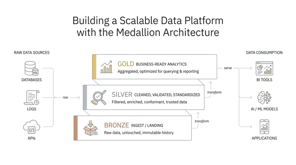
Understand Bronze, Silver, and Gold
If you’ve ever watched a messy desk slowly become organized, you already have the right mental model for the medallion architecture. The bronze, silver, and gold layers give raw data a path from “arrived” to “trusted” to “ready to use,” and that layered flow is what makes a scalable data platform feel manageable instead of overwhelming. In practice, this approach is a data design pattern for organizing data logically while improving its quality step by step as it moves through the lakehouse. What is the medallion architecture doing here? It is creating a single, guided journey for data so teams can keep the original facts, refine them carefully, and then package them for real business use.
The bronze layer is where the story begins, because this is the place where raw data first lands. Bronze means unvalidated data that keeps the original shape and content of the source system, almost like a receipt you tuck into a folder before you decide what it means. Databricks describes this layer as the source of truth, and it emphasizes that bronze is usually append-only, preserves historical data, and supports auditing and reprocessing later. That matters because if something goes wrong downstream, we can return to bronze and rebuild the pipeline without losing the original evidence.
From there, the medallion architecture moves into silver, where the data starts to look less like a pile of receipts and more like a tidy ledger. Silver is the refined layer: this is where we clean data, remove duplicates, handle missing values, enforce schema, and join related sources into integrated datasets. In plain language, a schema is the set of rules that tells us what fields exist and what type of data they hold, so enforcing it means the data starts following the same naming and formatting rules. This is also the layer where business rules begin to take shape, which is why analysts, data scientists, and reporting workflows often rely on silver when they need detail without the noise.
Then comes gold, the place where the data becomes truly business-ready. Gold is where we shape information around specific needs, often by aggregating it, simplifying it, or tailoring it for dashboards, executive reporting, operational views, or machine learning models. If bronze is the attic, and silver is the organized filing cabinet, gold is the presentation board we bring into the meeting room: it is designed to answer questions quickly. The official guidance also notes that gold can include access control, such as row-level security, column masking, or anonymized views, so different teams get the right version of the data for their role.
Once you see these layers together, the real value becomes easier to feel. Bronze protects fidelity, silver builds trust, and gold delivers speed and clarity for consumers. That progression is why people often ask, “How do bronze, silver, and gold work together in a data platform?”—because the answer is not just about storage, but about shaping trust over time. The medallion architecture also supports a practical recovery path: if downstream tables depend on bronze, teams can rebuild later layers from the raw layer instead of starting from scratch. In other words, the layers do not compete with each other; they cooperate, each one doing a different job in the same data journey.
As you keep reading, it helps to treat bronze, silver, and gold as a set of promises rather than a set of folders. Bronze promises preservation, silver promises refinement, and gold promises usability, and that simple sequence is what helps the medallion architecture scale as more sources, teams, and use cases arrive.
Design the Raw Ingestion Layer
Now that the bronze layer is on the table, we can focus on the next question: how do we design the raw ingestion layer so it protects the original data without turning into a dumping ground? This is where the medallion architecture starts to feel practical, because the raw ingestion layer is not about polishing anything yet. It is about getting data in safely, consistently, and with enough structure that we can trust our future selves to make sense of it later. If bronze is the place where data arrives, the raw ingestion layer is the doorway that decides how it arrives.
The first design choice is to preserve the source as faithfully as possible. That means we capture data in its original form, keep the payload intact, and attach a little bit of context around it, such as when it arrived, where it came from, and which pipeline brought it in. Think of it like labeling boxes as they come off a truck before you open them. We do not want to rewrite the contents too early, because the raw ingestion layer earns its value by keeping the evidence untouched while still making it findable. In a scalable data platform, that habit becomes the safety net we return to whenever downstream logic needs to be rebuilt.
From there, we make the ingestion path sturdy enough to handle messy reality. Sources fail, retries happen, and sometimes the same record shows up twice, so the raw ingestion layer should be designed for idempotent processing, which means running the pipeline more than once does not create duplicate results. We also watch for schema drift, which is when the structure of incoming data changes over time, like a new column appearing in a feed or an old field changing type. Instead of forcing every source to behave perfectly, we build the layer so it can absorb change, flag surprises, and keep moving without losing the original raw ingestion stream.
That is why landing-zone design matters so much. The landing zone is the first storage area where incoming files, events, or records are written before deeper processing begins, and it should be simple, durable, and easy to replay. In practice, we usually organize it by source, date, or ingestion batch so we can trace problems back to a specific arrival window. We also keep metadata close by, because metadata is the descriptive information about the data itself, and it becomes the breadcrumb trail that helps us answer questions like “what arrived, when, and from where?”
A good raw ingestion layer also thinks about scale before scale becomes painful. Large data streams arrive in bursts, not neat lines, so partitioning helps by splitting data into manageable chunks, often by time or source, so reads and writes stay efficient. File format choices matter too, because some formats are better for storage efficiency and later querying, while others are better for preserving the exact shape of incoming events. The point is not to overengineer the layer; it is to choose a structure that lets the raw ingestion layer stay fast, traceable, and cheap to operate as volume grows.
How do you design the raw ingestion layer in a way that still feels reliable six months later? You give it rules that are small enough to follow and strong enough to survive change. That means keeping raw data immutable, which means we do not overwrite the original copy; recording lineage, which means tracking where data came from and how it moved; and separating bad records from good ones so the pipeline does not stall on every surprise. When we do that well, the raw ingestion layer becomes more than a mailbox. It becomes the steady front door that lets the rest of the medallion architecture do its work with confidence.
Clean and Validate Silver Data
Once the raw ingestion layer has done its job, the silver layer is where the medallion architecture starts to feel trustworthy. This is the place where we clean and validate silver data so it stops looking like a stack of arriving packages and starts behaving like a shared, reliable dataset. Databricks describes this layer as the refined, validated part of the pipeline, where data cleanup, validation, deduplication, and normalization happen before downstream teams use it. In practice, that means the silver layer is where data quality begins to matter in a very visible way.
The first thing to remember is that silver should not be treated like a second ingestion zone. Databricks recommends building silver tables from bronze or other silver tables, not writing to silver directly from ingestion, because direct ingestion can fail when source schemas change or corrupt records appear. For append-only sources, most reads from bronze should be streaming reads, while batch reads fit smaller dimensional datasets better. That choice keeps the medallion architecture stable, because the silver layer is meant to refine what already landed safely, not to absorb every surprise at the door.
So what does cleaning actually look like? At this stage, we are giving the data a common language. We remove duplicates, handle null and missing values, enforce schema, cast types, normalize names and formats, and resolve out-of-order or late-arriving records. Databricks also calls out joins as part of silver processing, which is why this layer often feels like the first place where separate source systems begin to tell one coherent story. If bronze is the inbox, silver is the editorial desk where the pieces get checked, aligned, and prepared for real work.
How do we clean and validate silver data without losing the useful details that analysts still need? The answer is to keep at least one validated, non-aggregated version of each record in silver, then apply rules around it. Databricks notes that silver should retain detailed records, even when some downstream workloads may later prefer aggregated views in gold. That is why silver often becomes the right home for customer-level, transaction-level, or event-level data that has been made trustworthy but not yet simplified. It is detailed enough for analysis, but disciplined enough to avoid chaos.
Validation becomes much easier when we make the rules explicit. Databricks expectations let us define data quality checks as SQL Boolean conditions, and those checks can validate each record as it flows through a pipeline. When a record fails an expectation, the pipeline can fail the update or drop the record, which gives us a clear way to separate good data from bad data instead of pretending every record deserves the same treatment. This is also where monitoring matters, because the silver layer is only useful if we can see when quality starts drifting.
In a healthy silver layer, bad records do not disappear into the dark. We usually quarantine invalid rows, keep the original evidence available in bronze, and use silver to hold the records that pass validation. That separation gives us traceability, which means we can explain where a record came from, what changed, and why it was accepted or rejected. It also makes recovery easier later, because if a rule changes, we can rebuild silver from the raw source of truth instead of starting over from scratch.
This is also the point where modeling begins to peek through the cleaning work. Databricks notes that teams often start representing nested or semi-structured data in silver by using structures like VARIANT, JSON strings, structs, maps, arrays, or flattened tables. That matters because a clean silver layer does more than remove noise; it turns messy source shapes into forms that downstream readers can actually use. When we do that well, the silver layer becomes the steady middle ground in the medallion architecture: reliable enough for analytics, detailed enough for modeling, and flexible enough to keep evolving as the source systems change.
Build Gold Analytics Models
By the time we reach the gold layer, the data has already done the hard work of becoming clean and dependable. Now the job changes: we stop asking, “How do we fix this?” and start asking, “How do we make this easy to use?” That is the heart of gold analytics models in the medallion architecture. This layer is built around business needs, and Databricks describes it as the presentation layer where data is shaped into data marts, pre-aggregated views, and consumer-ready structures for reporting, dashboards, applications, and machine learning.
So what does a gold analytics model actually look like? Think of silver as the full recipe book and gold as the plated dish we serve at the table. In practice, gold often uses a dimensional model, which is a way of organizing data around a central business process with supporting details attached in tables like facts and dimensions. A fact table holds measurable events, such as sales or clicks, while a dimension table holds descriptive context, such as customer, product, or region. Databricks notes that gold commonly contains dimensional data marts and is where teams model data for reporting and analytics by defining relationships and measures.
The next design choice is to shape the model around how people ask questions. If a finance team wants monthly revenue by region, or a product team wants daily active users by feature, the gold model should answer those questions without making the reader reconstruct the logic each time. That is why gold analytics models often include pre-aggregated data, denormalized tables, or semantic layers that define business metrics in one place. Databricks’ metric views are a good example: they separate measures, which are the business values you calculate, from dimensions, which are the ways you group and filter those values, so the same metric can be reused across many views of the data.
This is also where performance and governance become part of the story. Gold is supposed to feel fast, but speed should not come from copying data everywhere; it should come from shaping the right model for the right audience. Databricks recommends business-specific, performance-optimized, and access-controlled gold data, including options like row-level security and column masking when different users need different levels of visibility. In plain language, row-level security means different people can see different rows, and column masking means sensitive values can be hidden or replaced. That makes the gold layer feel like a polished storefront: people see only what they need, and they see it in a form that is ready to use.
When we build gold analytics models well, we also protect consistency across teams. Instead of every dashboard author inventing their own definition of revenue, churn, or active user, we define those meanings once and reuse them everywhere. Databricks metric views support this kind of shared business logic by centralizing metrics in Unity Catalog, where teams can query the same definitions across dashboards, alerts, and self-service tools. That matters because a gold layer is not just a reporting layer; it is a trust layer. It gives everyone a common language, which is often the difference between a dashboard that informs decisions and one that creates debate.
As you design this layer, the practical question is not “What tables can we create?” but “What experience should the reader have?” A strong gold analytics model should feel like a well-marked trail: clear names, predictable relationships, fast answers, and business rules that are easy to follow. If bronze preserves the raw story and silver cleans the draft, gold is where we publish the version people actually rely on. That is why the gold layer matters so much in the medallion architecture: it turns trusted data into something a team can act on with confidence.
Add Governance and Data Quality
By the time we have bronze, silver, and gold in place, the next question becomes less about movement and more about trust. A scalable data platform can collect and transform data all day, but without data governance and data quality, it still feels like a busy kitchen with no recipe cards and no labels on the shelves. Governance is the set of rules for who can access, change, and rely on data, while data quality is the habit of making sure the data is accurate, complete, consistent, and fresh enough for the job. In the medallion architecture, those two ideas are what keep the whole journey from turning messy again.
The easiest place to start is ownership, because every healthy data system needs someone to answer, “Who is responsible for this?” That person might be a data steward, which is someone who helps keep a dataset trustworthy and understandable for others. In practice, governance means assigning owners, documenting what each table means, and deciding which teams can read, write, or publish it. When you do that in a medallion architecture, the data platform stops feeling like a shared attic and starts feeling like a well-run library, where every shelf has a label and every book has a purpose.
From there, we make the rules visible instead of hidden in someone’s memory. One useful tool is a data contract, which is an agreement between the team that produces data and the team that consumes it; it spells out things like field names, data types, expected freshness, and acceptable changes. That matters because many problems in a data platform begin with a small surprise, like a column arriving late or a field changing shape without warning. When we define those expectations early, we reduce rework downstream and give silver and gold tables a much steadier foundation.
How do we keep data quality from slipping as the platform grows? We check it continuously, not only when someone notices a bad dashboard. A data quality rule is a simple test that asks whether the data makes sense, such as whether an identifier is present, a date falls in range, or a total is never negative when it should not be. In the medallion architecture, bronze protects the original record, silver applies these checks and filters out the noise, and gold uses the trusted result to serve the business. That flow makes data quality feel less like a one-time audit and more like a habit woven into the pipeline.
This is also where observability becomes important. Data observability means watching the health of the pipeline the way we would watch the dashboard lights in a car, looking for signs that something is drifting before it breaks. We can monitor freshness, volume, schema changes, null spikes, and failed validations so problems show up quickly instead of quietly spreading across reports. When a record fails a rule, we usually quarantine it, which means placing it in a separate area for review instead of letting it contaminate trusted outputs. That keeps the medallion architecture resilient, because one bad batch does not poison every downstream layer.
Governance also gives us the guardrails we need for security and compliance. Some data should only be visible to certain roles, and some fields may need masking, which means hiding sensitive values while still allowing the rest of the record to be used. That is not only about protection; it is also about making access practical. If people can discover the right dataset, understand its meaning, and safely use it with the correct permissions, the data platform becomes easier to trust and easier to scale. In that sense, governance and data quality work together: one tells us who may use the data, and the other tells us whether the data deserves to be used.
What does good governance and data quality look like in practice? It looks like clear ownership, explicit rules, automated checks, and a steady path for reviewing exceptions. It looks like the medallion architecture doing more than organizing tables; it becomes a system for preserving trust as data moves from raw arrival to business use. When we build that discipline into the platform early, every later layer has a better chance of staying dependable, understandable, and ready for the people who rely on it.
Automate Pipelines for Scale
Once governance and quality checks are in place, the next challenge is volume. A scalable data platform can look perfectly organized in a small test, then start wobbling when more sources, more teams, and more refreshes arrive at the same time. That is where pipeline automation earns its place in the medallion architecture, because we are no longer hand-holding each step; we are building a system that can repeat the same journey reliably, day after day, without asking someone to remember every move.
Automation begins with treating the pipeline like a sequence of connected jobs instead of one giant script. A job is a scheduled piece of work, and an orchestrator is the tool that starts those jobs in the right order, watches them, and reacts when something fails. In practical terms, we want bronze ingestion, silver refinement, and gold publishing to run as coordinated stages, so one layer only starts when the previous layer has finished safely. That kind of data pipeline automation matters because it turns the medallion architecture from a design idea into a dependable operating rhythm.
The easiest way to make that rhythm scale is to reduce how much each pipeline needs to know. We do that with parameterization, which means passing values like date ranges, source names, or table names into the same reusable code instead of copying the code for every dataset. Think of it like using one map with different destinations, rather than redrawing the map every time you travel. When pipelines are parameterized, we can onboard new sources faster, rerun specific batches when needed, and keep the logic consistent across bronze, silver, and gold.
So how do we automate pipelines for scale without creating a fragile maze? We split the work into small, clear units that can be retried, monitored, and replaced independently. A retry is another attempt after a temporary failure, and it matters because cloud systems, network calls, and source APIs can all blink at the wrong moment. If one bronze ingestion task fails, we do not want the entire medallion architecture to stop moving; we want the orchestrator to pause, retry, alert the right people, and let the rest of the platform keep its shape.
This is also where dependency management becomes important. A dependency is a task that must finish before another task can begin, and those relationships help us prevent silver from reading half-loaded bronze data or gold from publishing an incomplete aggregate. In a healthy scalable data platform, the dependencies should be visible and boring, because boring means predictable. We can think of them like traffic lights at an intersection: they do not add speed by themselves, but they keep the flow from collapsing into confusion when more cars arrive.
As the pipeline grows, we also start separating reusable logic from deployment logic. Reusable logic is the code that transforms data, while deployment logic decides when, where, and how that code runs. That separation makes it easier to test a transformation locally, promote it through environments, and then schedule it in production with confidence. It also supports incremental processing, which means we update only the new or changed data instead of reprocessing everything from scratch every time. For large data volumes, that small discipline can save a huge amount of time and cost.
Automation works best when it does not hide failure; it makes failure easier to understand. Good pipeline automation includes logs, metrics, and alerts, which are records of what happened, measurements of how the pipeline behaved, and notifications when something drifts. If a gold table is late, we should be able to trace the delay backward through silver and bronze, then decide whether the problem came from a source outage, a schema change, or a simple scheduling conflict. That kind of visibility turns the medallion architecture into a system we can operate, not just admire.
The real payoff shows up when the platform becomes busy enough that manual effort would otherwise become the bottleneck. With orchestration, parameterization, retries, and clear dependencies, the same pipeline pattern can serve one dataset or one hundred without losing its shape. That is the promise of data pipeline automation in a scalable data platform: the layers still matter, but now they can move on their own, at the pace the business needs.