Set Clear Marketing Analytics Goals (hubspot.com)
When you first step into marketing analytics, it can feel like you’ve walked into a control room with dozens of blinking lights. The temptation is to watch everything at once, but that usually leaves you with noise instead of direction. This is where clear marketing analytics goals change the story: they give your data a purpose, so you know what you are trying to learn before you start collecting numbers.
What does success look like for your marketing analytics goals? That question matters more than it might seem, because a goal acts like a destination on a map. If you want more qualified leads, better conversion rates, or stronger customer retention, you need to say that out loud first. A vague wish such as “improve marketing” sounds productive, but it does not tell you what to measure, what to compare, or when you have actually made progress.
A useful goal works like a well-labeled shelf in a messy room. Instead of stuffing every metric into one pile, you decide what belongs where and why it matters. For example, if your business wants more sales-ready leads, your marketing analytics goals might focus on the number of demo requests, the cost per lead, or the percentage of leads that become customers. Those targets turn marketing analytics from a reporting exercise into a decision-making tool.
To keep your goals useful, anchor them to a real business outcome. That means connecting the work you do in campaigns, content, email, or social media to something the company actually cares about, like revenue, pipeline growth, or repeat purchases. We often call this alignment between marketing and business objectives, and it helps you avoid chasing numbers that look impressive but do not change results. A large number of page views, for instance, may feel exciting, but it matters much less if those visitors never take the next step.
It also helps to make each goal specific enough to guide action. A strong goal answers four quiet questions: what are we trying to improve, by how much, by when, and for whom? If you can say, “We want to increase newsletter sign-ups from organic search by 20% in three months,” you have something concrete to work with. Now your marketing analytics goals can support experiments, content choices, and channel decisions instead of floating as a vague ambition.
Another helpful habit is to separate leading indicators from lagging indicators. A leading indicator is an early signal, like click-through rate, that hints at future results. A lagging indicator is the final outcome, like revenue, that shows what already happened. When you set marketing analytics goals, it helps to include both, because the early signals tell you whether you are on track while the final results tell you whether the strategy actually paid off.
Clear goals also protect you from one of the easiest traps in analytics: measuring too much and learning too little. If every report tries to answer every question, the important patterns get buried. When you choose a few meaningful marketing analytics goals, you give yourself a sharper lens and a calmer way to work. You can then ask better questions, spot trends sooner, and adjust your campaigns with more confidence.
Once those goals are in place, the rest of marketing analytics becomes much easier to read. You are no longer staring at charts and hoping they make sense; you are comparing real results against a destination you chose on purpose. That clarity will shape the metrics you track next, because now every number has a job to do.
Choose the Right Marketing KPIs (hubspot.com)
Now that the goal is on the map, we can choose the numbers that actually tell us whether we are moving toward it. Which marketing KPIs should you track first? A KPI, or key performance indicator, is a measurable value that shows progress toward an important business objective, so the whole point is not to collect every number in sight but to choose the few that make decisions clearer. If your earlier goal was the destination, your marketing KPIs are the road signs that keep you from drifting off course.
The easiest way to start is to match each KPI to the outcome you care about most. If you want more qualified interest, then a conversion-based measure belongs near the top of the list, because conversion rate is the percentage of interactions that turn into a desired action, like a signup or demo request. That matters because it shows whether attention is becoming movement, not just noise. In other words, you are not asking, “Did people see us?” You are asking, “Did the right people take the next step?”
From there, we usually add an efficiency KPI so we can see what that progress costs. Cost per action (CPA) is the total cost spent to get a desired action, such as a purchase or registration, while customer acquisition cost (CAC) is the total expense required to secure a new customer, including marketing, advertising, and sales investment. Those two measures help you notice an important truth: a campaign can look busy and still spend too much to be healthy. A strong marketing KPI does not only measure motion; it measures motion at a price the business can live with.
When the goal is revenue, we should bring in a profitability measure too. Return on investment (ROI) compares the gain or loss from an investment against its initial cost, which makes it a clean way to ask whether a campaign was worth the money. That is why ROI belongs in the conversation when you are choosing marketing KPIs for paid campaigns, content initiatives, or channel experiments. It gives you the bigger picture that sits behind the early activity numbers and tells you whether the effort actually paid back.
It also helps to separate leading indicators from lagging indicators, because they play different roles in the story. A leading indicator is an early clue about where results may be heading, while a lagging indicator shows what already happened after the dust has settled. In marketing, clicks, form fills, and conversion-rate trends can act like leading signals, while revenue and closed sales often behave like lagging ones. Google Ads even notes that conversion tracking helps guide advertising decisions, which is a good reminder that early signals are most useful when they help us adjust course before the quarter ends.
So the real skill is not finding more metrics; it is choosing better ones. The strongest marketing KPIs usually cover three things at once: whether people are responding, how much it costs to win them, and whether the result pays off. If a metric does not help you decide what to do next, it is probably just extra dashboard furniture. Keep the set small, keep it tied to the goal you named earlier, and let the data work like a story you can follow rather than a wall of numbers you have to decode.
Collect Data From Key Channels (books.google.com)
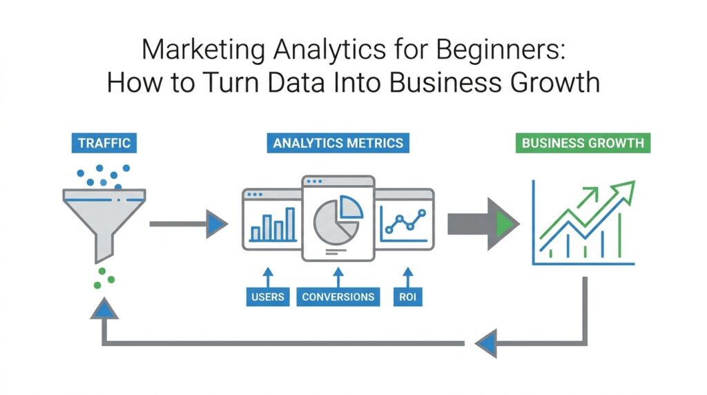
Now that we know what we want to measure, we arrive at the part where marketing analytics starts to feel real: gathering the signals from the places your audience actually shows up. If goals and KPIs are the map and road signs, data collection is the walk through the town itself, where every storefront, street corner, and conversation leaves a clue. Which channels are giving you the clearest picture of customer behavior? That question matters, because the best marketing analytics only works when we collect the right data from the right places.
A good place to begin is your website, because it often acts like the front door to your business. Website data is the information you collect about how people arrive, what they click, how long they stay, and where they leave; a web page view, for example, is a recorded visit to a page on your site. This kind of data helps us see not only how much attention we are getting, but also whether visitors are finding what they came for. In practice, tools such as analytics platforms and tracking tags work like quiet note-takers, recording the path a visitor takes without interrupting the experience.
From there, we move to paid media, which means advertising you pay for, such as search ads, display ads, or social ads. Paid channels are valuable because they show how efficiently your budget turns into clicks, signups, and sales, and they help connect earlier KPIs to real business activity. If you have ever wondered, “Where should I spend my next marketing dollar?” this is where marketing analytics starts to answer you with evidence instead of guesswork. We can compare the traffic, conversions, and costs from each campaign and see which ones deserve more attention.
Email is another channel worth treating with care, because it gives us a closer look at how existing or interested customers respond over time. Email data includes metrics like open rate, click-through rate, and unsubscribe rate, which tell us whether the message was noticed, explored, or ignored. Open rate is the percentage of recipients who opened an email, and click-through rate is the percentage who clicked a link inside it. Together, these numbers show whether your message is landing well enough to move someone one step farther along the journey.
Social media adds a different kind of story, one that mixes reach, engagement, and brand attention. Engagement means the actions people take after seeing a post, such as liking, commenting, saving, or sharing it, and it often tells us more than raw follower counts do. A post with modest reach but strong engagement may be doing more useful work than a flashy post that earns lots of views but no reaction. When we collect data from key channels like social, we are not trying to admire every number; we are trying to understand which content invites people to lean in.
We also need to remember that no single channel tells the whole story, which is why source data matters so much. A traffic source is the origin of a visit or lead, such as search, email, social media, or a partner referral, and it helps us trace performance back to its starting point. Without source data, we might celebrate a conversion without knowing what caused it, like applauding a runner without noticing the finish line they crossed. With it, we can compare channels side by side and start seeing patterns in how people discover, trust, and choose us.
The real challenge in data collection is not adding more and more channels, but making sure the ones you track are clean, consistent, and tied to the goals we already set. If the same action is labeled differently in different tools, the story gets blurry fast, so we want to use shared definitions for things like leads, purchases, and signups. That discipline turns marketing analytics into something you can rely on, because now the numbers from your website, paid campaigns, email, and social media all speak the same language. Once that happens, we can begin turning scattered activity into a connected picture of what customers are doing and why.
Build a Simple Performance Dashboard (hubspot.com)
After you have your goals, KPIs, and channel data in place, the next question feels very practical: how do you turn all of that into something you can actually use? This is where a simple performance dashboard earns its keep. A dashboard is a single screen that gathers your most important marketing metrics in one place, so you can see what is happening without jumping between tabs, tools, and reports. Think of it like the instrument panel in a car: you do not need every wire and engine part in view, only the dials that help you drive with confidence.
A good dashboard starts small on purpose. If you try to include every metric from every channel, the result looks impressive for about five seconds and then becomes tiring to read. The better path is to choose the handful of numbers that connect directly to the goals you already set, such as qualified leads, conversion rate, cost per acquisition, and return on investment. A simple performance dashboard works best when it answers one clear question: are we moving in the right direction, and if not, where should we look first?
The easiest way to build one is to group your metrics by story, not by tool. At the top, place the business outcome you care about most, such as total leads or revenue, because that is the number leaders usually want to see first. Underneath, add the support metrics that explain what is driving that outcome, like traffic by source, conversion rate by channel, and cost per action. This structure helps your marketing dashboard feel like a guided tour instead of a pile of numbers, because each layer tells you a little more about the same journey.
Once the layout is set, we can think about visuals. A line chart is useful for trends over time, a bar chart works well for comparing channels side by side, and a scorecard is a clean way to show one important number at a glance. A scorecard is a small visual tile that displays a single metric, such as monthly leads or ROI, so the reader can catch the result quickly. If you are asking, “What is the easiest way to build a marketing dashboard?” the answer is usually to start with these three visual types and resist the urge to add anything that does not help you decide what to do next.
Clarity also depends on choosing the right time frame. If you only look at daily data, you may react to normal ups and downs that do not mean much; if you only look at quarterly data, you may miss a problem until it has already grown. Many teams use a weekly view for active campaign management and a monthly view for broader performance checks, because those windows are long enough to smooth out noise but short enough to support action. In a simple performance dashboard, the time frame should match the speed of the decisions you need to make.
It also helps to build in comparison, because numbers make more sense when they have a neighbor. You might compare this month to last month, this quarter to the previous quarter, or one channel to another channel with the same goal. Comparison is useful because it reveals movement, and movement is what tells us whether a campaign is improving, slipping, or staying flat. When you connect the current result to a baseline, your marketing analytics dashboard becomes less like a snapshot and more like a story with direction.
One of the most useful habits is to make the dashboard easy to trust. That means using the same definition for each metric everywhere, checking that the data updates on a regular schedule, and removing anything that is not clearly tied to the decision you want to make. If a metric cannot change your next step, it probably belongs somewhere else. A clean dashboard is not about decoration; it is about confidence, because you want to look at it and know that the numbers are telling the same story your channels are telling in real life.
When you keep the design simple, a performance dashboard becomes a quiet decision-making partner. It helps you spot where attention is turning into action, where costs are climbing, and where a channel deserves a closer look. More importantly, it gives you a shared view of marketing analytics that team members can read without a long explanation, which makes every future conversation faster and more focused.
Analyze Conversion Paths and Attribution (hubspot.com)
Once your dashboard is telling you what happened, the next question is the one that really unlocks growth: how did it happen? That is where conversion paths and attribution come in. A conversion path is the trail of interactions someone takes before a key action, like signing up, requesting a demo, or buying, while attribution is the set of rules that decides how much credit each touchpoint gets along that trail. Google Analytics even offers an Attribution paths report, formerly called Conversion paths, to show those customer journeys and the way different models share credit across them.
This matters because real customers rarely arrive in a straight line. They might discover you through social media, return later from a search result, open an email, and convert days afterward on a landing page. If we only look at the final click, we miss the earlier moments that built trust; if we only look at the first click, we miss the nudge that closed the deal. Marketing attribution helps us see those interactions as a sequence instead of a single event, which makes the whole buyer journey easier to understand.
So when readers ask, “Which channel should get credit for the conversion?” we want to slow the story down and ask a better question: which touches helped most, and at what stage? That is the job of attribution models, which are simply different rules for dividing credit. Some models give all the credit to the first interaction, some give it to the last, and multi-touch attribution spreads credit across several touchpoints so you can see more of the path instead of only the starting point or the finish line.
A helpful way to read these paths is to think like a detective. The first touch often tells you which channel introduced the person to your brand, the middle touches show what kept interest alive, and the last touch often shows what finally tipped the decision. HubSpot’s attribution tools and reporting are built around this idea of assigning credit to the interactions that move people from visitor to contact and customer, while Google’s paths reporting helps you inspect how those journeys unfold across different channels and key events.
The real value appears when you compare models instead of trusting only one. If first-touch attribution says paid search deserves the credit, but last-touch attribution points to email, that is not a contradiction; it is a clue. It suggests one channel may be strong at introducing people, while another is better at closing them, and that distinction can shape budget, content, and campaign planning. Multi-touch attribution is especially useful here because it shows how multiple channels contribute, rather than pretending one interaction did all the work.
You will also want to keep your eyes open for gaps in the story. If a path looks unusually short, the person may already know your brand well, or your tracking may be missing earlier steps. If one channel appears to win every conversion, that can be a sign of true dominance, but it can also mean your tagging, tracking code, or reporting setup is uneven. HubSpot notes that attribution depends on the rules and tracking behind the report, which is why clean setup matters as much as the model itself.
Once you start reading conversion paths this way, attribution stops feeling like a technical afterthought and starts acting like a map of customer momentum. You are no longer asking only, “Did we convert?” You are asking, “What combination of touchpoints helped that conversion happen, and what should we do more of next time?” That shift is what turns marketing analytics from a report into a practical guide for better decisions.
Test Changes and Measure ROI (books.google.com)
Once you can see the path a customer takes, the next move is to change something on purpose and watch what happens. This is where marketing analytics turns from observation into experimentation, and it often feels a little like adjusting the sails while the boat is already moving. You are no longer asking only where people came from; you are asking whether a different headline, offer, email subject line, or landing page can improve the result. That is the heart of test changes and measure ROI: make one thoughtful change, compare it with the original, and see whether the return is worth the effort.
The most familiar way to do this is with an A/B test, which means showing two versions of something to similar audiences and comparing the results. The original version is the control, and the new version is the variation, like two doors that lead to the same room but with different signs on them. If the variation wins, we learn that the change helped; if it loses, we learn that the original was stronger or that the idea needs another try. What matters most is that we do not rely on hunches when marketing analytics can give us a cleaner answer.
Before we test, we need one clear question and one clear success metric. A success metric is the number that tells us whether the change worked, and it should match the goal we already set earlier, whether that is more signups, more demo requests, or more purchases. If we are testing a landing page, for example, we might track conversion rate, which is the percentage of visitors who take the action we want. That focus keeps us from celebrating a test that gets more clicks but fewer qualified leads, because in marketing analytics a busy result is not the same thing as a useful one.
What is the ROI of a marketing test? ROI, or return on investment, compares the value we gained with the money we spent, so it helps us answer that question in plain business terms. To measure it, we look at the extra revenue or value created by the change, then subtract the cost of running the test, building the asset, and promoting it. If a new email template brings in more purchases but costs far more to produce and send, the test may look better on the surface than it does in the numbers. That is why measuring ROI keeps us honest.
The cleanest tests usually change only one important element at a time. If we alter the headline, the image, and the call to action all at once, we may win or lose, but we will not know which piece caused the shift. A call to action is the prompt that tells someone what to do next, like “Sign up now” or “Book a demo,” and it is often a strong place to start because small wording changes can create real movement. We also need to give the test enough time to gather meaningful data, because early results can swing wildly when only a few people have seen the variation.
It also helps to read the results through the same lens we used for attribution. A change may improve the final conversion, but the effect might appear differently across channels, audiences, or devices. For example, a landing page change could help paid traffic but do little for email visitors, and that difference is useful, not confusing. When we measure ROI alongside channel performance, we can see whether the improvement is broad, narrow, or tied to a specific part of the journey.
The real value of testing is not that every experiment wins. The value is that every test teaches us something we can use to make the next decision smarter, faster, and less risky. When we test changes and measure ROI carefully, marketing analytics becomes a steady feedback loop: we try, we learn, we adjust, and we build growth on evidence instead of guesswork. That rhythm is what turns small improvements into a stronger strategy over time.