Define Success Metrics
When you start building an e-commerce analytics dashboard, the hardest part is not the chart library or the SQL; it is deciding what success looks like. Building on this foundation, we had to answer a more important question before we drew a single chart: how do you know whether the dashboard is actually helping the business? That question sounds abstract at first, but it becomes real the moment you realize that a dashboard can look polished and still tell you almost nothing useful. What we needed was a small set of success metrics that turned the dashboard from a pretty report into a decision-making tool.
The first step was choosing a north star metric, which is a single core measure that keeps everyone pointed at the same outcome. Think of it like the compass on a hiking trip: it does not show every tree and rock, but it tells you whether you are still heading in the right direction. For our e-commerce analytics dashboard, that meant resisting the urge to track everything and instead picking the measure that best captured customer value and business value together. We also made sure the metric was SMART, meaning specific, measurable, achievable, relevant, and time-bound, so it would be clear enough to act on instead of vague enough to argue about forever.
Once that anchor was in place, we could layer in the supporting metrics that explained the story behind it. This is where things get interesting, because a good e-commerce analytics dashboard does not rely on a single number alone; it uses a small group of measures that reveal where the customer journey is helping or hurting. We tracked things like product page views, add-to-cart rate, checkout completion, and repeat purchase behavior because they showed the path from curiosity to purchase and then to loyalty. In Google Analytics 4, the idea maps neatly to events, key events, and conversions, which is a useful way to separate ordinary interactions from the actions that truly matter to your business.
We also learned that success metrics need guardrails, not just goals. A guardrail metric is a safety check that tells you whether progress in one area is accidentally creating damage in another, like a faster checkout flow that increases abandoned carts later in the funnel. In practice, that meant watching revenue and conversion rate alongside customer-related signals such as refund rate, order cancellation rate, or returning-customer share. How do you keep a dashboard honest when one metric starts looking too good? You pair it with another metric that can expose the tradeoff, and you do not let the team celebrate a surface win before checking the rest of the journey.
The real test came when we asked whether these success metrics could guide action, not just reporting. If a metric could not tell us what to change on Monday morning, it was not doing enough work for us. That is why we preferred metrics that answered practical questions like which channel brought in high-value customers, where people dropped out of the funnel, and which product categories drove repeat purchases. In other words, the dashboard had to help us spot patterns quickly, because product and marketing decisions become much easier when the data is visible, consistent, and tied to clear goals. As we discussed, this is the point where the e-commerce analytics dashboard stops being a collection of charts and becomes a shared language for the team.
In the end, defining success metrics was less about picking numbers and more about choosing a story the whole team could believe in. We wanted a dashboard that answered, “Are we growing in a way that creates value?” before anyone asked for a deeper slice of the data. That mindset kept the e-commerce analytics dashboard focused, prevented metric overload, and made every chart earn its place on the screen. With that clarity in hand, we were ready to move from measuring success to shaping the dashboard around the questions those metrics would raise next.
Pull Store Data
Building on the metrics we had already chosen, the next challenge was to pull store data in a way that made those numbers real. A dashboard can only answer useful questions if the underlying information is reliable, so we had to treat data collection like the foundation of a house rather than the paint on the walls. How do you pull store data without turning the dashboard into a fragile mess? We started by thinking less about charts and more about the raw ingredients that feed them: orders, products, customers, inventory, refunds, and payment status.
The first thing we learned was that store data usually lives in several places at once. The e-commerce platform holds order records, the payment system knows what actually cleared, and the customer database carries names, regions, and repeat-buyer history. An application programming interface, or API, is the bridge that lets one system request information from another, and in our case it became the main doorway into the store. That doorway mattered because an e-commerce analytics dashboard is only as good as the data pipeline behind it, and a data pipeline is the path that moves data from source systems into the place where we analyze it.
Once we had that path in mind, we focused on pulling data incrementally instead of copying everything every time. Incremental sync means fetching only what changed since the last run, which saves time, reduces load on the store system, and makes the process far less painful when the catalog grows. We relied on timestamps, record IDs, and pagination, which is the method an API uses to split large result sets into smaller pages. That may sound technical, but the idea is familiar: instead of carrying every grocery bag in one trip, we make several smaller trips and keep track of where we left off.
This is where data freshness and data accuracy started to matter in very practical ways. An order is not always a fixed thing; it might begin as pending, become paid, then later be refunded or canceled, so we had to make sure our store data reflected the latest state rather than an old snapshot. We also had to watch for duplicate records, mismatched time zones, and inconsistent product names, because those small issues can quietly distort revenue, conversion, and repeat-purchase reporting. In an e-commerce analytics dashboard, a tiny mismatch in one field can ripple through several charts and make the whole story feel off.
To keep the process manageable, we separated raw ingestion from cleanup. Raw data landed in a staging area first, which is a temporary holding space where information arrives before we reshape it for analysis. From there, we standardized field names, aligned currencies, and matched related tables such as orders, line items, and customer profiles so the numbers would connect cleanly. Taking this concept further, we treated the warehouse, or central storage system for analysis-ready data, as the single place where the dashboard would read from, instead of letting every chart query the store platform directly.
That separation changed everything for us because it made the system easier to trust and easier to debug. When a number looked strange, we could trace it back through the pipeline and see whether the issue came from the source system, the ingestion step, or the transformation logic. We also found that the best store data strategy was the one that stayed close to the business questions we defined earlier, not the one that tried to collect every possible field. In other words, we were not building a data museum; we were building a dependable feed for the e-commerce analytics dashboard, and that meant choosing the fields that would help us understand what customers were doing and why.
Clean and Model Data
Building on the foundation we had just laid, the raw store feed still needed a second pass before it could power a trustworthy e-commerce analytics dashboard. This is the part where the story shifts from collecting data to shaping it, because raw data rarely arrives in a form that is ready for analysis. How do you turn a pile of orders, customers, and refunds into something a dashboard can actually explain? You clean it, then you model it, which means you remove noise first and arrange the information into a structure that makes reporting feel natural instead of awkward.
Data cleaning is the careful work of making records consistent, complete, and believable. At this stage, we looked for missing values, duplicate orders, mismatched product names, and timestamps that did not agree with each other. A timestamp is the recorded date and time of an event, and it sounds small until you realize that a sale recorded in the wrong time zone can land in the wrong day, week, or even month. If you have ever tried to reconcile two versions of the same story, you already understand the challenge: we were making sure every row told the same truth.
One of the first things we cleaned was the order status flow, because an order is not a frozen object. It may start as pending, move to paid, and later become refunded or canceled, so we had to decide which version counted for each metric. That decision matters because an e-commerce analytics dashboard can easily overstate revenue if it treats every authorized payment as a finished sale. We also standardized currencies, trimmed whitespace from text fields, and fixed inconsistent category labels so that “T-shirts,” “T shirt,” and “tee shirts” would not show up as three different products in the final report.
Once the data was clean, we moved into data modeling, which is the process of organizing data so it answers questions efficiently. Think of modeling like arranging a kitchen before cooking: the ingredients may already be there, but you still need a layout that helps you move quickly and avoid mistakes. We separated the data into fact tables and dimension tables, two common structures in analytics. A fact table stores measurable events, like orders or line items, while a dimension table stores descriptive details, like customer region, product category, or channel source.
That structure gave us a clear grain, which is a fancy way of saying the level of detail each row represents. For example, one row in our order fact table might represent one product purchased in one transaction, not the entire cart and not the entire customer history. Why does that matter? Because if you mix different levels of detail in the same table, your totals can become misleading fast, and the dashboard starts answering the wrong question with confidence. By choosing the grain early, we made sure every metric had a stable foundation.
Taking this concept further, we built relationships between the tables so the dashboard could join the pieces together without confusion. The customer dimension connected each order to a person or account, the product dimension added category and price context, and the calendar dimension helped us analyze trends by day, week, or month. A calendar dimension is simply a table of dates with extra labels, such as weekday, month, quarter, and holiday flags, which makes time-based analysis much easier. That may sound like a small convenience, but it is often the difference between a dashboard that feels scattered and one that feels like a story unfolding over time.
As we discussed earlier, the warehouse was the single source of truth, and this is where that choice paid off. Because the cleaned and modeled data lived in one place, every chart pulled from the same definitions for revenue, orders, customers, and repeat purchases. That consistency made the e-commerce analytics dashboard easier to trust, easier to maintain, and much easier to explain when someone asked why one number looked different from another report. In the next stage, those polished tables would become the backbone for the metrics and visual views that turned all of this preparation into something people could actually use.
Design KPI Dashboard
Building on this foundation, the dashboard started to feel less like a technical project and more like a conversation with the business. We already had clean data and meaningful metrics, so the next question was how to present them without drowning people in numbers. How do you design a KPI dashboard that tells the truth quickly? We learned to treat the screen like a storefront window: the most important information should be visible first, and the supporting detail should sit just behind it, ready when someone wants to look closer.
The first design choice was hierarchy, because not every metric deserves the same amount of attention. A KPI, or key performance indicator, is a number that signals whether the business is moving in the right direction, and the dashboard needs to make those signals impossible to miss. We placed the highest-priority measures at the top, used larger cards for the most important figures, and reserved smaller spaces for context. That structure helped the e-commerce analytics dashboard feel calm instead of crowded, which mattered because a busy layout can make even strong data feel confusing.
Taking this concept further, we designed each section around a question the team would actually ask. Which channel is driving revenue? Where are shoppers dropping out? What happened this week compared with last week? Those questions shaped the layout more naturally than a generic grid of charts ever could, and they kept the KPI dashboard tied to real decision-making. Instead of asking people to hunt for meaning, we let the design lead them through the story one step at a time.
Charts came next, and here we had to be careful not to confuse decoration with clarity. A line chart works well when you want to see change over time, a bar chart helps compare categories, and a table is useful when someone needs exact values rather than patterns. In contrast, a pie chart can feel attractive but often slows people down when they need to compare slices precisely. We chose each visualization based on the job it needed to do, which made the e-commerce analytics dashboard easier to read and much faster to trust.
We also learned that a dashboard is not finished when the charts look good; it is finished when people can use it without asking for a tour every time. Filters became a big part of that experience, because they let a user narrow the view by date range, channel, product category, or region. Think of filters like the controls on a camera lens: the picture is already there, but you can zoom in to find the part that matters most. That flexibility gave the KPI dashboard room to serve both quick check-ins and deeper investigations without forcing us to build separate reports for every question.
Color and spacing turned out to be more important than we expected. We used color sparingly so that red, green, or amber signals meant something instead of becoming background noise, and we left enough white space so the eye could rest between sections. When every panel shouts, nothing gets heard, so we tried to let the most important metric speak while the rest supported it quietly. This is especially useful in an e-commerce analytics dashboard, where revenue, conversion rate, average order value, and repeat purchase behavior can all compete for attention if the visual language is not disciplined.
We also had to design for trust, not just beauty. A metric looks far more believable when it includes a clear label, a time period, and a small comparison against the previous period or target. That tiny bit of context answers the quiet question every reader carries: compared with what? By showing deltas, trends, and thresholds together, the KPI dashboard became more than a snapshot; it became a working surface for discussion, especially when a manager wanted to understand whether a sudden spike was a real win or a temporary blip.
As we discussed earlier, the best dashboard is the one that helps the team act, and design is what makes action feel obvious. Once the layout, hierarchy, and visual choices clicked into place, the e-commerce analytics dashboard finally matched the way people think: start broad, notice the signal, then drill down only when needed. That balance kept the experience focused, readable, and useful, which gave us a solid base for the next step in turning raw insight into something the whole team could work from.
Add Segments and Alerts
Building on this foundation, the dashboard stopped being a single wide lens and started becoming a set of focused windows. Once the core metrics were in place, the next question was not, “How are we doing overall?” but “Who is driving those numbers, and what should we do when something changes?” That is where segments and alerts came in. A segment is a defined slice of your audience or data, like first-time buyers, repeat customers, or visitors from paid social, and an alert is a rule that tells you when a metric crosses a threshold that deserves attention. Together, they turn an e-commerce analytics dashboard from a summary page into a tool for action.
The first step was to create segments that matched real business questions. Instead of treating every customer as part of one giant crowd, we separated people by behavior, source, and value so patterns could stand out more clearly. For example, new shoppers often need different messaging than loyal customers, and wholesale buyers may behave very differently from one-time discount hunters. When you look at the data through those slices, the story becomes easier to read, because you are no longer asking one chart to explain every kind of customer at once.
Why does that matter in practice? Because the same average can hide several very different realities. If overall conversion looks steady, but mobile visitors from paid search are dropping off while returning desktop customers are growing, the average will not warn you on its own. Segments let you separate those threads, so you can see whether the issue is broad or isolated, seasonal or structural, profitable or noisy. In our e-commerce analytics dashboard, that meant building views for channel segments, product category segments, and customer lifecycle segments, then comparing them side by side instead of relying on a single blended number.
Taking this concept further, we made the segments feel practical rather than decorative. Each one had to answer a question someone on the team would actually ask during a meeting or a campaign review. Which customers return within 30 days? Which region brings the highest average order value? Which acquisition source produces the most repeat purchases? By designing segments around those questions, we gave the dashboard a way to speak the language of marketing, merchandising, and operations without forcing everyone to interpret the data the same way.
Alerts were the other half of the story, and they solved a different problem. A dashboard is useful when you are looking at it, but business problems do not wait for someone to refresh the screen. An alert is a trigger that sends a signal when something important happens, such as a sudden drop in conversion rate, a spike in refund rate, or a product going out of stock. That sounds small, but it changes the rhythm of work: instead of discovering issues after a bad week has passed, the team can respond while the problem is still unfolding.
We kept the alert logic simple at first, because noisy alerts can train people to ignore them. A threshold alert fires when a metric passes a set value, while a change alert fires when a metric moves by an unusual amount compared with a previous period. For example, a 20 percent drop in checkout completion might matter more than a tiny dip in revenue if the funnel is the real place where customers are getting stuck. The key was to tie each alert to an action, so when the notification arrived, someone already knew whether to check inventory, investigate traffic quality, or review a recent site change.
As we discussed earlier, clean data and consistent metrics made the whole system trustworthy, and that trust mattered even more here. If an alert is built on shaky definitions, it creates panic instead of insight, which is the last thing you want from an e-commerce analytics dashboard. So we tested each rule against historical data, watched for false positives, and tuned the timing so daily noise would not drown out real movement. That careful calibration made segments and alerts feel like a natural extension of the dashboard rather than an extra layer bolted on at the end.
In the end, this was the moment when the dashboard started behaving less like a report and more like a guide. Segments showed us where the story was different, and alerts told us when the story was changing fast enough to matter. That combination kept the team focused on the right customers, the right signals, and the right moments to act, which is exactly what a thoughtful e-commerce analytics dashboard should do.
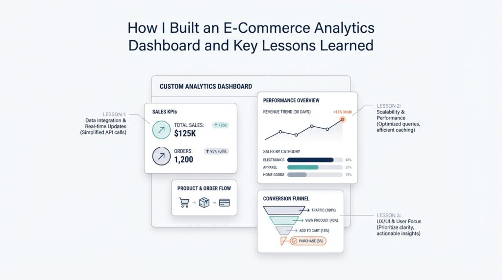
Practical Lessons Learned
Building on this foundation, the biggest lesson was that an e-commerce analytics dashboard succeeds when it stays close to the decisions people actually make. It is tempting to treat the dashboard like a grand final product, but in practice it behaved more like a living workspace. The more we tried to answer every question at once, the noisier it became, so we learned to protect the core use case first and let everything else earn its place. If you are asking, “How do you keep a dashboard useful as the business grows?” the answer starts with restraint: keep the first version focused, then expand only when a real question appears.
We also learned that trust matters more than visual polish. A dashboard can look impressive and still lose the room if one number feels off, because people remember the wrong number long after they forget the chart style. That is why we spent so much time checking definitions, date logic, and joins between tables. In an e-commerce analytics dashboard, a small mismatch in order status or currency can create a ripple effect that touches revenue, conversion, and customer retention all at once. The practical lesson was clear: every metric needs a plain-language definition that the team can repeat without guessing.
Another lesson was that data quality problems are easier to solve when you make them visible early. Instead of waiting for someone to notice a strange spike, we built habits around routine checks for missing rows, duplicate records, delayed syncs, and broken source fields. That sounds unglamorous, but it saved us from many late-night mysteries. Taking this concept further, we started thinking of the pipeline as part of the product, not a background task. A dashboard only feels reliable when the path from source data to chart is stable, and that stability comes from small, repeated maintenance, not heroic fixes.
We also discovered that stakeholder feedback becomes much more useful after people can see something concrete. Before that, feedback tends to sound vague, like “make it better” or “add more insight.” Once a working version existed, the conversation changed. Marketing could point to campaign performance, operations could ask about stock-related drops, and leadership could focus on the few metrics that mattered most. That is one reason the e-commerce analytics dashboard improved so quickly: the dashboard gave each group a shared object to react to, instead of a loose idea to argue over.
Performance taught us a different kind of lesson. Even a well-designed dashboard feels frustrating if it loads slowly or requires too many clicks to answer a simple question. We learned to simplify queries, pre-aggregate common metrics, and avoid unnecessary calculations on the fly. This was not about making the system clever; it was about making it dependable under everyday use. When someone opens the dashboard during a meeting, they should feel the system responding at the speed of thought, not waiting for the database to catch up.
Perhaps the most important lesson was that context beats volume. We could have filled the screen with every available number from the store, but that would have made the dashboard harder to use, not more helpful. Instead, we kept asking whether each chart changed a decision, clarified a trend, or exposed a risk. That discipline helped us avoid dashboard sprawl, which is what happens when every new request becomes a permanent panel. The e-commerce analytics dashboard stayed useful because we treated each addition as a tradeoff, not a default.
In the end, the practical lessons were less about tools and more about habits. We learned to define each metric clearly, validate the data constantly, design for real questions, and keep the experience fast enough that people wanted to return to it. Those habits turned the e-commerce analytics dashboard into something the team could rely on, not just admire. And once that reliability was in place, we were ready to keep refining the system around the next question the business would inevitably ask.