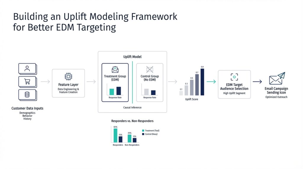
Define Treatment and Control Groups (uplift-modeling.com)
Imagine you’ve just launched your first uplift modeling project, and the first question lands on the table: who gets the message, and who doesn’t? That is where treatment and control groups come in. In uplift modeling, the treatment group receives the communication action, while the control group receives no communication, so we can compare what happens under each condition and estimate the net effect of the campaign. We need both groups because a single customer can’t receive and not receive the same message at the same time, and uplift modeling is built around that contrast.
The next step is making sure those groups are formed in a way that feels fair. How do you define treatment and control groups so uplift modeling can tell a real story instead of a misleading one? The answer is random assignment: we take a representative slice of the customer base and divide it into treatment and control groups at random. That random split helps keep the two groups comparable, so the difference we see later is more likely to come from the communication itself rather than from hidden differences between the people in each group.
This is a little like baking two nearly identical cakes and changing only one ingredient. If we want to know whether the message changed customer behavior, we need the same starting recipe as much as possible, then one controlled change. In uplift modeling, the “recipe” is the customer population, and the controlled change is whether they receive the offer. The scikit-uplift guide explains that the response data from this experiment becomes the training data for the model, which is why the experiment design matters so much before any modeling begins.
Now that we understand the setup, the real reason for these groups becomes clearer. A response model asks, “Who is likely to respond?” but uplift modeling asks a more precise question: “Who is likely to respond because of the treatment?” That distinction matters when some people would buy, click, or convert anyway, even without a message. The treatment and control groups let us measure that incremental effect, so we can focus our marketing budget on customers who are influenced by the communication rather than on customers who were already going to act on their own.
There is also a practical lesson hiding in the data collection process. If the live campaign looks very different from the experiment used to create the groups, the model can lose accuracy, because it learns from one pattern of treatment assignment and then faces another in production. For that reason, the scikit-uplift guide recommends continuing to collect fresh data with a mix of randomly selected customers and model-selected customers, so the treatment and control groups keep reflecting the world the model actually works in. That iterative loop helps the uplift modeling framework stay honest as campaigns evolve.
Seen this way, treatment and control groups are not a technical detail tucked away in the background; they are the stage on which uplift modeling performs. One group shows us what happens with communication, the other shows us what happens without it, and the gap between them is the signal we are trying to learn. Once that structure is in place, we can move on with much more confidence, because the model has a clean foundation for measuring incremental impact.
Prepare Campaign Data (uplift-modeling.com)
Building on this foundation, campaign data becomes the raw material of uplift modeling: it is the table we hand the model after the experiment is over. The goal is to turn a marketing campaign into a clean learning set where each customer record carries three things at once: pre-campaign features, a binary target showing what happened afterward, and a binary treatment flag showing whether the customer received the message. In scikit-uplift, the core model interfaces are built around that same pattern, with inputs shaped as X, y, and treatment.
How do you prepare campaign data for uplift modeling without confusing the model? We start by freezing the timeline. Every feature should describe the customer before the campaign reached them, because any information collected after the message goes out can leak the answer back into the model, like reading the last page of a mystery novel before solving the clues. The response label should also use one consistent observation window for everyone, so we measure outcomes on the same clock rather than mixing short and long follow-up periods. That discipline matters because uplift modeling is trying to learn the effect of treatment, not just a pattern in messy historical records.
While we covered treatment and control earlier, now we need to make sure the campaign data reflects that experiment in a model-ready form. In practice, that means keeping the dataset representative, preserving the random split when you have one, and recording the actual response to the offer as the target. The scikit-uplift guide recommends collecting data through a controlled experiment, then repeating that process over time so each new campaign adds fresh training data; it even suggests mixing a random customer subset with model-selected customers in later iterations. That iterative loop helps the uplift modeling framework stay aligned with the real world instead of drifting away from it.
Once the table is clean, we can shape it for the method we plan to use. If you choose a single-model approach like SoloModel, the treatment flag becomes an extra feature and the model scores each customer twice, once as treated and once as untreated, before taking the difference. If you choose TwoModels, you split the campaign data into treatment and control subsets and train a separate predictor on each side. In contrast, ClassTransformationReg uses a transformed target that depends on the outcome Y, the treatment flag W, and a propensity score p, which is the probability of being assigned to treatment.
That is why campaign data preparation is more than tidy housekeeping. We are not only cleaning columns; we are protecting the causal story the model is supposed to learn. Missing values, inconsistent labels, and mixed measurement windows can blur that story, while well-structured uplift modeling data keeps the treatment signal visible and the comparison fair. When the data is prepared this way, the model can focus on the question that matters most: who changed because of the campaign, and who would have acted the same way anyway?
Engineer Treatment Features (uplift-modeling.com)
Building on this foundation, treatment features are where uplift modeling starts to feel less like a plain prediction task and more like a conversation about cause and effect. The treatment flag tells the model whether a customer saw the message, but the real trick is helping the model notice how that flag changes the meaning of the other customer features. In scikit-uplift, the simplest version of this idea is the single-model approach, where treatment is added as an extra feature and the model is scored twice: once as if the customer were treated and once as if they were not. The difference between those two scores becomes the uplift estimate.
So what does that mean in practice? Think of the treatment flag like a switch on a lamp, and the other customer features like the room around it. A room can look calm in daylight and dramatic under warm light, and the same feature can matter differently depending on whether the campaign reached the customer. That is why treatment features are not only about recording exposure; they are about letting the model learn that exposure can change the role of age, purchase history, browsing behavior, or any other pre-campaign signal. When you engineer treatment features well, you help the model ask a more precise question: not “Who will convert?” but “Who will convert because the treatment changed the picture?”
This is where treatment interaction features enter the story. In the scikit-uplift user guide, the treatment interaction method expands the data by multiplying each original attribute by the treatment flag, creating a second version of the feature space that only becomes active under treatment. That sounds technical, but the intuition is friendly: we are giving the model two mirrors, one for the control world and one for the treated world, so it can compare how the same customer looks in both. If a person’s past spending matters only when they receive the offer, the interaction feature helps the model see that pattern instead of blending it into a single average effect.
How do you choose between a plain treatment dummy and interaction features? The answer depends on how much flexibility you need. A basic treatment flag is a good starting point because it keeps the setup simple and works well when the effect of treatment is fairly stable across customers. Interaction features are more expressive, because they let the model learn that treatment may amplify some traits, weaken others, or leave some unchanged altogether. In scikit-uplift, this is exposed as the SoloModel class with the 'dummy' method for the basic version and 'treatment_interaction' for the richer one, which makes the transition from a simpler setup to a more nuanced one feel like adding detail rather than changing the whole recipe.
There is also a practical reason to engineer treatment features with care: they can only help if the underlying data still reflects the experiment honestly. If the treatment flag is noisy, if post-campaign information leaks into the feature set, or if the treatment and control groups are no longer comparable, the interactions can amplify confusion instead of insight. That is why the treatment features we build must stay rooted in pre-campaign information and in the same randomized structure we discussed earlier. In uplift modeling, the treatment signal is delicate, and feature engineering should sharpen it, not distort it.
Taken together, treatment feature engineering gives the model a richer stage on which to compare treated and untreated outcomes. The treatment flag marks the presence of the campaign, while interaction features show how that campaign changes the way customer attributes behave. Once that idea clicks, the rest of the framework becomes easier to read, because you can see why uplift modeling is not trying to predict response in general; it is trying to predict the difference the campaign makes.
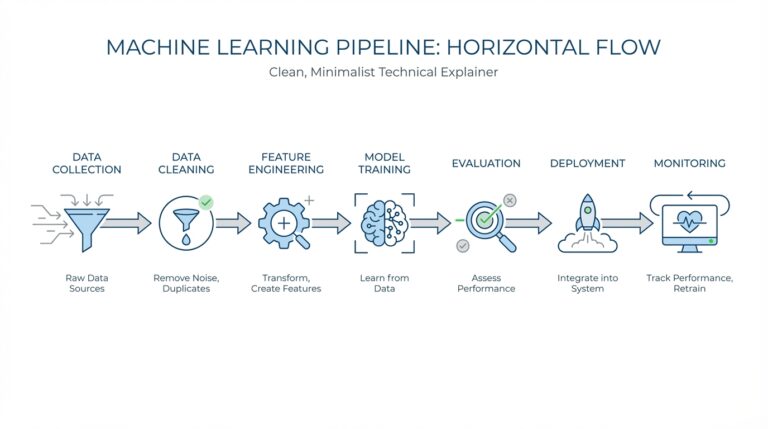
Train an Uplift Model (uplift-modeling.com)
Building on this foundation, training an uplift model is where the experiment starts turning into a decision engine. At this point, your dataset already carries the story we need: pre-campaign features, the outcome, and the treatment flag. The next step is to choose how the model should read that story, because scikit-uplift follows a scikit-learn-style API and lets you plug in estimators that already fit that ecosystem. In other words, we are not inventing a brand-new machine here; we are teaching a familiar one to compare the treated world with the control world.
So how do you train an uplift model in practice? We start by picking the modeling strategy that matches the shape of the campaign problem. The simplest path is SoloModel, which trains one model on the full dataset with treatment included as an extra feature, then scores each customer twice: once as treated and once as untreated. The gap between those two scores becomes the uplift estimate, which makes this approach feel like asking, “What changes if we flip the switch?”
If your audience behaves differently in the treatment and control groups, the next chapter is TwoModels. This approach trains one model on treatment samples and another on control samples, then subtracts the control score from the treatment score. The docs also describe two dependent-data variants, ddr_control and ddr_treatment, where one model’s predictions become extra features for the other, helping the second model learn the difference between the two worlds more carefully. Think of it like sketching the same person twice, once in daylight and once at dusk, so the contrast reveals more detail.
There is also a more mathematical route called ClassTransformationReg, which turns the problem into regression after redefining the target. In that setup, the transformed outcome is Z = Y * (W - p) / (p * (1 - p)), where p is the propensity score, meaning the probability that a customer is assigned to treatment. The docs explain that p can be a constant, such as the overall treatment rate, or learned with a classifier, and then a regressor predicts the uplift from the transformed target. This is a useful option when you want the model to learn the treatment effect more directly rather than infer it only from separate scores.
Once the model is trained, the real craft is checking whether it learned the campaign signal or only memorized noise. A good uplift modeling workflow keeps the training and evaluation logic aligned with the original experiment, because the model is only as trustworthy as the pattern it saw during fitting. That is why the scikit-uplift docs emphasize fitting on the X, y, and treatment trio, then predicting uplift on new customers with the same structure. When you keep that rhythm intact, training feels less like a black box and more like a careful comparison of two parallel customer realities.
From there, the main decision becomes practical rather than mysterious: do you want the compact logic of a single model, the separation of two models, or the transformed-outcome view? Each one is a valid way to train an uplift model, but each one tells the story a little differently. And that is the heart of uplift modeling in EDM targeting: we are not chasing response alone, we are learning who changes because of the message, so the next campaign can speak to the customers who are most likely to move when it matters.
Rank Customers by Uplift (uplift-modeling.com)
Building on the foundation we have already laid, this is the moment when the model starts making business sense. You already have a predicted uplift score for each customer, and now the practical question becomes: how do you know who should receive the next email, push, or offer? The answer is to order customers from the highest predicted uplift to the lowest, because uplift modeling is designed to surface the people who are most likely to change their behavior because of the message, not the people who would act anyway. In the scikit-uplift guide, those are the persuadables, and choosing the top of the ranking is really an attempt to find that group first.
This is where the ranking step feels less like statistics and more like triage. Imagine a crowded waiting room where you can only help a few people at a time: you would start with the people who benefit most from your help, not the people who are already fine. Uplift scoring works in the same spirit, except the “benefit” is the extra response caused by the campaign. When you sort by predicted uplift, the customers at the top are the ones the model believes will move from “probably not” to “yes” because of treatment, which is exactly why uplift modeling is so useful in EDM targeting.
How do you check whether that ranking is actually useful? We read it from the top down and watch the response pattern change as we include more customers. Scikit-uplift gives you tools for that story, including uplift_at_k, which measures uplift in the first portion of the sample after ordering by predicted uplift, and uplift_by_percentile, which shows uplift, treatment group size, and response rates at each percentile. That makes the ranking easier to interpret, because you can see whether the best-scored slice really behaves better than the rest or whether the signal fades as you move down the list.
Now that we understand the ranking itself, the next layer is evaluation. A good uplift ranking should not only look sensible; it should also produce a strong Qini curve, which plots the gain you get as you target more customers in uplift order. The scikit-uplift docs describe qini_curve as taking y_true, predicted uplift, and treatment, and they pair it with qini_auc_score for a summary measure. The plotting helper can also draw random and perfect reference curves, which gives you a visual way to ask whether your model is doing better than chance and how far it is from an ideal ranking.
That visual check matters because ranking is not only about the top customer; it is about the whole ordering. A model may look good at the very top but lose its edge quickly, and that would matter if your budget lets you contact a large audience. The uplift_at_k metric helps with that decision, because it answers a very practical question: if we can contact only the first 10 percent, 20 percent, or 30 percent of the list, how much incremental response do we expect there? In other words, ranking customers by uplift is really a way to turn a score into a campaign plan, one slice of the list at a time.
So the ranking step is where uplift modeling becomes operational. You are no longer asking whether the model can estimate effect in the abstract; you are asking whether it can put the right names at the top of the queue. If the ordering is strong, you spend less money on sure things and lost causes, and more on the customers the campaign can actually persuade. That is the quiet power of uplift modeling: it does not merely predict response, it helps you decide who to reach first when every message has a cost.
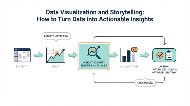
Evaluate with Qini Curves (uplift-modeling.com)
Building on this foundation, the Qini curve is where the ranking story becomes visible. After the model gives each customer an uplift score, qini_curve(y_true, uplift, treatment) takes the true binary outcome, the predicted uplift, and the treatment labels, then returns points that trace how cumulative gain changes as we move through customers in uplift order. In plain language, it shows whether the people at the top of the list are really the ones whose behavior changes because of the campaign, or whether the score is only looking confident on paper.
That visual check is useful because uplift modeling is not trying to find the customers who will respond anyway. It is trying to find the customers who respond differently once we send the message, and the Qini curve lets us see that difference as we include more and more of the ranked audience. When the curve climbs quickly near the left side, the model is concentrating incremental response where it matters most; when it flattens early, the campaign is spending effort on people with little or no added lift. That is the practical heart of Qini evaluation, even before we reduce it to a single score.
This is where the picture gets a helpful frame. Scikit-uplift’s plot_qini_curve helper can draw both a random reference curve and a perfect reference curve, which gives you two benchmarks to compare against. The perfect curve is the best-case ordering, and the docs note that it can include negative effects when negative_effect=True, meaning the benchmark can also account for customers who react worse because of the campaign. That matters in real EDM targeting, because a message can persuade some customers, leave others unchanged, and even push a few in the wrong direction.
Once you have the curve, the compact score comes from qini_auc_score, which computes the normalized area under the Qini curve, also called the Qini coefficient. The docs describe it as a summary of the curve information in one number, and for binary outcomes they define it as the ratio of the actual uplift gains curve above the diagonal to the optimum Qini curve. Think of it like the chart’s executive summary: the curve tells the full story, while the coefficient helps you compare candidates quickly when several models are competing for the same campaign budget.
How do you evaluate uplift model performance without losing the story behind the score? We read both. First, we inspect the shape of the Qini curve to see whether the model is front-loading incremental gain where the most persuadable customers sit. Then we check the Qini coefficient to compare models in a single number, using the same y_true, uplift, and treatment inputs that the scikit-uplift metrics expect. In practice, this gives you a clean bridge from model output to campaign action: the curve shows where lift appears, and the coefficient tells you how strong that ordering really is.