Why memorability matters for visuals
Building on the ideas we introduced earlier, the strongest charts do more than communicate numbers — they stick in memory so your audience can act later. Memorable data visualizations help transfer insight from a single meeting into future decisions, and that persistence matters when stakeholders revisit dashboards, write post-mortems, or brief executives who weren’t in the room. By front-loading this section with the problem and the payoff, we frame memorability as a product-quality metric as much as a design goal: it’s about retention, not just readability.
Memorability is the ability of a visual to be accurately recalled or reconstructed after a delay, and it directly affects downstream workflows. If a chart is forgotten within minutes, analysts repeat work, alerts are ignored, and the organizational learning loop breaks. For example, when an SRE documents an incident, a memorable chart that highlights the root-cause pattern (time on the x-axis, error rate spike, correlated CPU throttling) cuts cognitive friction during postmortems and speeds remediation planning. That practical impact is why we treat memorability as a reliability feature of instrumentation and dashboards.
Design choices change how well viewers encode visuals into memory, so you must prioritize encoding-friendly patterns. Use position and length encodings for precise comparisons, because spatial encodings are easier to remember than color gradients alone; choose distinct categorical colors sparingly so they serve as anchors rather than noise. When you need to highlight a trend, annotate the inflection point and label the key metric inline — these narrative anchors transform raw plots into story elements that the brain stores more readily. In code terms, prefer renderChart(data, {x:’time’, y:’latency’, mark:’line’, annotations:[{x:’t1’,label:’deploy’}]}) over a dense multi-series plot with unlabeled legends.
How do you balance memorability against analytical density? The trade-off is real: higher memorability often requires reducing visual complexity, which can remove secondary signals analysts might need. We recommend a progressive disclosure strategy: present a distilled, memorable overview for broader audiences, and provide drill-down panels for power users. In dashboards, that looks like a single-panel summary that uses strong encodings and an accompanying link to an explorable view; for reports, it’s a clear takeaway visual up front followed by appendices with full statistical context. This approach preserves both quick recall and technical rigor.
Measurement matters: treat memorability like any other metric and validate assumptions with simple tests. Implement quick A/B experiments where one group sees a stripped, annotated chart and another sees the dense original, then measure recall after 24 hours or test reconstruction accuracy via a short quiz. You can automate this in analytics workflows by logging which visuals users revisit and how often they open drill-downs; charts with high revisit rates but low immediate recall indicate poor memorability. These pragmatic tests let us iterate on color choices, annotation styles, and layout until we find what actually sticks for our users.
Finally, think about real-world use cases where memorability is non-negotiable and design accordingly. In executive briefings, sales decks, or incident summaries, pick a single, unambiguous visual and design it to survive being screenshotted, printed, or described by someone else. In operational monitoring, prioritize recallability for key SLO signals so on-call engineers can recognize failure modes under stress. Taking this concept further, the next section will show concrete patterns and micro-interactions that increase recall — letting us convert memorable data visualizations from an aesthetic preference into a measurable product capability.
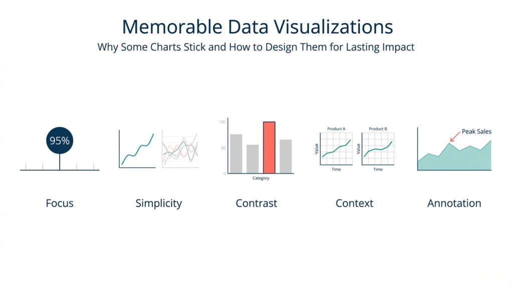
Key principles of memorable charts
Building on this foundation, the first rule is to prioritize the encodings that the human visual system remembers best: position and length. These spatial encodings give you precision and improve memorability more than color gradients or area alone, so make them the default for quantitative signals. When you need emphasis, add a redundant encoding — for example, a bolded line plus a distinct marker — rather than relying on color alone. In practice, choose a single primary metric to occupy the x/y spatial plane and use other marks only when they add an orthogonal, clearly labeled story element.
Clarity comes from a deliberate visual hierarchy rather than minimalism for its own sake. Establish a single focal object in each chart (a trend, an anomaly, a current value) and render everything else as context: muted lines, faded axes, or light gridlines. That hierarchy helps viewers encode the takeaway into memory because their attention is guided to one interpretable pattern; we often do this in dashboards by placing an annotated panel at the top with a high-contrast mark and collapsed context panels beneath. How do you decide which metric to foreground? Prioritize decisions your audience will make after leaving the page — the metric that triggers an action should be the most salient.
Narrative anchors turn visuals into memorable stories instead of transient illustrations. Add inline labels at inflection points, short annotations that explain why a jump happened, and a single-frame caption that states the takeaway. These anchors create semantic hooks for recall: people remember scenes better when they can attach a cause or a label to them, so an annotated spike with “deploy X at 09:12” will stick far better than an unlabeled uptick. Use precise language in annotations and avoid ambiguous terms; a one-line annotation tied to an x-coordinate is more durable in memory than a separate legend that requires cross-referencing.
Manage complexity with progressive disclosure, not by cramming every series into one pane. For analysts we provide explorable views: start with a distilled summary that uses strong encodings and inline labels, then let users expand into small multiples or detailed tables for signal validation. In UI terms, implement an overview panel with a single prominent chart and an affordance like “Show details” that loads the multi-series view or time-windowed decomposition. This balances analytical density with recallability so your memorable charts do not sacrifice the ability to inspect edge cases.
Perceptual design choices matter: use color and contrast as functional tools, not decoration. Select color palettes that are colorblind-safe and reserved for categorical anchors; rely on luminance contrast to separate foreground from background. Avoid rainbow scales or saturating many hues — too many distinct colors create noise and reduce memorability. Reserve motion for transitions and attention-guiding micro-animations (for instance, animating an anomaly from gray to red on hover) and avoid continuous motion that competes with pattern recognition.
Structure and chunking help the brain store information more reliably. Break long time-series into meaningful epochs, use aligned faceting to compare the same metric across cohorts, and maintain consistent axes across panels so patterns map semantically between charts. When we prepare incident summaries, we often include a three-part sequence: baseline, anomaly, remediation action; that sequence leverages chunking to make the narrative reconstructable later. Consistency across reports — same colors for the same entities, identical axis scales for like-for-like comparisons — reduces cognitive load and increases long-term recall.
Finally, treat memorability as a product metric you instrument and iterate on. Run simple recall tests, log which charts users reopen, and A/B the presence or absence of annotations and redundant encodings to see what truly sticks. As we explore concrete micro-interactions in the next section, think of these principles as constraints: choose spatial encodings, design a clear hierarchy, anchor the narrative, manage complexity, and measure — together they make your data visualizations memorable and operationally useful.
Choose the right chart type
Memorable data visualizations succeed when the chart you pick matches the decision you want the reader to make. If your goal is to show a clear trend, highlight an outlier, or compare categories, choose the encoding that makes that decision effortless—position and length for precise comparison, ordered spatial layout for ranking, and temporal axes for trend recall. How do you decide which visual to use for a given question? Start by naming the question in one sentence and map it to the cognitive task: comparison, distribution, composition, correlation, or change over time.
Building on this foundation, treat visual encoding as a mapping problem: data → task → mark → channel. Visual encoding (the rule that maps data values to visual properties like x/y position, length, color, or shape) should be explicit in your design process. For comparisons use bars or dot plots; for time series use lines with annotated inflection points; for distributions use histograms or boxplots; for correlations use scatter plots with trend lines; and for part-to-whole use stacked bars or small multiples rather than a crowded pie. Choose the chart type that preserves the primary encoding for the user’s mental model and reserves color for categorical anchors or highlighting.
You can make this concrete with an SRE example: when your incident report must communicate a latency regression, pick a line chart that plots time on the x-axis and latency on the y-axis, add an annotated vertical marker at deployment time, and shade the regression window. In code terms you might render that as renderChart(data, {x: 'timestamp', y: 'p90_latency', mark: 'line', annotations: [{x: '2026-02-18T09:12Z', label: 'deploy v2'}], focusWindow: ['2026-02-18T09:00Z','2026-02-18T10:00Z']}). This pattern uses position and length as the primary encodings and an inline label as a narrative anchor, which reinforces memorability and supports later recall under stress.
Avoid chart choices that undermine recall. Pie charts steal spatial precision and become hard to compare when categories exceed five; stacked area charts obscure individual series when totals change; 3D effects and elaborate color ramps add aesthetic weight but reduce the brain’s ability to extract structure. When you need to show many related series, prefer small multiples with consistent axes or an interactive selector rather than cramming everything into one multi-series view. These decisions protect the core message and reduce cognitive friction for both analysts and executives.
Design interactions that respect progressive disclosure so the initial visual remains memorable while supporting analysis. Present a distilled primary panel with a single, high-contrast encoding and an affordance to expand into drill-downs, faceted comparisons, or raw tables. Implement overview+detail patterns—brush to select a time window, then load an explorable decomposition—so power users can validate signals without degrading the mnemonic quality of the headline chart. These UI patterns align with our earlier recommendation to separate memorable summaries from dense analytical views.
Make durability part of your chart selection: consider how visuals will be consumed—screenshots, prints, slides, or small mobile screens—and choose types that survive those media. Use high-contrast strokes, avoid color-only distinctions, and place concise inline labels at key points so the takeaway survives out-of-context reuse. For operational dashboards, prioritize chart types that are quickly interpretable by on-call engineers, since memorability under stress has real operational impact.
Finally, treat choice of chart type as an experiment. A/B the simplified chart versus the dense original, log which visuals users revisit, and run short recall tests (ask users to redraw or describe the key pattern after 24 hours). Track metrics like recall accuracy, drill-down rate, and screenshot frequency to guide iterations. In the next section we’ll translate these chart-type decisions into micro-interactions and annotation patterns that further increase retention and actionable recall.
Craft a clear visual narrative
Building on this foundation, the first step is treating a chart as a single-scene story that your audience can retain after they close the tab. Data visualizations must do two jobs at once: convey the precise measurement and leave a semantic hook that anchors recall. How do you turn a time series or a bar chart into a scene people remember tomorrow? By picking one focal metric, giving it a clear role in the composition, and attaching a concise label or annotation that ties the pattern to a cause or decision.
Start the composition by defining the narrative arc explicitly: context, event, consequence. The context sets baseline behavior (a muted axis or light grid), the event is the focal object (a bolded line, shaded window, or callout), and the consequence is an explicit takeaway (an inline label or single-sentence caption). This maps directly to the encodings we prefer—position and length for the focal metric, color or marker as a redundant cue, and text annotations as semantic hooks that the brain stores better than legend-only encodings. These narrative anchors make your memorable data visualizations reproducible in conversation and slides.
When you build the chart, follow a tiny recipe you can automate in code: selectPrimaryMetric(data, ‘p95_latency’); renderPrimary({x:’time’, y:’p95_latency’, mark:’line’, strokeWidth:2}); addContext({series:otherServices, opacity:0.15}); annotate({x:‘2026-02-18T09:12Z’, text:’deploy v2’, arrow:true}); addCaption(‘P95 spike following deploy — investigate throttling’); This pattern gives you a repeatable API for producing coherent visuals across reports. Use it as part of your chart-rendering library so every headline panel adheres to the same storytelling contract and your dashboards remain consistent across teams.
Illustrate the sequence with a concrete use case: imagine an e-commerce dashboard where conversion rate dips after a frontend push. Start with a single-panel overview that plots conversion on the y-axis and time on the x-axis, annotate the push timestamp, and shade the post-deploy window. Below that, provide an explorable drill-down that decomposes traffic by cohort and device. That sequencing—overview then detail—lets non-technical stakeholders take away the high-level narrative while analysts immediately query the root causes without losing the original story.
Design interactions that preserve the headline when users dive deeper. Implement an overview+detail pattern with a brush for time-window selection, but keep the headline annotations pinned and exportable so a screenshot or PDF still contains the story. Prefer redundant encodings: a red dot plus a thicker stroke beats relying on color alone, and consistent axis scales across small multiples let viewers mentally map patterns between cohorts. Don’t forget accessibility: choose colorblind-safe palettes and provide short textual captions for charts so your memorable data visualizations survive varied modes of consumption.
Finally, treat the story as an iterated product feature: measure recall, not just clicks. Run brief A/B tests where one group sees the annotated, distilled visual and another sees the dense original, then measure recall accuracy after 24 hours and track drill-down rates and screenshot frequency. Use those metrics to decide whether annotations, redundant encodings, or chunked epochs actually improve retention in your user base. Taking this empirical approach lets us move from attractive charts to reproducible, memorable visuals that drive better decisions—and in the next section we’ll convert these patterns into concrete micro-interactions and annotation styles you can implement in your UI library.
Use salience, anchors, and cues
Building on this foundation, memorable data visualizations must grab attention quickly and hold it long enough to form a durable memory. If your chart fails at the moment of encoding, nothing else in the dashboard will stick, so we prioritize salience, anchors, and cues as the practical toolkit for durable recall. Salience and anchors should appear within the first visual sweep; cues guide reconstruction later. How do you design those elements so a chart remains recallable after 24 hours and usable under stress?
Start with salience as your primary signal strategy: make the thing that matters visually dominant. Salience is about contrast, size, and placement—use luminance contrast and stroke width to make the primary metric pop, reserve saturated hues for that single focal element, and position it where the eye lands first (top-left or center depending on your layout). Redundant encodings increase reliability: a bold line plus a distinct marker is easier to remember than color alone. In practice, set your default renderer to emphasize the primary series with higher z-order and a clear numeric label so the visual system encodes position and magnitude together.
Next, build semantic anchors that attach meaning to what’s salient, turning raw shape into a retrievable story. Anchors are inline annotations, reference lines, epoch shading, and named markers that tie a visual feature to a cause or decision—“deploy v2” at t=09:12 rather than a floating legend entry. Implement anchors in code as structured metadata so they persist when charts are exported: for example, annotate({x: ‘2026-02-18T09:12Z’, text: ‘deploy v2’, importance: ‘primary’}) and render that annotation with a leader line and a pinned tooltip. Those anchors provide mnemonic hooks people use when describing the chart to others or reconstructing it mentally during a meeting.
Use cues—small, directed interactions and affordances—to guide attention during exploration and to reinforce memory during re-use. Cues include micro-animations that transition an anomaly from muted to highlighted on hover, focus outlines when a user tabs to a series, and subtle sound or haptic feedback in mobile incident apps. Avoid continuous motion that competes with pattern recognition; prefer transient transitions that signal change without adding cognitive load. For example, on-call engineers benefit from a cue that pulses a degraded SLO point once when an incident opens and then pins an anchor, which both draws attention and creates a moment of encoding under stress.
Combine salience, anchors, and cues with progressive disclosure so you preserve recall while enabling analysis. Front-load one high-salience overview with an attached anchor and an affordance labeled “Explore details”; do not reveal dense multi-series plots until the user requests them. Ensure export and screenshot fidelity by rendering anchors as part of the static image and by avoiding color-only distinctions that get lost in print. Validate choices with simple experiments: A/B the anchor language, log recall quiz results after 24 hours, and instrument drill-down rates as a proxy for whether the headline visual carried enough information.
Finally, treat the interplay of these elements as a reproducible pattern rather than ad hoc decoration: codify a small API for salience weights, anchor types, and cue behaviors and make them part of your charting library. When teams adopt consistent salience rules and anchor semantics across dashboards, you reduce cognitive load and increase cross-report recall. Taking this approach moves memorable data visualizations from a one-off design flourish to a repeatable product capability that scales across incident reports, executive decks, and operational dashboards—next, we’ll map these patterns to concrete micro-interactions and annotation styles you can implement in UI component libraries.
Test, iterate, and measure retention
Designing attractive charts is only half the job; you must test whether those visuals actually survive the real world and remain memorable to users. How do you measure whether a chart actually sticks? Start by treating memorability and retention as product metrics you can instrument: define what “remembering” means for your audience (recognition, reconstruction, or action) and pick a measurable signal that maps to that definition. Front-load your experiments with simple, repeatable tests so you can iterate quickly and learn what increases recall for your users.
Building on the earlier principles about salience and anchors, structure controlled experiments that compare variants of the same visual. Randomize users into cohorts and A/B the presence of inline annotations, redundant encodings, or simplified layouts; run a short pilot with 30–100 participants per arm to validate feasibility, then scale with a power analysis if you need precise effect estimates. Use a 24–72 hour delay for recall tests—this window balances ecological validity and logistics and aligns with how decisions get revisited in meetings, dashboards, and incident reviews. Track cohort assignment in analytics so you can segment results by role, experience, and context.
Run both recognition and reconstruction tasks to capture different memory types. Recognition tests show whether a user can pick the same chart from distractors; reconstruction tests measure how accurately they can redraw or describe the pattern (for example: peak timing, direction, or labeled anchor). Instrument these with lightweight UX flows: after the delay, present a short quiz UI that logs a recall_quiz_response event and stores structured answers like {chartId, userId, variant, recallType, correct}. These discrete outcomes let you compute recall accuracy and error patterns across variants without heavy lab resources.
Complement active quizzes with passive telemetry as proxies for retention. Log events such as chart_view, chart_revisit, drilldown_open, screenshot_export, and share_action; analyze the distribution of time-to-revisit and funnel-based drilldown rates to infer whether a headline visual carried enough information. Combine these quantitative signals with occasional qualitative follow-ups—short interviews or annotated reconstructions—to understand why a variant failed. Correlate telemetry with recall accuracy to discover cases where users revisit frequently because the chart wasn’t memorable versus revisiting because it invites deeper analysis.
Iterate by changing one mnemonic element at a time so you can attribute effects: toggle inline annotations, add redundant markers, increase stroke weight, or adjust epoch shading and then re-run the test. Use feature flags to ship multivariate experiments without complex deployments: renderChart(data, {variant: ‘A’, annotations: true, redundantMark: ‘dot’}) versus renderChart(data, {variant: ‘B’, annotations: false, redundantMark: null}). Prioritize changes that increase recall accuracy or decrease time-to-revisit while preserving analytic fidelity for power users; when trade-offs arise, favor progressive disclosure so the headline remains memorable and the details remain discoverable.
Apply this approach to high-stakes scenarios where retention matters most. For SRE incident dashboards, run recall drills during on-call rotations: after an incident simulation, ask engineers to sketch the key time window and annotate suspected causes; measure both speed and correctness. For executive reports, A/B the inclusion of a single annotated takeaway frame and measure downstream behaviors such as deck reuse, screenshot exports, and clarification requests. We’ve found that combining short recall quizzes with telemetry gives a reliable signal about what design choices actually improve long-term recall under stress and in decision workflows.
Measuring retention turns memorability from a design intuition into a product capability you can optimize. Build small experiments, log both active recall and passive usage signals, iterate on one variable at a time, and validate changes with mixed quantitative and qualitative evidence. Taking this empirical path lets us convert memorable data visualizations from an aesthetic objective into a measurable feature set—and in the next section we’ll apply those findings to concrete micro-interactions and annotation styles you can implement in your charting library.