Know Your Audience (storytellingwithdata.com)
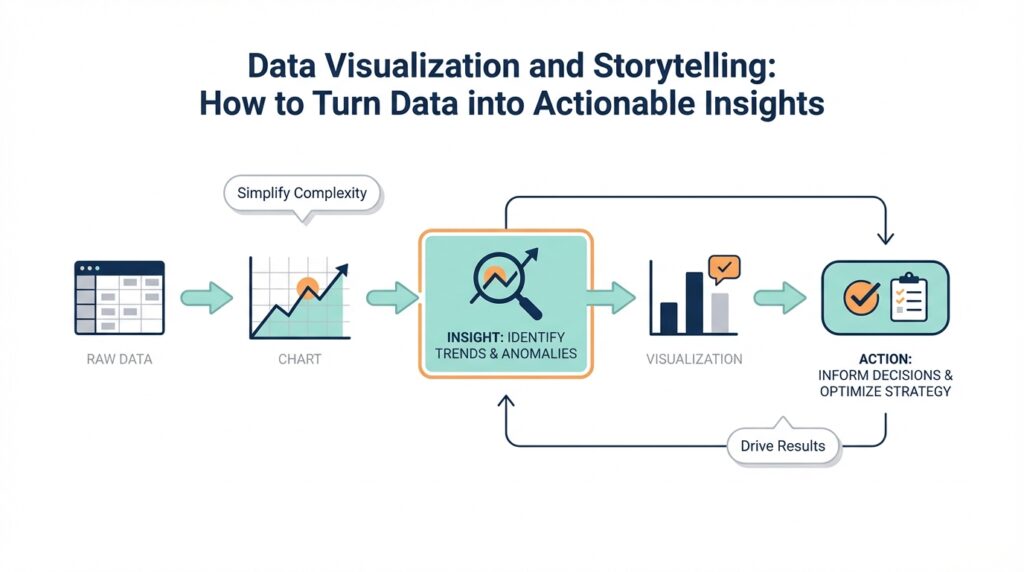
Building on this foundation, the next move in data visualization is to stop thinking first about the chart and start thinking about the person who will read it. If you have ever prepared a dashboard for a manager, a slide for a client, or a report for a team meeting, you already know the quiet challenge: the same numbers can mean very different things to different people. How do you know what your audience needs from a chart? We begin by asking who will look at it, what they already understand, and what decision they need to make after they see it. That is the heart of storytelling with data, because data storytelling works best when the message fits the listener.
Once we shift our attention to the audience, the chart stops being a decoration and becomes a tool. Think of it like packing for a trip: you would not bring the same suitcase for a weekend hike, a business meeting, and a family wedding. In the same way, an executive, an analyst, and a frontline operator rarely need the same level of detail. An executive may want the main takeaway in a single glance, while an analyst may want the trend, the comparison, and the underlying numbers. When we know the audience, we can decide whether the story should be broad and directional or precise and technical.
This is where many data visualization efforts go off course. We often build for what we can show, not for what someone can use. A crowded chart may feel complete to the person who made it, but it can overwhelm a busy reader who only has a minute between meetings. On the other hand, oversimplifying can leave an expert audience frustrated because the chart hides the very detail they need to act. The goal is not to make everyone happy with the same graphic; the goal is to match the level of information to the people in front of us. That balance is what makes audience awareness such an important part of data storytelling.
To get there, we need to know more than job titles. We need to understand context, which means the setting, the stakes, and the questions already on the reader’s mind. Are they deciding where to spend money, trying to spot a problem, or looking for evidence that a plan is working? A chart that supports a weekly team review may need a different emphasis than one used in a board presentation. Even the vocabulary matters, because a group that lives inside the data every day may be comfortable with terms and abbreviations that would confuse a new stakeholder. When we tailor the language and the visuals to that reality, we make the message easier to absorb.
Practical audience awareness also changes what we highlight. Instead of showing every possible metric, we choose the few that answer the real question. Instead of forcing readers to search the screen, we guide their eyes toward the pattern that matters most. And instead of assuming our interpretation is obvious, we name it clearly so the audience does not have to guess. This is a small but powerful shift in storytelling with data: we move from presenting information to shaping understanding. The best data visualization does not ask people to work harder; it helps them see faster.
So as we keep moving through the story, let us remember that every chart has a reader behind it. If we understand that reader first, we can decide how much detail to include, which comparison to make, and what message deserves the spotlight. That same idea will carry us into the next step, because once we know who we are speaking to, we can start choosing the right structure for the story we want to tell.
Clarify the Key Message (storytellingwithdata.com)
Building on this foundation, the next step is to decide what you actually want the reader to remember. A strong data visualization does not try to carry every observation at once; it chooses one key message and lets everything else support that point. If you have ever stared at a chart and thought, “What am I supposed to do with this?”, you have felt the cost of an unclear takeaway. The real work now is to answer the question behind the question: what is the so what? When that answer is missing, even accurate data can feel muddy and forgettable.
That is why the message should appear in words, not only in numbers. In storytelling with data, the title is treated like valuable space because it is the first place many readers look, and it can carry the main point for a slide or report. Think of it like a road sign: the graphic is the road, but the title tells you where the road is headed. When your key takeaway sits in the title, subtitle, or spoken narration, the audience does not have to reverse-engineer your intent while they are still trying to understand the chart itself.
Here is where it gets interesting: once the message is clear, the visualization can work much harder for you. In the article’s example, the original graphic is messy until the point is named plainly, and then the same data become easier to shape into a line chart that shows change over time. That change matters because a chart should match the story you want to tell, not the other way around. If the point is that one measure rises after a specific event, then your data visualization should help the reader see that rise without forcing them to hunt for it. Clarity in the message gives clarity to the design.
We can make that clarity even stronger by connecting the words to the data itself. The source example shows how annotations can place an event directly on the chart, and how consistent color can tie the takeaway to the relevant marks. That combination works a little like pointing at a photograph while telling a story: the listener hears the claim and immediately sees where it lives. In data storytelling, this is one of the most useful habits you can build, because it keeps the reader from having to make the leap alone. When the message and the evidence are visually linked, the chart feels guided rather than cryptic.
So before we keep building, it helps to pause and name the point in plain language. What one sentence would you want someone to repeat after they leave the room? That sentence becomes the anchor for the rest of the data storytelling process: it shapes the title, guides the chart choice, and tells you which details belong on the page and which do not. A clear key message is not an extra layer added at the end; it is the thread that holds the whole explanation together. Once we have that thread, the rest of the story can finally hang together with purpose.
Select the Right Chart (storytellingwithdata.com)
Building on that clear message, we arrive at the moment where many people feel stuck: the data is ready, the audience is known, the takeaway is clear, but the page is still blank. This is where chart selection matters most, because the right chart does more than display numbers; it quietly guides the reader toward the story. If you have ever wondered, “How do you choose the right chart for data visualization?”, the answer starts with one simple idea: match the chart to the question you want the reader to answer.
Think of a chart like a lens on a camera. A lens does not change the scene, but it changes what you notice first, what feels sharp, and what fades into the background. In storytelling with data, that same principle applies. A bar chart, for example, is a chart made of rectangular bars that makes comparisons easy to see, so it works well when you want to show which category is larger or smaller. A line chart connects values over time, which makes it a natural fit when your story is about change, growth, or decline. Once you know the shape of the story, the chart choice becomes less about decoration and more about emphasis.
This is where the different chart families start to feel like different tools in a kitchen. If you are comparing categories, a bar chart usually gives the clearest answer because our eyes are very good at comparing lengths. If you are showing change across months or years, a line chart often feels more natural because the path helps the reader follow the movement. If your question is about how two measures relate to each other, a scatter plot, which uses dots to show paired values, can reveal patterns that a bar chart would hide. What causes sales to rise when ad spend increases? That is the kind of question a scatter plot can help you explore.
Not every chart is about comparison, though. Sometimes you need to show how a whole is split into pieces, or how values are spread out across a group. A part-to-whole chart shows how pieces make up one total, but it only works well when the parts are easy to compare and the total is the main point. A histogram, which groups numbers into ranges, helps you see the distribution, meaning the spread of values and where they cluster. That matters when you want to answer questions like whether most customers are buying small, medium, or large amounts. When we choose a chart based on the pattern in the data, we give the reader a faster path to understanding.
Here is the trap to avoid: picking a chart because it looks familiar, not because it tells the story well. A pie chart, for instance, can be tempting because it feels friendly, but it becomes hard to read when the slices are close in size or when there are too many of them. In contrast, a bar chart often makes the same comparison easier to grasp at a glance. The same caution applies to stacked charts, which combine categories into one visual block; they can be useful, but they are best when the reader needs to see the total and the main pieces at the same time. The right chart in data visualization is not the fanciest one. It is the one that reduces effort for the reader.
So as we make the chart choice, we keep returning to the same three questions: what is the data showing, what does the audience need to notice, and what do we want them to remember? That habit keeps storytelling with data grounded in purpose instead of habit. When the chart fits the message, the title feels clearer, the annotations feel more natural, and the whole graphic becomes easier to trust. And once that happens, we are no longer asking the reader to decode the picture; we are helping them move through it with confidence.
Add Context and Labels (storytellingwithdata.com)
Building on this foundation, we now reach the part where a chart starts to feel like a conversation instead of a puzzle. Even when the audience is clear and the main message is chosen, a piece of data visualization can still leave people guessing if the reader has to work out what the numbers mean on their own. Context and labels are what turn raw marks on a page into something understandable, because they answer the quiet questions readers always bring with them: What am I looking at, why does it matter, and what should I notice first?
Think of context as the background music in a scene. It does not take center stage, but it changes how we experience everything else. In storytelling with data, context is the extra information that helps the chart land properly, such as the time period, a benchmark, an event, or a comparison point that gives the numbers meaning. Without it, a line can rise or fall, but the reader may not know whether that movement is unusual, expected, good, or bad.
Labels play a similarly important role, and they are more than tidy text on a screen. A label is any word or phrase placed on the chart to identify a value, a category, a line, or a key moment; it can be an axis label, a direct data label, or a short annotation, which is a note that explains something specific in the visual. When we use labels well, we spare the reader from constantly matching legends to colors or jumping back and forth between the graphic and the surrounding text. That small reduction in effort can make a data visualization feel far more readable.
So how do you know what to label? A good starting point is to label the thing the reader would most likely ask about first. If the chart shows a trend, we can label the line itself instead of forcing the reader to decode a legend. If one point marks a turning moment, we can add a brief annotation to explain what happened there. If the scale matters, we can make sure the axis title is plain and specific, because vague labels create uncertainty even when the data is strong.
This is where context and labels work together like a map and a street sign. The map shows the landscape, but the sign tells you where you are and which direction matters now. In storytelling with data, a reference line can do that job too; a reference line is a horizontal or vertical guide that shows a target, average, or threshold, giving the reader a stable point of comparison. Once that line is visible, a number no longer floats in isolation. It becomes part of a story about performance, progress, or distance from a goal.
Another helpful habit is to label what the reader should not have to infer. If a bar chart compares several categories, direct labels can remove the need to cross-check a legend and keep the eye moving naturally across the bars. If the chart includes an important event, a short note can explain it in the same place the change appears, rather than burying the explanation in a paragraph below. This is one of the quiet strengths of storytelling with data: it respects the reader’s time by making the meaning visible where the data lives.
At the same time, we want to be careful not to label everything. Too many notes can crowd the chart and make the important parts harder to see, which is why context should clarify rather than compete. The best data visualization uses labels like a good teacher uses a pointer: enough to guide attention, not so much that the main idea disappears. When we add only the context that helps the reader understand the message, the chart becomes lighter to read and stronger to trust.
As we keep moving forward, this idea gives us an important foundation. Once the audience knows what they are seeing, the message is clear, and the right chart has been chosen, context and labels help the story speak in plain language. That is the moment when data visualization stops asking people to decipher the picture and starts helping them read it with confidence.
Highlight Key Patterns (storytellingwithdata.com)
Building on this foundation, we now reach the moment when a chart stops being informative and starts becoming memorable. In data visualization, highlighting key patterns means helping the reader notice the one movement, comparison, or turning point that matters most. Without that guidance, even a well-built chart can feel like a crowded room where everyone is speaking at once. So how do you help readers spot the pattern without turning the whole graphic into a neon poster? We do it by creating visual hierarchy, which means arranging elements so the most important one naturally stands out first.
Think of it like telling a story in a busy café. You would not raise every voice in the room; you would lower the background noise and let one clear voice come through. The same idea applies in storytelling with data. If every line, bar, and label receives equal attention, nothing feels important. But if we mute the supporting elements and give one series, one point, or one time period more emphasis, the reader immediately knows where to look. This is one of the quiet powers of data storytelling: you are not changing the data, only guiding attention.
The simplest way to highlight key patterns is through contrast. A single color can carry the main message while the rest of the chart stays gray, which acts like stage lighting around the lead actor. In a line chart, that might mean drawing the central trend in a strong color and letting the comparison lines fade into the background. In a bar chart, it might mean coloring only the category that answers the question. This works because our eyes naturally go first to differences in color, brightness, and thickness, so the important pattern becomes easier to find at a glance.
That same idea applies when the pattern lives in a specific moment rather than across the whole chart. Sometimes the story is not about every data point; it is about the spike, drop, or shift that changed everything. In those cases, markers, which are small visual symbols placed on a chart, can draw attention to a single value without overwhelming the view. An annotation, which is a short note attached to the visual, can explain why that point matters. When we pair the marker with a plain-language note, we give the reader both the what and the why in one glance.
What causes this kind of highlighting to work so well? It reduces the mental work required to interpret the chart. Instead of asking the reader to compare five lines, scan ten bars, and guess which point matters, we make the pattern visible. This is especially helpful in storytelling with data when the audience is busy or unfamiliar with the subject, because attention is limited and decisions need to happen quickly. A chart that highlights the key pattern does not shout louder; it speaks more clearly. That is a small distinction, but it makes a big difference in how the message lands.
At the same time, restraint matters. If we highlight everything, we highlight nothing, and the chart loses its shape. That is why visual emphasis should be reserved for the part of the data that supports the key message we already defined earlier. A good rule of thumb is to ask whether the emphasis helps the reader answer the main question faster. If it does, keep it. If it only adds decoration, remove it. Strong data visualization uses emphasis the way a writer uses punctuation: enough to shape meaning, not so much that the sentence becomes noisy.
As we move forward, this habit becomes even more useful because highlighted patterns are often the bridge between observation and action. Once the reader can see the meaningful shift right away, we can decide whether to explain the cause, compare it with a benchmark, or show the consequence more clearly. That is where storytelling with data starts to feel alive: the chart no longer just displays numbers, it directs attention toward the insight that matters most.
Drive Actionable Next Steps (storytellingwithdata.com)
Building on this foundation, the next step is to make the chart point somewhere. A strong piece of data visualization does not stop at “here is what happened”; it moves one step farther and asks, “what should we do now?” That is where actionable insights begin to form, because the reader is no longer just observing a pattern but being guided toward a decision. If you have ever looked at a report and felt unsure what to do next, you already know why this matters. In storytelling with data, action is the moment when the story leaves the page and enters the real world.
The clearest way to drive action is to name the decision the reader needs to make. Before we ask people to react, we need to tell them what kind of reaction we are looking for: approve a budget, investigate a drop, shift resources, or keep doing what is already working. That may sound small, but it changes everything about the chart’s purpose. Instead of being a passive snapshot, the visual becomes a decision aid. How do you turn a chart into action? You start by making the next question obvious, because a reader who knows the question is much more likely to answer it.
Once the decision is clear, we can pair the chart with a recommendation. This is not about telling people what to think; it is about showing them what the data suggests and where the story leads. Think of it like a trail sign on a hiking path: the sign does not force the route, but it helps you choose the right direction before you wander off. In data storytelling, that recommendation might be written in plain language near the title, in a subtitle, or in a short note attached to the visual. When the recommendation matches the evidence, the chart feels purposeful instead of merely descriptive.
Action becomes even stronger when we explain the consequence of doing nothing. A reader is more likely to move when they can see what is at stake, whether that means lost revenue, delayed work, lower satisfaction, or missed opportunity. This is where storytelling with data shifts from reporting to persuasion, because we are connecting the pattern to its real impact. A line moving downward is not enough on its own; we need to say why that drop matters and who feels it. That connection gives the data weight and helps the audience understand why this chart deserves attention now.
We also need to make the next step specific enough to be useful. Vague guidance like “monitor this closely” or “take action soon” leaves people standing at the edge of the road. Clear guidance sounds more like “review the top three regions this week,” “pause the underperforming campaign,” or “recheck the target by Friday.” Those phrases matter because they translate analysis into work that someone can actually do. In a well-built data visualization, the reader should be able to leave with a next move, not just a general feeling that something needs attention.
Timing and ownership help turn that next move into a real plan. A recommendation without a timeframe can drift, and a chart without an owner can become someone else’s problem. So when the story calls for action, we should show when it needs to happen and who should own it. That might mean pointing to a team, a date, a threshold, or a follow-up check. These details are part of actionable insights because they close the gap between understanding and execution, which is often where good ideas quietly stall.
As we discussed earlier, every strong chart serves the audience, clarifies the message, and highlights the pattern that matters most. Taking this concept further means making sure that pattern leads to a decision people can carry out. When a visualization answers not only “what is happening?” but also “what should happen next?”, it earns its place in the story. That is the real power of storytelling with data: it helps people move from seeing, to understanding, to doing.