Prepare Retail Sales Data
Before any chart tells a convincing story, we need to give it clean facts to work with. That is why retail sales data preparation comes first in Power BI: it turns a messy export from a point-of-sale system, spreadsheet, or database into something the model can understand. If you have ever wondered, “How do I prepare retail sales data in Power BI so my reports actually make sense?”, this is where the answer begins. We are not decorating yet; we are laying the floor so every later analysis stands straight.
The first thing we usually meet is clutter. Real-world retail sales data often arrives with extra spaces, mixed date formats, duplicated rows, missing values, and column names that mean different things in different files. One store might label a field as Sales, another as Revenue, and another as Net Amount, even when they all point to the same idea. In Power BI, those small inconsistencies can create big problems later, because the model needs one clear language before it can calculate sales performance or profitability analysis reliably.
So we begin by opening the data in Power Query, which is Power BI’s data-cleaning workspace. Think of Power Query as the kitchen before the meal: this is where we wash the vegetables, trim the rough edges, and put every ingredient in the right bowl. Here we remove obvious clutter, rename columns so they are easy to understand, and set the correct data type for each field, such as text for product names, whole numbers for quantity, and decimal numbers for sales amounts. That last step matters more than it looks, because a number stored as text cannot behave like a number when we want totals, averages, or profit margins.
Next, we make sure the time data is trustworthy. Retail analysis depends heavily on dates, because sales trends, seasonality, and month-over-month changes all live inside the calendar. If the date column is inconsistent, the whole story becomes blurry, so we convert it into a proper date format and check that every record belongs to the right day, month, and year. This is also the moment to think about whether you need a separate date table later, because Power BI works best when time-based reporting has a clean structure to lean on.
Then we look at the business meaning of each field, not just the technical shape of it. A sales transaction may include quantity, unit price, discount, cost, and profit, but those values only help if they line up logically. For example, if a discount is stored as a percentage in one file and as a dollar amount in another, we need to standardize it before we calculate margins. This is the heart of retail sales data preparation: making sure that every column tells the same story every time, so the final numbers support sales performance and profitability analysis instead of arguing with it.
We also pay close attention to duplicates, blanks, and outliers. A duplicate transaction can make revenue look stronger than it really was, while a missing product category can leave a hole in your product analysis. Outliers deserve a careful look too, because a single unusually large order might be a real wholesale sale or it might be an entry error that slipped through. In Power BI, a good model is not built by trusting every row blindly; it is built by checking which rows deserve a place in the story.
By the time the data is cleaned, typed, and aligned, the rest of the work becomes much easier. Measures calculate more predictably, visuals respond more honestly, and the report starts to feel like a steady guide instead of a puzzle. That is the quiet reward of retail sales data preparation: we spend time on the invisible work so the visible analysis can feel effortless. From here, we are ready to shape the model and start asking the questions that matter most.
Create Core Profitability KPIs
Now that the data is clean, we can start giving it a business voice through profitability KPIs in Power BI. KPI means key performance indicator, which is a simple way of saying “the few numbers that tell us whether the business is healthy.” If you have ever asked, how do I create profitability KPIs in Power BI that actually mean something?, this is the point where those numbers start to take shape. We are no longer counting raw transactions; we are translating retail activity into profit, margin, and efficiency.
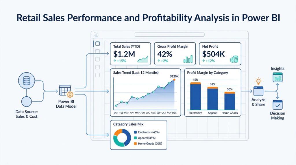
The first KPI most retail reports need is gross profit, which is the money left after subtracting the direct cost of the goods sold from sales revenue. In plain language, it tells us how much value the store kept before overhead costs entered the picture. In Power BI, this usually becomes a measure, which is a calculation that updates automatically as you slice the report by store, product, date, or category. That flexibility is what makes profitability analysis in Power BI feel alive instead of static.
A typical starting point looks like this:
Gross Profit = [Sales Revenue] - [Cost of Goods Sold]
Gross Margin % = DIVIDE([Gross Profit], [Sales Revenue])
Here, DIVIDE is a DAX function, and DAX stands for Data Analysis Expressions, the formula language Power BI uses for calculations. We use DIVIDE instead of ordinary division because it handles blanks and zero values more safely, which matters when a category has no sales in a given period. Gross margin percentage is especially useful because it lets us compare a small product line and a large one on the same scale, almost like comparing how much water each bucket kept after being filled.
From there, we usually add net profit, which goes one step further and includes other business costs such as discounts, returns, shipping, or operating expenses, depending on how your model is set up. Gross profit shows how well products themselves are performing, while net profit shows what is left after the broader business realities are included. That difference matters in retail sales performance and profitability analysis because a product can look healthy at the shelf level and still fail to earn enough once returns or markdowns enter the story. When we build both measures, we get a clearer picture of where profit is truly coming from.
Once those core measures exist, we can create supporting KPIs that make the story easier to read. Profit per transaction tells us how much profit we earn from each sale, while profit per unit tells us how much value each item contributes. These measures are helpful because they expose the shape of the business, not just its total size. A store with fewer transactions can still outperform a busier one if its average profit per order is stronger, and that is exactly the kind of insight a good profitability dashboard should reveal.
We also want to think about profitability by slice, not only in total. When we place gross profit, gross margin, and net profit next to product category, store, region, or time period, we begin to see patterns that raw totals hide. One category may drive revenue but carry thin margins, while another may sell less often but produce steadier profit. This is where Power BI earns its keep: the same measure can answer different questions depending on where we place it, like a flashlight revealing different corners of the same room.
As we build these KPIs, it helps to keep them consistent, readable, and tied to the business logic we established during data preparation. If a measure uses the wrong cost field, mixes discounted and undiscounted sales, or ignores returns, the result may look polished while telling the wrong story. That is why core profitability KPIs should always be checked against the source data and the retail process behind it. When the numbers are trustworthy, we can use them to steer decisions instead of second-guessing them.
With these measures in place, the report starts to move from description toward judgment. We are no longer asking only what sold; we are asking what sold well, what earned well, and where the business is leaking value. That shift is the real payoff of profitability KPIs in Power BI, because it gives the rest of the analysis a financial backbone to stand on.
Analyze Revenue and Margin Trends
Now that the profitability KPIs are in place, we can watch them move through time and see whether the business is building momentum or merely bouncing around. Revenue and margin trends in Power BI tell a richer story than a single total ever could, because line charts are designed to show continuous change, seasonal patterns, and long-term direction. If you have been wondering, “How do we analyze revenue and margin trends in Power BI without getting lost in the noise?”, this is where the report starts to feel like a conversation instead of a snapshot.
The first thing we need is a trustworthy calendar, because trend analysis falls apart when dates behave like loose puzzle pieces. Power BI recommends using a date table for most models, and its classic time intelligence features require one that is marked as a date table; auto-date/time can create hidden tables for convenience, but Microsoft notes it is not ideal for larger or more complex models. That matters here because revenue trend analysis in Power BI depends on clean month, quarter, and year groupings, not on dates that only look complete at first glance.
Once the calendar is steady, we can place revenue and margin on the same visual and let the pattern speak. A line chart works well because it can plot values along a continuous date scale, show multiple series at once, and even use a secondary Y-axis when two measures live on very different scales. In practice, that means you can track Sales Revenue on one line and Gross Margin % on another, then see whether they rise together, drift apart, or cross paths during promotions, season changes, or stock-heavy periods.
That comparison is where the real insight begins. When revenue climbs but margin slips, the business may be growing through discounting, higher costs, or a tougher product mix; when revenue stays flat but margin improves, the store may be selling fewer units but keeping more profit from each sale. Those are interpretations, not automatic truths, so we read them as clues and then test them against categories, stores, and time periods to see what actually changed.
To keep the picture readable, it helps to break the story into smaller panels instead of stacking every line into one crowded chart. Power BI’s small multiples feature creates a grid of mini line charts, one per category, which makes it easier to compare store-by-store or product-by-product revenue and margin trends without the lines tangling together. This is especially helpful in retail, where one region might be growing steadily while another is suffering from markdown pressure or weak demand.
We can also lean on time intelligence to make the trend more meaningful than a simple month-to-month climb. With a proper date table, classic time intelligence lets us calculate familiar comparisons such as same period last year or year-to-date, which gives revenue trend analysis in Power BI a sense of context instead of isolation. That extra context matters because a strong month is more impressive when it beats the same month from last year, and a thin margin looks more serious when it keeps repeating across quarters.
As we read these lines together, we are looking for the places where growth quality and growth quantity stop telling the same story. That is the quiet power of revenue and margin trends: they show not only whether the business is moving, but whether it is moving in the right direction. Once that pattern is clear, the next layer of analysis becomes much easier, because we already know which periods deserve a closer look and which ones are simply carrying the business forward.
Compare Stores and Districts
With the revenue and margin trends already in view, the next question is wonderfully human: which store and district comparison tells us where the business is actually winning? In Power BI, this is where the report starts to feel like a map instead of a scoreboard. A single store can look impressive on its own, but once we place it beside other stores and then roll those stores up into districts, the pattern becomes much easier to trust. We are no longer asking only, “How much did we sell?” We are asking, “Where did we sell well, and which part of the business made that happen?”
That distinction matters because stores and districts do not play the same role. A store is the smallest everyday unit, the place where customers buy, browse, and return; a district is the group that gathers several stores under one umbrella, often across a city, region, or operating territory. When we compare stores in Power BI, we look for local behavior. When we compare districts, we look for broader business shape. One store might be a standout because of a holiday promotion, while its district may still be lagging overall, and that difference can reveal whether the issue is isolated or structural.
The safest way to compare stores and districts is to line up both absolute and relative numbers. Absolute numbers are the raw totals, like revenue, gross profit, and net profit. Relative numbers are the fairer lens, such as gross margin percentage, profit per transaction, or revenue compared with the district average. That second layer matters because bigger stores naturally produce bigger totals, and totals alone can hide weaker efficiency. If you have ever wondered, “How do I compare stores in Power BI without being fooled by size?”, this is the answer: we compare what a store earned and how efficiently it earned it.
A clustered bar chart works well here because it lets us place store results beside district results in a single glance. We can sort stores by revenue, then switch the same visual to gross margin or net profit to see whether the ranking stays stable or changes completely. A matrix is also useful when we want a clean side-by-side view of store, district, and key KPI values, especially if we add conditional formatting to spotlight the strongest and weakest performers. That simple color cue often reveals the story faster than a long table ever could.
The real power of a store and district comparison comes from context. A store that sits below its district average in revenue but above it in gross margin is telling a different story than one that leads on revenue but trails on profit. The first store may be selling fewer units at healthier prices, while the second may be driving traffic at the cost of heavy discounting. These are not abstract differences; they are clues that help us decide whether the issue lives in traffic, pricing, mix, or cost control. Power BI makes that comparison easier because the same visual can respond to slicers for date, category, or product line.
Once we see a district behaving differently from its stores, or one store pulling away from the rest of its district, drillthrough becomes the next natural move. Drillthrough means opening a deeper report page with the selected store or district already filtered in place, almost like stepping through a doorway from the lobby into a single room. That lets us ask more precise questions without losing the bigger picture. We might discover that one district’s revenue rose because two stores expanded strongly, while another district stayed flat because its top store was stable but its smaller stores weakened.
This is why store comparison in Power BI should never stop at the total. The moment we place stores next to districts, we begin to see whether performance is concentrated, balanced, or unevenly distributed. And once we can see that shape clearly, we are better prepared to explain why a district looks strong on paper while still hiding a problem inside one of its stores.
Segment Customers and Products
At this point in profitability analysis in Power BI, the numbers are clean, but the real question is still waiting: which customers and products are carrying the business, and which ones are only making the report look busy? That is where segmentation comes in, which means grouping customers or products into meaningful bands so we can compare like with like instead of staring at one giant crowd. Think of it like sorting a shelf of groceries before cooking: once the pieces are in the right piles, the pattern is easier to see.
On the customer side, we usually begin with behavior, not labels. A customer who buys once a quarter, a customer who returns every week, and a customer who spends heavily but infrequently are all telling different stories, so Power BI’s grouping and binning tools help us separate those patterns into clearer bands. Binning means putting numeric values into evenly sized ranges, and that is useful when we want to turn raw spend, order count, or profit-per-customer values into low, medium, and high segments that are easier to read.
Product segmentation follows the same logic, but the clues look different. Here we often group items by category, price band, or margin band, so a wide product catalog becomes a smaller set of business-friendly families. Power BI lets us create groups directly in visuals, and it also lets us define bins for numeric fields, which is helpful when we want to see whether a product line sells a lot, earns a lot, or does both. In practice, that makes it much easier to spot the items that drive volume but weaken margin, which is a common tension in retail sales performance.
Once those segments exist, the decomposition tree becomes a very natural next stop. A decomposition tree is a Power BI visual that breaks one measure across multiple dimensions, and it lets you drill down in any order, which feels a lot like following a trail of breadcrumbs through the report. If you start with profit and then split it by customer segment, product category, and then store or district, you can watch the same number reveal different layers of meaning. Power BI’s AI splits can even suggest the next dimension to explore, which is helpful when you do not yet know where the story is hiding.
This is also where the Key influencers visual earns its place. Key influencers is a Power BI visual that looks for factors associated with a result, and its Top segments view shows combinations of factors that define distinct groups. That makes it useful when you want to answer questions like, “What traits are common among our most profitable customers?” or “Which product characteristics appear most often in the highest-margin group?” The visual works best when the fields you use match the level of the metric you are analyzing, so we keep the customer or product grain aligned with the measure.
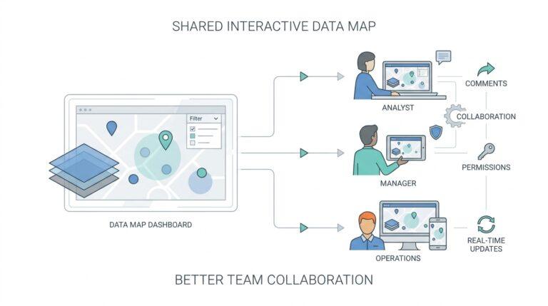
Slicers keep this whole exploration manageable because they filter the report directly on the page. A slicer is a visible filter, so instead of opening a hidden filter pane and guessing what changed, you can click a customer segment, product family, or price band and watch the rest of the visuals respond immediately. If you are wondering, “How do I compare customer segments in Power BI without losing the bigger picture?”, slicers are usually the answer, especially when you synchronize them across pages so the same segment stays in view as you move through the report.
What we gain from all this is not just cleaner visuals, but better judgment. Customer segmentation shows us who is valuable, product segmentation shows us what is valuable, and Power BI gives us several ways to compare both without flattening the story into a single total. Once those groups are visible, we can move from broad averages to sharper questions about loyalty, mix, and margin, which is exactly the kind of shift that makes a retail report feel alive instead of generic.
Add Drilldowns and Slicers
After we have the store, district, and profitability picture in place, the next job is to make the report feel walkable. That is where drill-down controls and slicers help in Power BI: one lets you move deeper inside a hierarchy, and the other lets you narrow the whole report to the slice you care about. If you have ever wondered, “How do I explore retail sales performance in Power BI without drowning in charts?”, this is the part that turns the report into a guided path instead of a crowded wall. Power BI supports drill-down when a visual has a hierarchy, and slicers are built to filter information so you can focus on a specific portion of the model.
Drill-down works like a camera zooming in on a shelf. We might start with total profit by region, then move to district, then to store, and finally to product group or item, depending on how we build the hierarchy. Power BI lets you drill to the next level, drill back up, or expand all data points to the next level, so you can move between a broad summary and a more detailed view without rebuilding the visual. In retail sales performance and profitability analysis, that makes it much easier to answer a question like, “Which store is pulling the district down?” because the answer is hidden one layer deeper than the summary chart.
The easiest way to add that depth is to place related fields in the same visual hierarchy. A sales chart might use category, subcategory, and item; a geography chart might use region, district, and store; a time chart might use year, quarter, and month. Once the hierarchy exists, Power BI can reveal more detail as you drill, and the report viewer can climb back up when they want the bigger picture again. That back-and-forth matters because retail data rarely tells its full story at one level alone; margin pressure can hide in one category, while revenue growth may live in one district or season.
Slicers give us a different kind of control. Instead of moving down through levels, we use them to choose what part of the data should stay on the page, much like choosing which aisles to walk into before you start shopping. Power BI slicers can filter by things like district manager, store name, product category, or date, and if we need several related fields in one control, we can build a hierarchy slicer. That is especially helpful in retail reports because it keeps the page tidy while still letting us compare one chain, one category, or one segment at a time.
What makes slicers especially useful is that they can shape the whole page without forcing every visual to react in the same way. Power BI lets us edit visual interactions, which means we can keep one chart as a stable benchmark while other visuals respond to the slicer selection. That is a small but powerful habit in retail sales performance and profitability analysis, because sometimes we want one chart to move and another to stay still so we can compare the filtered result against the full context. It is like keeping one hand on the map while the other hand traces the route.
As we use these controls together, the report starts to behave like a conversation. First we drill into the place where profit changed, then we use slicers to narrow the time period, product family, or store group, and then we sync those slicers across pages if we want the same filter to follow us through the report. Power BI supports synchronizing a slicer selection across selected pages, which makes it easier to move from an overview page into a detail page without losing the thread. That continuity is what turns retail sales analysis from a one-time check into a repeatable investigation.