Choose a Sharing Workflow
When you start sharing interactive data maps with an internal team, the first decision is not about design or color. It is about the sharing workflow, meaning the path the map takes from your screen to everyone else’s hands. Think of it like choosing how to pass a message in a busy office: sometimes you walk over with the latest version, sometimes you send a note, and sometimes you pin something to the wall for everyone to see. What is the best way to share interactive data maps with internal teams? The answer depends on how often the map changes, who needs to see it, and how much control you need over the information.
The most common workflow is a live shared link, and it works well when the team needs the freshest version of the map. A live link is a web address that opens the current map instead of a saved copy, so updates appear without anyone re-downloading anything. This is a strong choice for planning meetings, operations check-ins, and any situation where people need to explore the same data map at the same time. It keeps everyone in sync, which matters when one outdated screenshot can send a conversation in the wrong direction.
That said, not every team conversation needs the live version. Sometimes a snapshot, which is a static copy of the map at a specific moment, is the calmer option because it freezes the conversation around one exact view. A snapshot works a bit like taking a photo of a whiteboard before people start erasing notes, and it can be useful when you need approval, feedback, or a record of what was reviewed. If your internal data sharing workflow includes executives, legal reviewers, or other groups who want stability more than exploration, a snapshot can reduce confusion.
Permissions come next, and they deserve careful attention because they decide who can open the map and what they can do once they get there. Permissions are the access rules attached to the map, such as view only, comment, or edit, and they protect both the data and the conversation around it. For sensitive internal data, the safest workflow often uses a shared workspace or a team platform with sign-in required, rather than an open link that could be forwarded too easily. This is where sharing interactive data maps becomes less like handing out flyers and more like opening a secured room with the right badges at the door.
Another choice to make is whether the map should invite discussion directly or only deliver information. If the team is still exploring a problem, the best workflow may be one that allows comments, annotations, or notes right on the map, because that turns the map into a conversation space instead of a one-way report. If the team already knows what decision it needs to make, then a cleaner workflow may work better: share the map, let people review it, and collect questions in a separate channel. The right internal data sharing workflow should match the team’s rhythm, not force every group into the same habit.
It also helps to think about how often the map changes after you share it. A map that updates daily or hourly needs a workflow that keeps pace, because otherwise people spend time debating yesterday’s numbers. A map that changes only after a formal review can tolerate a slower process, where you publish a fresh version once the data is checked and ready. In practice, this means choosing between speed and control, then deciding how much friction you can accept without slowing the team down.
The easiest way to choose is to imagine the real moment your colleague opens the map. Are they trying to make a quick decision, compare regions, leave a note, or approve a final view? That question usually reveals the right sharing workflow faster than any feature checklist. When you match the workflow to the team’s actual job, interactive data maps stop feeling like another tool to manage and start acting like a shared workspace that helps everyone move in the same direction.
Prepare Map Data
Before anyone on the team can explore the map, we have to give the map something trustworthy to work with. That means treating the source table like the foundation of a house: if the location fields wobble, the whole view can feel shaky later. Interactive data maps rely on spatial data, which tells the map where things are, and analytical data, which tells the map what those places mean. So when we prepare map data for internal teams, we are not polishing the edges for fun; we are preventing confusion before it starts.
The first pass is all about location clarity. If a field is meant to hold cities, keep it for cities; if it is meant to hold full addresses, keep it for full addresses; and if you have latitude and longitude, use them because they remove a lot of guesswork. Mapping tools work best when each location field has one clear purpose, and adding extra location columns can help disambiguate places with the same name. In practice, that means you may build map data from one full address column or from several structured fields, but you should avoid mixing formats in a way that leaves the map guessing. How do you prepare map data for internal teams when several people contribute to the same file? Start by making the location story unmistakable.
From there, we tighten the labels so the map speaks the same language everywhere. A city name should always look like the same city name, not three slightly different versions written by three different people. The same idea applies to states, countries, postal codes, and date fields, because inconsistent reference data makes it harder for a map to match records cleanly and can create noisy results later. ArcGIS guidance also notes that reference data changes over time, so what looked correct last quarter may need a refresh now. For internal teams, that is a quiet but important part of data sharing: the map should reflect the current reality, not a stale version of it.
We also want to keep the dataset lean enough to be usable. A map does not need every column in the warehouse; it needs the location fields that place the data and the measures people will actually compare. Microsoft’s guidance for map visuals recommends limiting spatial data to only what the report needs, and that idea translates well here because smaller, cleaner map data is easier to load, easier to read, and easier to trust. When internal teams open the map, they should spend their attention on the pattern, not on fighting through unnecessary fields. In other words, we trim the excess so the useful parts can stand out.
Before we hand the map off, we do one last reality check. We load a few sample rows, compare the plotted locations against something we already trust, and look for the places where the map hesitates, such as ambiguous city names or incomplete addresses. Geocoding guidance from Microsoft and Esri both point to the same lesson: more specific location information usually produces clearer results, while weak or vague inputs are more likely to confuse the match. This final check is where good map data becomes reliable team data, because internal teams can only collaborate well when the map behaves like a steady guide instead of a moving target.
Set Permissions and Groups
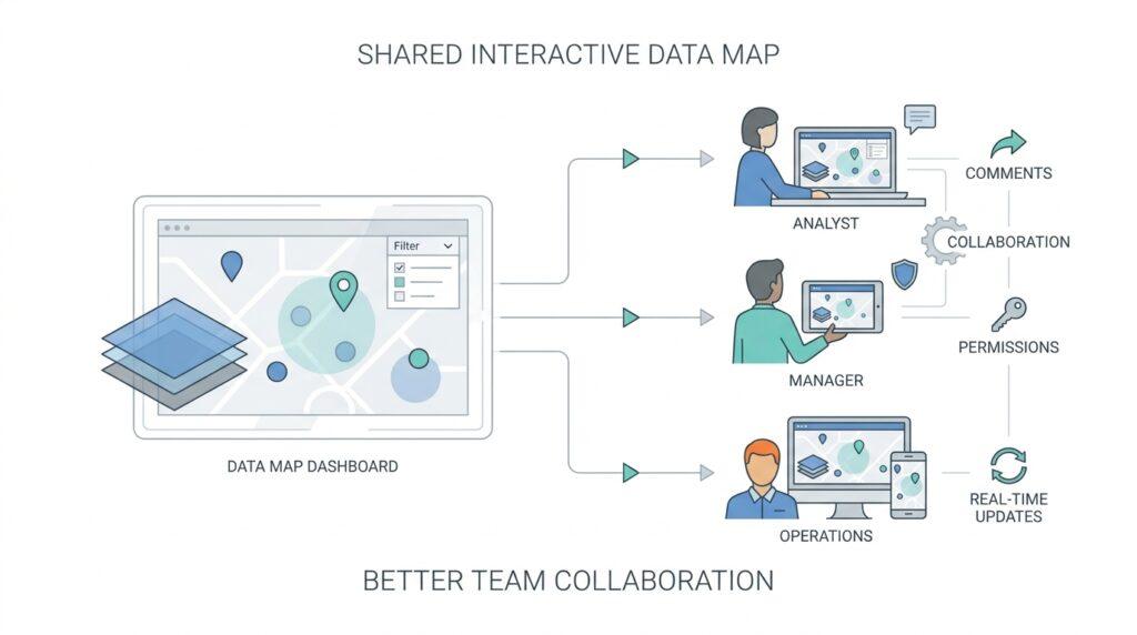
Once the map is ready, the next decision is not glamorous, but it is where collaboration either stays tidy or turns messy: permissions and groups. If you have ever watched a shared file drift through an office, you already know the risk—people open it, edit it, forward it, and soon nobody is sure who can see what. For interactive data maps, the safer pattern is to define access on purpose, because map access can depend on workspace permissions, permissions on the underlying data, and the permissions attached to the map itself. If one of those layers is missing, the map may open with gaps, errors, or incomplete layers.
A good way to think about groups is to picture name badges at a conference. Instead of handing each person a separate badge every time, you give a badge to a role or team, and everyone in that group gets the same doorway into the conversation. That is why group-based access works so well for internal teams: it keeps interactive data maps aligned with real working relationships, like operations, sales, finance, or leadership. Microsoft Fabric supports sharing maps directly with users or groups, and direct access lets you explicitly add the people who need the map rather than relying on a loose, forwardable link.
The real question is, what should each group be allowed to do? For many teams, read access is enough, because they need to explore the map without changing it. For a smaller working group, edit access can make sense when the map is still being refined, and share access should stay in the hands of the people responsible for governance. In Microsoft Fabric, all workspace roles can read map items, but share and edit capabilities depend on the role and the permission level you assign. That structure is useful because it gives us a simple rule of thumb: the broader the audience, the narrower the power.
One detail that often surprises people is that sharing the map does not automatically share the data behind it. That means the map may be visible, but the layers can still fail if the recipient does not have permission to the underlying Lakehouse, Eventhouse, or KQL database that feeds it. In plain language, the map is the window, but the data source is the room behind it. This is why permissions and groups should be planned together, not separately, especially when internal teams depend on live or real-time data to make decisions quickly.
So how do you set this up without creating chaos? Start by asking who needs to view the map, who needs to edit it, and who should be able to share it onward. Then assign those people to the smallest practical group, because that makes access easier to review later and reduces accidental exposure. For a broader audience, a shared link or org app can work, but for focused collaboration, direct access is usually the cleaner choice because it is tied to specific users or groups and is easier to revoke. When you match permissions and groups to the real shape of the team, interactive data maps become a controlled workspace instead of a loose attachment drifting through inboxes.
Share in Team Channels
Once the map has the right permissions, the next step is to place it where people already talk. Team channels are that shared hallway in the office: they keep interactive data maps close to the conversation instead of hiding them in a folder someone forgets to open. If you are wondering how to share interactive data maps with internal teams in a way people will actually use, this is often the most natural path. A good channel post does more than drop a link; it gives the map a reason to matter.
The first thing to remember is that the channel itself sets the tone. A busy project channel usually works best when the map supports an active decision, while a quieter private channel may fit sensitive reviews or smaller working groups. That choice matters because internal teams do not need more noise; they need the right people seeing the right map at the right moment. When we share interactive data maps in team channels, we are not broadcasting for attention. We are inviting a focused group into a shared workspace.
The message around the map should do some of the heavy lifting. Start with the reason the map is there, because people scan channel posts quickly and need a clue about why they should click. A short note like “Here is the latest regional sales map for today’s planning discussion” tells readers what changed, what it represents, and whether it is worth opening now. If the map is a live view, say so plainly; if it is a snapshot, say that too, so nobody mistakes a frozen picture for current data.
It also helps to name the behavior you want from the team. Do you want quick feedback, a decision, a sanity check, or a round of comments before the next meeting? That question may feel small, but it shapes how people interact with the map once they open it. For example, asking “What patterns do you see in the west region?” creates a very different response from “Please review and confirm the figures for this morning.” Clear prompts turn a passive link into an active working session.
Another helpful habit is to keep the map post easy to revisit later. Teams move fast, and even a useful map can get buried under new messages by the end of the day. A simple naming pattern, a date stamp, and one line of context make it easier for people to find the right version when they return to the thread. This is especially important for interactive data maps that update often, because the channel should help the team track the current source of truth instead of hunting through old posts.
The thread below the post can become the map’s notebook. Instead of scattering comments across email, chat, and meetings, ask people to keep questions, observations, and decisions in one place. That way, the map and the conversation stay connected, which is a huge advantage when internal teams need to explain why a number changed or why a region looks unusual. If the map supports comments or annotations, the channel can link those notes back to the discussion so nothing gets lost.
There is also a quiet etiquette to sharing interactive data maps with internal teams in channels. If a map is especially important, post it at a time when the right people are likely to see it, and avoid burying it in unrelated chatter. If the audience is broad, keep the message simple; if the audience is specialized, give enough detail that experts can move faster without extra back-and-forth. The best channel posts feel calm and purposeful, like a guide pointing everyone toward the same view.
When you use team channels this way, the map stops acting like a file and starts acting like part of the team’s rhythm. People know where to look, what version they are seeing, and how to respond without guesswork. That makes internal collaboration smoother, and it gives interactive data maps the one thing they need most: a place in the daily conversation.
Gather Comments and Annotations
Once the map is in the team’s hands, the quietest part of the workflow ends and the useful part begins: people start reacting to what they see. This is where comments become the map’s sticky notes. In Power BI, comments can live on dashboards, reports, and individual visuals, and a comment can @mention a colleague so they get notified; when a comment is added to a report, Power BI also captures the current filter and slicer values as a bookmark, so the exact view can be reopened later. That same idea fits interactive data maps: we want feedback tied to the exact region, layer, or view the team was looking at, not to a vague memory of it.
The trick is to ask for the right kind of comment at the right moment. If you ask a broad question like “thoughts?”, you usually get a broad answer; if you ask, “What changed in the west region between Tuesday and Thursday?”, you give the team a handle they can hold. Comments work best when the map review is still fresh, because the map’s current filters, layers, and zoom level still match the conversation. That is especially helpful on live Fabric maps, which stay connected to underlying data and can update as the data changes, so the feedback thread should move fast enough to keep up.
Annotations play a slightly different role. If comments are the conversation, annotations are the note pinned to the wall. In ArcGIS Pro, annotation is a separate cartographic workflow that can be created for selected features or converted from labels, which makes it useful when you need text that stays attached to a location or feature instead of drifting away from the discussion. For internal teams, that can mean marking a boundary issue, naming a facility, or preserving a reviewer’s note directly on the map so the next person does not have to decode it from chat history.
That distinction matters because not every note deserves the same treatment. Use comments when the team is still debating, comparing options, or asking for a decision; use annotations when you need a stable label, a reminder, or a cartographic mark that should remain part of the map. In Fabric Maps, access still depends on workspace roles, map-level sharing, and permissions on the underlying data sources, so the people gathering feedback also need permission to see the layers being discussed. Otherwise, the conversation can outpace the data and leave some teammates looking at missing or incomplete layers.
Once the notes start arriving, the next job is to sort them before they pile up. A good habit is to separate feedback into three buckets in your mind: data questions, location corrections, and decision notes. Data questions usually ask whether the numbers are current; location corrections point to a bad geocode, a mislabeled region, or an outdated boundary; decision notes capture the action the team agreed to take. That small amount of structure turns a scattered comment thread into something the team can actually reuse later, which is the whole point of collecting map feedback instead of letting it vanish in a chat window.
If you want the review to stay useful, keep the conversation anchored to the exact map state and the exact next step. Ask people to comment while the view is still on screen, use @mentions when a specific owner needs to answer, and keep the annotation or comment close to the feature it describes. That way, the interactive data maps you share with internal teams do not become another place where good ideas disappear; they become a record of what the team noticed, what it trusted, and what it decided to do next. How do you gather comments on a map without losing context? You keep the feedback attached to the map state, then you carry the most important notes forward into the next review.
Review and Refresh Maps
Once the team has commented and annotated the map, the work is not finished—it has only reached the part where trust gets earned again. This is where we review and refresh maps, meaning we check whether the map still reflects the real world and then update it when the data has moved on. If the earlier sections were about opening the door and inviting people in, this stage is about making sure the room still looks the way the team expects. Interactive data maps stay useful only when people believe the picture in front of them matches today’s reality.
The first step is to review the map with fresh eyes, especially after a round of feedback. We look for the kinds of issues people tend to miss in the moment: a region that is labeled differently, a point that landed in the wrong place, or a filter that hides part of the story. What is the map saying now, and does it still say the same thing it said when the team first shared it? That question matters because a map can look polished and still be outdated, and outdated maps are one of the fastest ways to slow internal collaboration.
Refreshing the map means bringing in newer data, but it also means checking the parts around the data. A refresh is not only a replacement of numbers; it is a reset of the whole view so the map keeps making sense. If a source table changed, if a boundary file was revised, or if a geocode, which is the process of turning an address into a map location, has improved, the map should reflect that change. For teams sharing interactive data maps, this is the moment when yesterday’s working draft becomes today’s working version.
A good refresh rhythm depends on how the map is used. Some maps need a scheduled refresh, meaning they update at a set time each day or week, while others need a manual refresh after someone checks the data for accuracy. Live maps can be helpful because they reduce the chance of people working from stale information, but live does not mean carefree; we still need to confirm that the underlying data source is healthy and current. In practice, the best internal data sharing workflow is the one that matches the speed of the business without letting small errors spread quietly.
This is also the point where the comments and annotations we gathered earlier become practical guidance. If several teammates noticed the same confusing label or questioned the same location, we do not ignore that pattern—we use it as a checklist for the next revision. That is the real advantage of collaborative review: the map is no longer edited in isolation, because the team has already shown us where the weak spots are. A refreshed map that ignores those notes may be newer, but it is not necessarily better.
Versioning helps here because it gives us a way to tell one map state from another. Versioning means keeping track of changes over time so we know what was shared, when it was shared, and what changed between one release and the next. For internal teams, this can be as simple as naming the map clearly, stamping the date, or saving a previous copy before publishing the new one. That small habit makes it easier to answer a question that comes up often in map review: which version are we looking at right now?
The safest habit is to pair every refresh with a quick validation pass. We open the map, compare a few known locations, and make sure the new data still lands where it should. Then we tell the team what changed, because people work faster when they know whether they are seeing a minor correction or a meaningful shift in the story. When we review and refresh maps this way, interactive data maps stay dependable, and internal collaboration keeps moving with the confidence that the map is still telling the truth.