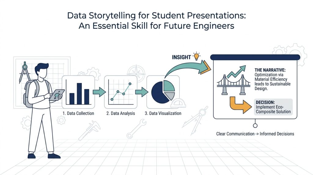
Understand Your Audience
Once you have a data story in mind, the next move is to look up and ask, who is in the room? That question shapes everything in data storytelling for student presentations, because the same chart can feel obvious to one audience and confusing to another. A group of classmates, a professor, and a panel of future employers will not hear your message in the same way. If we want our engineering presentations to land, we have to think about the audience before we think about the slides.
This is where many strong ideas lose their power. You might have a solid dataset, a clean graph, and a clear point, but if you speak as though everyone already knows the context, you leave people behind. Audience awareness means noticing what your listeners already understand, what they care about, and what would feel like a puzzle to them. In other words, we are not changing the truth of the data story; we are changing the path we use to bring people to it.
A good way to picture this is to imagine explaining the same map to three people standing at different places. One person needs directions from the front door, another needs only a shortcut, and a third wants to know why the route matters at all. Your audience works the same way. Some listeners need definitions of basic terms, such as a variable, which is a value that can change, or a trend, which is a pattern that appears over time. Others may already know the language of statistics, but they still need help seeing why this particular finding matters.
So how do you read the room before you speak? Start with the simplest questions: What class or department are they from? How much technical background do they have? Are they looking for a lesson, a decision, or a takeaway? When we answer those questions, we can shape the level of detail, the examples we choose, and even the words we use. For example, if you are speaking to first-year students, your data storytelling should slow down and explain each step; if you are speaking to engineering peers, you can move faster, but you still need to make the logic visible.
Understanding your audience also helps you decide what not to include. That can feel strange at first, because we often want to show everything we learned. But a presentation is not a storage box for every result; it is a guided path through the most important ones. If your listeners are new to the topic, too many numbers can blur the point. If they are experienced, too much background can make them restless. The art of audience awareness is choosing the details that support the story instead of crowding it.
This is also why wording matters so much in student presentations. A phrase that sounds precise to you may sound like jargon to someone else, and jargon is specialized language that can block understanding when it arrives too quickly. You do not need to sound less intelligent to be clearer. You need to sound more considerate. When you explain terms as they appear, use familiar comparisons, and keep asking what your listener needs next, your data story becomes easier to follow and much harder to forget.
If you want a quick test, try finishing this sentence before you rehearse: “My audience needs to understand , care about , and remember ___.” That one habit can sharpen your data storytelling faster than almost anything else. It reminds us that great engineering presentations are not only about correctness; they are about connection. Once we know who we are speaking to, we can build the next part of the story around what will matter most to them.
Define the Main Message
After we understand who is in the room, the next question is sharper: what is the one idea you want them to carry out of the room? In data storytelling for student presentations, the main message is the anchor that keeps your charts, examples, and explanations from drifting apart. It is the central claim, which is the single point your data supports, and it works a lot like a compass on a long hike. Without it, we may still walk through interesting territory, but we can lose the path that makes the trip meaningful.
This is where many presentations become crowded. You may have five useful findings, three strong graphs, and one memorable anecdote, but if they all pull in different directions, the listener has to do the hard work of deciding what matters. The main message solves that problem by giving everything a shared purpose. When someone asks, “What is this presentation really about?” you want one clear sentence ready, not a search through your slides.
A useful way to find that sentence is to ask what your data changes. Does it show a problem that is larger than people expected, a pattern that appears at a key moment, or a comparison that overturns a common assumption? Those possibilities are the raw material of a thesis statement, which is a concise sentence that states the point you are trying to make. For example, instead of saying, “We studied traffic data,” your message might be, “Rush-hour congestion rises sharply near campus because most students travel at the same time.” That version gives the audience a direction, a reason, and a takeaway.
If you are wondering, how do I define the main message for a data story without oversimplifying it?, the answer is to separate the point from the details. The point is the meaning; the details are the evidence. Think of a bridge: the message is the span that holds everything together, while the charts, numbers, and examples are the supports underneath it. We need both, but the bridge only works when the span is clear before we add the weight of evidence.
Once the message is clear, every slide gets easier to judge. You can look at a graph and ask, “Does this support my central claim, or does it send the audience somewhere else?” That question protects you from including data that is interesting but distracting. In data storytelling for student presentations, clarity often comes from subtraction, not addition, because removing weak or unrelated points makes the strongest evidence stand out.
This also helps your wording become more confident. Instead of sounding like you are collecting observations, you start sounding like you are guiding a listener toward an insight. You might say, “The data shows,” “This pattern suggests,” or “The comparison reveals,” because those phrases signal what the evidence is doing. That small shift matters, because your audience is not only hearing numbers; they are following a line of reasoning.
The final test is simple: if your main message disappears, does the presentation collapse? If the answer is yes, you have found the right center. If the answer is no, the story may still be waiting for a sharper claim. Once we define that claim clearly, the rest of data storytelling becomes easier to organize, easier to remember, and much more convincing for the people listening.
Choose Clear Visuals
In data storytelling for student presentations, the visual you choose often decides whether your audience leans in or quietly gets lost. We have already named the main message, so now the question becomes: what picture will carry that message with the least confusion? A clear visual works like a good window—it lets people see the scene without making them work to clean the glass first. When a chart is honest, simple, and readable, your listeners spend their energy understanding the idea instead of decoding the slide.
The first step is matching the chart to the job you want it to do. A chart is a visual way to show numbers, and different charts tell different kinds of stories. A bar chart compares categories, a line chart shows change over time, and a scatter plot shows how two things move together. If you want to answer, “How do I choose the right visual for my presentation?”, start by asking what the audience needs to notice first: a difference, a trend, or a relationship. That question keeps data storytelling for student presentations focused on meaning rather than decoration.
Once the shape is right, we need to clear away anything that competes with the message. Clutter is every extra element that asks for attention but does not help understanding, such as heavy grid lines, too many colors, or labels that repeat what the title already says. Think of it like packing for a short trip: if you carry too much, the useful items become harder to reach. In the same way, clean visual design gives the central point room to breathe. A chart does not need to look busy to look smart.
Color deserves special care because it speaks before we do. A strong color choice can guide the eye, separate groups, and highlight the most important value, while too many bright colors can turn the slide into a traffic jam. A legend, which is the key that explains what each color or symbol means, should be easy to find and easy to read. If one category matters most, we can use a single accent color to make it stand out, while keeping everything else quiet. That small contrast helps the audience know where to look first.
Labels, axes, and scale also carry more weight than beginners often expect. An axis is the numbered line that gives a chart its frame of reference, and scale is the size range shown on that axis. If the labels are tiny, cut off, or vague, the audience has to guess at the meaning of the data. If the scale starts in a misleading place, the chart may exaggerate or flatten the pattern. In data storytelling for student presentations, clarity means making the chart tell the truth in a way the eye can follow without effort.
Annotation can turn a decent visual into a memorable one. An annotation is a short note placed directly on a chart to point out something important, like a peak, dip, or unusual result. Instead of forcing the audience to search for the insight, we can place the insight where it belongs—right on the visual. This is especially useful when you want to guide people through a surprising result or a turning point in the data. The chart becomes less like a puzzle and more like a guided conversation.
The best test is to step back and ask what a stranger would understand in three seconds. If they can tell what the visual is about, what changed, and why it matters, you are on the right track. If they have to squint, compare too many colors, or read every label before the message appears, the visual is doing too much work. Good data storytelling for student presentations does not hide the evidence; it shapes the evidence so the story arrives quickly and clearly. Once the visual does that job, we can use it to build the next part of the presentation with confidence.
Build a Story Arc
When you stand in front of a class with your slides ready, the hardest part is not finding the numbers—it is giving them a journey. That is what a story arc does in data storytelling for student presentations: it arranges your ideas so the audience can follow the movement from setup, to tension, to resolution. Think of it like walking someone through a room in a dark house with the lights slowly turning on. We are not dumping facts on the table; we are helping the listener see how the evidence leads somewhere.
The easiest place to begin is with the starting point, because every good story needs a scene before it needs a surprise. Here, we show the baseline, which is the normal condition or reference point your data will build on. If you are presenting survey results, for example, you might first explain what people usually expect; if you are showing performance data, you might establish what counts as typical. This opening matters because the audience cannot feel change until they understand what came before it.
From there, we move into the complication, which is the part of the story where the data becomes interesting. A complication is not a problem in the bad sense; it is the moment where the pattern shifts, the assumption breaks, or the question becomes sharper. Maybe the trend rises faster than expected, maybe one group behaves differently from the others, or maybe the numbers point to a hidden bottleneck. In data storytelling for student presentations, this is where your audience leans in, because they can feel that the story is asking for an explanation.
That middle section works best when each slide earns the next one. Instead of showing every chart at once, we can treat the presentation like stepping stones across a stream: each visual supports one small leap in understanding. One chart establishes the context, the next reveals the change, and the next explains why the change matters. This is one reason the story arc is so useful—how do you build a story arc for a data presentation without losing people along the way? You guide them through questions in the same order they would ask them themselves.
As the evidence builds, we want the path to feel intentional, not crowded. A strong arc does not repeat the same point in different forms; it increases the pressure of the idea until the audience is ready for the payoff. That means we can use our visuals like chapters in a short novel, each one adding a new layer instead of starting over. In data storytelling for student presentations, this kind of pacing helps the room stay with us, because people always understand more easily when they can see why the next piece belongs.
The resolution is where the story earns its meaning. This is the moment we connect the findings back to the main message and show what the audience should take from them. Maybe the data suggests a design change, a scheduling adjustment, or a new way to think about the problem. What should your audience do with this information? They do not need every possible implication; they need the one or two that turn insight into action.
This final step matters because a presentation can have strong data and still feel unfinished if the ending does not point somewhere. When we close the loop, we show that the evidence was never random—it was moving toward a conclusion all along. That is the quiet power of a story arc: it turns a collection of slides into a guided argument, and it turns data storytelling for student presentations into something people can actually remember. Once the arc is clear, the rest of the presentation has a path to follow.
Practice with Feedback
Now that the story has a shape, the next step is to rehearse it out loud and let other people react to it. This is where data storytelling for student presentations starts to feel real, because practice turns ideas on a slide into words in the air. A rehearsal is a practice run before the actual presentation, and feedback is information someone gives you about what was clear, what was confusing, and what made them pay attention. If you have ever wondered, how do I practice for a data presentation and know what to fix? this is the moment where the answer begins to appear.
The first rehearsal should feel like a dry run, not a performance. We want to see where the story stumbles when it has to live in your voice, your timing, and your pauses. You may notice that a sentence sounds smooth in your head but feels awkward when spoken, or that a chart you thought was obvious needs one more line of explanation. That is not failure; it is the presentation teaching us where the weak joints are before the real audience finds them.
Recording yourself can be especially helpful because it gives you a mirror without judgment. A recording is a captured version of your talk that you can replay, and it lets you hear pacing, filler words, and places where your explanation runs too fast. When we listen back, we can catch moments where the data story feels rushed or where the main message gets buried under extra detail. This small step often reveals more than another silent read-through ever could.
After that, we bring in other people, because practice with feedback works best when the listener is close to your audience. A classmate can tell you where they lost the thread, while a friend from another major can show you which terms sound technical instead of clear. This matters in data storytelling for student presentations because the problem is rarely that your data is wrong; it is usually that the path to the meaning is not yet easy enough to follow. We are not asking people to grade the work at this stage. We are asking them to help us see it the way a first-time listener would.
The most useful feedback is specific, so we need to ask better questions than, “Was it good?” Instead, we can ask, “What was the main point you heard?”, “Where did you start to feel confused?”, and “Which slide made the strongest impression?” Those questions work because they point to the parts of the story that matter most: message, clarity, and memory. When someone answers them honestly, we get a map of where the presentation is working and where it still needs support.
It also helps to listen for patterns instead of treating every comment as equally urgent. If one person says a slide was unclear, we may need to adjust a sentence; if three people say the same thing, we probably need to rethink the explanation itself. That is the quiet craft of revision: we learn to separate a small wording issue from a deeper storytelling issue. In data storytelling for student presentations, revision is not about making everything longer or fancier. It is about making the logic easier to follow.
Once we know what to change, we rehearse again with the revisions in place. This second pass is where confidence starts to grow, because the presentation no longer feels like a pile of separate pieces. The words fit the visuals more naturally, the pauses land better, and the main message begins to sound like something you truly own. Practice with feedback gives you that shift from I hope this makes sense to I know where the audience will go next.
The real payoff is not perfection; it is clarity under pressure. When the room is full and nerves are high, the work you did in rehearsal comes back to guide you. You have already heard where people got lost, already tightened the transitions, and already tested the story aloud. That is why practice with feedback matters so much in data storytelling for student presentations: it turns a draft into a guided experience, and it gives us the confidence to share the story as clearly as we understand it.