What Counts as Outliers
When you first start looking for outliers in statistics, it can feel like you’re searching for the “weird” data point in a crowd. But what counts as an outlier is not always the same thing as what looks unusual at first glance. In plain terms, an outlier is a value that sits far away from the rest of the data, yet the real question is far more interesting: far away compared with what? That comparison is what turns a suspicious number into a meaningful data outlier.
A good way to think about it is to picture a classroom of test scores. If most students score between 70 and 85, a score of 20 will immediately stand out. In statistics, though, standing out is not enough on its own. We also need to know whether the score is unusual because it is truly different, because the group is small, or because the data include a natural spread that is wider than we expected. This is why outliers depend on the shape and context of the data, not on a fixed sense of “oddness.”
So what counts as outliers in practice? One common clue is distance from the rest of the values. If a point sits far beyond the main cluster, it may be an outlier. A second clue is whether the value breaks the pattern the rest of the data follows. For example, if income data mostly rise gradually but one value jumps far above everything else, that number may be an outlier even if it is technically possible. These clues help us notice data outliers, but they do not yet tell us whether the value should be treated as a problem.
This is where the familiar rules of thumb come in. In many beginner-friendly analyses, people use the interquartile range, or IQR, which measures the spread of the middle half of the data. If a value falls far below the lower fence or far above the upper fence, it often gets labeled an outlier. Another common approach uses the z-score, a measure of how many standard deviations a value is from the mean, or average. When a point has a very large z-score, it suggests the value is far from the center of the data.
Still, no rule works like a universal alarm bell. A value that counts as an outlier in one dataset may be perfectly normal in another. Think about house prices, where a luxury home might look extreme in a small neighborhood survey but feel ordinary in a citywide market study. This is why outliers in statistics always need context. We ask not only whether a value is far away, but whether it is far away in a way that matters for the question we are asking.
That context also includes the story behind the data. Sometimes an outlier signals a simple recording error, like a misplaced decimal point or a missing digit. Other times it points to something real and important, such as a rare medical response, an unusually fast delivery time, or a sudden jump in sales after a campaign. In other words, outliers are not automatically mistakes. They are data points that ask us to slow down, look closer, and decide whether they reveal noise, error, or a genuine exception worth keeping.
When readers ask, “What counts as outliers?”, the most honest answer is that outliers are values that sit unusually far from the rest of the data by a rule, a pattern, or a practical judgment. The exact line depends on the dataset, the method, and the purpose of the analysis. Once we accept that, we stop treating outliers as random troublemakers and start seeing them as clues that help us understand the data more clearly.
Types of Data Outliers
Once you have spotted a suspicious value, the next question is not “Is it weird?” but “What kind of outlier is it?” In outliers in statistics, that distinction matters because different outlier types behave differently and deserve different attention. Think of it like noticing someone standing apart in a crowd: sometimes it is one person who is truly alone, sometimes it is someone who only seems unusual in a certain setting, and sometimes it is a small group moving together in a way the larger crowd does not. That is the real job here: not to label a point as strange, but to understand the shape of its strangeness.
The easiest place to start is the point outlier. This is a single observation that sits far away from the rest of the data on its own, like one temperature reading that is wildly different from the others or one purchase amount that jumps far beyond the usual range. When people first learn about data outliers, this is usually the picture they have in mind, because the odd value stands alone and is easy to notice. That said, a point outlier is not automatically a mistake; it may be a typo, a sensor glitch, or a real event that matters a great deal. In other words, the value is isolated, but our judgment should not be.
Then we meet the contextual outlier, which only looks strange once we bring the setting into view. A value may be perfectly ordinary in one situation and unusual in another, which is why context behaves like the background of a photograph: change the background, and the same object can feel completely different. A temperature reading that seems fine in winter may look suspicious in midsummer, and a sales figure that feels modest in December may look unusually high on a quiet weekday in February. Researchers describe contextual outliers as observations that resemble a larger reference group in some attributes but diverge sharply in others, so the surrounding conditions are part of the story, not extra decoration. If you have ever asked, “How can this number be an outlier if it looks normal to me?”, context is usually the missing piece.
Finally, there is the collective outlier, and this is where outliers in statistics start to feel more like a pattern than a single dot. Here, each point may look ordinary by itself, but the group becomes unusual when we see the whole sequence or cluster together. Imagine a handful of calm measurements followed by several small rises in a row; none of them shouts on its own, yet together they may signal an outage, an outbreak, or a burst of unusual activity. That is why collective outliers often show up in sequence data, graph data, and spatial data, where order and neighborhood matter as much as the individual values. The surprise is not inside one point; it lives in the company those points keep.
What helps most is treating the type as a clue, not a verdict. When we ask whether data outliers are isolated, context-dependent, or collective, we move from “that number looks odd” to a much sharper question: “what story is the data trying to tell us?” That shift matters because the same strange-looking value can point to an error, a rare but real event, or a meaningful pattern that only appears when we step back and look at the whole picture. Once we learn to separate the types of data outliers, we are in a much better position to decide what to keep, what to question, and what deserves a closer look.
Visual Detection Methods
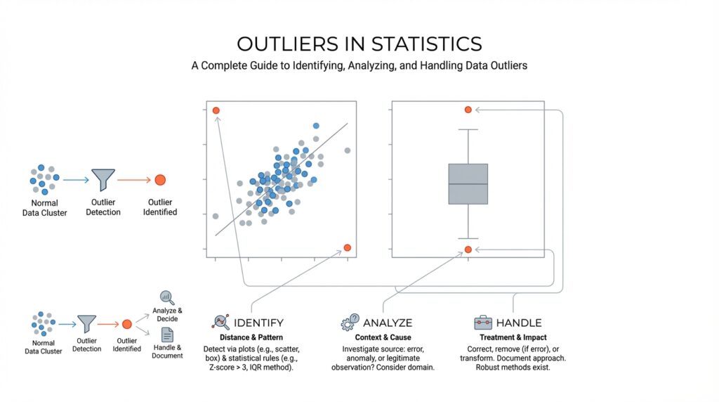
When you first begin using visual detection methods for outliers, the process can feel a lot like scanning a crowd for the person who is out of step. You are not proving anything yet; you are training your eye to notice where the data stops behaving like its neighbors. A quick picture often tells us more than a page of numbers, especially when we want to spot lone values, strange gaps, or a pattern that suddenly bends away from the rest. In exploratory data analysis, simple graphs such as dot-charts, boxplots, and histograms are a standard first look because they help reveal location, spread, clustering, and possible anomalies.
For one variable at a time, the boxplot usually becomes our best starting point. A boxplot, also called a box-and-whisker plot, shows the middle half of the data, the median (the center value), and the values that stretch outward from that center; points beyond the whiskers are flagged as potential outliers. NIST notes that boxplot fences can be used to mark mild and extreme outliers, and it also says boxplots are generally better graphical tools for detecting outliers than histograms. That makes the boxplot feel like a fence line: if a value lands outside it, we stop and ask why.
Histograms still matter, but they ask a different question. A histogram groups values into bins, which are ranges of numbers, so it helps us see the overall shape of the data: where most values cluster, whether the data lean left or right, and whether a tail stretches unusually far. The tradeoff is that the picture can change with bin width, so a histogram can hide or exaggerate a suspicious point depending on how it is drawn. That is why we treat it as a broad map, not a final verdict. In practice, visual detection methods work best when a histogram and a boxplot are read together, because one shows shape and the other shows unusual distance from the center.
When the data come in pairs, the scatterplot becomes the star of the show. A scatterplot places one variable on each axis so we can see whether the points follow a trend, cluster into groups, or drift away from the main cloud. If a single point sits far from the rest or refuses to fit the relationship everyone else follows, it may be an outlier in the pairwise sense, even if neither value looks strange on its own. NIST’s example describes a scatterplot where the main data follow one linear pattern while one point appears to come from a different model entirely, which is exactly the kind of visual clue we want.
If the data arrive over time, we need to watch the story as it unfolds. A run sequence plot, which is a plot of values in time order, helps us notice sudden spikes, drops, or shifts that a simple summary could miss. This matters because a value may not look extreme in isolation, yet it can still signal something unusual when it appears in a burst or after a long stretch of calm. In time-series work, visual detection methods often begin with this kind of line-by-line inspection, because the order of the values carries meaning all by itself.
The real strength of visual detection methods is that they let us compare several viewpoints before we decide what a suspicious point means. One plot might show a value as isolated, another might show it as part of a larger pattern, and a third might reveal that the apparent outlier is actually a normal response to a different context. That is why graphical checks are often used alongside formal outlier tests: they help reduce masking, where one outlier hides another, and swamping, where ordinary points get unfairly flagged. When we read the plots patiently, we are not hunting for trouble so much as learning the shape of the data’s neighborhood.
Statistical Outlier Tests
Once the plots have pointed us toward a suspicious value, statistical outlier tests give us a formal way to ask whether that value is unusual enough to reject. The idea is to start with a null hypothesis, which means we assume there are no outliers, and then compare the data to a cutoff set by a significance level, or alpha, which is the false-alarm rate we are willing to tolerate. That may sound abstract, but it is really a courtroom analogy: the plot is the eyewitness, and the test is the rulebook that tells us when the evidence is strong enough to act. In practice, these tests work best when we already have a suspected outlier and want a statistical answer instead of a gut feeling.
For a single odd value in one variable, Grubbs’ test is the familiar first stop. NIST describes it as a test for one outlier in an approximately normal univariate dataset, using the sample mean and standard deviation to measure how far the most extreme value sits from the center. Because it only handles one outlier at a time, it fits the moment when you suspect one measurement went off the rails, not a whole cluster of problems. It can also be framed as a one-sided check if you want to know whether the minimum or maximum is the odd one out.
When the sample is small, Dixon’s Q test often comes into the conversation. NIST notes that it is meant for small data sets, roughly 3 to 30 points, and that it compares the gap between the most extreme value and its nearest neighbor with the spread of the whole set. That makes it feel like checking whether one suitcase is awkwardly separated from the row of luggage: if the gap is large enough, the point may be rejected as an outlier. Like Grubbs’ test, though, it is aimed at a single suspicious value, so it is most useful when one end of the data looks lonely rather than when several points are acting strangely together.
If more than one value looks suspicious, a single-outlier test can get tripped up by masking, which is when one outlier hides another by pulling the summary statistics toward itself. NIST recommends the generalized extreme studentized deviate, or generalized ESD, for cases where you suspect multiple outliers in an approximately normal univariate dataset; it tests for one or more outliers and requires only an upper bound on how many you think might be present. This is the point where the analysis becomes less like a spotlight and more like a sweep across the room, checking whether several people are standing outside the circle at once. If the exact number of outliers is known, NIST also describes the Tietjen-Moore test as another multiple-outlier option.
The part that saves beginners the most time is remembering that these tests do not replace judgment; they depend on the data behaving roughly like the test expects. NIST warns that outlier tests are distribution-dependent, and that a Grubbs-style result can reflect non-normality rather than a true outlier if the underlying shape is wrong. So when you ask, “What statistical test should I use for outliers?”, the best answer is usually: start with the visual clues, match the test to the sample size and the number of suspected outliers, and treat the result as one more piece of the story rather than the final word. That is how outlier tests become useful: not as a verdict machine, but as a careful second opinion.
How to Handle Outliers
Now that we can spot suspicious values, the real question is: what should you do with outliers once you find them? The safest starting point is to treat every outlier in statistics as a clue, not a verdict. NIST’s guidance is clear: if the value is truly erroneous, correct it or delete it; if you cannot prove it is wrong, do not simply throw it away. Instead, step back and ask whether the point is telling you about bad data, unusual variation, or something genuinely interesting.
That means the first job is investigation. We look for a misplaced decimal, a duplicated record, a sensor problem, or a transcription error, because a bad measurement can tilt the whole picture like one heavy stone in a hanging scale. If the value survives that check and still seems real, we usually keep it and adjust the analysis rather than pretending it never existed. NIST describes this as outlier accommodation: modifying the statistical approach so the data outliers do not dominate the result.
When several values look unusual, patience matters even more. NIST warns that you should not apply a single-outlier test one point at a time to hunt for multiple outliers, because that can create masking or swamping. A better move is to use a method designed for the kind of pattern you see, and if the data are roughly lognormal or heavily right-skewed, a log transformation can bring the scale closer to normal before you judge the outliers. In plain language, we are not forcing the data to confess; we are changing the lens so the picture is easier to read.
If the extreme values are real, robust methods are often the gentlest next step. Robust statistical techniques are built to resist being pulled around by unusual points, and NIST notes that robust regression can downweight observations based on their residuals, letting the bulk of the data speak more clearly. Another common tactic is Winsorization, which replaces extreme tail values with chosen percentiles instead of throwing observations away; that is different from deletion, because the record still stays in the dataset. This is a lot like trimming the loudest notes in a song so the melody becomes easier to hear.
In practice, the best way to handle outliers is to choose the smallest intervention that still respects the story in the data. If a point is wrong, fix it. If it is valid but overly influential, transform it, downweight it, or use a robust method. And if you are unsure, keep the decision transparent so you can explain why you treated the data the way you did; that habit matters because outlier handling is part statistics and part judgment. Once we learn that balance, outliers in statistics stop feeling like interruptions and start acting like useful signals.
Robust Analysis Techniques
When we move from spotting outliers to working with them, the mood changes a little. We are no longer asking only, “What looks strange?” We are asking how to analyze the data without letting a few extreme values steer the whole story, and that is where robust analysis techniques come in. If you have ever wondered, how do you analyze data with outliers without throwing the whole dataset off balance? this is the part where the answer starts to take shape.
Robust analysis techniques are methods that stay steady even when the data include unusual points. In plain language, they are built to resist being tugged around by extremes the way a small boat resists rough water better when it is weighted properly. Instead of relying only on the mean, or average, which can drift toward large values, robust methods often lean on the median, which is the middle value, or on spread measures that care less about extremes. That makes outlier analysis feel less fragile and more like a careful conversation with the data.
One of the simplest robust tools is a transformation, which means changing the scale of the data before analyzing it. A common example is a log transformation, where we compress large values so they do not overpower the smaller ones. This is useful when the data are heavily right-skewed, meaning they have a long tail stretching toward larger numbers. In that setting, robust statistical methods can work with a more balanced view of the data, and the outliers in statistics become easier to interpret rather than harder.
Another useful family of techniques starts with the idea of downweighting. A weight tells the analysis how much influence a point should have, and a downweighted observation gets less say in the final result. Robust regression, which is a version of regression designed to reduce the impact of extreme points, does exactly this by treating the most unusual residuals, or differences between observed and predicted values, with extra caution. Instead of forcing us to delete a point immediately, it lets us ask whether the point is truly representative or just loudly unusual.
Sometimes the best move is not to discard extremes but to soften them. Winsorization replaces the most extreme values with chosen cutoff values, usually from the ends of the distribution, so the record stays in the dataset without dominating the calculation. That is different from trimming, which removes extreme values entirely. Both approaches can help when robust analysis techniques are needed, but they serve slightly different stories: trimming says, “These tail values should not shape the result,” while Winsorization says, “These values can stay, but they should speak more quietly.”
It also helps to look at the data through multiple summaries instead of trusting one number too much. The median and interquartile range, or IQR, which is the spread of the middle half of the data, often give a more stable picture than the mean and standard deviation when outliers are present. That stability matters because one extreme value can change the average dramatically while barely moving the median at all. In outlier analysis, that difference is often the first clue that a robust method is the better fit.
Good robust analysis techniques also include a sense check. We do not want to let the method do all the thinking for us, because an outlier can be a measurement error, a rare but real event, or a signal that the model itself is incomplete. So we compare the standard approach with the robust one and ask whether the main conclusion changes. If it does, that is not a failure; it is valuable information telling us the result depends heavily on those extreme points.
That is the quiet strength of robust analysis techniques: they help us keep our footing while the data do something unexpected. Instead of treating every extreme value as a problem to erase, we learn to ask whether it deserves less influence, a different scale, or a closer human look. And once we start thinking this way, outliers in statistics become less like disruptive guests and more like clues about how the data really behave.