Define the Decision Question
Before we choose a chart or a dashboard, we need to pause and ask a quieter, more important question: what decision are we trying to make? That is the heart of effective data visualization. A chart is not the goal; it is a tool that helps you act with more confidence. When you start by naming the decision question, you give the data a purpose, and the whole process becomes clearer, calmer, and far more useful.
A decision question is the specific choice you want to make after looking at the data. It might sound like, “Should we keep this campaign running?” or “Which product line needs attention first?” In other words, it is the bridge between raw numbers and real action. Without that bridge, data visualization can turn into a pretty picture that looks informative but does not help anyone decide what to do next.
This is where many beginners feel stuck, because it is tempting to start with the data itself. We have rows, columns, and a mountain of numbers, so we assume the next step is to “see what’s there.” But strong data visualization works in the opposite direction: we begin with the question, then choose the view that answers it. If you ask, “What is happening over time?” a line chart may help. If you ask, “How do categories compare?” a bar chart may tell the story more clearly. The question leads, and the chart follows.
The reason this matters is simple: different decisions need different kinds of evidence. A decision question often points toward one of three needs. You may need to compare, which means placing things side by side to see which one is larger, smaller, faster, or better. You may need to track change, which means watching how a number rises, falls, or stays steady over time. Or you may need to understand relationships, which means seeing whether two things move together in a meaningful way. Once we know which kind of thinking we need, the data visualization becomes much easier to design.
It also helps to make the question as concrete as possible. “How are we doing?” is too vague to guide a chart, because it could mean sales, traffic, profit, retention, or dozens of other things. A sharper question sounds more like, “Did weekend sales increase after the new promotion?” or “Which region is missing its monthly target?” The more specific the decision question, the easier it is to choose the right metric, which is a measurable value like revenue, sign-ups, or customer churn. That focus keeps us from wandering through the data without a destination.
A good way to test your question is to imagine the moment right after the chart appears. What decision would you actually make? If the answer is fuzzy, the question still needs work. If the answer is clear, you are probably on the right track. This is one of the most practical habits in data visualization: start with the choice, then work backward to the evidence you need, instead of collecting visuals and hoping one of them will speak for you.
So when you sit down with a dataset, we want you to think like a careful guide rather than an eager collector. Ask what decision is waiting at the end of this analysis, name it in plain language, and let that question shape everything that follows. That one habit will make your charts sharper, your insights easier to trust, and your data visualization much more likely to lead to a real decision.
Clean and Prepare Data
Now that we know the decision we are trying to make, we need to meet the part of the process that rarely looks glamorous but changes everything: data cleaning and data preparation. This is the moment when we take raw data and make it fit for analysis by correcting errors, removing inconsistencies, and shaping the dataset so it can actually answer the question we care about. It is a little like clearing the counter, washing the pans, and lining up ingredients before cooking; the meal matters, but the setup determines whether we can cook with confidence.
This step matters because messy data can quietly bend the story in the wrong direction. Duplicate records can make a trend look stronger than it is, missing values can leave important gaps, and inconsistent formats can make one row look different from another even when they mean the same thing. In practice, that might mean a sales chart is inflated by repeated orders, or a monthly report misreads dates because some entries use one format and others use another. When we do data cleaning, we are not polishing the numbers for show; we are protecting the decision from avoidable mistakes.
A good way to begin is to scan the dataset the way you would inspect a room before inviting guests in. We look for missing values, duplicate rows, odd category names, and outliers, which are values that sit far away from the rest and may signal an error or a rare but real event. Many tools surface this first pass for us, such as profile views that reveal nulls and unusual values, but even in a spreadsheet we can train ourselves to notice patterns that feel off. This early glance is part of data preparation, and it helps us see where the dataset needs care before we start choosing charts.
From there, we start making careful choices instead of automatic ones. If a row is duplicated, we usually remove it, because duplicate rows can distort analysis and make the data appear larger than it is. If a value is missing, we ask why it is missing before deciding whether to keep it blank, fill it in, or leave it out of a specific analysis, because dropping missing data can also mean losing useful information. If categories or dates are written in different ways, we standardize them so the dataset speaks one consistent language.
This is where beginners often have an important realization: cleaning data is not about forcing everything into the same shape no matter what. A strange value may be an error, but it may also be the most interesting thing in the dataset, so we need to check before we delete or change it. The same is true for missing values, because sometimes the absence tells its own story, and sometimes it simply means the data was never collected. Good data preparation asks, “What does this value mean in context?” before it asks, “How do I fix it?”
When the dataset is cleaner, the visualization does not have to fight through clutter to tell the truth. That is the quiet payoff of this stage: our chart can reflect the decision question we named earlier instead of echoing mistakes in the source data. So if you ever wonder, “Why does my chart look wrong even though the numbers are there?”, the answer is often that the numbers still need preparation. Once the data is tidy enough to trust, we are ready to turn it into a visual that can guide the next decision.
Choose the Right Chart
Now that the data is clean and the decision question is clear, we reach the moment where the story becomes visible: we have to choose the right chart. This is where data visualization stops being a general idea and becomes a practical craft. The chart you pick acts like a lens, and each lens reveals a different kind of truth. If you are wondering, “Which chart should I use for my data?”, the answer starts with what you want the reader to notice first.
A bar chart is often the best place to begin when you want to compare categories. Think of it like lining up jars on a shelf so you can see which one holds the most. If you need to compare sales by region, support tickets by team, or website visits by channel, a bar chart makes those differences easy to scan. It works well because our eyes are good at judging length side by side, which is why this kind of chart is a dependable choice in data visualization.
A line chart tells a different kind of story: it shows change over time. When you want to follow a trend, such as monthly revenue, daily active users, or temperature across a week, a line chart feels like watching a path unfold on a map. The line connects the points so we can see whether the data rises, falls, or moves in waves. That makes it especially useful when the decision depends on momentum, because trends often matter more than a single number sitting by itself.
Sometimes, though, the question is not about categories or time. Sometimes we want to know whether two things are related, and that is where a scatter plot comes in. A scatter plot places one value against another, like plotting study time against exam scores, or ad spend against conversions, so we can look for patterns. Do the points climb together, drift apart, or form a loose cloud? That shape can hint at a relationship, and it helps us decide whether a change in one factor may influence another.
Pie charts deserve a careful mention because they are familiar, but they are easy to misuse. A pie chart shows parts of a whole, which sounds useful, yet it only works well when the slices are few and the differences are obvious. Once the slices get small or the categories multiply, the chart becomes harder to read and compare. In many cases, a bar chart communicates the same message more clearly, which is why choosing the right chart often means choosing the clearer chart, not the flashiest one.
As we choose a chart, we also need to think about what the reader should be able to do in a few seconds. Should they compare values, notice a trend, spot an outlier, or understand a relationship? That question acts like a compass. The best data visualization does not ask the viewer to work too hard; it arranges the information so the answer feels almost immediate. When the chart matches the task, the insight arrives faster and with less confusion.
It also helps to remember that a chart can fail even when the underlying data is good. If you cram too many categories into one visual, use a chart type that hides differences, or place unrelated numbers together, the message gets muddy. Choosing the right chart means respecting both the data and the decision question we named earlier. In other words, the chart should make the choice easier, not more complicated, and that is what turns a nice-looking graphic into useful data visualization.
So as we move forward, keep this habit close: let the question decide the chart. When you want comparison, reach for bars; when you want movement over time, reach for lines; when you want relationships, reach for scatter plots. That simple discipline gives your data visualization a steady voice, and it prepares the ground for the next step, where we make the visual even easier to read and trust.
Use Color and Labels Well
Once the right chart is on the page, the next question becomes much more human: how do we help people read it without getting lost? This is where color and labels do their quiet, important work in data visualization. A well-chosen chart can still feel confusing if the viewer has to guess what a bar means, what a line represents, or why one part is brighter than another. When we use color and labels well, we turn the chart from a shape on a screen into a message that feels easy to follow.
Color is powerful because our eyes notice it before almost anything else. In a chart, color means the hue or shade we use to separate categories, highlight a pattern, or draw attention to one key point. That makes it useful, but also risky, because too many colors can create noise instead of clarity. If every series shouts at the same volume, the reader stops knowing where to look, and the data visualization loses its voice.
So the safest habit is to use color with intention, not decoration. One color can highlight the main series, while a softer neutral tone can hold the background information in place. Think of it like a spotlight in a theater: the stage may be full of actors, but the light tells us who matters right now. If you have ever wondered, “How do I make my chart easier to read?” this is often the first place to start.
Labels carry a different kind of weight. A label is the text that names a chart element, such as an axis title, a category name, a data value, or a brief annotation, which is a short note added to explain something specific. Without labels, a reader has to work backward and guess what the numbers mean, and that slows down the whole experience. Good labels act like signposts on a road: they do not argue with the traveler, they simply show the way.
This is why clarity matters more than cleverness. If the x-axis and y-axis are not labeled, even a strong chart can feel incomplete, because the viewer cannot tell what the measurement is or how to interpret it. If categories are abbreviated or too vague, the reader has to pause and decode them, which breaks the flow of understanding. In data visualization, every second spent guessing is a second spent away from the decision we want to support.
The best charts often use color and labels together, each doing a different job. Color helps the eye separate one idea from another, while labels help the mind name what it is seeing. For example, a line chart might use one bold color to highlight this month’s results, a muted line for the previous month, and a direct label near the line so the reader does not have to hunt for a legend. That combination feels small, but it can make the chart much more immediate and trustworthy.
There is also a gentle rule worth remembering: if color is carrying meaning, it should be doing real work. Use it to show categories, patterns, or emphasis, not to fill empty space or make the chart look busy. The same goes for labels, which should answer the reader’s likely questions before those questions become frustration. Good data visualization does not ask people to interpret every detail from scratch; it gives them enough help to move from looking to understanding.
Another helpful check is to step back and ask what someone would notice in the first three seconds. Would they know what the colors mean? Would they understand the labels without asking for extra context? If the answer is no, the chart may need fewer colors, clearer names, or a stronger annotation to guide the eye. These small adjustments often make the biggest difference because they respect the reader’s attention.
When we handle color and labels well, the chart starts to feel calm instead of crowded. The message becomes easier to trust, because the visual choices support the data instead of competing with it. That is the real goal here: to make data visualization feel like a clear conversation, where the chart speaks plainly and the reader can listen without strain.
Build Clear Dashboards
After we have the right chart and the right labels, the next challenge is bigger: we have to make several pieces of information live together without turning into noise. That is where clear dashboards matter in data visualization. A dashboard is a single screen that gathers the most important charts, numbers, and context into one place, so the reader can see the situation without jumping from tab to tab. If a chart is one clue, a dashboard is the whole scene, and our job is to arrange it so the story is easy to follow.
The best dashboards begin with restraint. It can be tempting to place every interesting metric on the page, but a dashboard is not a storage box for everything we know. It is more like a control panel in a car: the speed, fuel, and warning lights matter because they help you act right now, while the rest can wait. When we build clear dashboards, we choose only the visuals that support the decision question we already defined, which keeps the reader focused on what matters most.
That choice becomes much easier when we think in layers. The top of the dashboard should answer the biggest question first, often with one or two headline numbers that show whether things are improving or slipping. Below that, we can place supporting charts that explain why the number moved, which region is responsible, or which category needs attention. This structure gives the eye a path to follow, and it makes data visualization feel less like a puzzle and more like a guided conversation.
Spacing plays a quieter role, but it is one of the strongest tools we have. White space, which is the empty area around charts and labels, gives each part of the dashboard room to breathe. Without it, every chart competes for attention and the screen starts to feel crowded, even if the data itself is useful. A clear dashboard uses space the way a good speaker uses pauses: not as wasted time, but as part of the message.
Consistency matters just as much. If one chart uses weekly data and another uses monthly data, or if one scale starts at zero while another starts halfway up, readers may compare things that should not be compared. That is why clear dashboards keep formats, colors, and number styles aligned whenever possible. We are helping the viewer move through the dashboard without having to relearn the rules each time they glance at a new section.
A strong dashboard also gives context, because numbers alone can feel like floating pieces of evidence. A small reference line, a target value, or a simple comparison to the previous period can show whether the current number is good, bad, or merely different. This is one of the most useful parts of dashboard design, because it turns raw data into a story about progress. If someone asks, “How do I build a dashboard that people actually use?”, context is often the answer.
Interactivity can help too, but only when it serves the reader instead of distracting them. Filters, which let someone narrow the view by date, region, or category, are useful when the dashboard has to answer different questions for different people. Still, we should be careful not to hide the main message behind too many clicks, because a dashboard should reveal meaning quickly. The best interactive features feel like opening a window, not walking through a maze.
It also helps to test the dashboard the way a real person would encounter it. Imagine opening it on a busy morning with no instructions. Would you know where to look first, what changed, and what needs attention? If the answer is unclear, the problem is usually not the data; it is the layout. Clear dashboards work because they respect how people scan information under pressure, which is exactly when good decisions matter most.
When we bring all of this together, the dashboard becomes more than a collection of charts. It becomes a decision space, a place where data visualization supports action instead of competing for attention. That is the real goal here: not to show everything, but to show the right things in the right order so the next step feels obvious.
Turn Visuals Into Action
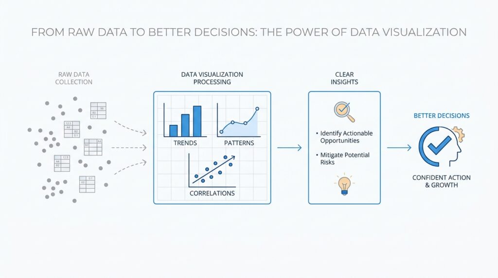
After the chart is clear and the dashboard is calm, we reach the moment that matters most: turning the picture into a choice. This is where data visualization proves its real value, because a good visual should not stop at showing what happened; it should help us decide what to do next. If you have ever looked at a chart and thought, What now?, you are standing at the exact threshold this section is about. The goal is to move from observation to actionable insights, so the visual becomes a starting point for action instead of a pretty endpoint.
The first step is to look for the signal that actually matters. Not every small rise, dip, or wobble deserves a response, and that can feel tricky at first. We want to ask whether the change crosses a meaningful threshold, breaks a pattern, or affects the decision we care about. A good way to think about it is like checking a weather forecast: a little cloud cover may not change your day, but a storm warning certainly does. In the same way, a data visualization becomes useful when it helps us separate background noise from the moments that need attention.
Once we spot the signal, we need to translate it into a next step that someone can carry out. That is the bridge between insight and action, and it should be concrete enough that a team member could take it without guessing. If a sales chart shows a drop in one region, the action might be to review the campaign, compare it with another region, or talk to the local team. If a retention chart reveals churn after week two, the next step might be to inspect onboarding or customer support. What should you do after the chart answers your question? The answer should sound like a real task, not a vague feeling.
This is also where ownership matters. A visual can point to a problem, but a decision only happens when someone knows who is responsible for acting on it. That is why the most useful charts often sit beside targets, benchmarks, or short notes that explain what “good” looks like. When a team sees the current number next to the goal, the chart stops feeling like a report and starts feeling like a guide. In other words, clear data visualization does not just describe the situation; it gives the situation a place to go.
A practical way to move forward is to treat every chart like a small decision loop. We observe the pattern, ask why it changed, choose one response, and then check whether the response worked. That last step is easy to forget, but it matters because action without follow-up can leave us guessing again. If a promotion improves conversions, the visual should help us confirm that lift over time. If it does not, the next chart should help us understand why. This is how data visualization becomes a feedback system instead of a one-time display.
We also need to guard against a common trap: gathering too many insights and acting on none of them. When everything looks important, the easiest move is often to delay the decision, but delay has its own cost. A strong dashboard helps here by narrowing attention to the few numbers that truly influence the choice. If the visual cannot tell us where to begin, we may need to simplify it until one action stands out. The best charts create momentum because they help us say, “This is the thing we need to work on first.”
In the end, turning visuals into action is about respecting the purpose behind the whole process. We cleaned the data so we could trust it, chose the right chart so we could read it, and shaped the labels so we could understand it. Now we use that clarity to decide, assign, and follow through. That is the quiet power of actionable insights: they make it possible for a team to move from seeing the story to changing the outcome, which is exactly where good data visualization earns its place.