Define the Core Question
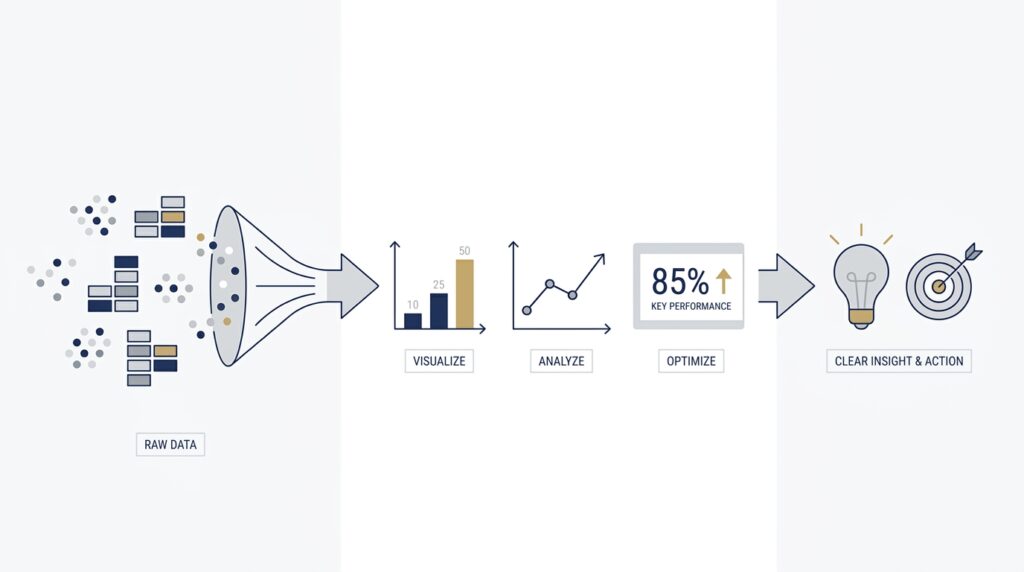
Before we draw a single chart, we need to answer the real question: what are we trying to understand? That is where clear data visualization starts, because growing data can feel like a crowded room where everyone is talking at once. A graph, dashboard, or map only becomes valuable when it helps us hear the right voice in that noise. If you have ever wondered, “What is the point of data visualization when the dataset keeps getting bigger?”, that is the exact place we need to begin.
The core question is not, “How do we show all the data?” It is, “What decision, pattern, or problem do we want the viewer to see?” That shift sounds small, but it changes everything. When we focus on clear data visualization, we stop treating the chart like a storage box and start treating it like a flashlight. A flashlight does not reveal every object in the room; it reveals the part of the room that matters right now.
This matters even more as data grows, because bigger datasets create a new kind of fog. Extra rows, extra categories, and extra time periods can make a chart look impressive while hiding the message inside it. We may have more information than ever, yet still miss the one trend that explains what is happening. So the first job is to narrow the lens and name the question in plain language, such as whether sales are rising, where customers are dropping off, or which region is lagging behind.
Once we name the question, the rest of the work becomes easier to judge. A useful visualization is not the one with the most colors or the most complicated layout; it is the one that answers the question without making the reader work too hard. Think of it like giving directions to a friend. You would not list every street in the city when they only need to know how to reach your house, and in the same way, clear data visualization should remove the detours and point straight to the destination.
This is also where context enters the story. A number by itself is like a single note played in an empty room, while a chart can place that note inside a melody. We need to know what comparison matters, what time frame matters, and what the audience already knows. Are we comparing this month to last month, this region to another region, or today’s performance to a target? The core question tells us which comparison gives the data meaning, and that choice shapes every visual decision that follows.
As the data grows, the temptation is to show more in order to seem more complete. But completeness is not the same as clarity. Sometimes the most helpful move is to hide noise, group similar items, or separate one large problem into smaller questions. That is not a loss of detail; it is a way of protecting the story inside the data so people can actually understand it. In practice, this is what makes clear data visualization so powerful: it turns overwhelm into direction.
So before we think about chart types, labels, or colors, we should pause and name the single question the visual needs to answer. That question becomes our guide rail, helping us choose what to include, what to simplify, and what to leave out. When we do that well, growing data stops feeling like a burden and starts becoming a source of insight. From here, we can begin looking at how to shape that insight into a form people can read at a glance.
Prepare Data for Clarity
When we move from the big question to the actual dataset, the story gets more practical very quickly. Clear data visualization starts with cleaning and shaping the raw information so it can speak in one voice instead of many. If the numbers are messy, the chart will be messy too, and no amount of color or design can fully rescue that. That is why preparation is not separate from clear data visualization; it is the quiet work that makes the picture readable in the first place.
Picture the data arriving on your desk like a stack of mixed puzzle pieces. Some rows are missing values, which means a field is blank where a number or label should be; some are duplicates, which means the same record appears twice; and some entries use different spellings for the same thing, like “NY,” “N.Y.,” and “New York.” Before we can trust what we see, we need to make those pieces fit together. How do you prepare data for clear data visualization without drowning in the details? We begin by making the dataset consistent enough that one row means one thing and one label means one category.
That usually starts with the smallest but most important repairs. We look for missing values and decide whether to fill them, remove them, or leave them out of a specific chart, depending on the question we are answering. We remove duplicates so the same event does not count twice, and we standardize formats so dates, currencies, and category names follow one pattern. These steps may feel invisible, but they protect clear data visualization from telling a story that the data never actually supported.
Once the basics are tidy, we can look for the rough edges that need judgment. A single extreme number, called an outlier, can stretch a chart so far that everything else looks flatter than it really is. Sometimes that outlier is a real signal, and sometimes it is a data entry mistake or a one-time anomaly that needs explanation. The goal is not to erase anything inconvenient; the goal is to make sure the data visualization reflects reality instead of noise.
This is also where grouping and simplification become useful. A crowded dataset often has too many tiny categories for the eye to process at once, so we may combine similar items into broader groups or focus on the most relevant segment. That is a little like tidying a toolbox before a repair job: you do not throw away the tools, but you place them where you can actually reach them. When we prepare data this way, we give the chart room to breathe, and clear data visualization becomes easier for the viewer to read at a glance.
Context matters just as much as cleanup. A number becomes meaningful only when we know what it is being compared with, whether that is a previous month, a target, a different region, or another product line. If the data comes from multiple sources, we also need to make sure the measures match, because one system might count orders differently than another. This is one of the quiet secrets of data visualization: the chart looks simple, but the preparation behind it often carries the real complexity.
We also want to think ahead to the person who will read the final chart. If they care about trends over time, then dates need to be reliable and evenly spaced; if they care about geography, then locations need to be named consistently; if they care about performance, then thresholds and benchmarks need to be built into the dataset. In other words, we are not cleaning data for its own sake. We are shaping it so clear data visualization can answer the question we already named, without forcing the audience to decode the raw material first.
By the time we finish preparing the data, the chart has a much better chance of feeling calm, direct, and trustworthy. We are not trying to make the dataset perfect, because perfect data is rare and often unnecessary. We are trying to make it reliable enough that the next step—choosing the right visual form—can do its job well. And once the data is ready, we can start deciding how to turn that preparation into a visual story people can understand in seconds.
Pick the Right Chart
Now that the data is clean and the question is clear, we reach the moment where the visual itself has to earn its place. Picking the right chart is where clear data visualization starts to feel real, because the chart type is not decoration; it is the shape of the answer. If we ask, “What chart should I use for my data?” we are really asking which visual form helps the reader see the pattern fastest without extra effort.
This is easier to think about if we imagine each chart type as a different kind of lens. A line chart helps us follow movement over time, like watching a trail across a map. A bar chart helps us compare separate groups, like lining up jars to see which one holds the most. A scatter plot shows how two things move together, almost like tossing two kinds of breadcrumbs onto a table and noticing whether they cluster or spread apart. The right choice in data visualization depends on the job we want the chart to do.
The easiest place to begin is with time. When the story involves change across days, months, or years, a line chart usually gives the clearest picture because it lets the eye trace rise and fall in one continuous path. That makes trends easy to notice, which is why line charts are so common in clear data visualization for sales, weather, or growth data. If the data is not about movement over time, though, forcing it into a line can make the story feel smoother than it really is.
When we need to compare categories, a bar chart often becomes the more honest choice. Categories are separate groups, so bars give each group its own space, which makes differences easier to judge at a glance. This is especially helpful when we want to compare regions, products, departments, or customer segments. In practice, bar charts often support clear data visualization better than more decorative options because they make ranking and contrast feel immediate.
Sometimes the question is not about trend or comparison, but about relationship. That is where a scatter plot enters the scene, because it shows how two numeric values behave together. If we are wondering whether more ad spend leads to more sales, or whether higher temperature affects demand, a scatter plot can reveal clusters, gaps, and outliers in a way that feels almost conversational. It does not tell the whole story by itself, but it often shows whether a pattern is there to investigate further.
There are also moments when the best chart is the one that stays out of the way. A pie chart, for example, can work when we need to show parts of a whole and the slices are few and clearly different. But once the categories multiply, the chart becomes harder to read and the comparison gets fuzzy. That is why clear data visualization asks for restraint: the goal is not to use every chart type we know, but to choose the one that matches the shape of the question.
Context still matters here, because the same dataset can lead to different chart choices depending on what we want the viewer to notice. Do we want them to compare values, follow a trend, inspect a relationship, or understand composition? If we choose the chart first and the question second, we may end up dressing the data in the wrong outfit. If we choose the question first, the chart becomes a tool instead of a guess.
A good test is to imagine the reader standing in front of the visual for only a few seconds. What should they see first? What should they understand without reading a long explanation? The right chart should do the heavy lifting quietly, so the message feels obvious once it appears. That is the heart of data visualization: not making data look impressive, but making it readable, believable, and fast to understand.
Once we learn to match chart type to purpose, the rest of the visual design starts making more sense. Titles, labels, and color choices all become easier because they now support a chart that already fits the story. In other words, picking the right chart gives clear data visualization a strong backbone, and that backbone is what lets everything else fall into place.
Reduce Visual Clutter
Now that the chart has a backbone, the next challenge is making sure nothing unnecessary crowds the view. Clear data visualization depends on reducing visual clutter, because even a well-chosen chart can become hard to read when too many lines, colors, labels, and decorations compete for attention. If you have ever looked at a dashboard and felt your eyes bouncing around without landing anywhere, that is clutter at work. The data may be useful, but the design is asking the reader to do too much.
The easiest way to think about clutter is to imagine a desk covered in papers, pens, mugs, and sticky notes. Nothing is wrong with the items themselves, but the important document disappears into the pile. A chart works the same way when every border is heavy, every gridline is dark, every category has a different color, and every data point carries a label. The message is still there, but it hides under layers of visual noise, which makes data visualization feel tiring instead of helpful.
So how do we reduce clutter without stripping away the information people need? We start by asking which marks on the chart actually help the reader understand the story. If a line is purely decorative, a border is overly bold, or a label repeats information already visible in the data, we can remove it and make the chart breathe. This is one of the quiet strengths of clear data visualization: it lets the important parts stand up by themselves instead of competing with background details.
Color is often the first place where clutter sneaks in. A bright palette can feel exciting, but too many colors turn a chart into a box of mixed crayons, where nothing gets enough attention to matter. A restrained color scheme works better because it gives the eye a clear path, especially when one highlight color can point to the key trend while the rest stay calm and muted. In practice, that means we use color to guide attention, not to decorate every corner of the page.
Labels deserve the same careful treatment. When we label every point, every bar, and every slice, we may think we are being helpful, but we can accidentally smother the chart. It is usually better to label only the values or categories that need direct attention and let the rest speak through position, length, or shape. If the reader can understand the chart faster without a legend, then direct labels may be the cleaner choice; if a legend is necessary, it should stay simple and close to the data it explains.
White space also plays a bigger role than many beginners expect. White space, meaning the empty area around chart elements, gives the eye room to rest and helps separate one idea from another. Without it, the visual feels jammed together, like trying to hear a conversation in a crowded hallway. With it, the chart feels calmer, and clear data visualization becomes easier because the audience can focus on one relationship at a time.
We also need to be honest about when more detail stops being useful. A chart can hold a large dataset, but it does not need to show every possible layer at once. Sometimes we reduce clutter by grouping minor categories into an “other” bucket, moving less important context into a note, or showing only the most relevant time range. Are you trying to show everything, or are you trying to help someone see what matters? That question is often the difference between a chart that informs and a chart that overwhelms.
The best test is to step back and look at what your eye finds first. If the first thing you notice is the legend, the grid, or a splash of decoration instead of the actual pattern in the data, the design is still too noisy. When we trim that noise, the chart stops shouting and starts speaking plainly. That is the real payoff of reducing clutter: it gives the viewer a direct line to the insight, and it prepares us to make the final visual choices with even more confidence.
Surface Trends and Outliers
When the data starts piling up, the hardest part is not finding a number—it is noticing the pattern hiding inside the numbers. That is where clear data visualization earns its keep, because it helps us surface trends and outliers before they get buried under volume. A trend is the overall direction the data is moving in, like a tide rising or falling over time. An outlier is a point that sits far away from the rest, like a single bright light in a row of lanterns.
This matters because our eyes are good at stories, not spreadsheets. If we ask, How do you identify trends and outliers in data? the answer starts with giving the viewer a path to follow. A line chart can show a steady climb, a dip, or a sudden jump without forcing us to inspect every row one by one. That kind of data visualization turns a long list into a shape we can recognize at a glance, which is exactly what growing datasets need.
The first step is to look for the general movement before we chase individual exceptions. A rising sales line, a slowing support queue, or a widening gap between regions tells us something is changing in the system. When we focus on the direction of the data first, we stop mistaking small wiggles for the main story. That is one of the quiet strengths of clear data visualization: it helps us separate the weather from the climate.
Once the broader pattern is visible, outliers become easier to spot for the right reasons. An outlier may signal a data error, a one-time event, or a meaningful shift that deserves attention. If a customer purchase suddenly spikes, or one location falls far below the rest, the visual should make that stand out without making us hunt for it. In other words, the chart should nudge us toward the unusual point instead of hiding it among everything else.
Context is what keeps those unusual points honest. A large value is not automatically a problem, and a small value is not automatically a mistake. We need to ask whether the outlier fits the story of the business, the season, or the process behind the data. That is why clear data visualization is not only about seeing differences; it is about helping us ask better follow-up questions once those differences appear.
One helpful approach is to compare each point with its neighbors instead of reading it alone. When nearby values form a smooth pattern and one point breaks away, the break becomes meaningful. That contrast is easier to see when the chart is sorted, grouped, or plotted over time rather than scattered randomly across the screen. We are not trying to make the data look neat for its own sake; we are trying to make the shape of the dataset easier to read.
Sometimes the best way to surface trends is to soften short-term noise without hiding the underlying movement. A moving average, which is a running summary of nearby values, can help reveal the direction beneath sharp daily ups and downs. That does not replace the raw data, but it gives the eye a steadier line to follow. Used carefully, this kind of data visualization keeps the story clear while still leaving room for detail.
Outliers also become easier to understand when we compare them across segments. A point that looks unusual in the total dataset may make perfect sense within a smaller group, such as one region, product, or customer type. That is why it helps to break large datasets into smaller views when the first pass feels too crowded. Clear data visualization works best when it lets us zoom out for the trend and zoom in for the exception.
As we do that, the goal is not to eliminate every surprise. The goal is to make sure the surprise is real, visible, and interpretable. A strong visual helps us see where the data behaves normally and where it breaks the pattern, which is often where the most useful insight lives. And once those trends and outliers come into view, we are ready to turn them into a story the reader can trust.
Turn Insights Into Action
Now that the pattern is visible, the real work begins: we have to decide what to do with it. A chart that exposes a trend or an outlier is valuable, but it becomes powerful only when it helps us move from observation to response. This is the moment where clear data visualization stops being a mirror and starts becoming a map. If you have ever asked, “What do we do after data visualization shows a problem?”, this is the answer we need to build together.
The first step is to turn the insight into a decision, because not every insight deserves the same response. Some findings call for a quick correction, like fixing a broken label or chasing a data error. Others point to a broader business choice, such as changing a process, adjusting a budget, or testing a new approach. When we treat every chart as a signal for action, we give data a real job instead of letting it sit politely on a dashboard.
That shift works best when we make the next step unmistakably clear. A useful insight should answer three quiet questions at once: What happened, why does it matter, and who needs to act? A sales decline is more useful when we know which region fell, how far it dropped, and which team owns the response. In other words, clear data visualization helps us see the issue, but action begins when we attach responsibility and timing to the insight.
This is also where context protects us from rushing too fast. A spike, dip, or gap may look urgent, but the right response depends on whether it is a one-day blip, a repeating pattern, or a sign of a larger shift. We can think of the chart like a weather report: a passing cloud does not demand the same response as a storm front. By reading the visual in context, we avoid overreacting to noise and focus our energy where it can actually help.
Once we know the likely cause, we can test a small change before making a large one. This is one of the most practical uses of data visualization, because it helps us compare before and after instead of guessing in the dark. Maybe we try a new subject line, a different route through a checkout flow, or a revised staffing schedule, then watch whether the numbers move in the direction we expected. Clear data visualization makes those experiments easier to trust because we can see the change instead of relying on memory.
The most helpful teams do not stop at seeing the result; they build a feedback loop around it. A feedback loop is the simple habit of checking whether an action changed the outcome, then using that lesson to decide the next move. That keeps insight from fading into a one-time conversation. When the chart updates and the team checks it again, clear data visualization becomes part of the rhythm of decision-making rather than a report that gets read once and forgotten.
Communication matters here too, because insight only becomes action when other people can understand it quickly. If we want a manager, teammate, or client to respond, the visual needs a plain title, a clear takeaway, and enough context to make the next step obvious. We are not asking the audience to admire the chart; we are inviting them to use it. That is why the best data visualization for action feels calm, direct, and specific, almost like a note left on a desk with the next move already written out.
So the final question is not whether the insight is interesting. It is whether the insight changes what we do next, and whether the chart helps us see that change clearly. When clear data visualization supports action, the data stops being a record of what happened and starts becoming a guide for what happens now. From here, the strongest visuals are the ones that make the next decision feel easier to see and easier to trust.